Here on this piece I broke off much smaller pieces so I would have more control over the foliage itself. I wanted it to look kind of like a mini bonsai tree, like a tree that is struggling to live. Here was my test run without glue to see how it would look:

I liked it, but it felt fractionally too yellow to me. I decided to airbrush the foliage a white colour to match the tree a bit more. I did that on the pieces, then broke off the smaller ones and glued them to the tree. I then airbrushed from underneath a darker colour, and from above a lighter one.
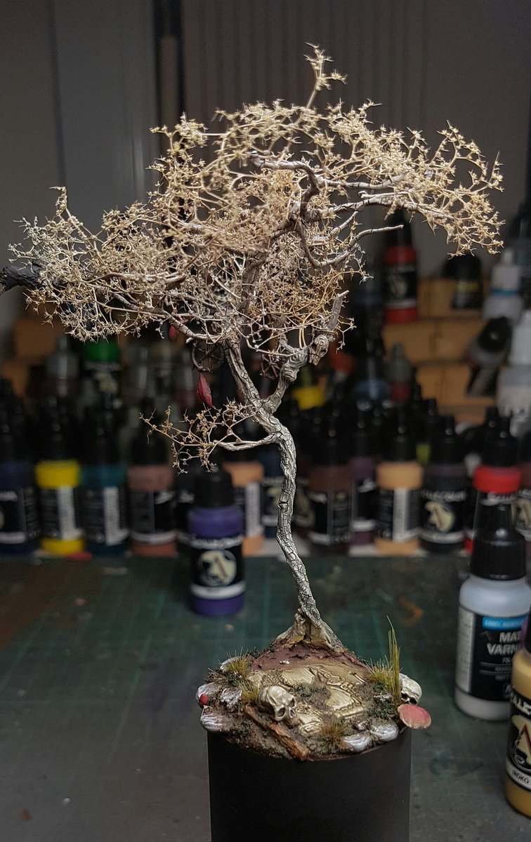
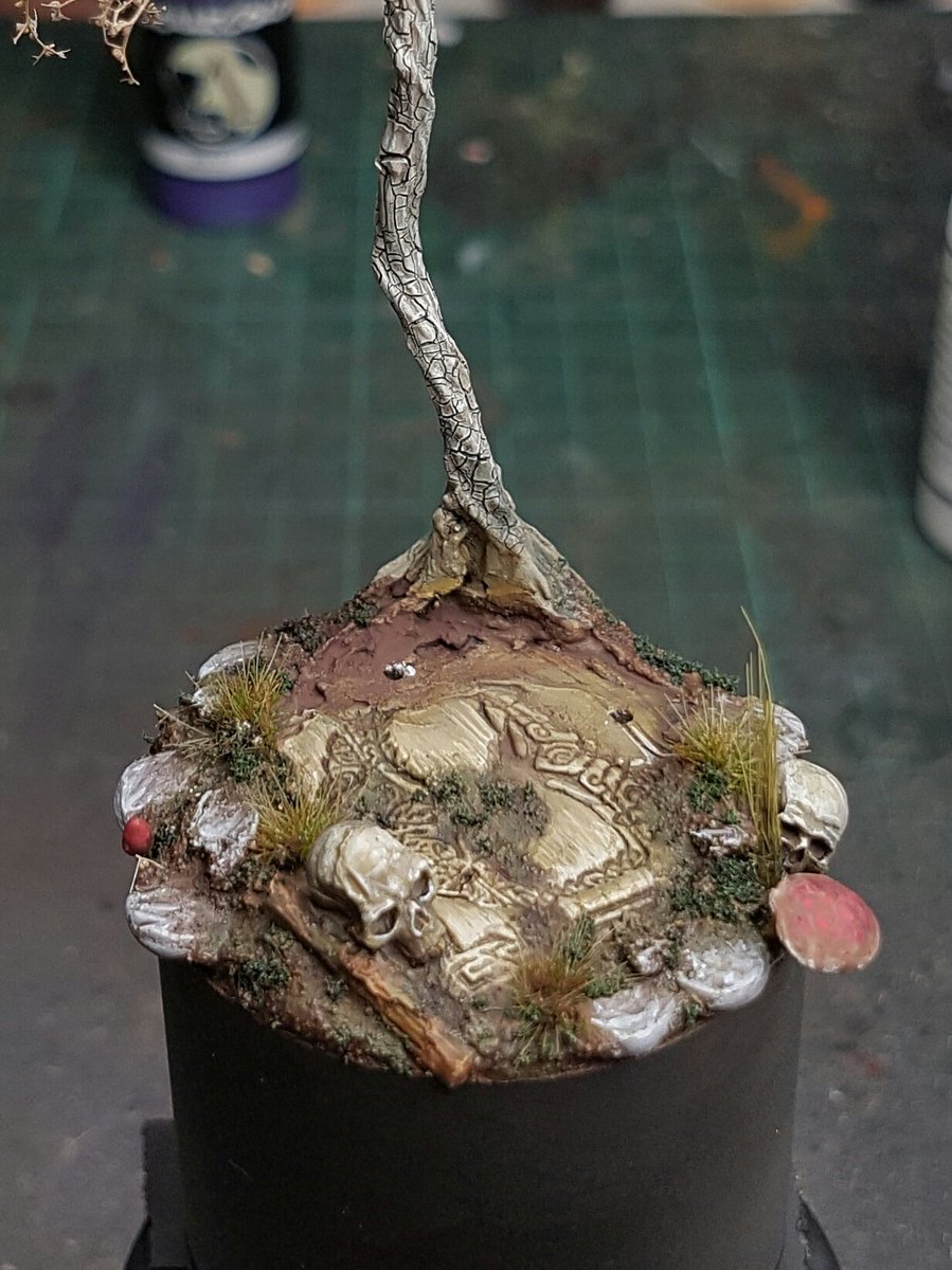
I feel like I may have gone just ever so slightly too far on the whiteness, I think it needs a little more colour so I may muck around with some more airbrush glazes. I fixed up a few more little things on the base, and I think I will add a small flower or something on the front in front of the twig.
Having already airbrushed some of the skin, I did a bit more on it with the robes and the thing around his shoulders. It is funny, I posted a picture of all my projects on Twitter the other day, and the first thing I noticed was how many colours I have used over and over without realising it. Maybe it is just because I am a bad painter, or because I like painting what I know, but all I've done really is red or blue as a core colour! So for this guy I decided I would try to avoid primary colours, and focus on secondary colours, so I will not have any red, blue or yellow on him, except as shades. I want to try and use mostly neutral colours and have there be a lot of life in them, see if I can make it look good.
So I went with an old favourite of bone for the robes, or cream, or off white or whatever you want to call it. I think the model will need some warpaint or something like that, so I will need to go for purple or something for it. Anyway, here is the first few layers of highlighting and shading:

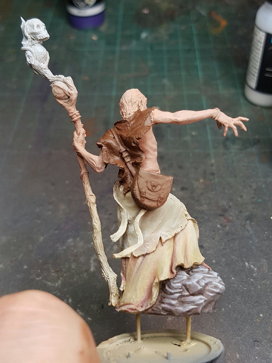
Again I am sticking with no black at all for shading, to try and ensure the colours stay bright and vivid.
I am excited for this model. I think it is shaping up to be my best entry at CD, and I have a lot of them!
Cheers
Trent
No comments:
Post a Comment