Monday 30 January 2017

Painting Rakkir, the Blood Shadow

During this post, which was written a little while back, I am going to break down step by step how I painted my Rakkir model, getting it ready for the gaming table!


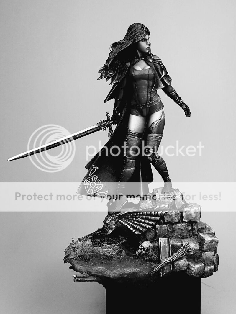
Painting a 54mm provides some challenges over a normal 30mm model.  The larger a surface area is, often the harder it can be to create a smooth blend.  One of the ways to get around this is to use an airbrush. Whilst it is not an essential tool for a painter, it certainly makes aspects of painting larger models a lot less time consuming and can create a smoother final result.

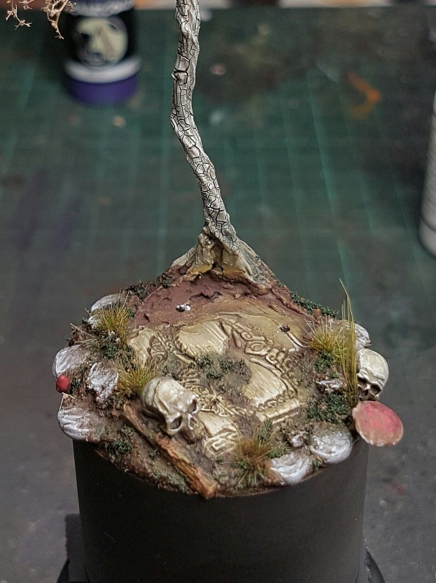
I started by preparing the miniature in the usual way, cleaning off mold lines and filling gaps. Fortunately the casting on Rakkir is very good, there was only a couple of very small mold lines to fix, and a little gap filling required around where the cloak joined the torso.  I decided not to the use the base that Rakkir is provided with, because I want to have my warband all on the same base to tie them together.  The base that is provided with him was also super cool, so I wanted to use it on another project! :)


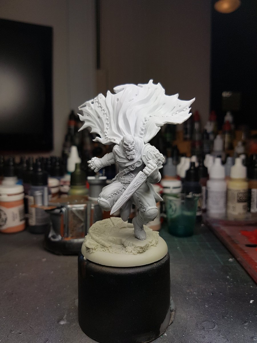
Here he is is, all ready to be undercoated!  I use a method of undercoating called zenithal priming. It is a method of creating light and shadow on the model in a natural way to create shading before the painting process commences.  First the model is sprayed black, using Chaos Black GW spray, then I used the Vallejo Grey Surface Primer through the airbrush to spray from the top down, creating a natural shadow on the model.  You can find lots of information about zenithal priming online, it is a good technique to use when using an airbrush.

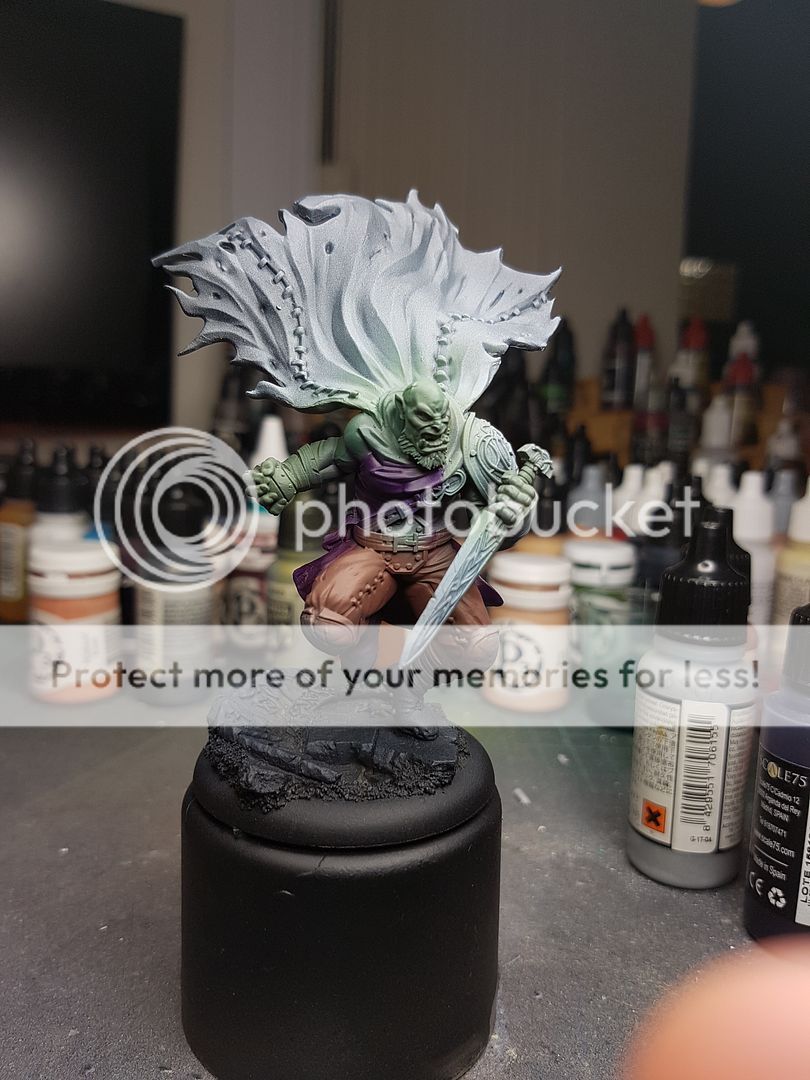
I’ve always painted following the “dressing a model” approach.  If you imagine as you paint the model that you start with the skin, then paint each layer as if you were dressing the model. It makes it easier to avoid work you’ve already completed, as the layers get progressively further up on the model.  I decided to create some basecoats with my airbrush for the skin.  I used a basic dark green and then airbrushed a lighter green over the top.  By using thin coats of paint through the airbrush, the zenithal priming impacts the saturation of the colours, brighter over the grey and darker over the black.  Here he is after the first round of airbrushing.


I also went in and basecoated his pants with the airbrush using a rust colour.  At this stage I am not too worried about getting colours on areas they are not supposed to be on.  It is mostly just blocking out the areas of colour to get a feel for what it is going to look like.


Purple for his shirt came next, and this was a little more delicate, making sure I didn’t get too much overspray on the adjacent areas.  You could mask these areas off with some blutac if you wanted, but at this early stage I did not bother and just kept the PSI low and made sure I was delicate with my airbrush.


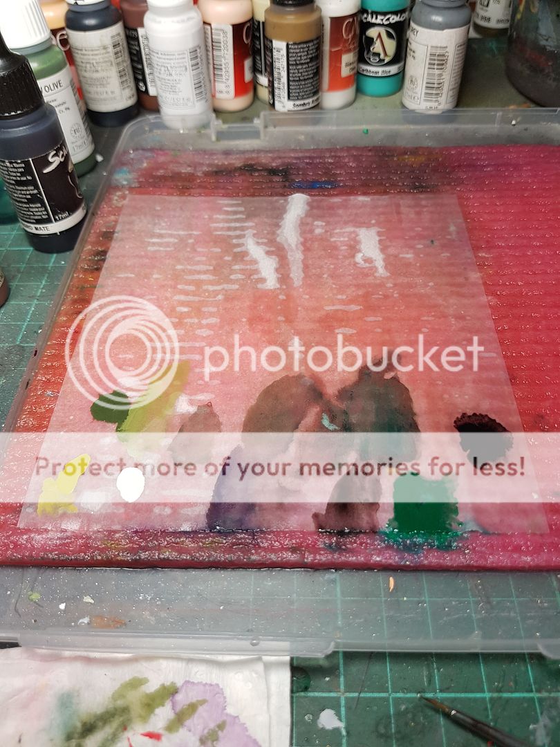
I cleaned out my airbrush and pulled out the brushes to get started on the skin. There is no one good technique for painting something this size, no one trick that will make things immediately look amazing. I use a combination of techniques, two brush blending, layering, washes, glazing, feathering, all working together to try and create a realistic and interesting look. Real human skin when you look at it has translucent layers where you can see veins, imperfections, hairs and all sorts of other crazy things going on. Trying to replicate that in miniature form is difficult, but I try to introduce a few different colours in different areas.  You can see here the colours I mucked around with on my palette:


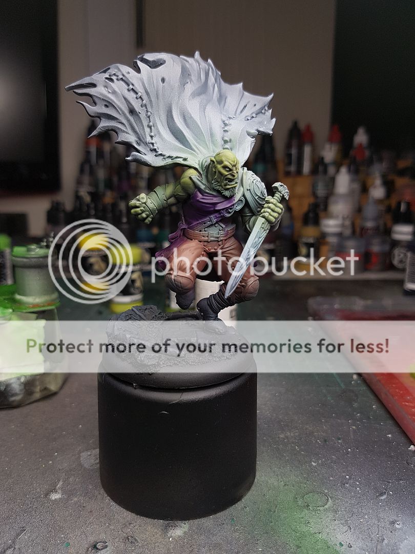
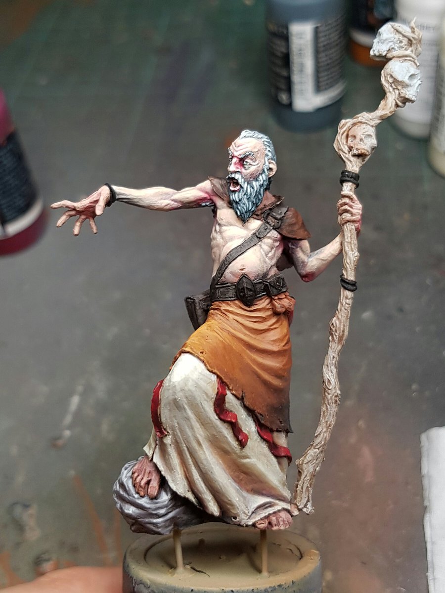
Once I reached a point where I was pretty happy with the skin, I painted in the eyes and began blocking in a few other areas for colour.  I highlighted the pants but it was at this point that I started to try to create focus on the central part of the model, the face.  By having a much brighter and heavily contrasted face, and much lower contrast and saturation on the other areas, it draws the focus to the face.  The pants therefore did not receive as much highlighting as the skin had.


I painted in the rest of the colours to start to see the model take shape.  Often I will start with a colour which doesn’t necessarily have a lot to do with the final colour, and for bone I start with this yellow colour first. You still see this colour come through very softly in some areas and it gives some depth to it.  But here is the first stage!


As a general process that I like to follow, it is basecoat colour, then wash to create a shadow, rehighlight the basecoat, then a few highlight stages to finish it off.  For the wrappings, the boots, the purple, this is exactly the process I followed.  I try to use a similar colour to highlight with across a model, mixing in with the base shades. Doing this ties the highlighting together and creates a more harmonious finish.


The next stage for my painting of Rakkir was to try and reach a point where I could see what the model was going to look like. I find it easier to see what areas I need to work on when the model is starting to take shape, and often things like areas that still have primer change how things look.  I know it sounds strange, but try this: put your hand on the fridge, and then put it on a black table. The hand stays the same, but because of the colours around it, your perception of it changes.  That is kind of what it is like looking at areas of a model that still have primer beside areas that are finished.

I pulled out my airbrush again here. I wanted to make the cloak black, given that Rakkir is an assassin, and it made it much easier to get a smoother coat with the airbrush and saved a lot of time. I also used it to reinforce what I was talking about earlier: changing the focus of the model. I made the areas around the feet and in the recesses darker by passing over them with a few extremely watered down coats of black.

The base was painted and now you can start to see the final Rakkir coming together.


I painted in the metallics, focusing on shading down the metals rather than trying to highlight up. I wanted to put some colour on his cloak, although I wanted it to be a pattern I didnt want it to take too much focus off his face.  I started with purple, and using the airbrush I decided to mask off a simple line across the cloak.


I highlighted this purple and some of the black very lightly, then began blocking in the symbol on his cloak.


The symbol itself got highlighted, paying attention to the contours of the cloak.


At this point the model was nearly finished. All that was left was to pick out some of the small details, like the stitching on his cloak. It is a minor thing, the stitching but when it is done it actually brings a lot of the model to life.  It changes the cloak from being all black and somewhat lifeless to a lot sharper and more defined.  I popped a little bit of green ink and varnish on his dagger, since Rakkir is not against the use of poison when he stabs people,  added some blood into the scar over his eyes, and that was it!

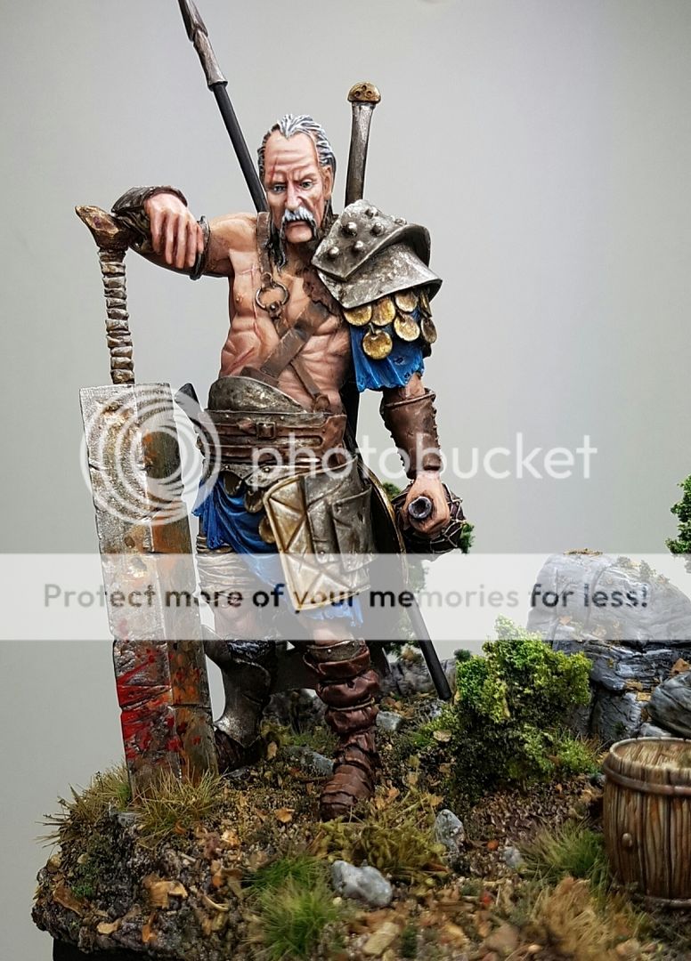
A finished Rakkir, ready to hit the tabletop.


You definitely do not need an airbrush to work on a model of this size, you can achieve very smooth and nice blends with techniques like two brush blending, glazing and even just feathering.  The trick is making sure you have your paint consistency correct, because on a model of this scale, you will really notice when paint is too thick. It is much better to do three or four thin coats of a colour, rather than one thick one.  Focus on the model as a whole, because on something this big you need to have an area that draws the focus, for this model it is his face and upper shoulder area.  And finally, have fun!  It is supposed to be fun painting something like this, and accepting the fact that it might take a little more time will make the finished product better.


Cheers
Trent

Crystal Dragon 2017 Wrapup

I have returned home after what was a mammoth weekend of all sorts of glorious activities with my great friends and beautiful fiance: parkrun around Lake Burley Griffin, a crazy good escape room called the Dungeon where we were chained to the wall, basketball challenges, tennis and cricket watching, eating many foods and drinking many of the drinks, and of course, the painting competition I had been working towards for a decent amount of time!


As I reflected upon right after my Enchanted Pool project was completed, I recognised that I needed to focus not on the competing aspects of the event, but more on the opportunities for growth and constructive feedback from many painters.  I spent a lot of time just hanging around the painting area, chatting with many good people including Meg and Mark, David Higgins, David Colwell, Kyle, Matt D and Casey.  Lots of good chats about all the usual stuff painters talk about, paints, contrasts, techniques etc.  I took lots of notes, and spent ages gazing at all the incredible work that was put up.

With over 100 entries this was the largest Crystal Dragon so far, and the judges said they thought the quality stepped up a notch again this year. With a few notable absentees that usually make an appearance and throw out some beautiful stuff, it bodes well for future events both in terms of quality and quantity.  For a small (population wise) island country, it is encouraging for me to see.


If you've followed my Twitter (@sious69) for the weekend, you would have already seen all the entries which I posted photos of, and there was a truckload of great pieces.  I really enjoyed seeing the different ways people approach things like base construction, using contrast and light and colour, and even things like how to present a model on a plinth.  I took so many great ideas away even just from looking at the models, let alone the conversations I had with other painters.


My own performance far exceeded my expectations for the weekend, it is fair to say.  I was hoping (desperately hoping) that I might squeeze a Silver from the weekend, but in my heart I felt like I was looking at mostly Bronze for my best pieces, and nothing for the rest.  I was utterly shocked when I saw that everything I had entered had received an award, and even more shocked when I saw that I had THREE Gold awards.  I figured if anything would get a Silver it might be Surt, or the Lord of the Spirits, but to see both of them AND Papa Jambo in Gold... I was actually a bit stunned.  I didn't really know what to think.  I actually still don't.  It's nice to realise a goal every once in a while.

The prize ceremony was a small and intimate affair, and I had been tipped off a little earlier that I was in contention for the People's Choice award, and so when my name was announced I was pleased, but truthfully it was both a default win, and nowhere near as satisfying as the Gold awards.  The other thing that made it a little jarring was how unsatisfied I was with the model that had won, and how much more I wanted it to be.


After everyone congratulated the well deserved winner, Kara, for her amazing (and I mean it, it was literally jaw dropping) Sentinel of R'yleh, the judges began fielding about eight hundred thousand questions from people wanting feedback.  I was in no rush, so I waited for everything to die down and then sat down with Mark, Meg, Toya my fiance, Moops and Leeps my bromance buddies, and the Davids to discuss each of the entries in a bit more detail.  Before I get into this in much more detail, I should elaborate on how I approach my hobby.

I've always given 100% to anything I start out, and I also firmly believe that to be the best, you have to beat the best.  I throw myself into a challenge and losing over and over again until I can finally succeed.  I like to use a golf analogy to explain it: when you first start playing golf, you kick the ball out from under trees so you can have an easier shot.  It isn't until you realise that you don't get better until you accept your mistakes and learn from them, that you will actually start making real progress in achieving your goals.  The judges have an unenviable job sometimes, but I wholeheartedly supported any decision they made and made a point of thanking them after the event.  I wouldn't have cared if they thought everything I painted was absolute trash, because at least I could have gotten feedback as to why, and learnt from the experience.  So here is my learnings from each of the models I submitted.


The first one we discussed was the Reaper, which received a Bronze.  It was obvious that the model had been rushed, and the composition was not great.  We talked through a lot of the aspects that they did like, but we all agreed the model and pose let it down, and my square basing effort made everything worse.

The Zombie Knight came next, and I was really very pleased it got a Bronze, because I felt it was one of my weakest in terms of the painting. Roughly, the detail on the leather areas needed more work, the metallics were not detailed enough and the actual model itself lacked a lot of ability to do more with it.

The next obvious ones were my two earlier pieces, the Last Mercenary and Zoraida.  The conversations about these two were encouraging, the judges felt they could see an improvement and progression from these to my later pieces, and that it was very obvious that they were things I had painted months ago.  The banner needed more work, the base on both let them down, and the metallics on the Mercenary were highlighted as a big problem area.

We then started to get into some of my better painted things.  There was a period during the judging where both Luz, the Gnomes and the Crimson Priest were all in the mix for Silver, but in the end they got bumped down to Bronze, and for all of them it was little details.  The sculpt, pose and basing was what let down Luz, although there was some really nice areas there was a few that werent at the same standard.  The Gnomes, they felt the base was not quite polished enough, and that the busts needed more depth of colour and shading. Finally the Priest, one of favourite pieces, they felt just didn't quite do enough, and maybe on another day it gets Silver, but didn't quite make the cut this time.  


The first piece that we discussed from my Silver winning entries was the Enchanted Pool.  I had given Meg a rundown on how much I had changed the model during the process of building it, and if you want to read exactly how that went down, you can check out this blog post here: Enchanted Pool Start to Finish!. But as I reflected on then, I actually really dislike the final product, and I think maybe that coloured my perception of it a lot.  The feedback was really good, and they felt that the main issues were two that I had already highlighted for myself: Not enough contrast from the model to base, the base was too saturated and didn't put enough focus on the model (which I painted pretty well actually!).  The second was simply the tree.  It was too big, bulky and closed off the scene. It was a compositional mistake from me, Meg recommended a nature Shrine, Mark suggested a big old mushroom both would have been much better than what it ended up with.  But they felt there was enough attention to detail and cool little elements that it warranted Silver.

Skulk, the Ratcatcher, is actually one of the best painted pieces I did.  The smaller scale meant he didn't really have the wow pop factor that some of the other ones did, but the judges recognised the work was of a high quality which was really satisfying.  When I asked how I would get it to Gold, the answer was pretty simply, a display base, rather than a gaming base attached to a plinth.


So, onto the Gold entries!


Papa Jambo I kind of forgot how good it was.  I really nailed a lot of elements of that guy.  The funniest part of that model being entered, was that another entrant had painted an almost identical version of the same bust, with the same base style, but she had put more atmosphere into her piece, with a beautiful dawn colour scheme on the right hand side. I was sure mine would not place as high as Caseys, but mine got GOLD.    I am really very pleased about that Gold, in case you couldn't tell.  :)

The Lord of the Spirits is my most recent piece, and it really came together beautifully from start to finish, and it is the first time I have felt like I really put my model on a base that perfectly suited it. I thought about the framing, I thought about the colours, I thought about the textures and I was able to bring it all together with a really nice paintjob.  Mark noted that the skin tones didn't have enough depth on the stomach and chest area, and when he put it beside Surt, I could completely see where he was coming from.

Surt is probably my best painted model to date, possibly better even than Jessica, and he was given really great comments by the judges.  Meg said that had Kara's model not been entered, he was in contention for Judge's Choice!!!  That was just so humbling to hear and really just ultimate motivation for next year to bring something that knocks the judges socks off.


After all the conversations ended and I packed up, it was back home to Brisbane and to the toil and drudgery of work and Post Tournament Depression, or PTD.  I had a bit of time to pull out all the prizes I received and took a quick snap:


Pretty sweet. :)


So in terms of moving forward, this weekend was both a goal realised, and a new goal set.  I know now that I can paint to a level that satisfies some of the best painters in not just Australia, but the world, but the challenge is to rise above that standard, and push for the sort of quality that I see coming out of Europe.  The innovation, the colour choices, the texture, the boundaries that I see pushed on a day to day basis via Facebook groups, Putty and Paint and various chat groups... there is a huge gap between what I am putting out and what they are putting out, and I want to close that gap.  I've seen some incredible innovation from Australian painters this weekend, and it has made me so motivated to improve.  The painters whose work I was most captivated by were Kyle (his two dwarf pieces were on another level, his diorama entry was incredible and the face on Saladin was out of this world), Kara (not only the winning entry, but the both her goblin entries were super cool) and David C. (whose style, basing and technique were really exceptional, a style I want to try and emulate, and possibly had my favourite piece at the whole event, the Mountain Man).  I also saw a lot of other painters who next year will be competing right up there in the Gold categories, in David H. (his Jamal was a standout for non caucasian skin tones (and he also bought two of my models on the weekend, what a legend!)), Casey (Porco Rosso, Papa Jambo both really great concepts and well executed) and Lee (only one entry, Hellboy, but it was a fucking doozy).  I am still buzzing from the experience.


A massive thanks to Meg Maples, Mark Soley and Sebastian Archer for their judging work on the weekend, Charles for helping out with the entries and general tomfoolery, and the Davids who helped out taking some photos and whatever else they did that I didn't see.  It takes a huge amount of work to run an event like this, it often goes unappreciated but they did a fantastic job!  I am inspired by their work and by the event that they have put together.


Thanks for all the support I have received, and thanks for reading!


Cheers
Trent


Sunday 22 January 2017

A Conversation About Contrast

I spend a lot of time talking about contrast on this blog, and on my Twitter.  It was one of the main focus points in my class with Raffa from Massive Voodoo, and one of the things that Meg discussed constantly in her painting class.


It is something that I try to keep at the forefront of my mind when painting.  One great trick that I read about and was shown by Meg and Roman was using a greyscale shot of your mini to see how it looks.  Here are some examples of my own work:


This is one of my earlier models, but painted after my class with Meg. There is a few issues with the contrast in general.  Firstly, one of the things that really resonated with me was when Raffa said you should try and have each section that sits beside another have a different contrast (value), so they stand out.  You can see that on the lower leather sections, they are very similar value, and the same as the skin and the shirt colour, and hair and skin colour.  The model has pretty good contrast on individual colours, the skin goes from quite dark to quite bright, although other areas need more contrast.  Also as a whole, the model needed more focus on the contrast of the key area: the face.


This is another of my earlier models, you can see similar problems to the bust.  The head is again not as much of a focus as it needs to be, the value of the blue is too similar to the clothes, and there needs to be more contrast from dark to light in the skin.


This model I got right with the values moving from darker down the bottom to lighter up the top, but the differentiation between sections isn't great. A few areas where it works though, including that little patch of creamy leather stuff.


This model I did a lot better job in most areas, the skin vs the blue, you can see the contrast, the leather, the staff, all definitely improving over the last few examples.  I missed the mark on the banner, and also on her wrappings on her legs.  They are almost identical value to the skin.  I also needed more contrast on the skin, and the hair.  The good news is that all the focus is drawn to the face and head area, but for this piece the banner should also have been a focus.

So the rest of my pieces I've got photos of were done after the class with Raffa, where I had a lot of lightbulb moments.  However, as you will see it's still not smooth sailing!


This is one of my main problems with this model.  You can see all of the model sort of merges together without any real focus point. Whilst individual pieces of the model are well painted, it all sort of lacks any focus and this is a problem with my initial painting process.


Some good improvements here, the faceand helmet are the highest points of contrast, but there needed to be a bigger differentiation between the sections again.


Another improvement, with the focus on the face, but I could have gone darker on those lower areas, and there could have been a bit more contrast in sections individually.


So these were all examples where I felt like I had room to improve, but you can see a gradual improvement.  My last two pieces however, I feel like I am really starting to nail it:


Look at how big a contrast there is between sections!  The only issue is that I probably needed to focus more on brightening the face area so it is more of a focus.  The legs kind of draw attention because they are so bright.


This is the best piece in terms of contrast I have completed to date.  The various sections are all separated from each other, really dark leather, darker beard, the orange and bone contrast, the focus is on the face and upper chest area, how the base is a much lower value to the rest.  This is now my new mark, moving forward.


Anyway, enough about contrast.  I have finished all my entries for Crystal Dragon:


It is 12 in total.  My goal for this year was to improve on last years result, where I received no medal for my single entry of the Fishermens Guild team I submitted. So, if one of these entries achieves a Bronze, I will be happy.  Obviously I'd like to achieve more than that, but as I wrote about in my Enchanted Pool reflection post, I have lost my real drive to compete for competings sake, I am more excited about the feedback and possibilities for growth and improvement.


This will be my last post before Cancon, so I will have a big post afterwards giving a rundown of the event!  Check my Twitter over the weekend as I'll be posting lots of photos I hope!

Cheers
Trent

Lord of the Spirits, Part 3 and Finished

I used Panzer Putty to seal off the areas I was happy with, and shifted over to the main cloak area.  I sort of hadn't really planned much about the colour scheme, outside of not wanting to use the primary colours in my palette.

I had some assistance from Bennyhorse in selecting a burnt orange colour, and after I painted it I loved it so much I let him decide on the rest of the colour scheme.


I went back and did a little more on the base, added some more little plant type things, and went with red again.  To tie everything together, base and model, I realised I needed some smaller red components on him.


I began painting the staff with grey, gave it a few washes of various colours and shades, then began highlighting back into it.  It was a really nicely sculpted staff, but I did miss a few mold lines which meant I had to be creative with my paint use.

I painted the eyes, and kept going back to sections to try and add more contrast and create more interest in various areas.


I airbrushed the leaves again, using the same orange colour I used on the models skirt, and the same shade colour from underneath, trying to bring it all together as one harmonious piece.


After the last few touchups, layers of varnish, I painted the metallic areas gold, added some blood trickling from his pouches, and from the runic skull on his staff and then glued him down.


I tidied up the areas where he joined with the base not quite flush, added some dosh and then put some pigments on his cloak, showing off the tattered nature of this guy.  And that was him all finished:


I really really love this guy.  I think I absolutely nailed the palette, the tree and the base integrate so well, it matches the initial vision I had for him.  In terms of the painting, there are a lot of areas I am really happy with.  The skin, the burnt orange, the dark red, the bone, all really on point.  Having said that, I feel like I could have been smoother, and taken the contrast further, and maybe actually added some more interest pieces, like a worn tattoo, or some liver spots or sores on his chest, maybe some grey hairs or similar.


And that is where I find myself now, reaching a point where I am happy with something but realising that I need to push further and go deeper.  I need to stop rushing through pieces and being happy with merely good, I need to develop myself and push into the realms of great.

This guy felt like the first step though.


You can find more pictures here:

Lord of the Spirits on Putty and Paint

And he is also for sale:

Models for Sale


Thanks for the constant support and help with my enthusiasm and drive to paint!


Cheers
Big Deno

Wednesday 18 January 2017

Lord of the Spirits, Part 2

I purchased a product from a company called JOEFix, they are really cool foliage branch things, with a really natural appearance.  I used them on the Enchanted Pool foliage, and they worked quite nicely.

Here on this piece I broke off much smaller pieces so I would have more control over the foliage itself.  I wanted it to look kind of like a mini bonsai tree, like a tree that is struggling to live.  Here was my test run without glue to see how it would look:


I liked it, but it felt fractionally too yellow to me.  I decided to airbrush the foliage a white colour to match the tree a bit more.  I did that on the pieces, then broke off the smaller ones and glued them to the tree.  I then airbrushed from underneath a darker colour, and from above a lighter one.


I feel like I may have gone just ever so slightly too far on the whiteness, I think it needs a little more colour so I may muck around with some more airbrush glazes.  I fixed up a few more little things on the base, and I think I will add a small flower or something on the front in front of the twig.


Having already airbrushed some of the skin, I did a bit more on it with the robes and the thing around his shoulders.  It is funny, I posted a picture of all my projects on Twitter the other day, and the first thing I noticed was how many colours I have used over and over without realising it.  Maybe it is just because I am a bad painter, or because I like painting what I know, but all I've done really is red or blue as a core colour!  So for this guy I decided I would try to avoid primary colours, and focus on secondary colours, so I will not have any red, blue or yellow on him, except as shades.  I want to try and use mostly neutral colours and have there be a lot of life in them, see if I can make it look good.

So I went with an old favourite of bone for the robes, or cream, or off white or whatever you want to call it.  I think the model will need some warpaint or something like that, so I will need to go for purple or something for it.  Anyway, here is the first few layers of highlighting and shading:


Again I am sticking with no black at all for shading, to try and ensure the colours stay bright and vivid.

I am excited for this model.  I think it is shaping up to be my best entry at CD, and I have a lot of them!


Cheers
Trent