Saturday 20 May 2017

The Minotaur, Part 2

I am just going to let the photos do the talking.  If you have any questions, add a comment, Tweet or email me!


Sunday 14 May 2017

The Minotaur, Part 1

I've been lucky this weekend that I got a few spare hours to put together and get started on my next model.

Out of nowhere I was hit with inspiration to paint this gladiator Minotaur that I have had sitting in my to paint pile.  I wanted to try some different coloured skintones, since I have been using a lot of the same skin colours recently.

I looked through my box of plinths and found a piece of PVC pipe that I had used for some other projects, and grabbed some putty and plasticard.  I drew a design on the plasticard in pencil, scored the surface with an awl and then with my dremel.  I glued it down and used putty to fill the other areas of the base.  I used some Vallejo Sandy paste to fill in the front, sandy areas.   I sanded it down so the edges would be smooth, added some bits I had in my bits box and put it aside while I assembled and puttied up the Minotaur man.  This was relatively quick, maybe a few hours in total.


Painting the base!  I airbrushed both the tiles and the sand with a few different colours to create some basic volumes, using masking tape and angles of the brush to catch only the front of the tiles.  I then used a variety of pigments on the sand, and let some of them bleed over onto the tiles.

The other bits and pieces got painted, I added some grass and then highlighted the tiles, added some washes to tie it all together.  I was reasonably happy with this so far, but often I make changes to the base based on how the model looks when it is on there.  I plan to airbrush glaze some darker colours on there and also work on the tiles a little more, and possibly add some wetness to it.


Now normally I paint all of the model and then seal it with varnish, and then will go back and paint the metallic areas.  I have been really struggling with metallics recently, so I decided to try non metallic metal (NMM) for this piece.  It would allow me to spend some time on it before the project was almost finished, and hopefully alleviate that urge I get to call a piece done and rush the last few things.


Unfortunately I've never do it before, so it was always going to be an interesting experiment.  When I started painting the helmet, it was the first time I felt lost in painting in a while.  I didn't have any idea what to do, where to start, or paint on the highlights or even just how to consider it.  I looked at a few pictures, and then just starting painting!  Eventually I figured things out, and I got it to the below stage:


Now that I have done it, I have a bit more of an idea how to approach it in future.  My biggest issue at the moment is that it looks very cartoony, not like a real metal.  I need to start, and have more of the model be a darker value, then sharpen up the highlights much more starkly.  But I am happy with this as a starting point.


Next post will talk about starting painting the Minotaur!

Thursday 11 May 2017

The Barbarian King - Finished and Reflections

I painted the base last night, did the final touchups and put the Barbarian King all together.  I took the finished photos, and uploaded to Putty and Paint!  Here is the link:

http://www.puttyandpaint.com/projects/13479

And one of the photos of him all finished up:


I have a number of reflections about this piece.  Firstly, I think this is probably my most cohesive and colour coordinated piece.  I think all of the choices I made reflect nicely the theme I was going for, the scheme has no primary colours and feels a lot more harmonious because of the shading and highlighting colours I chose.

Contrast is something I am always banging on about, and I think it is starting to come together for me.  This model has contrast higher up towards the focal point, whereas the lower areas have lower values. I have a good separation in most areas where I have a low value colour beside a high value colour, and overall the intensity of each section from dark the light is pretty solid.  I perhaps needed to consider it a little more with the base, and the cloak colour was maybe too pale compared to the skin.

I wanted to experiment with colour in the skin, and across the model, and I think it was a successful experiment on the whole.  I think looking back, I didn't push it far enough.  I wanted to go really wild with colours, have lots of incredible tones in various areas, but when I glazed and smooth I lost a lot of that vibrancy.  I think next model I will really concentrate on pushing it further and further.  The process I started with when I was painting his skin was a wet in wet, and it was extremely, extremely fun and made the basic volumes easy to get into position.  I will try that a lot more I think.

A weakness of mine is still metallics, I cannot seem to get them right.  Perhaps I will try some NMM, because maybe it is the actual properties of the metallics paints that I am struggling with, as opposed to the placement of the colours.

I spent a bit of time on the base, probably three or four hours, and I am really happy with it.  I used a lot of glazes, airbrushing some colours on and pigments, constantly going back and forth. I think I am finally starting to get the handle on basing in general, which is good because it was one of my goals for this year to improve my basing.


My biggest issue is that I do not think I have photographed the model all that well.  It was a real struggle to get the face in focus and have the colours and transitions look as they do in real life.  These are the closest ones I took, but unfortunately I think they do not quite do the model justice.


I think this sits in one of the top three or four models I have painted.  I am really pleased with it, one of those rare few where I am proud of the paintjob and think that it is reflective of my skill level currently.


Onwards and upwards!

Trent

Wednesday 10 May 2017

The Barbarian King - Part 2

The last update showed a relatively clean and solid looking barbarian.  The next steps for me now was the increase the contrast, add some of the texturing and detail and bring everything together.  I listed in my last blog post all the things I wanted to do, and I went through quite systematically and did them.


I also shopped the two stages side by side, so I could see the difference:


Looking critically at the two models, I definitely have more contrast on the model on the right, but the guy on the left looks a little more smooth, and his skin feels a little more alive.  The cloak on the right has also lost saturation, gone a little too pale, and I think the hair is far too white.  The boots I like the subtle darker shift, driving that intensity up.

Overally I think the guy on the left looks a little more like he is standing in the sun, the other guy like he is standing in the shade.  One thing to keep in mind, the lighting is possibly impacting on these images as well.

Based on that issue with the skin looking a little less soft and smooth, I decided to do a few glazes to try and soften everything out.  This is ultra dilute, moreso than I would normally do, because I want to keep most of the contrast, but just smooth it all out.  I panzer puttied everything but the skin, and went to town!


I was much happier with the skin after that, and decided to go a bit more glazing as well. I pulled the putty off I pulled out some oranges and reds, and hit areas of the cloak with some red, to increase saturation, and some oranges to smooth out some of that harshness.  I was happy with it, so I did a bit more work to the hair, and painted in some base tones for the metallics.


You can really see the extra red and orange I've got in there now, and I think it brings it all together a lot more.  I wasn't worried about bleed over into other areas, as it was a pretty dilute mixture and I was pushing it out at a low PSI.  I figured it would just help transitions.  One other thing I did was almost 0 PSI, with a medium amount of dilution in my paint, and sprayed on the cloak.  It creates a spattering effect, giving a random spread.  It is next to impossible to paint random.  I called the cloak done.

I began work on the base, I have a lovely wooden plinth that I am going to use for this guy, and I didn't want to risk getting any sand or paint on the plinth, so this is a plasticard base to use as the surface for everything.  I've glued the original rock structure that comes with Conan in the centre, and added various bits of forest and debris to the surrounding areas.  I think it is pretty clear with this model that I've gone for a very autumnal scheme, and so the forest will be a lot of soft oranges, leaves and debris.


I painted on the textured paint, and sandy paste onto the base to cover off some of the milliput, and add some texturing to the stones and other areas.  I also added a horn from a beast man bust that I had spare, as a rams horn or something.  And with that, left it to dry overnight!


Going back to Conan, I was happy with most of the areas, but I wanted to improve the face a little bit, paint in the eyebrows, and fix up the cords and other bits that were left to do.  I also put a little blue back into his green areas, as they felt a little too monotone.  I then painted in the crown, the sword and axe and belt.  I used a brass colour for some parts, and steel for the others. I tried to put some oxidising on the brass with a little blue, but it was a little overpowering so I went back in a worked with it a bit.  I tried to keep the steel areas very dark, with some cold blues in them.  I painted gloss on the eyes, Tamiya X27 on the cuts on his body, and a bit in his mouth, and put him up on a proper background to get a really good photo so I could look at it closely.


Overall, I am pretty pleased with it.  I have a few areas I want to fix, the axe, the leather gauntlet on his right arm and a maybe a few areas need some blacklining (or in this case it will be brown lining).

Once I paint the base, I think this will be one of my best models yet!  It's been a good few weeks for my in terms of my ability levelling up I think.


Monday 8 May 2017

The Barbarian King - Part 1


I basically just buy models all the time, that I find inspiring.  Sometimes, unfortunately, they sit on my shelf, I lose interest in them for whatever reason, or aesthetically I've found something similar that I enjoy more.  Occasionally I buy a model and when it arrives I dislike the sculpt.  But usually when I buy a model and it turns up, I get super excited, put it on my shelf of models to paint.  That shelf has dwindled dramatically the last few weeks!  I am running out of cool shit to paint.

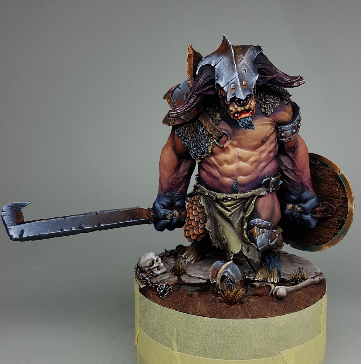
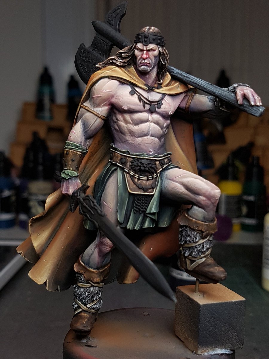
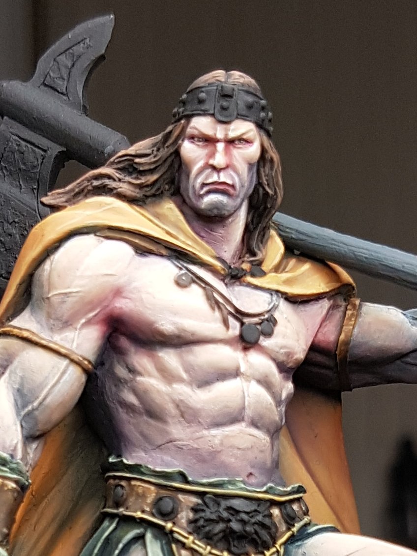
Sometimes I forget models that sit on my shelf of models to paint.  This was the case with my Conan model, or its proper name: the Barbarian King from Joaquin Palacios Studios.  Alongside Lucas Pina, Freeman is probably my favourite sculptor at the moment.  He is incredible.

I was showing off my models to Yianni and he was checking out my pile and he pulled that out and had a closer look.  I remembered I had it and decided to put it together while I was watching Toya paint some Arcadia Quest models.  Once I got it together, it reminded me of old school pieces of artwork from like Frank Frazetta and Boris Vallejo, guys whose artwork made my eyes boggle when I was a young lad.  I have been aiming to push myself more and try more difficult techniques on each piece, and this model felt like a good chance to try painting something that was in a similar vein to their artwork: vivid, full of colour and depth and atmosphere.


Cue, crazy balls deep starting point:


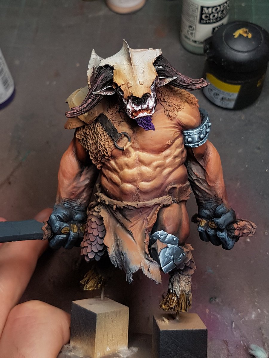
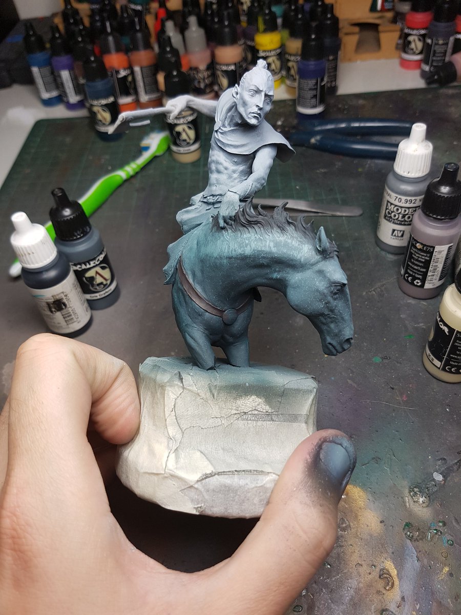
I airbrushed some really basic colours and shades onto the model, all very desaturated.  The plan was to use wet in wet technique to create some colour and interesting volumes.  I added some drying retarder and mixing medium to the colours so that I could spend a bit more time blending and fusing the colours all together.  After I mucked around with that, I then used a hairdryer to dry it off, and use some more fleshtone to paint on some highlights.


You can see I have already got a lot of volumes in there with the blending and highlights, as well as a few different colours and tones.  One of my techniques that I wrote my article on is called airbrush glazing, so after this crazy wild beginning, I tone everything back down.  But because it drops contrast, what you see here is not enough contrast.  I pulled out a pure white and cream colour and added even more crazy light points.


One of my mantras these days is "There is no mistakes, only happy accidents".  Thanks Bob.  But really, when you actually start to live and breathe this mantra, you find yourself with more freedom and creativity.  You can always, always fix a bit of paint in the wrong area, or a colour choice not quite right, or a textural mistake or whatever, so why not go crazy and push things and see how it all comes together.


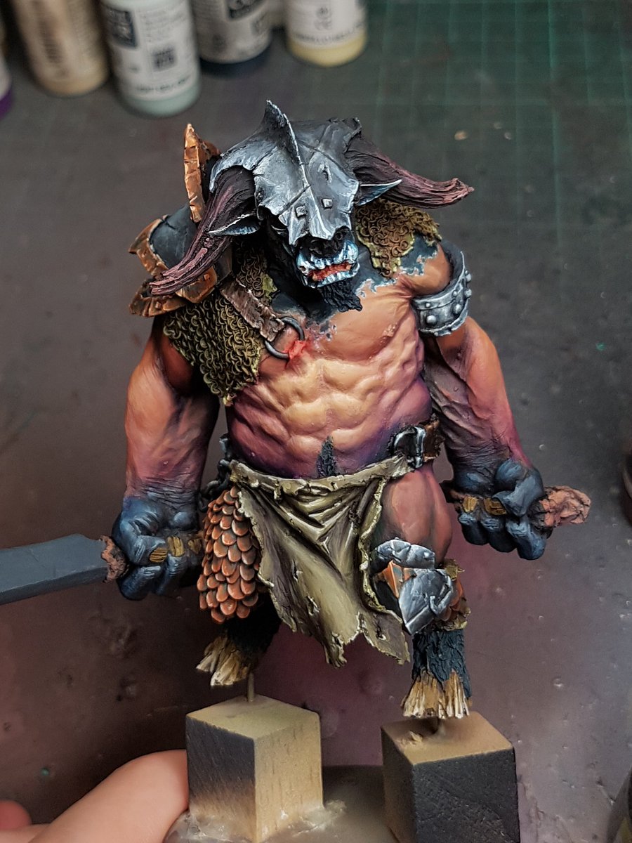
Using my airbrush, I glazed multiple thin coats of mid tone paint over the entirety of the model, softening the transitions and colours and harmonising it all.  This is a technique I am using more and more, just in the early stages of my pieces, because I can go crazy large on highlights, knowing that it will be softened.


And this is what it looks like after I use my glazes. You can see the huge difference between the two models, and what is probably most interesting is that to get to that second stage took me all of about five minutes?   In fact, this entire process was less than an hour, because I am not worrying about precision and refinement, just actually getting value and tones where I want them.


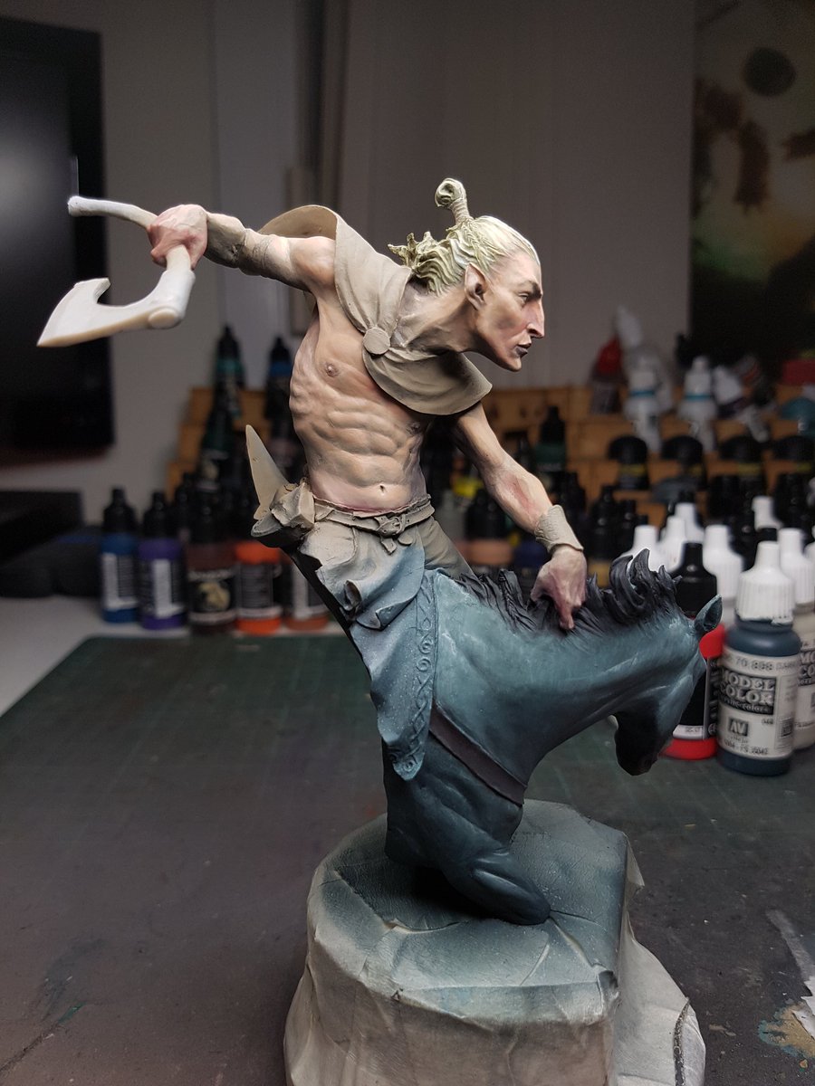
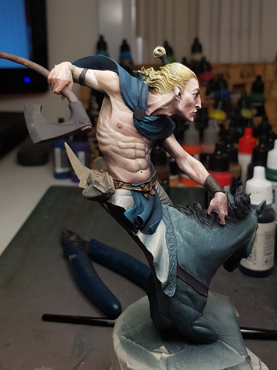
After this I need to bring more contrast back in, and add a few more colours and tonal interests.  Red on the knees, elbows, nose and armpits is usually where I start, and then some cooler blues and purples in the deep recesses.  The next step then is to paint in the rest of the model.  It is so crucial to have the rest of the colours at least blocked in, because the contrast and relative value of everything relies on everything else surrounding it.  The best example of this is when you paint a models base black.  Going from either white, or grey and then suddenly having the base black makes the model pop more, because the other areas are not reflecting more light, or are not a higher or similar value.  So I pulled out my trusty Panzer Putty, covered the skin and then painted the cloak.


Why orange?  I dunno.  I've been using so many primaries recently, I wanted to dive into a model with mostly secondary colours. In fact, that was my focus on Alice as well, and she came together so well that I figured I could keep trying to push it and see how far I could take it.  The orange I planned to be like a dry leather, with a bit of texture on there.

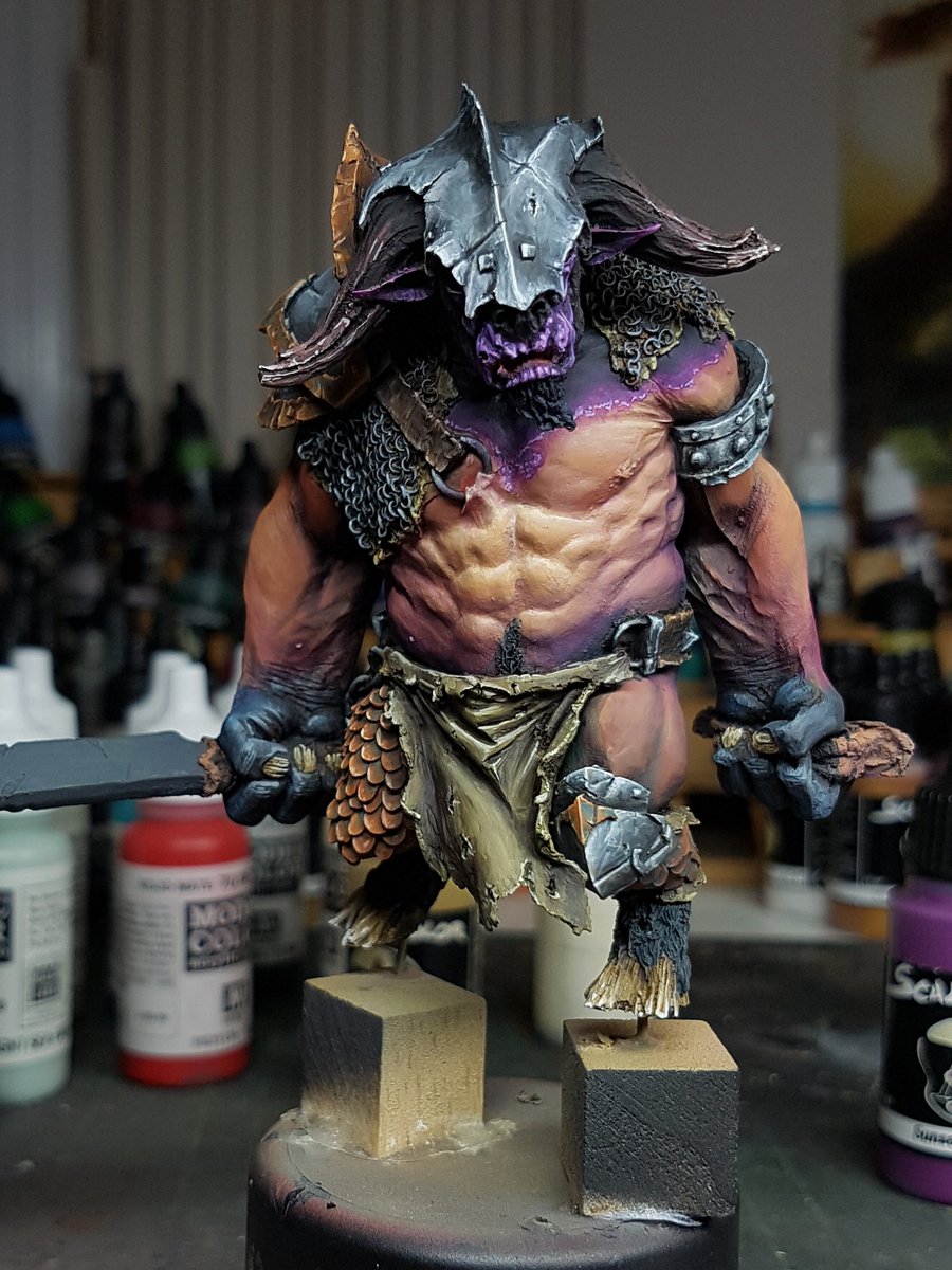
I pulled off the Panzer, painted the loin cloth in blue, the complementary colour for orange, but kept it very dark.  Painted the hair, and suddenly the model looked a lot more accurate to what I was going to be ending up with.


Another thing that the pros do which I've been trying to use more and more is shade and highlight with complementary colours.  It adds more richness and diversity to the piece, so I started with blue and purple/red to shade the cloak with.  I was pretty heavy handed early on, even though the airbrush creates that really nice effect, adding some actual texture is a part of the plan down the track.  I painted in some of the browns and leather areas.  Starting to come alive now, as each area starts breaking apart the model.


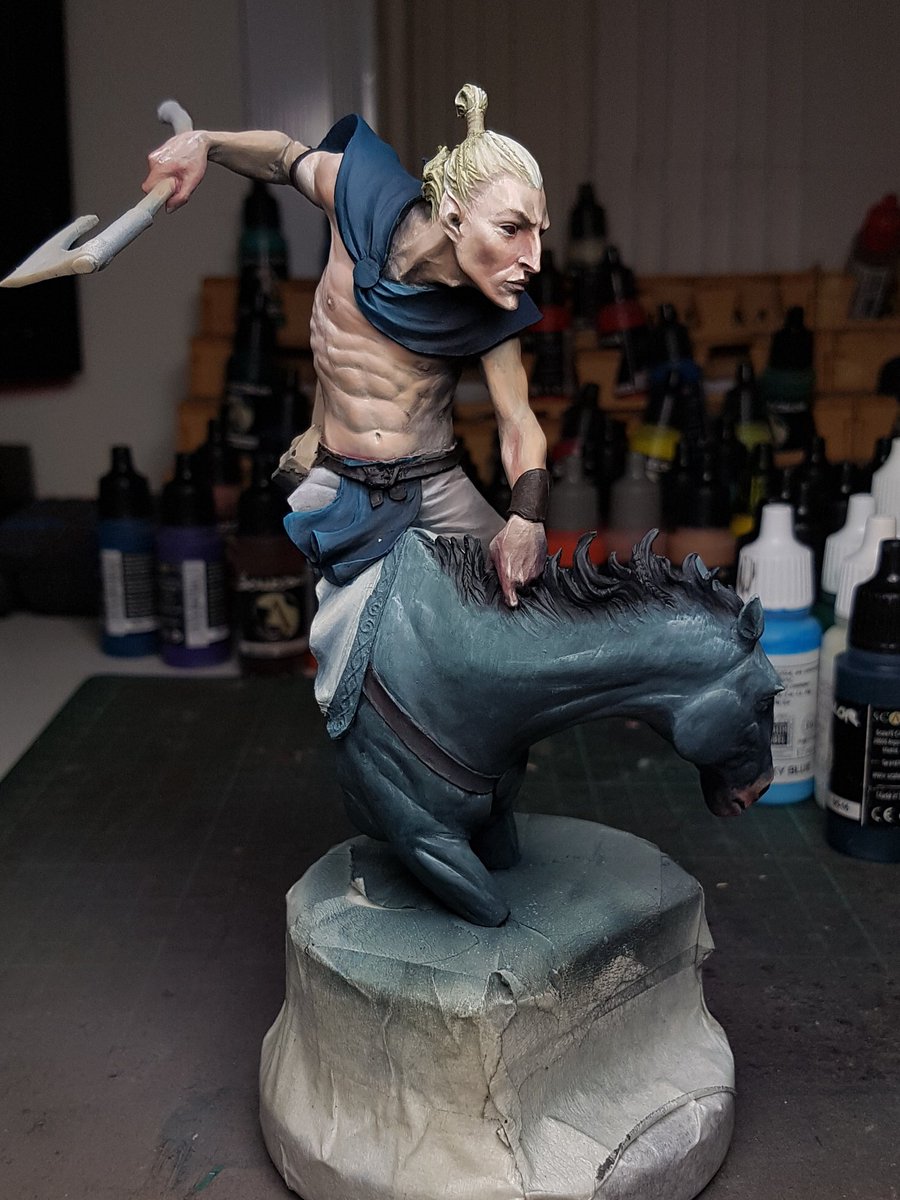
I went back in and worked a bit more on the skin, smoothing the face details and so on.  I kept trying to get the balance right between skin texture, smoothness, colour and contrast.  It is still not where I want it, but you can see it is getting close.  I also mixed in the orange from the cloak, and some ivory, into the blue of the loincloth.  This create a really interesting desaturated green, which I used. It still has some of the hints of blue so I think still works with the orange.


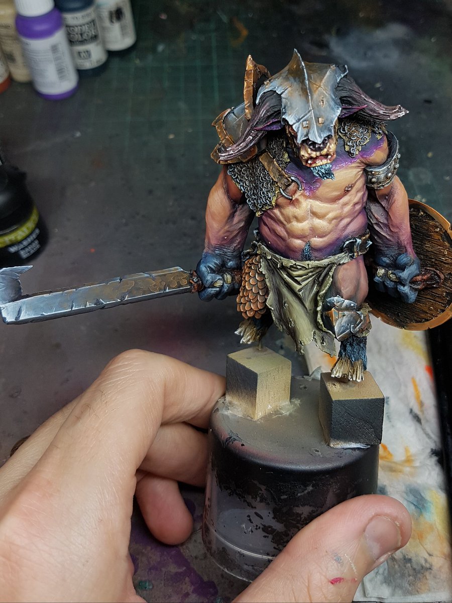
More highlights on the cloak, painting the fur with some more wet in wet work, the leather strappings, painting the leather belt, and getting the skin smoother again, as well as adding more contrast to the lower areas.  Looking at the black and white photos I could see that I need more contrast within the skin itself.


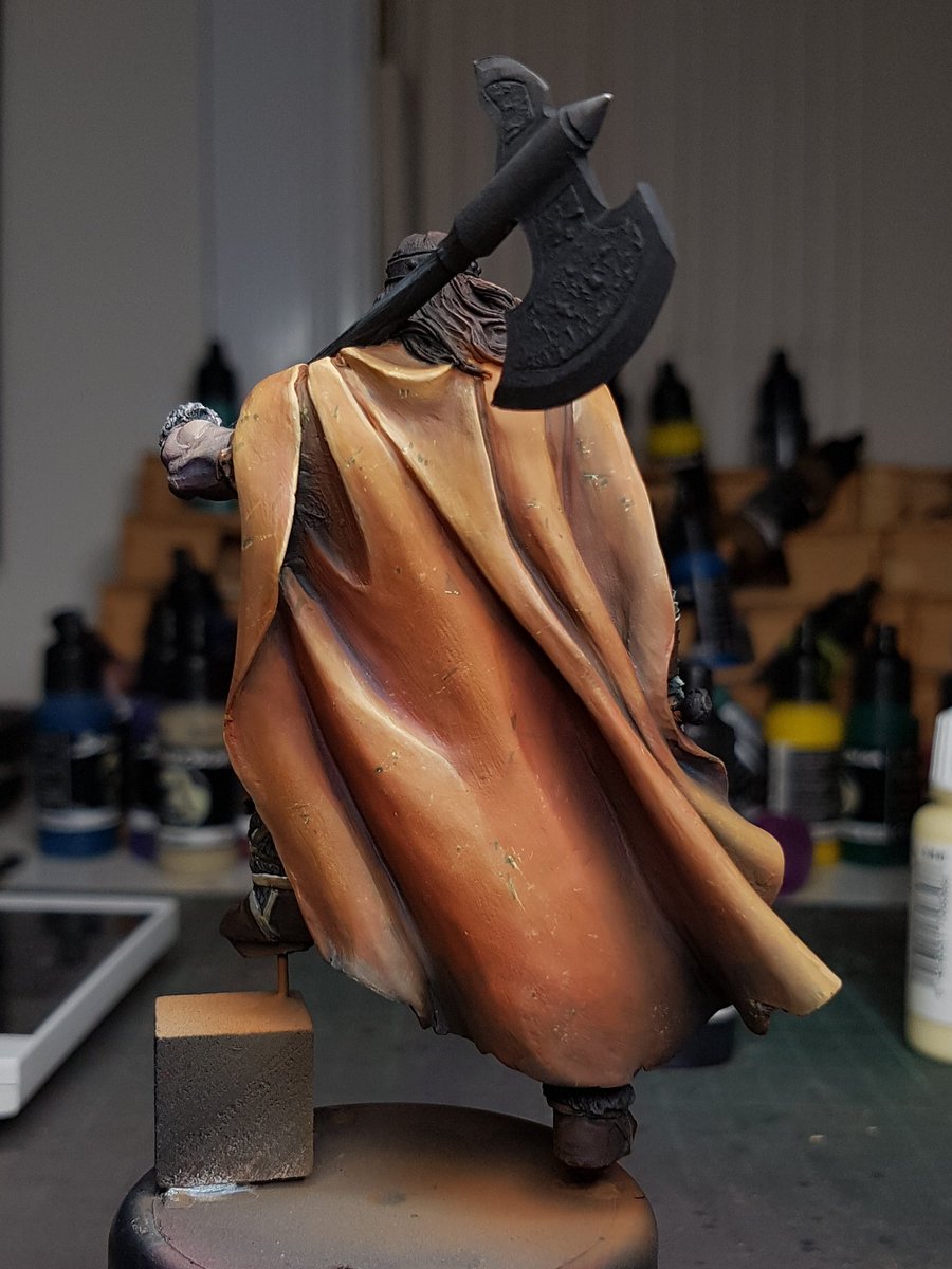
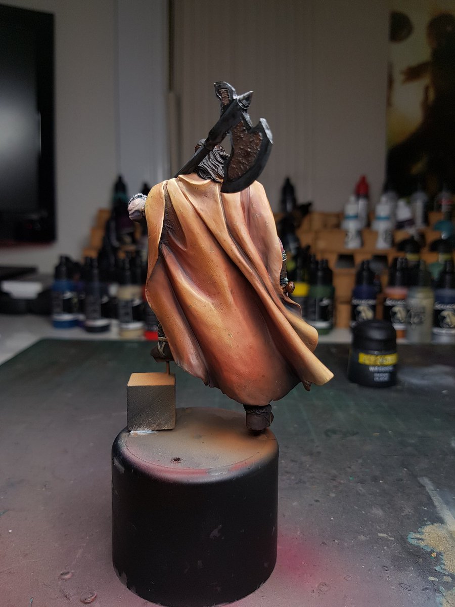
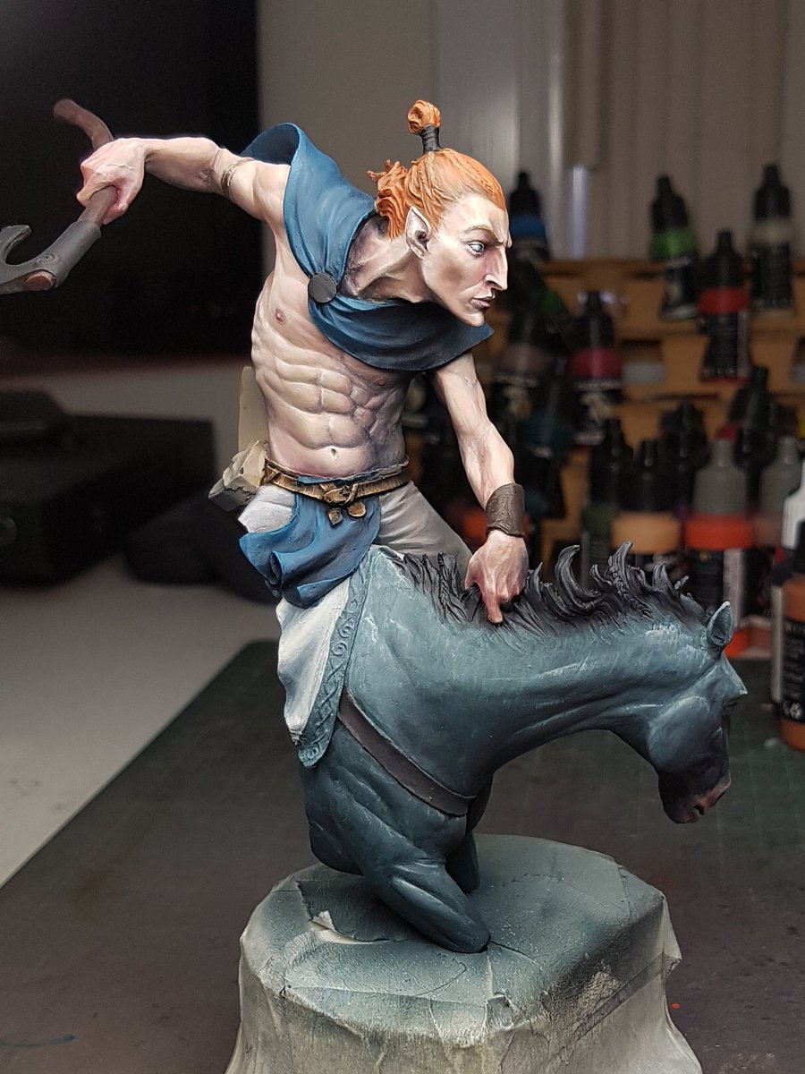
I have a large up version of the back of the cloak.  I've got a lot of different shades in there, but the highlights are consistent orange, to an ochrey yellow.  The next stage of their highlights will be a cream colour which should make the cloak pop off the model.


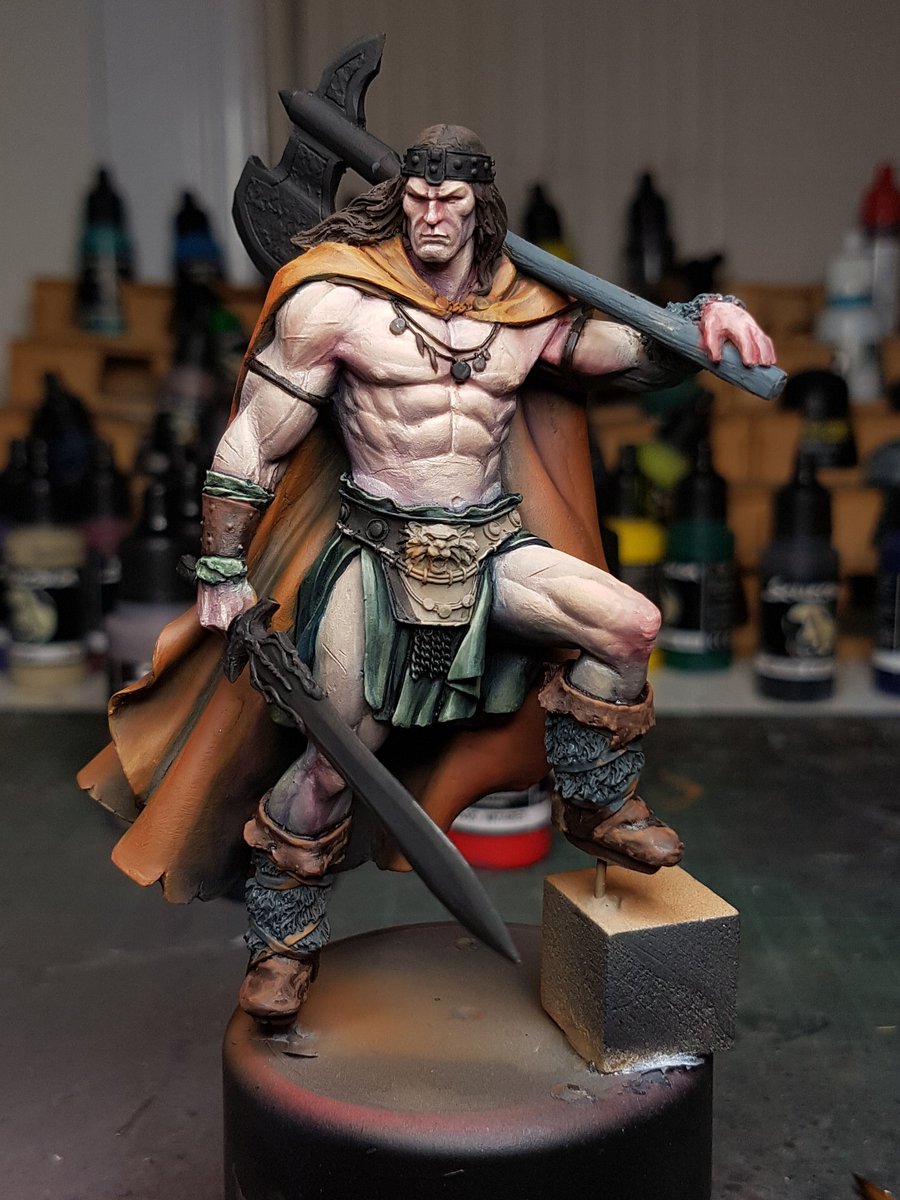
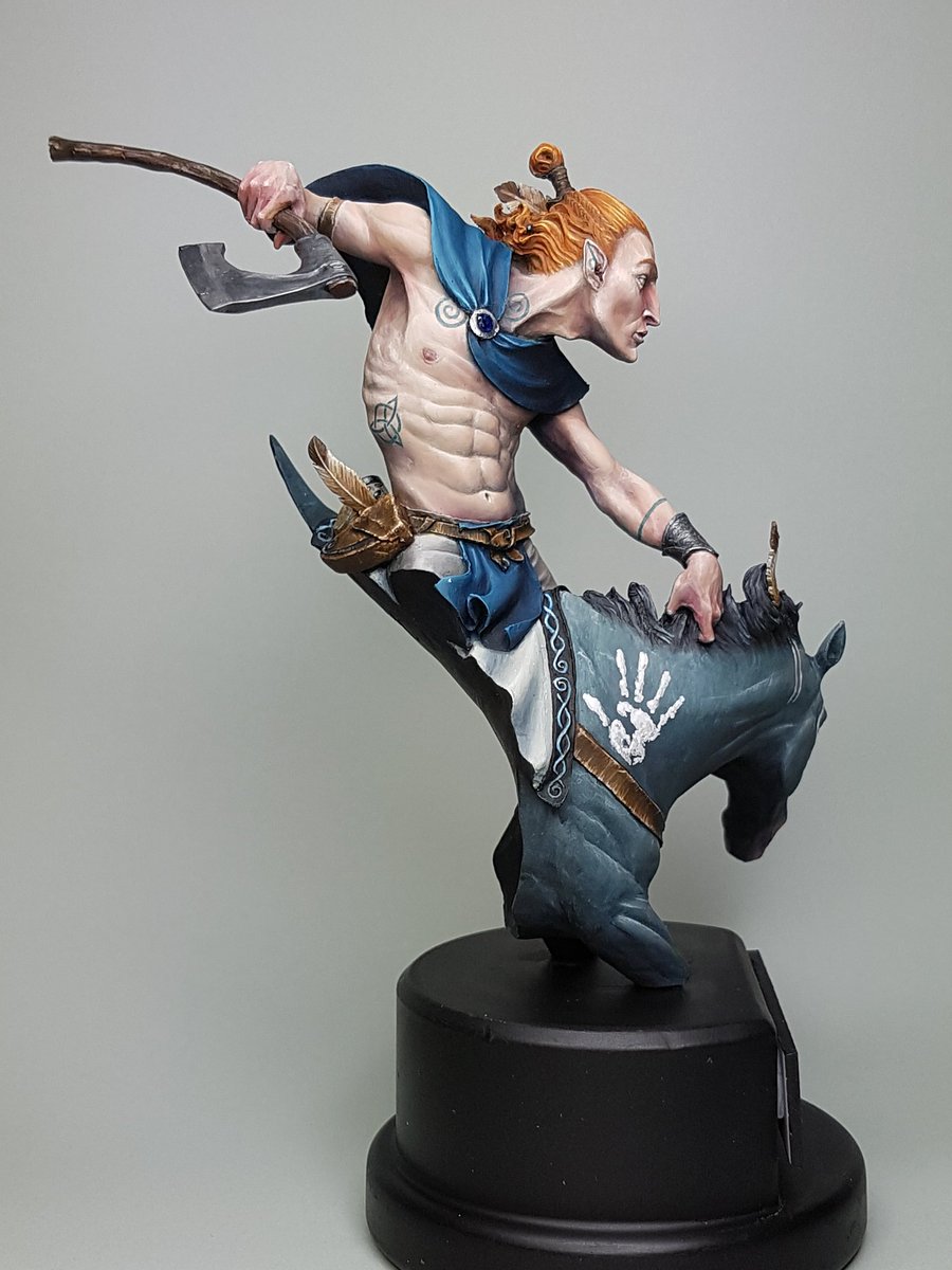
I also painted the eyes, a very difficult job on this model as they are inset, and very small.  I managed to nail it first time, which I am stoked about.  I also added some blue tones to the lower jaw, and a bit more white to his forehead and nose.


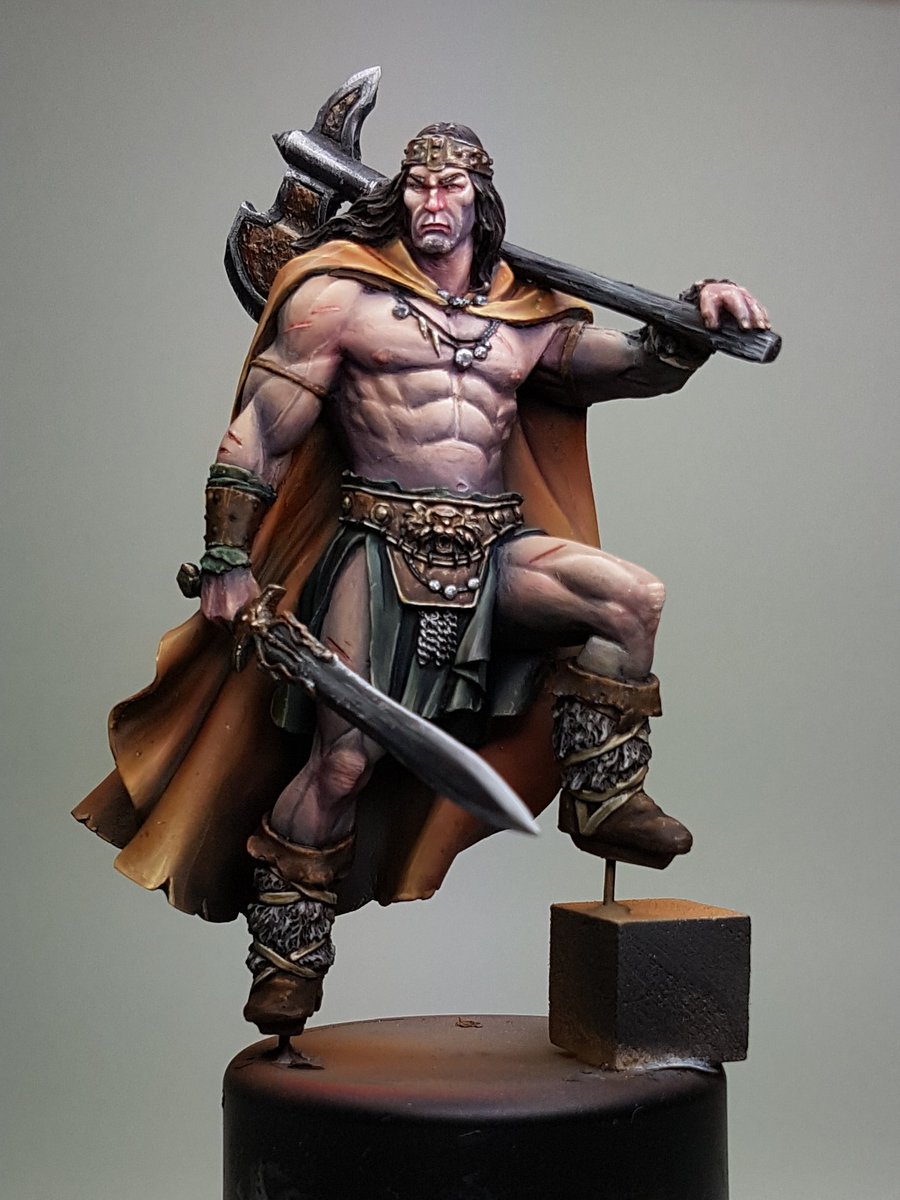
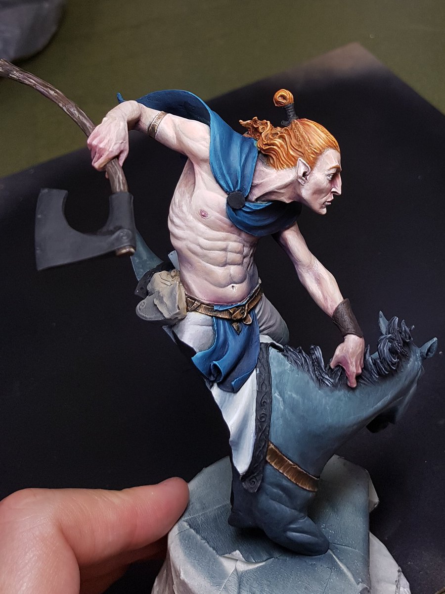
Moving forward from here, I want to use some really small micro stippling to add to the stubble effect on his jaw, to put even more redness into the nose underneath, work on the hair more so it is more refined, add those pop highlights and texture scratches on the cloak, smooth the torso skin tones out just a tiny bit more, darken up the leathers on the lower half of the model and make the fur even darker, make the straps and cables around the belt ivory, paint the wooden haft and then move into the metallics!

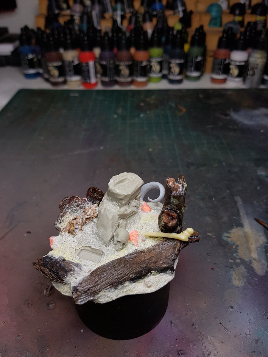
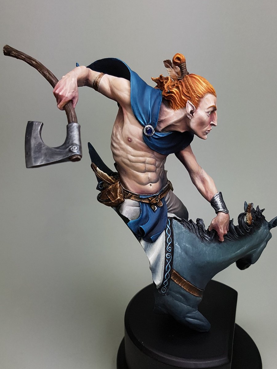
I've still got the base to consider, which I've been waiting on some more plinths before I put together, but I am really excited to play around with one, because I feel its an area that I need work on, but also one that I have started to develop.  


Exciting times. 

Sunday 7 May 2017

The Elf Rider Step by Step

Welcome back to regular blogging.

I've gushed about this sculpt a lot, and it is pretty divisive.  Some people have said they don't like it.  I think its one that really needs to be viewed in person, because the sheer dynamic nature of the model makes it hard to photograph.  I really wanted to do a great job on this model, so I didn't try and push any boundaries of techniques or ideas.  I stuck with what I felt good about and it came out quite well.  I think that when I don't push myself, I don't really create my best work.  I do not feel challenged and it is only when we are challenged that we grow.


The first thing I did was obviously assemble and gap fill the model.  I also spent a lot of time choosing the right plinth.  I found that having the right shape and plinth size is really important.  The one I ended up with has worked out so perfectly, but in hindsight I may have got the facing of the model every so slightly wrong.  I think if it was turned slightly more to the right, it would have a bit nicer front on angle.  You'll see from my step by step photos the angle I preferred.


I started off with a grey undercoat over the top of the black.  I did some research on horses, and I wanted the model to have quite a cold colour scheme, from the mountains or in the snows.  I found a horse called a blue roan, which is apparently quite a rare patterning.  I tried to emulate this colour scheme, although I started off a little bluer than may have been optimal.


I used a toothbrush to scrape down some texture of fur on the upper areas.  The idea I was going to try and use was lots of thin glazes of colours over the top to try and retain a little of that texture coming through.  I added some cream and white and brought up the contrast, and also added some darker areas underneath the neck.  Looking back at what I did, I think I would add some splotches of colour at that early stage with the toothbrush, and use that glazing technique to show off those patches.


My next step was airbrushing in some desaturated skintones to start off the basic flesh.  I started with a colder colour again, trying to keep the atmosphere in mind.  A bit of black to fix up the hair of the mane.


I started adding some warmth to the skin, using purples, and reds.  I initially decided on a blond hair colour, and I added this on.  I immediately was not sure, because the whole model had a very pale appearance and it felt a little washed out.  I decided to keep going for the time being, and see how things progressed.


More warmth to the skintones.  I was trying to add a bit of colour in there as well, and also try and have the skin feel like it was cold.  I then painted in the other areas, to get a better idea of how much contrast the other areas would need.


The skin felt like it needed a bit higher value, and higher contrast points.  I was enjoying the way the colours were all working, and the hair actually looked quite good with the other colours in there.  I added to the skin tone, and painted in the leathers on the belt.


I felt like the hair was working alright, but when I looked at the piece as a whole the focus was not driven up, because everything was all cold.  By changing the hair to red, it would make the head pop and everything else recede.  I decided to go for it, and in the end I think it was a positive move.


I kept working on the blue, adding more contrast and smoothing it out.  I painted the red hair with the highlights and made it quite bright.  Added the leather to the horse, and some grain on the wooden haft of the axe.


As things were starting to progress along now, I realised this would be a perfect time to start making changes to the model!  Not really, I had just been struck by inspiration, and had some perfectly sized feathers that I wanted to add to the model, and a jawbone.  I think they benefited the overall story and made him a bit more unique.


I was nearing the home stretch now.  Adding more colour, smoothing transitions, painting the little bits and pieces, sealing the model and painting the metallics, constantly evaluating the contrast and trying to make sure this model lived up to my expectations.


The last step was to paint on some warpaint, and tattoos.  I think the  biggest regret I have is not leaving the model off the plinth.  I really struggled with keeping the lines smooth and getting the detail stuff done because the model was so heavy and difficult to hold steady.  I used a bit of pigment and bicarb for the warpaint on the horse, and I liked this addition of some texture.


Now that he is all finished up, you can find more photos here: http://www.puttyandpaint.com/projects/13360


On the whole, this is a model that I think feels a little bit safe.  I didn't really push the boundaries of what I can do and although it is definitely one of the better things I've painted, I feel a little on the low side about it.  It doesn't have the same punch as some of the other pieces.  Maybe thats the desaturated colours, or the base plaque I did up being a little naff.  I just think I am capable of better, and I want to be making that happen.

I am going to be using less black and white and more colour in the next few pieces I work on.