I've gushed about this sculpt a lot, and it is pretty divisive. Some people have said they don't like it. I think its one that really needs to be viewed in person, because the sheer dynamic nature of the model makes it hard to photograph. I really wanted to do a great job on this model, so I didn't try and push any boundaries of techniques or ideas. I stuck with what I felt good about and it came out quite well. I think that when I don't push myself, I don't really create my best work. I do not feel challenged and it is only when we are challenged that we grow.
The first thing I did was obviously assemble and gap fill the model. I also spent a lot of time choosing the right plinth. I found that having the right shape and plinth size is really important. The one I ended up with has worked out so perfectly, but in hindsight I may have got the facing of the model every so slightly wrong. I think if it was turned slightly more to the right, it would have a bit nicer front on angle. You'll see from my step by step photos the angle I preferred.

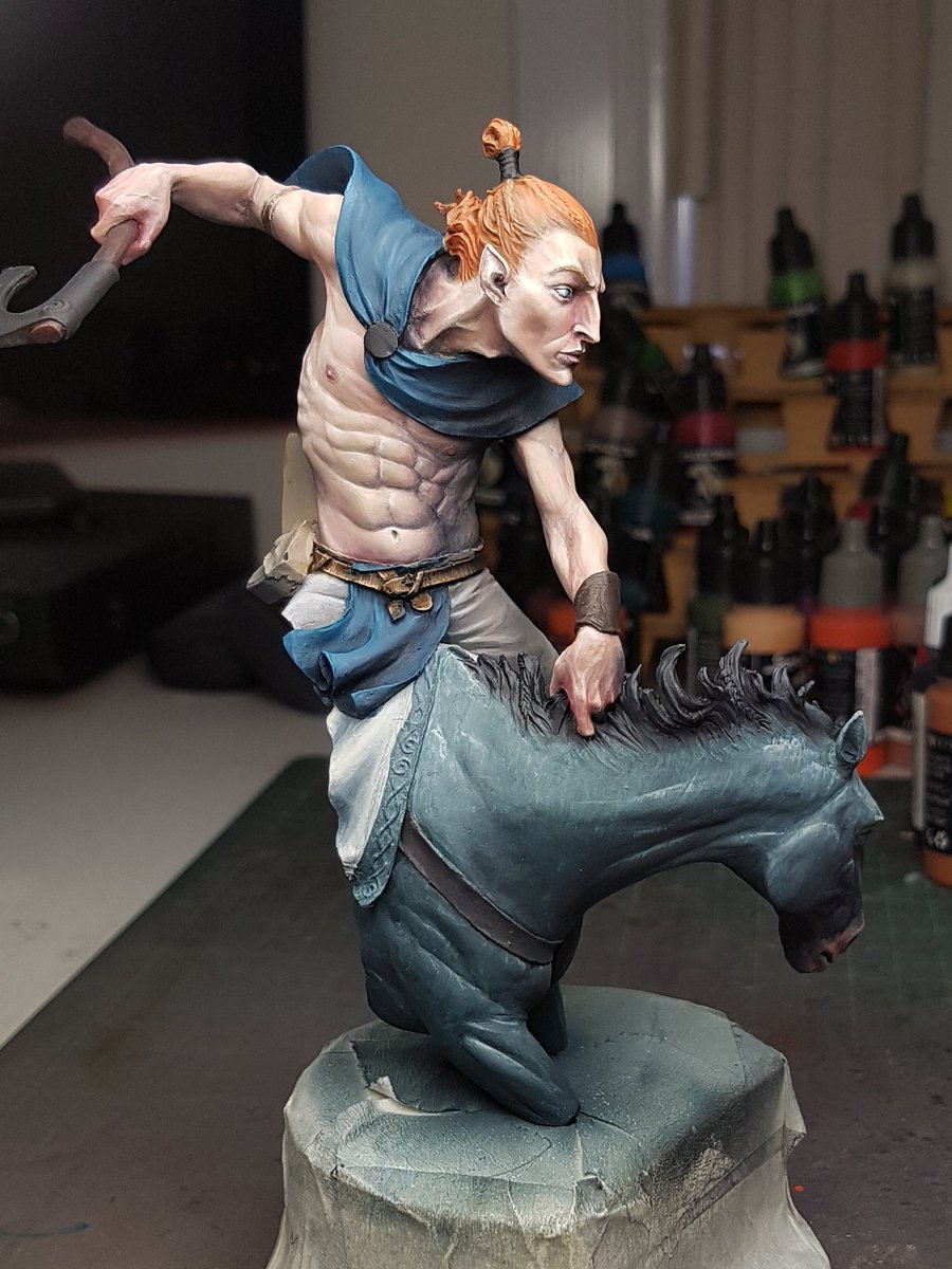
I started off with a grey undercoat over the top of the black. I did some research on horses, and I wanted the model to have quite a cold colour scheme, from the mountains or in the snows. I found a horse called a blue roan, which is apparently quite a rare patterning. I tried to emulate this colour scheme, although I started off a little bluer than may have been optimal.
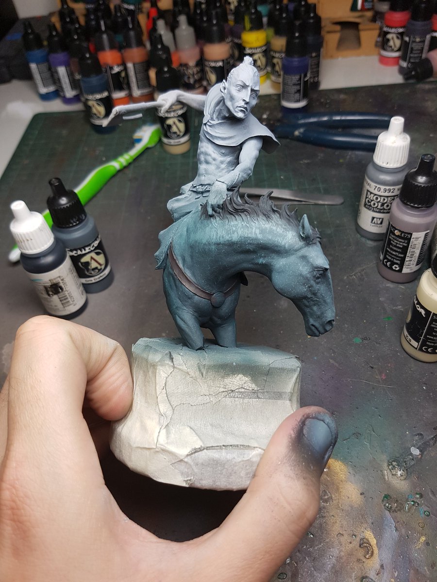
I used a toothbrush to scrape down some texture of fur on the upper areas. The idea I was going to try and use was lots of thin glazes of colours over the top to try and retain a little of that texture coming through. I added some cream and white and brought up the contrast, and also added some darker areas underneath the neck. Looking back at what I did, I think I would add some splotches of colour at that early stage with the toothbrush, and use that glazing technique to show off those patches.

My next step was airbrushing in some desaturated skintones to start off the basic flesh. I started with a colder colour again, trying to keep the atmosphere in mind. A bit of black to fix up the hair of the mane.

I started adding some warmth to the skin, using purples, and reds. I initially decided on a blond hair colour, and I added this on. I immediately was not sure, because the whole model had a very pale appearance and it felt a little washed out. I decided to keep going for the time being, and see how things progressed.
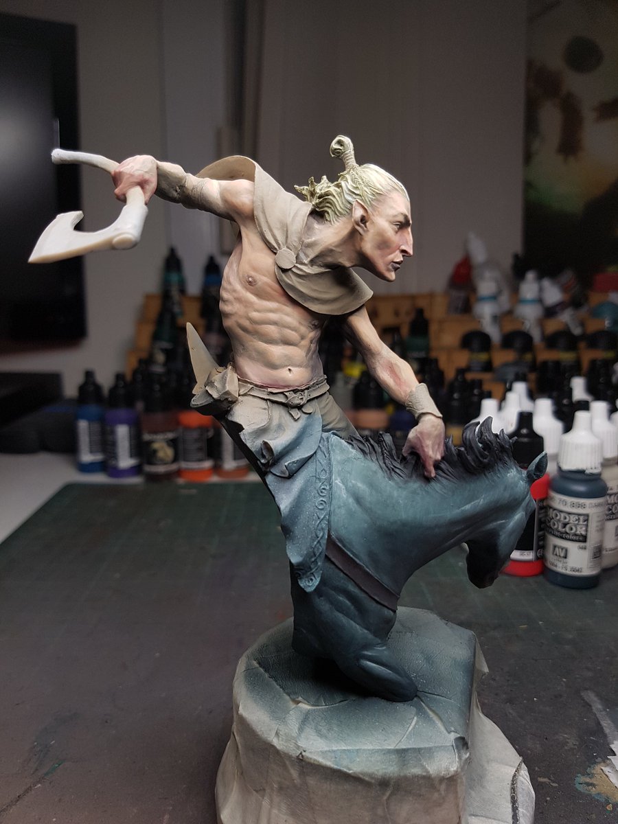
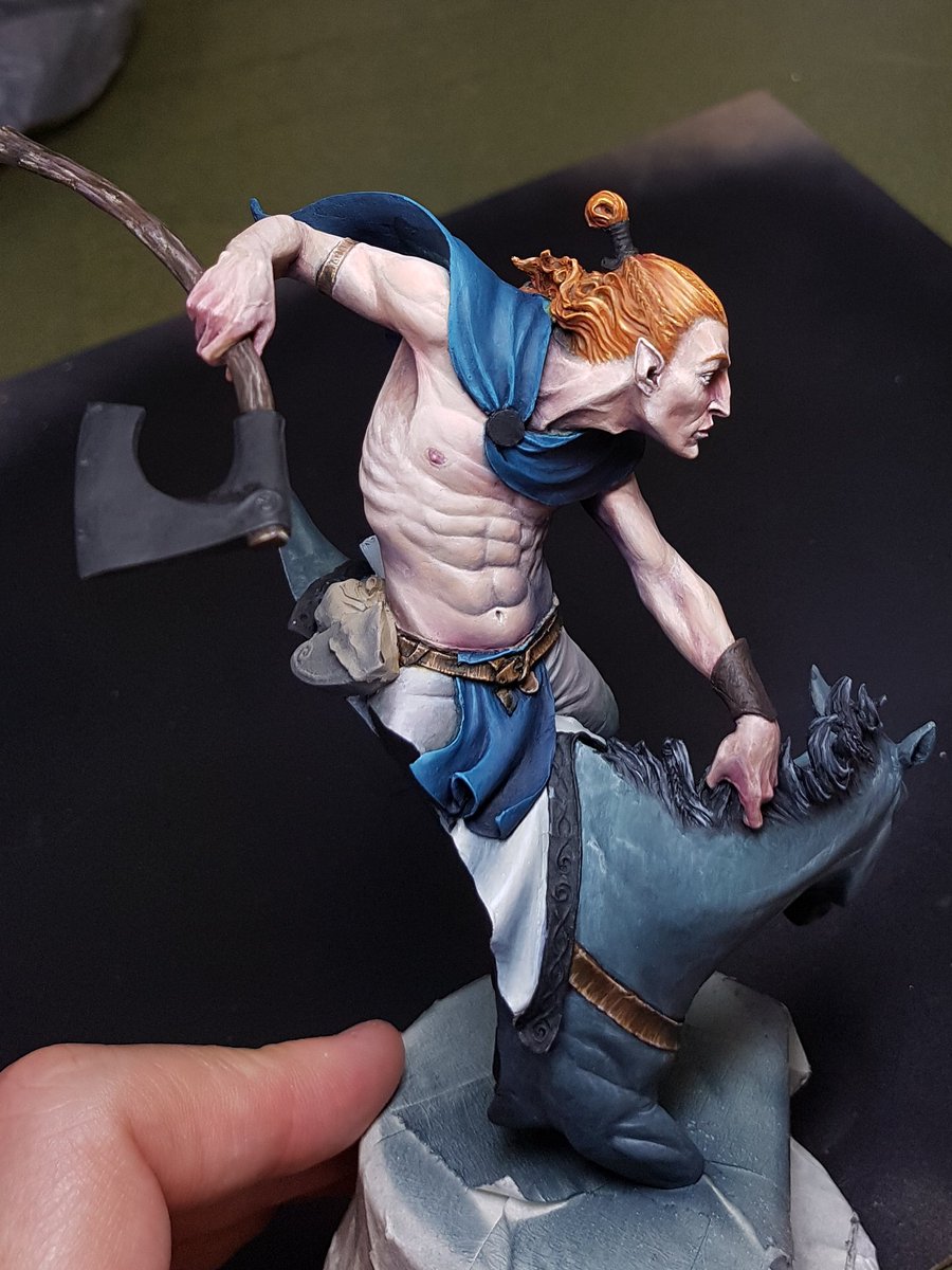
More warmth to the skintones. I was trying to add a bit of colour in there as well, and also try and have the skin feel like it was cold. I then painted in the other areas, to get a better idea of how much contrast the other areas would need.
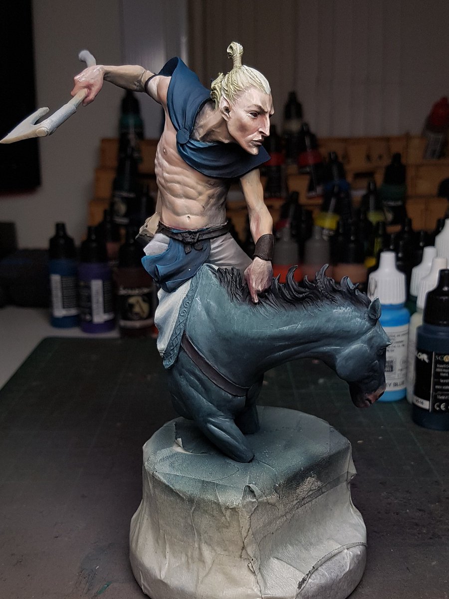
The skin felt like it needed a bit higher value, and higher contrast points. I was enjoying the way the colours were all working, and the hair actually looked quite good with the other colours in there. I added to the skin tone, and painted in the leathers on the belt.
I felt like the hair was working alright, but when I looked at the piece as a whole the focus was not driven up, because everything was all cold. By changing the hair to red, it would make the head pop and everything else recede. I decided to go for it, and in the end I think it was a positive move.
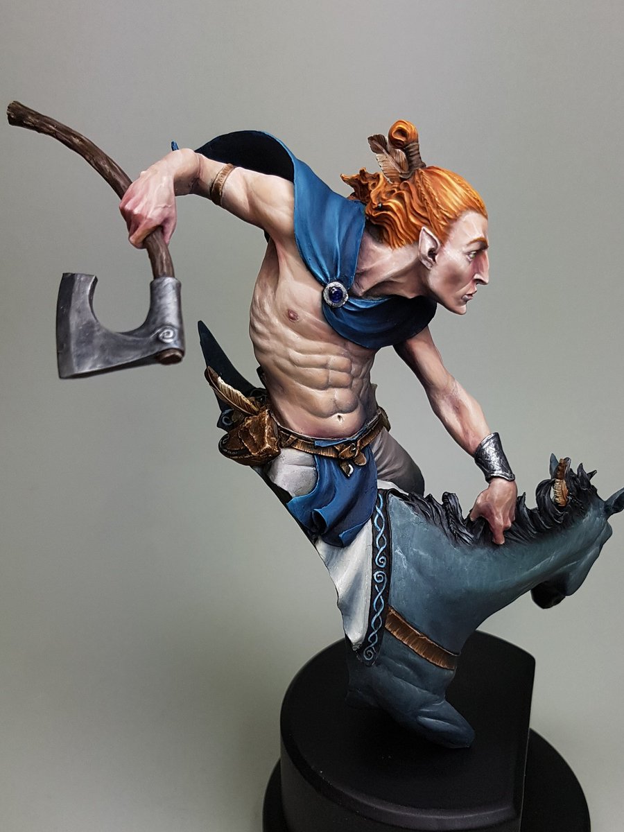
I kept working on the blue, adding more contrast and smoothing it out. I painted the red hair with the highlights and made it quite bright. Added the leather to the horse, and some grain on the wooden haft of the axe.
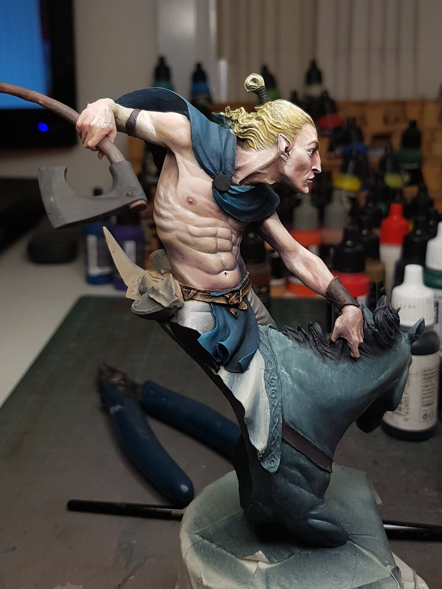
As things were starting to progress along now, I realised this would be a perfect time to start making changes to the model! Not really, I had just been struck by inspiration, and had some perfectly sized feathers that I wanted to add to the model, and a jawbone. I think they benefited the overall story and made him a bit more unique.

I was nearing the home stretch now. Adding more colour, smoothing transitions, painting the little bits and pieces, sealing the model and painting the metallics, constantly evaluating the contrast and trying to make sure this model lived up to my expectations.
The last step was to paint on some warpaint, and tattoos. I think the biggest regret I have is not leaving the model off the plinth. I really struggled with keeping the lines smooth and getting the detail stuff done because the model was so heavy and difficult to hold steady. I used a bit of pigment and bicarb for the warpaint on the horse, and I liked this addition of some texture.
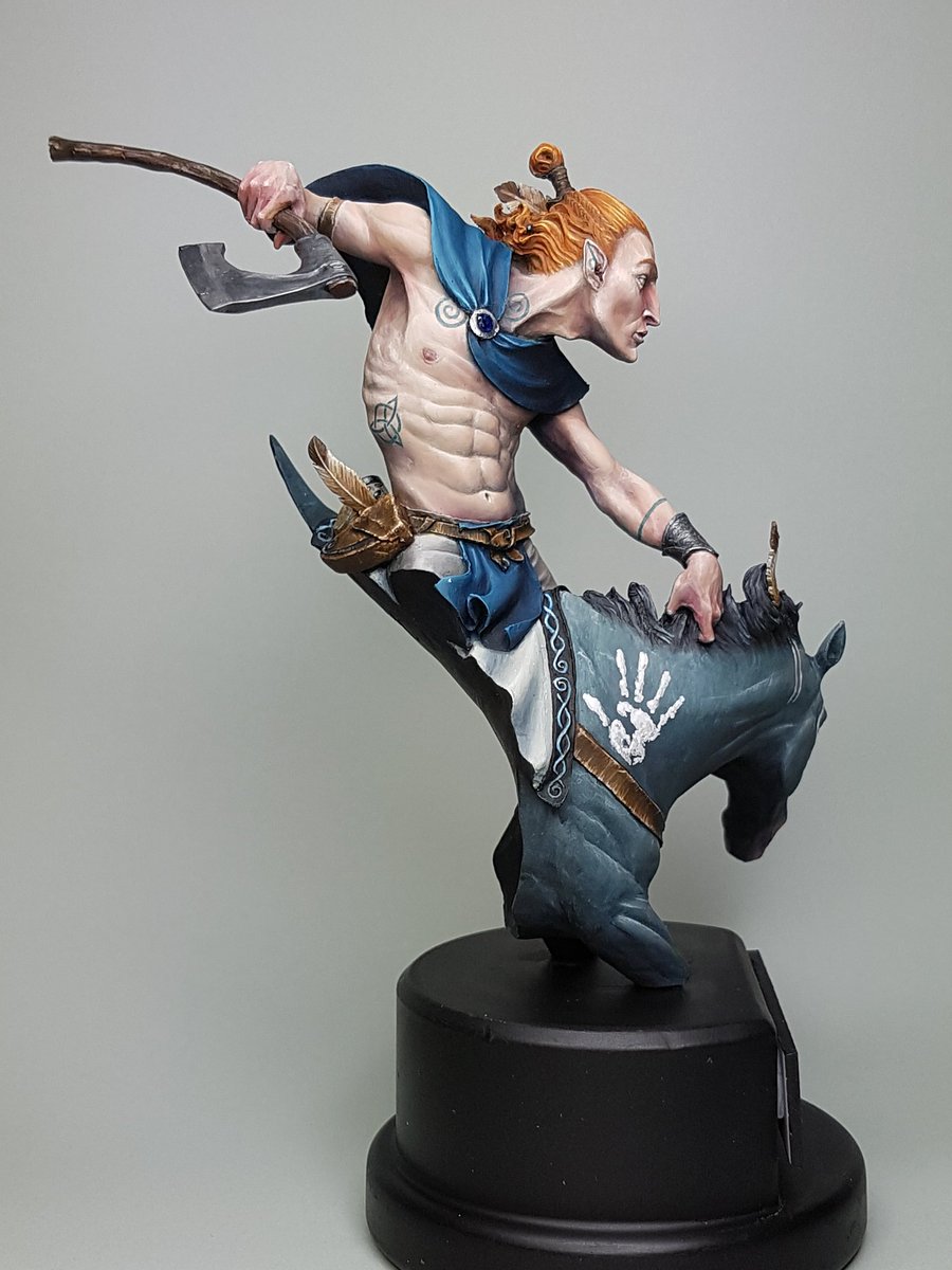
Now that he is all finished up, you can find more photos here: http://www.puttyandpaint.com/projects/13360
On the whole, this is a model that I think feels a little bit safe. I didn't really push the boundaries of what I can do and although it is definitely one of the better things I've painted, I feel a little on the low side about it. It doesn't have the same punch as some of the other pieces. Maybe thats the desaturated colours, or the base plaque I did up being a little naff. I just think I am capable of better, and I want to be making that happen.
I am going to be using less black and white and more colour in the next few pieces I work on.
No comments:
Post a Comment