Tuesday 22 November 2016

Massive Voodoo Painting Class, Day 2

Day two dawned and unsurprisingly, I was feeling significantly more refreshed and relaxed than the previous day.  I had a full 7 hours sleep and my jetlag is pretty much taken care of now.  Experienced traveller tip: If you can just get that first day right, not sleeping until the the night, and then holding on for the next day just to get your body clock shifted, the jetlag will disappear. Having a little snooze just for a bit will fuck you completely.

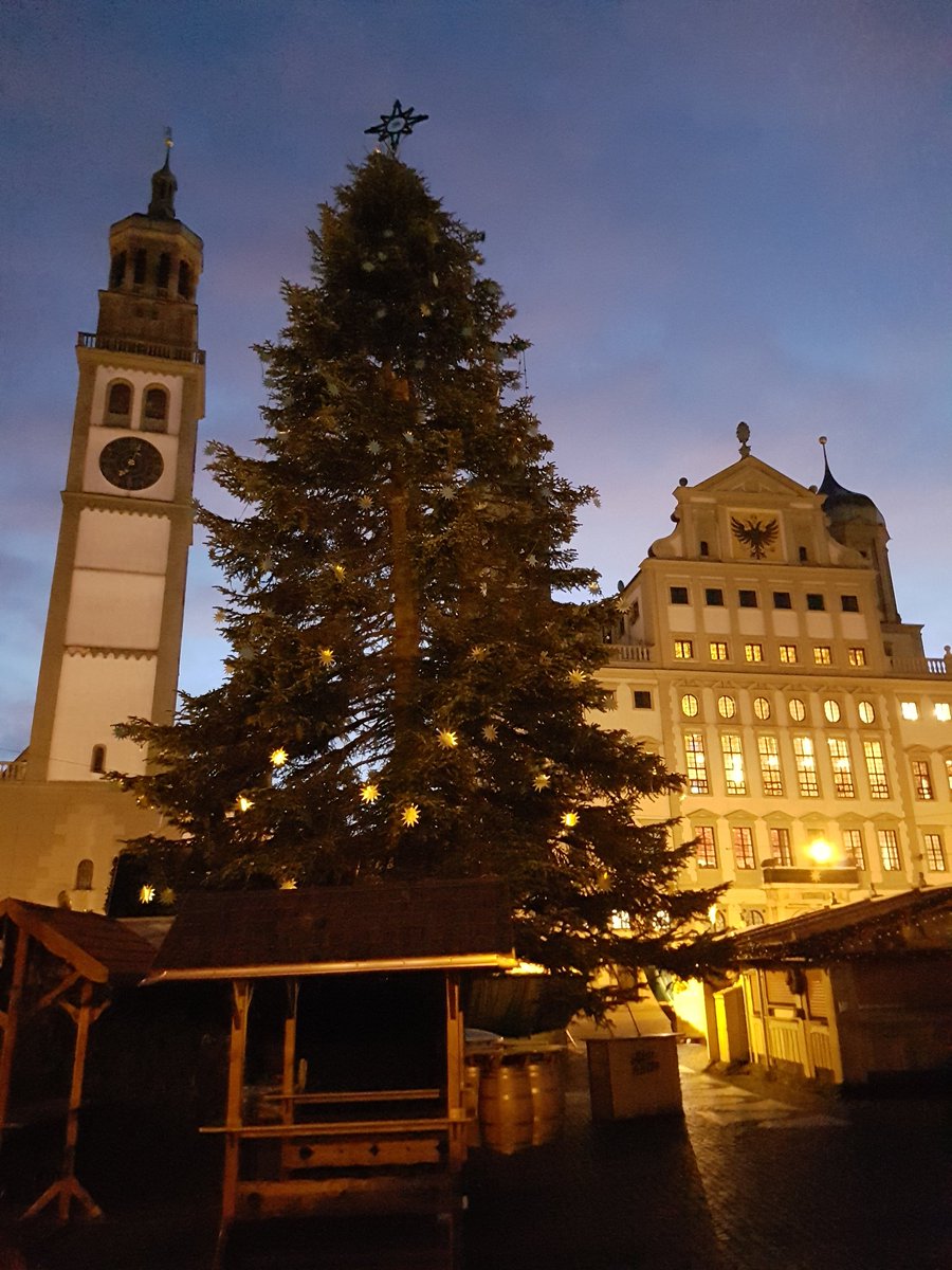
I had another lovely walk to the studio today, the beautiful fresh air of Augsburg gets the blood pumping and invigorated for a big day of painting.  Arriving at the studio this morning I quickly took a few more snaps of the corridor into it.  I also brought a few gifts and found a few of them just hanging around...


Today we had a good canvas to work on, having done a lot of the preparatory work yesterday.  Today was all about focusing on the little details, the pieces that elevate a model, and again pushing those highlights and contrasts up and up!

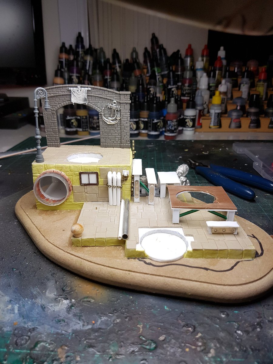
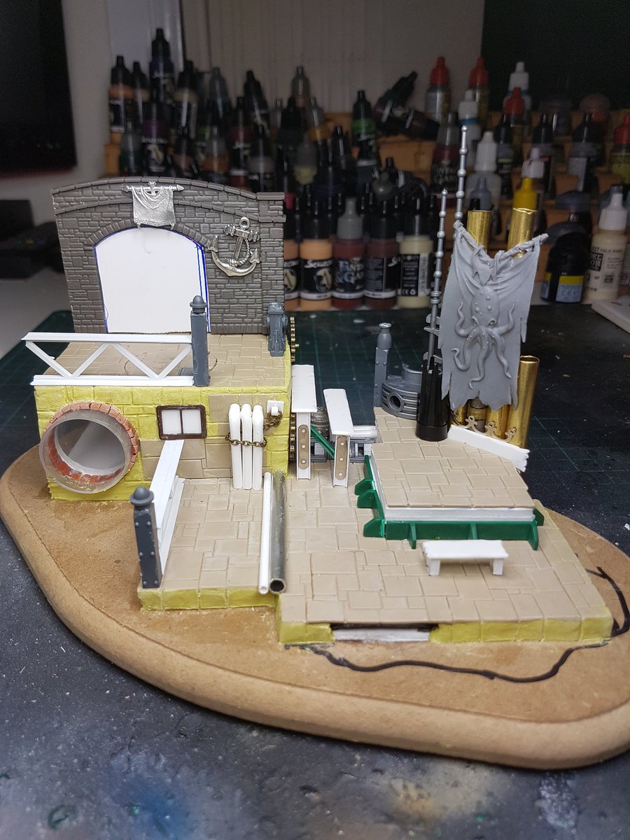
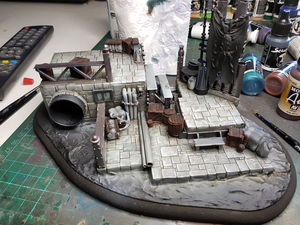
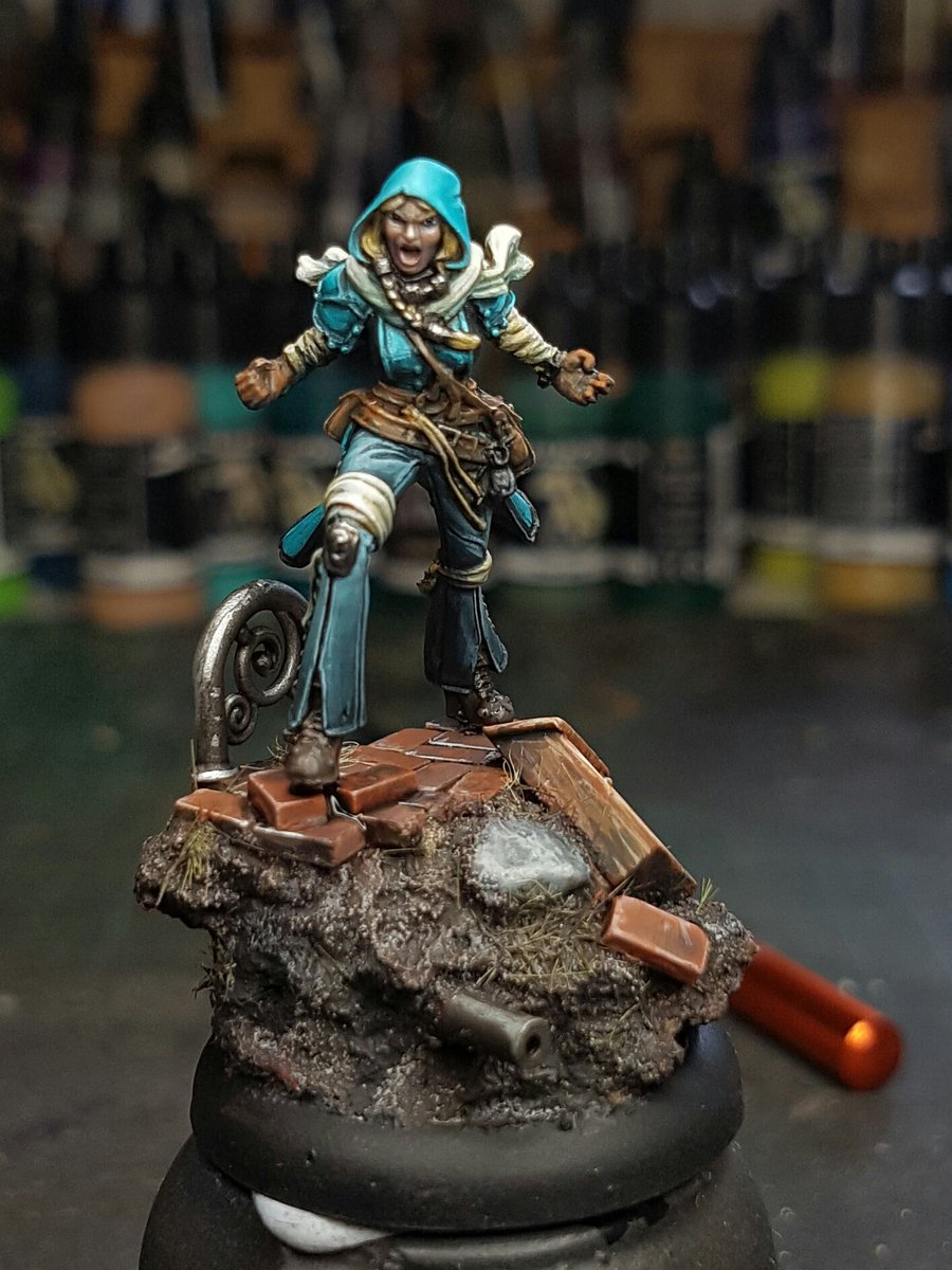
Before we started though, Raffa had brought into the studio a few models for me to look at:


I said it on Twitter, and I will say it here again. Next level shit man.  Raffa drilled out the eyeballs on the Tiefling bust, painted in the rich colours then used an epoxy resin to create the dome. You can look at them from the side and they just look so real.  The Red Lion is incredible in real life, the detail is simply beautiful and he has so much interesting colours in his skin that isn't immediately apparent.  And the monkey is great!

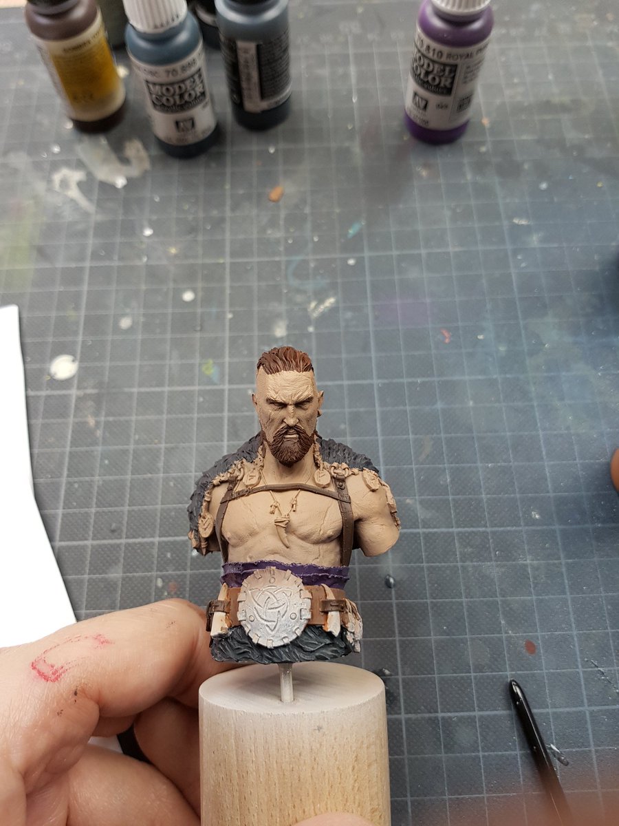
Alright, onto painting.  The next step was easy. We created some nice smooth shading on the skin yesterday, with some good contrast, but as always more contrast is needed.  Here on this guy we focused primarily on the face, and the upper chest, adding in some more intense lights, and one great trick here was mixing in just a little touch of yellow to the white when mixing the highlights. It helped combat the chalkiness and lifeless look that you can get with white.  Again, occasionally airbrushing a filter over the top to soften the blends and just keep everything the same tone:


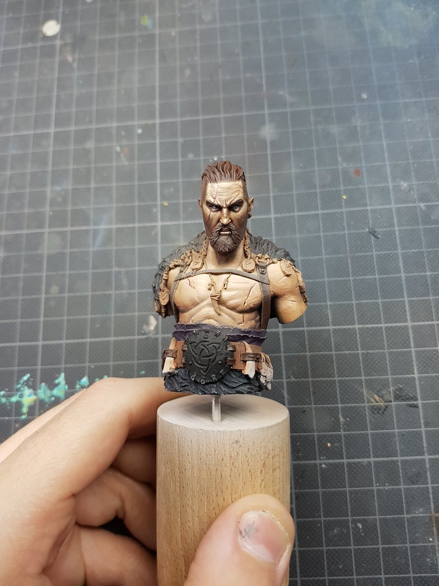
We did a few more touches of highlights, but we began working on some other areas.  One thing I wanted to try on this sculpt was some tattoos, and Raffa and I had been discussing other types of contrast over the whole weekend. One interesting one was the contrast between round and hard edged shapes.  Contrast is all about creating visual interest. I decided to get a bit fucking loose and go balls deep on some rectangular tattoos, and this was the result:


Raffa enjoyed it... but he wanted MOAR.  "Get some on his face mate, we aren't here to fuck spiders!" was his exact wording as he pushed me to go even more elaborate.  I got stuck in, and also did some of the hair work.  We didn't go too heavily into hair, but discussed more technique on different types of hair like the stippled close shaved head of Tink or the side shavings here on Mannaz.


The next step was the fur. I will admit that this was probably the most challenging part that I did, and I am definitely not happy with the first result. However we really discussed a lot of the minutae and technical aspects of the technique, and on second attempt I got a much better result.  Broadly speaking it is using a wet in wet blend to create contrast of the fur volume, and the highlighting the strands further. I am excited to try the technique again and see what I can achieve with more practice.

Another area for me I've struggled with is metallic areas. I think for me this is mostly a technique thing, but also an understanding of how metal works in a lot of ways, and this was a good area for discussion.  Raffa did a lot of demonstrating here, and I was also able to see the techniques he used on the gold sections he painted on Tink.  Oh yeah, and we did some leather too.


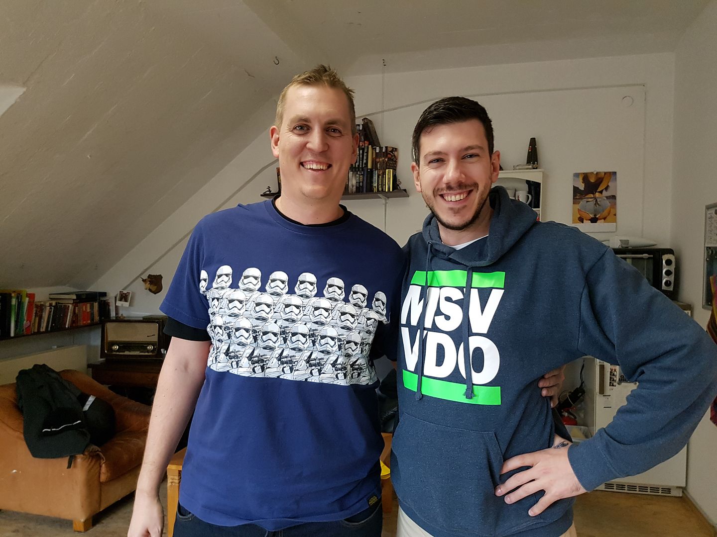
We then began the wind down of the coaching, discussing what sort of things Raffa felt I needed to work on more at home, areas to consider and just general banter.  We had a really great time over the two days, lots of joking around, singing terribly (mostly me singing terribly), eating delicious German food and sharing our mutual passion over miniatures and painting.  I also got to meet Bene from the MV Studio, or as we like to call him, Sir Castsalot.

I was a little nervous about taking this sort of class on, I feel like my own painting journey is very much at its beginning and when you see some of the incredible pieces that Raffa is not just painting but also sculpting, I was concerned that I would not really be able to get full value out of the teaching. But as is often the case, his teaching was tailored to my own level of expertise, and was able to help me reach the next step as opposed to really advanced techniques that I wasn't able to grasp.  I cannot recommend enough taking a class with these guys, the studio itself is so inspiring, the dynamic of the space and the projects and even just the city itself, it really is a wonderful place to paint.  I said to Raffa I wished I could just come and hang out and paint sometime, purely for inspiration!!  Details of their classes can be found here:  Private Coaching.


I'll leave this blog post with a picture of the two models we painted side by side...   Big Deno, OUT!


Monday 21 November 2016

Massive Voodoo Painting Class, Day 1

Back at my hotel right now after the first day of my private coaching with Raffaele Picca from Massive Voodoo, and although I've been awake since 4am and absolutely crushed by jetlag, I wanted to start writing about the experience of my first day of coaching, and my day in Augsburg.


It started early... as I said, I was up at 4am, refusing to go back to sleep. I eventually got up for a walk at 6am, into the city centre.  Note for those unused to European winters... it does not get light until 7.30ish!  I found myself a cheese pretzel thing, and downed an energy drink to start what I hoped would be a long day.  Here are some photos of the walk around:


I arrived at the studio at 9.30am, ready for a 10am start.  Raffa messaged me to tell me to walk up the stairs, which I did, arriving in the studio:


I'll take some more pictures tomorrow, but it was both inspiring, humbling and exciting to be in that space. There is projects galore, lying all over the room, some finished, some barely started, but all oozing with creativity and passion.  You can really tell these guys care about what they create, that they put themselves into their art, and it really leaves you awestruck.  


Before we got started painting, Raffa and I sat down and chatted for a while, discussed some models I had brought and areas I could look at improving, as well as the general getting to know each other chat. Raffa was delighted I wasn't a massive dickhead (obviously didn't get to know me that well). 

We then got cracking on some basic theory side of things, some of it I was pretty good on, other stuff was like a lightbulb going off in my head.  I took a whole pile of notes, two pages worth, and no doubt I will add to that tomorrow also.  The biggest thing we discussed was contrast, between all of the different textures, colours, hues, values, and cool/ warm colours.  It is one of the key areas for me to focus on moving forward.


The model that we chose for the class was Mannaz the Rune Collector, one of Raffa's own sculpts, a great model that I was actually going to buy, but held off on as I knew we would be doing it in the class.  Normally Raffa would paint the same model, but he had a special new model he needed to be working on... "Tinkerbell", his new sculpt. LOL.  Here is the base coating, done with an airbrush to give us a nice smooth and opaque surface to work from.


Next step was to fill in the other colours, even only roughly, but focusing on the value more than anything else.  Once that was done, I was able to paint the first layer of highlighting, using a different technique to what I am used to.  It is a lot more like painting with oils, using a stark highlight to get an idea where the high points of contrast need to be.  Hard to explain, but seeing in action it made a lot of sense.


After the first layer of highlighting, we started adding some shadows.  Again, a lot of theory and discussion as to what colours to use, for the various shading stages, discussion of the technical aspects of where to lay the shades and so on.  We then did another few stages of highlighting, giving us the left hand picture.  After giving the skin a few airbrush glazes to harmonise and filter the layers, we went back in an added some colours and richness to the skin, and then painted the eyes.


It was a long long day of painting, thinking, discussing and eating, but it was made a lot easier by Raffa, how personable and friendly he is.  He was able to easily break down a topic into manageable pieces, and was able to find the happy medium for demonstrating vs explaining, and when to push further when he felt I could achieve more.  However..  here is his days work:


Guy is a fucking weapon.  So is the Tinkerbell.


Really excited for day two.  The second day will be the really crazy stuff, where we go nuts with tattoos, face paint, full on ultra white highlights, more colours into the skin and model and texture all day, erry day.  Cant wait.


Friday 18 November 2016

Smog Riders Diorama: Part 1

This project has been ongoing for a long while.


I actually genuinely started taking painting seriously earlier in the year, and the models I decided to cut my teeth on were the Smog Riders range from Scale 75. They are actually a really beautiful product, the shapes are designed for painting mostly, with lots of nice skin surfaces, big eyes and simple hair.  The first guy I did was Colonel Clayton, and I think did Clawfinger Jack, and a few others.  I ordered a few more to keep me going, still not feeling up to painting a proper model yet, and as I was looking I noticed a pretty cool theme going through most of the models. They all had the little Kraken symbol, or some interesting tie in to the aquatic theme.  I had this idea about a cool little diorama showing off the Smog Riders, and when I saw the walrus crime lord, I was struck by inspiration.

I was going to build the headquarters of the Smog Riders crime gang.

Firstly, here are the models I decided to use. Dr Morsiarty, the crime lord himself, Kelly Kraken, his witch lieutenant, Duane Van Der Shark, the hired muscle, Octopii and Rafter, to fill some spaces and be little fucking legends, and Hans Kruger, the sniper.

I purchased these models and went utterly gung ho on building a display base. This is my first attempt at anything like this at all!


I had this vision of a sewer pumping out some rubbish onto the docks, with actual bases made up for the models so I could pull them off and use them for... I dunno what.  The initial idea was wooden platforms to walk down to the lower levels.  You can immediately see this isn't really working.  Too much space and lots of failed ideas happening here.


Shelved the project for a bit, then came back with some fresh ideas a few days later.  I decided I needed some height on the left hand side, creating a staircase sort of view, hopefully drawing the eye down in a natural way.  Added more pipes, and it was beginning to look a little fuller.  I realised at this point that a docks should have lots and lots of stuff everywhere, barrels, boxes, crates, etc.  So I ordered some, from BNA Model World and tabletop-art.de.


Here is the models on their bases, with the basic idea now. It doesn't look great.  I know this, but I cannot see where I am going wrong at the moment.


The platform is part of the problem. It doesn't fit at all with the rest of the aesthetic design, and unfortunately the shape I was trying to work with, angling down from the left, is actually working against it. I decided to put some height back into the piece on the right, with some steampunk bits, and remove the platform completely and replace it with more brickwork.  Adding some girding on there also adds a lot more detail which is really good.  This next one is actually pretty good, and I start getting more keen on it.  It was at this point I realised the basing was a fucking dumb idea and scrap it.


Again, just a few things not working for me now, but it is certainly starting to come together a lot more.  The first is the wall. It was supposed to be an inn or something, the headquarters of the gang.  It looks like shit, because the scale of the bricks is so different to the scale of the tiling. It was jarring, and despite me trying to work on a door with balsa and some cool pewter sheet, I failed. It had to come off.  All the while this was going on I was finding cool Octopus models and just adding them to the piece. 


This brings us to a few weeks ago, when I was looking at the Smog Riders site and they had a new release... the Sharktilus!  A ship, but I immediately knew it was actually an airship, ready to fly through the air, being a fucking mad pirate thing and just delivering stolen shit for my gang. And it was going to fill my gap on the left hand side of this diorama.. I was excited again.


Although I still wasnt totall happy with the placement of the models, I figured that I had enough pieces to fill the space well, have a lot of interesting visual elements, but not feel cramped or cluttered.

So I pulled all the models off, glued down my boxes and crates!  Now the funny thing about this, is I started this project about four months ago, and I always imagined from the start that it would have a water element.  Yet, I really only figured out how to do a good water element in the last few weeks, and suddenly I got to do it for this.  I filled it in using the Vallejo gel, and once it dried, got undercoating!


I used the airbrush to lay down a few brown and sandy tones first, to create some interest, then did a few light passes with light sea grey. I wanted quite a pale base tone to work with, as I planned on using a number of washes to bring them back.  I used successive washes of Strong Tone, Armour Brown, and Green Inktensity to get some good shading in there.  Painted the bits in brown, did some black washes, and highlighted some edges with sea grey and white.


I was already pretty stoked with how it was looking. But I've learnt a lot recently about pushing glazes and colours and creating more depth in things, and so I grabbed more colours, DSB, Tank Brown mixed with green, black, and began washing these areas more.  I also painted the water, which was a lot of DSB, Flat Blue, Inktense Green, Black and Artist acrylics white in various shades, wet blended together and softened a lot.


At this point I added the metals, and started putting in rust effects, using a tan colour for the satchels and sacks, and copper piping.  I tried to keep it all muted, it is hard to remember that this is not supposed to be the focal point, yet I want it to be technically well painted.  You can see I've got more highlighting towards the corner of the top area, the left corner of the middle area and the centre of the lower sections. This is where the three main pieces will be standing, so hopefully this draws the eye towards it.

And it was at this stage I mixed up a little something of my own creation, inspired by David Soper of Sprokets Small World:  Bicarb Soda, green pigment, Inktense Chestnut and Matt Varnish, with a touch of water.  Depending on the mixture you can have it be quite thick and textured, or thin and more like a glaze.  I used this to create a moss, or at least the first stages of moss around the edges of the plinth where the water meets it.  I still will be going in an adding actual moss pads in some areas, and using a bit more of the bicarb mixture.  I gave the dried mixture a bit of Strong Tone to just shade it, and highlighted a bit with some lighter green. It can dry quite flat, being pigments and not really any depth, but the texture it creates is really good.


And it is at this point that I am finished painting for the evening!

Tomorrow is the big trip, to Germany. I am very excited at the opportunity to learn, getting to paint a new bust, and hopefully making some new friends as wel.

Thanks for following, feel free to leave some comments below or on Twitter if you are enjoying the blog.


Cheers
Trent

Wednesday 16 November 2016

Haley3 Commission Part 5: Complete

After consultation with the client, we looked at a few final things. One interesting thing he asked for was the metallics on middle Haley's spear needing a bit of a lift. With the interesting marble texture down the shaft, the metallics (although very nicely done, my new Scale75 metallics are really really good) looked a little plain.

He suggested maybe trying to make it look like a power sword, or similar. It isn't something I have tried before, but I figured I would give it a crack.  I however imagined a power sword like crackling blue electricity and lightning arcing down it, when he sent me this:


We both agreed that the lightning would look pretty naff, but trying to replicate what is essentially a NMM technique with metallics was not really something I had put much thought into before.

If I was to list a few of my weaknesses as a painter at the moment, it would start with metallics, then I would have daylight second, then hair, eyes and texturing.  And my biggest issue is that I cannot seem to figure out how to shade them correctly.  Mixing transitions in a normal flat colour is quite easy to see the subtle changes, and you can see on the model where that shade needs to go. With metallics, I find it hard to see the difference between the shades on the palette, and on the model its often difficult to place it effectively and correctly.  I've had some success on a few different models, using washes and lots and lots of glazes to create the shadow, like this chick. 


 I still cannot seem to make it really click however.  It's something I am going to practice a lot on my next bust, a zombie Knight.  But I figured I could give it a crack, and you can see the result of the paintwork on the middle Haley in the finished photos!


As per usual, key strengths as a painter do not include photography, so these make the models look a little less vibrant and smooth but you can see he rough idea of them! 


I really went into this project with an open mind, willing to give anything a try.  I was not expecting to have my basework stand up without my usual grass to hide mistakes behind, but I think the shapes are not too discernibly cork bases, with the bricks and assorted doodads making up for it.  I got to experiment a bit more with pigments which was good, I tried mixing bicarb in with the pigments to give a bit more substance, which helped also covering up the mistakes. 

I expected to love painting Grandma because of her beautiful cloak but the lines in it fucking crushed me.  She was easily the longest paint of the three clocking in at like 7 hours, almost half the total time I painted for. 

Changes I would make if I was starting from scratch: I would be a little more considerate of the bases and the lack of grass, adding some more rocks and points of interest to hide the cork.  Reverse the cool and warm colours, or at least add a few more warm tones into the models themselves. They look super cool and I am very happy with them, but I would try a different concept and see how it panned out.  


Up next of course is the big trip to Germany, for the MV class, and Steamcon to enter my Kraken and a few of my teams.  I am painting a couple of Fisherman's Guild models to finish off the Fish, as I have sold them.  And once that is completed, no more commissions for a while, as I focus on my two BIG projects for Cancon, and Crystal Dragon.  


The first is the Docks Gang, the working title on my as yet untitled diorama.  I'll have a more indepth blog post showing off the start of this journey tomorrow.  The second is a very secret project, which I plan to take plenty of step by step photos of, and do a full writeup on here after the event.  No Twitter updates, it will be exclusively on the blog, after January 27th!


Cheers
Trent

Tuesday 15 November 2016

Haley3 Commission Part 4: Bases Redux

After another bunch of painting today, the Haley girls are beginning to reach the stages where I simply need to fix areas, touch up little things and they will be done. The main Haley was only partially done, and the client suggested the spear might look cool with a marble handle.  Its actually not the first time I've done marble, although I did the opposite version last time, the black with green lining.  This time I tried to do white marble, but I also wanted to keep it in that same colour palette I've been working with.  I added a neutral grey in Deck Tan, then painted Coal Black lines over it.  I glazed over these lines several times with various mixtures of those two colours, before refining the lines again with Coal Black, and then Coal Black mixed with VMC Black.  The next step was highlighting the volume (ie, brighter at the top of the staff, and darker at the bottom) by adding some Menoth White Highlight to the Deck Tan and generally painting underneath the green lines, like highlighting chipped battle damage.

I kept working back and forth with these stages until I was happy, and here is the result!


After last blogs discussion on the wonders of grass and leaves...

We definitely decided no grass, and yet I still have to make the bases look good!  So, I mixed some bicarb, pigment and matt varnish together, in a few different colours, and blobbed it all over the bases with the brighter reds at the top, and the black at the bottom.

After that dried, I splashed some washes on there with a few different colours but mostly Strong Tone, just to add a bit more richness into some of the shadows.


Once it dried, it looked like this:


You can see the difference I think.  After the pigment fixer has dried, I will do some very subtle highlighting on a few areas, and polish the metal and rock elements up a bit, and the bases will be done.  

For painting the three girls: Baby Haley I just want to fix up a few little transitions on her pant legs, and the metallics.  On middle Haley, I need to do a little bit more to the blade, refine the leathers a little, finish her goggles and make sure I am happy with her hair.  

Grandma is the biggest fucking molebag and she is taking forever... I still need to smooth the cloak transitions, paint the rivets all over her cloak, paint her goggles and paint the metallics.  

I've got some black areas to edge highlight with grey, and then I will hit the models with some Satin varnish (or Matte depending on what the client wants) and the final step will be to just paint over the water with a tiny bit more gloss gel (I repainted the water so it isnt glossy any more).


Might be finished before I leave for Munich on Saturday!

Cheers
Trent

Monday 14 November 2016

Haley3 Commission Part 3: Gluing Down Ladies

As you would have read I have a bad habit of gluing models down to bases earlier than I should.  However with these models, as they are gaming models on reasonable size bases I have not found it any more difficult gluing them down and then painting them.  It also gives me the added advantage of seeing how the model is shaping up as it progresses with the base in tow.  I've still done most of the painting off the base but I dont feel worried about gluing them down with some stuff left to go.

Here is the progress since the last post on the painting of the girls:


Added the teal to Grandma Haley's cloak.. took a long time to get that cloak looking like that and I feel like it still needs some glazing to soften it out. I am considering the airbrush glazing I did with Kraken, but without the ability to control the overspray as easily... It might be a risk.  Still considering it!  Baby Haley was pretty basic, just getting the colours where they needed to be on her.


Put these girls on their bases once they reach a point where I was happy with them.  Pretty excited about how they look!


This is generally the base colour I start with for my white/ bone colour.  I give it a wash of Strong Tone to create some shadows and depth, and the highlight back up through to white. In this instance I actually added another stage where I shaded back into the bone colour with DSB, to further tie the model together, every colour on these models has been shaded with Dark Sea Blue, tying them all together in a subtle way, harmonising the model.


And there you can see the finished bone colour with that shading of DSB. It has actually very quickly become my favourite bone colour I have painted, its got more depth than what I usually paint.


Now to just go back a little bit and discuss basing... you would've seen the early basing attempts in my first blog post on this topic.  I have used cork to build up the basic structure of the base, but it does tend to have a very obvious shape. I try to break this up by cutting into it, but after that I add doodads to it to again make it less obvious. I try to work with some different heights usually as well.  The final thing I do is add static grass the static flock from Silflor (Mininatur) are fucking excellent quality, I have about 30 different packs sitting on my shelf I can use, in a variety of different textures and finishes.

So, as per usual, I varnished these bases after putting down pigments, and then when it dried I glued down my grass.  Here is what they looked like:


For me, this was a big improvement over the bases as they were.  However, the client was not happy with this grass addition, and asked if I could try removing it and see how it looked then.  Initially I was a bit surprised by this, but his reasoning was very sound: you dont see grass like that in war torn futures.  I tried just leaving dead sort of grass on there, and seeing how that looked.  Again, client wanted no grass at all!

We tried leaves next, again me scrambling to cover up my obviously cork bases with something to draw the eye...


I dunno about you but I was 100% on board with the leaves. Loved the look, felt it added to the warmth of the bases, but without taking over too much attention.  The client again, preferred the bases as they were.  I was forced to come to terms with the fact that my bases would need to be polished up without the assistance of external foliage... 

But I have actually really come around to the idea.  I think I understand the vision now, and it feels like a really good challenge for me to try and simply utilise pigments and paint work to try and make the bases look visually interesting, without taking focus off the model.  I am excited for the challenge.


Here is where the ladies are at now:


Reaching the home stretch now with this commission, which is good because I head off to Europe in five days, starting with a trip to Massive Voodoo in Augsburg, Germany!


Cheers
Trent