Monday 11 September 2017

Updates Galore

Seems like a long time since an update!  3 months to be precise. :)  I have a few things on my mind, and I prefer painting to blogging, but I am committing to making a more regular occurrence of blogging.


I have not been idle during this time away from the keyboard.  The difficult thing for me has been feeling positive about my work.  I see so many incredible artists who produce masterpieces, of vibrant colours, intense contrast and exceptional innovation.  I find it both equally motivating and disheartening.  Sometimes I bring things together into a piece that I am really happy with, other times it just does not quite feel right.

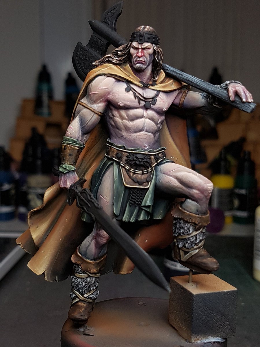
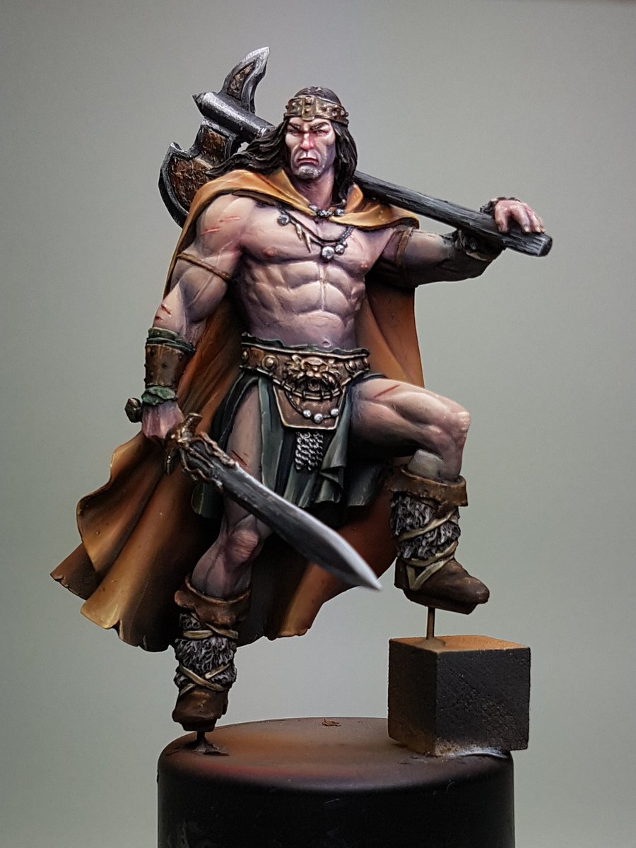
I have painted a few pieces recently that other great painters have also painted, like Conan and the Lost Princess, and the Fade by Mirico.  It is interesting when I compare my own work to others.  Roman Lappat and Sergio Calvo Rubio have painted version of the Conan, which I've put beside mine here in this image:


The piece on the left is done by Roman, right by Sergio.  Mine falls down a lot when placed beside these, you can see how incredible the atmosphere on Roman's piece is, so much beautiful colour hidden in each little area.  Sergio has the most incredible blends, great harmonious colour and such vibrant contrast.


Once again, I know where I am falling down.  It's time spent.  I get so enthusiastic about new pieces, incredible models out there that I want to paint, and I lose steam on a piece.  I need to be able to motivate myself into painting a piece until it is done, and not when I get bored.


Or at least, that is what I need to do if my goal is to improve the end result of my pieces.  I am not really sure if that is my goal at this moment.  I think my goal is to paint, to enjoy my art, and to experiment with the beauty that can be created in miniature painting.


I find myself trying to expand the way I see colours and paint things "different".  I would like to be able to finish a piece and have someone not be able to easily recognise it as mine, because it has such diversity of style.  Maybe thats not an achievable goal, or even necessarily a good one, but I am going to keep pushing.


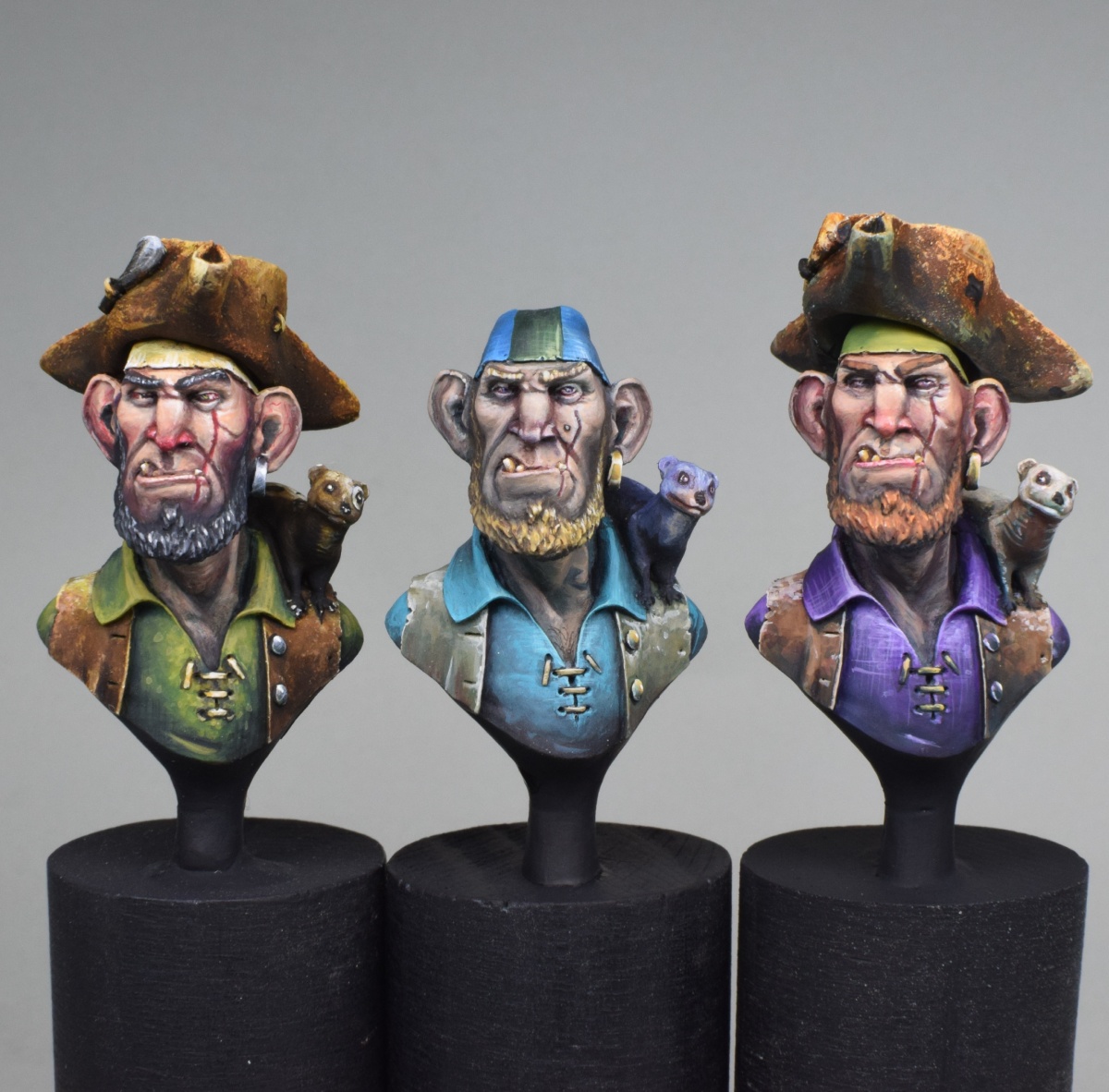
In other great news, I've managed to sell quite a few works recently to some fantastic collectors.  They've been exceptional to deal with, and have been very appreciative of my work.  It is so humbling for me, that people enjoy my work enough to pay hard earned money for it.  I also ran a painting class, which was successful enough that I've organised a second one for a few weeks from now.  I'll do a more detailed writeup on that in the near future.  The models I painted for the class are below (three pirates!)

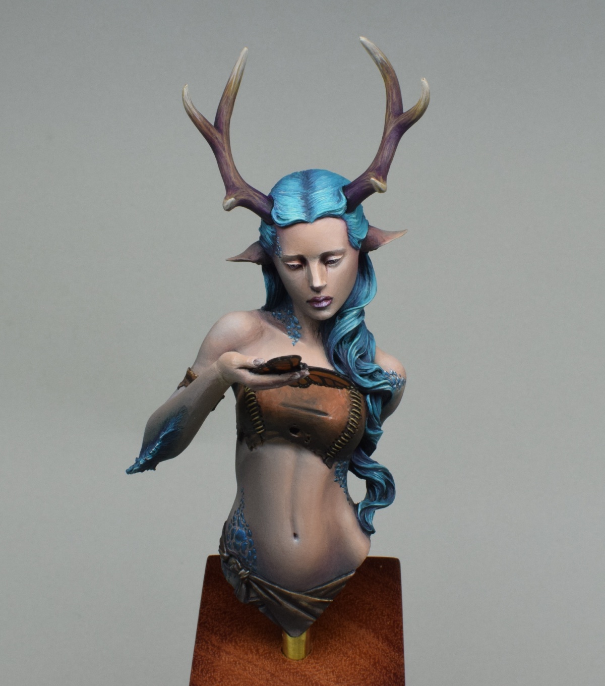
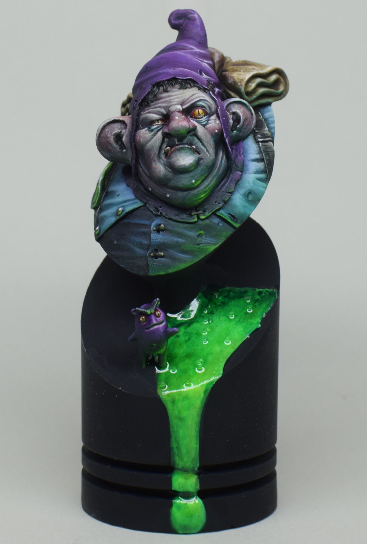
I also entered in the Queensland Model Hobby expo with the following pieces.


I scored two Gold, for the Elf Rider, and the Twisted Shaman, two Silver, for Excelsy and the Minotaur Gladiator, and three bronze, for Conan, Father of Asgard and Red Riding Hood.  This was a nice point for me to reflect, because I entered last year with a number of pieces, and got three Bronze.  I don't paint models for competition, I paint because I love it, but the acknowledgement of my mentors, and peers is nice for motivation.


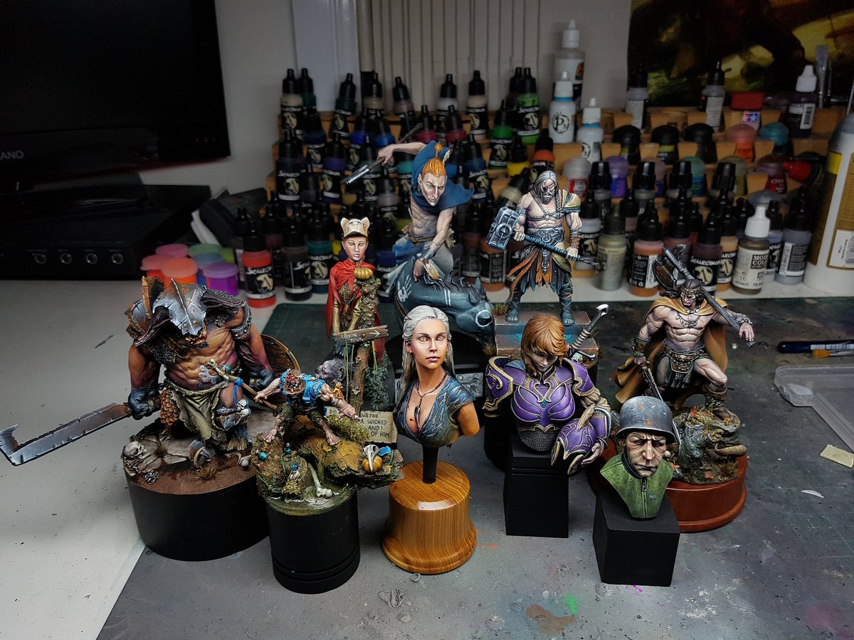
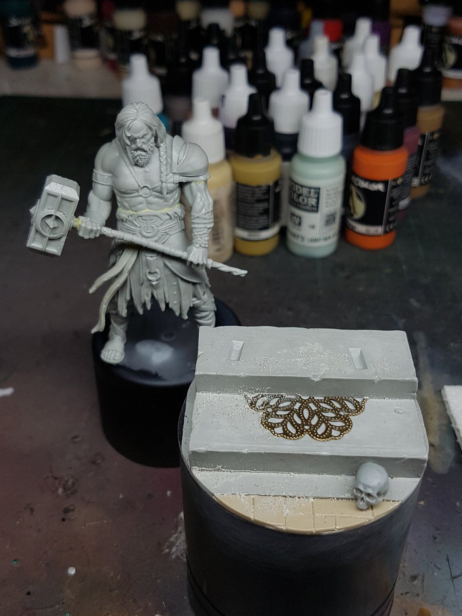
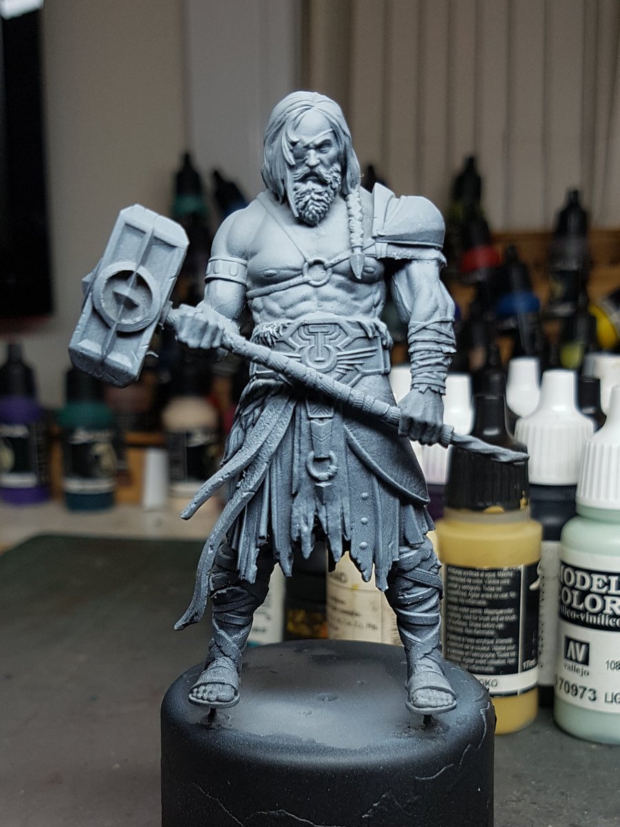
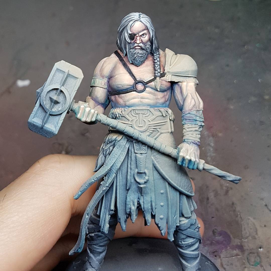
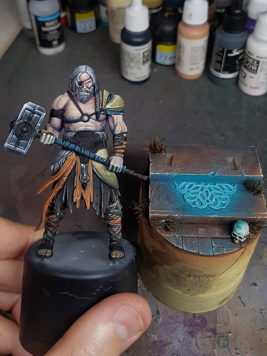
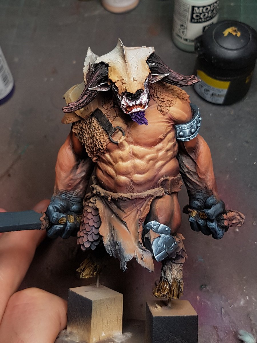
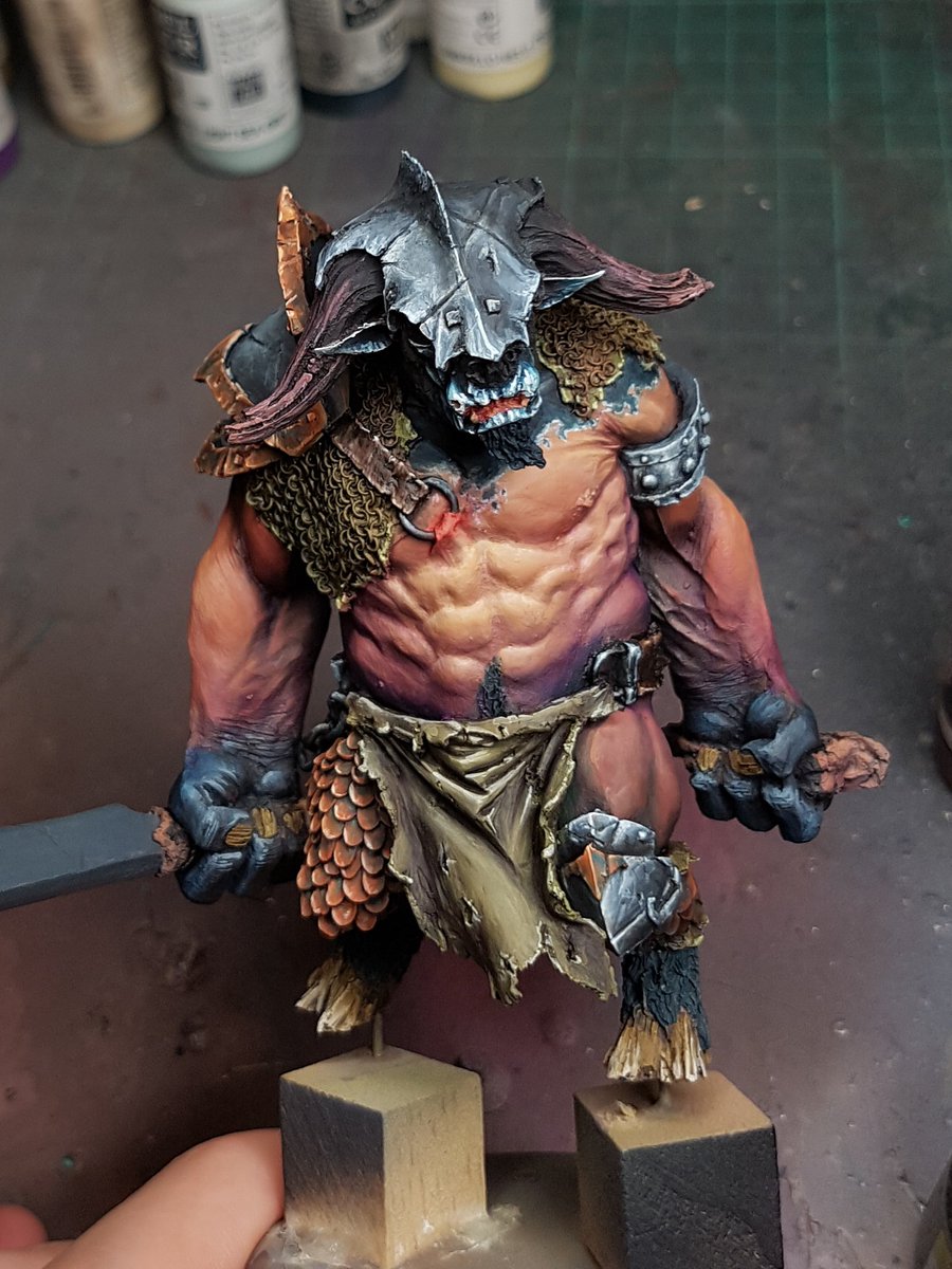
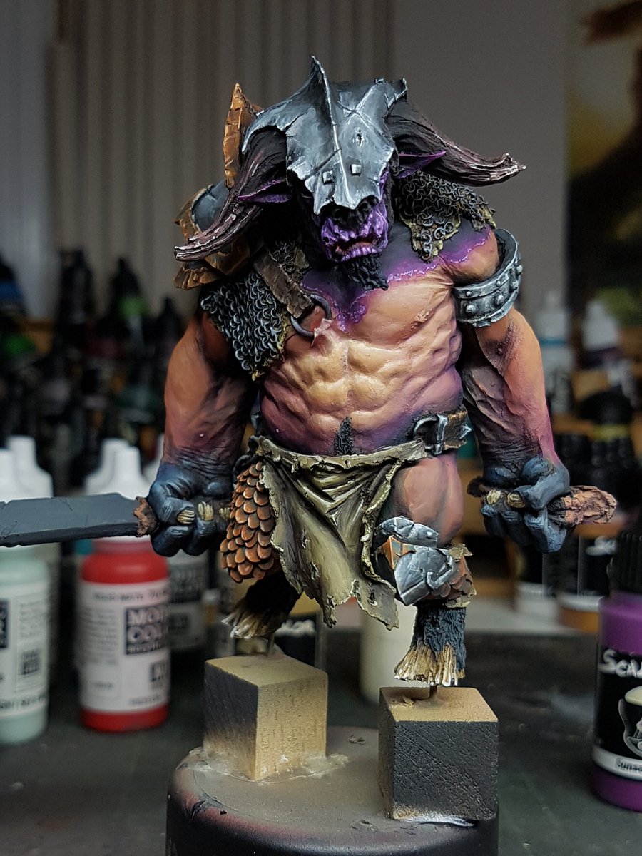
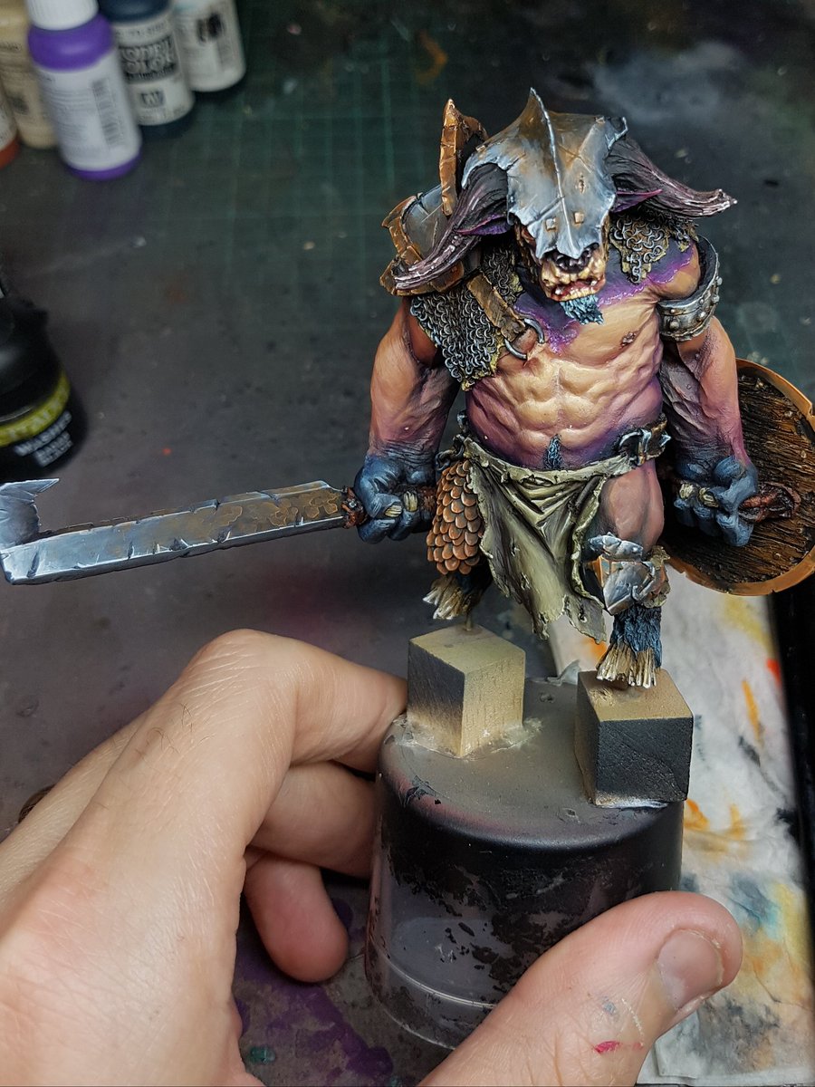
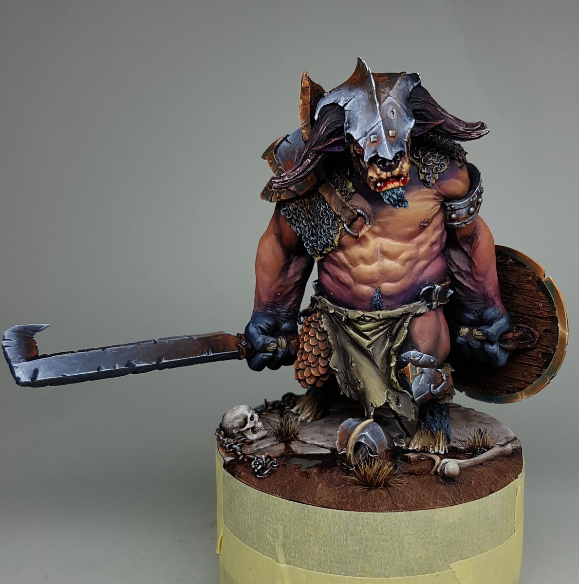
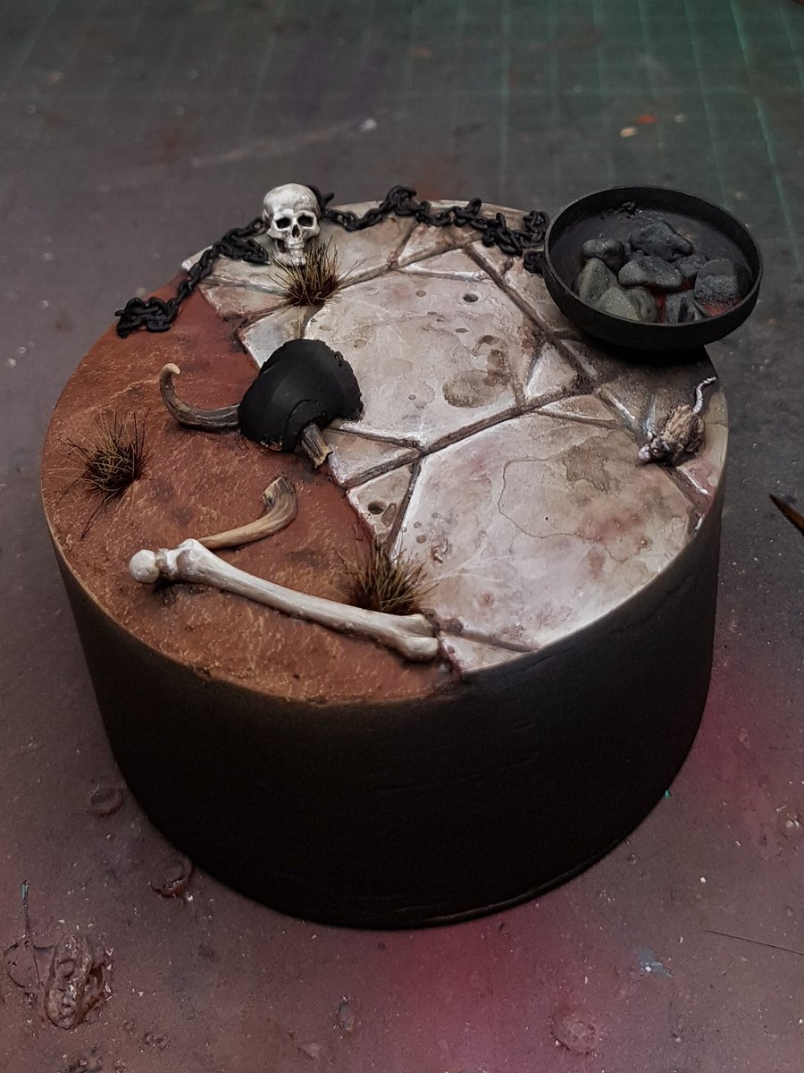
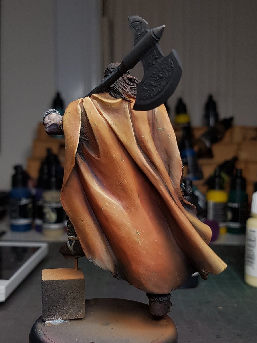
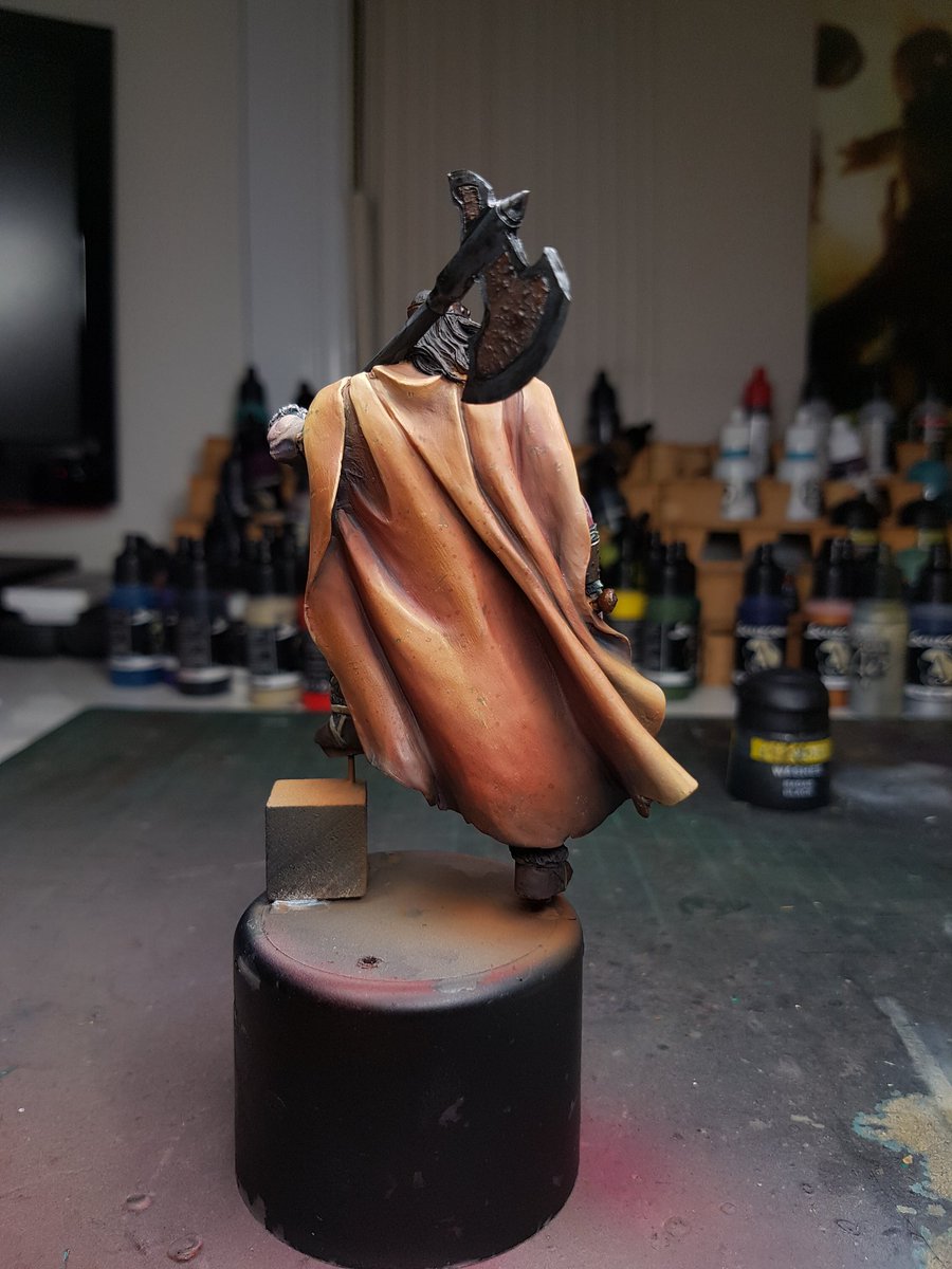
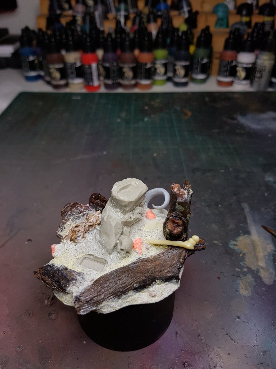
Here are some of the works I've done over the last three months, and a WIP of my latest piece.


Sunday 11 June 2017

Father of Asgard, Photo Step by Step


A step by step of the Father of Asgard by Scale 75.  I'll let the pictures do the talking again.  The wet in wet blending stages early on shaped the whole model's scheme and it was pretty much unplanned.


Strength and Honour, and Some Thoughts

Been a little while since a blog post, but I am not sweating the lack of them.  I tend to spent more time painting than posting, which I figure is a good thing!


I have been struggling a bit lately with my perceptions of my work.  I look at the work I have done recently and I am unhappy with the way it looks.  I feel like I overuse white, and that I focus on brightness as my only source of value contrast.  That results in a lack of saturation, where the overall colours can appear pastel, or lacking power.


Some examples of what I mean.


The difference in these works vs my own (obviously outside of the hours that get put into them), is how the colours have more power, because they use saturation to control the contrast.  One of the best exponents of this is Marc Masclans, whose work very rarely goes up to a white highlight, even at the brightest points.


My other problem is that all my work seems to look the same.  And that stems from the fact that I use the same colours, I have default colours that I like to use because they work well, or I like how I paint them.  Skin colour is a key one, I tend to use the same colours and it always results in the same look.


I wanted to try and challenge myself out of my comfort zone, and it started with the Minotaur that I painted a few weeks ago.  I wanted to push the colours and use different stuff, and one of the bigger challenges was NMM.  I've never painted it, I've always lacked confidence in it.  I decided to give it a crack and see if I could pull it off.  I was happy with my first attempt.

Again, I fell into similar patterns on other colours and could not get a model that looked different to my other works.


I painted up the Father of Asgard, from Scale 75, and tried a completely different base of blues for the shading in the skin.  I felt like I started it off well, but then things fell away again when I got to the later stages and I kept using the same colours and techniques.  There was a big improvement on my NMM though, and that came from recognising where I went wrong on the Minotaur.


Bringing my to my latest piece, the Strength and Honour bust from Ares Mythologic.


I wanted to focus more on the saturation of the piece, and use pure chroma (or hue) to be my highlights on the areas that were not metallic.  I failed, again, but I think I am heading in the right direction.  I used grey mixed into the basecoat of my skin, then shaded with a bit more grey added, and used the pure colour to highlight.  I then added white and colours into the mix and added that to the skin.

I did get a few things that I am happy with.  Firstly, the gold NMM I think is really cool.  The dappling effect on the armour looks mad, and that was actually a really easy process.  I used a stiff bristled brush and stippled on colours over the red base tone, all the way up to an off white.  I then glazed over a few different colours in the shadows and over the piece just to harmonise it all together.

Hair continues to be a problem that I just don't seem to get right.  When it is hair that is smooth and well sculpted, I can usually get it looking ok, but rough hair is something I always seem to fail hard on.  This is a fail also.

I know one area that I could easily change, and that I would get an immediate improvement: the time I spend on models.  I know for a fact that I get bored, or get interested in painting something else, and when that happens it is very hard for me to keep at a model.  I generally paint a piece in 10-15 hours.  Seems like a long time, but in painting little toy soldiers to a display standard, it is lightning quick.  And it is the biggest thing that is holding me back, I believe.


So where to?  Obviously I am not letting this sense of frustration at my lack of reaching the level of work I want to prevent me from painting.  Literally the only way you can improve at something is to keep making mistakes and learning from them.  It is one of the things I think I have really learnt over the last ten years in my hobby life.  You have to embrace getting flogged, or being shit, or making a bad decision, or fucking up.  It is not easy.  Nothing worth having ever is.  So I will push on, keep painting, and keep trying to take that next step up into a model that I am happy with.

That becomes hard though, when I consider the time factor.  I don't know if I can spend more time on a model that I already do.  Maybe if it is something I am super motivated by, and everything is working beautifully.  I think before I can start devoting more time to a single project, I need to be able to feel like my skills are worthy of spending that time.  I am going to keep challenging myself to try new things, and learn more and experiment with how colours and things interact together and focus on those saturation elements that I feel are letting me down.  Once I feel like I actually understand them, I can hopefully feel confident enough to know where I am going with a piece.

Thanks for reading!

Cheers
Trent


Saturday 20 May 2017

The Minotaur, Part 2

I am just going to let the photos do the talking.  If you have any questions, add a comment, Tweet or email me!


Sunday 14 May 2017

The Minotaur, Part 1

I've been lucky this weekend that I got a few spare hours to put together and get started on my next model.

Out of nowhere I was hit with inspiration to paint this gladiator Minotaur that I have had sitting in my to paint pile.  I wanted to try some different coloured skintones, since I have been using a lot of the same skin colours recently.

I looked through my box of plinths and found a piece of PVC pipe that I had used for some other projects, and grabbed some putty and plasticard.  I drew a design on the plasticard in pencil, scored the surface with an awl and then with my dremel.  I glued it down and used putty to fill the other areas of the base.  I used some Vallejo Sandy paste to fill in the front, sandy areas.   I sanded it down so the edges would be smooth, added some bits I had in my bits box and put it aside while I assembled and puttied up the Minotaur man.  This was relatively quick, maybe a few hours in total.


Painting the base!  I airbrushed both the tiles and the sand with a few different colours to create some basic volumes, using masking tape and angles of the brush to catch only the front of the tiles.  I then used a variety of pigments on the sand, and let some of them bleed over onto the tiles.

The other bits and pieces got painted, I added some grass and then highlighted the tiles, added some washes to tie it all together.  I was reasonably happy with this so far, but often I make changes to the base based on how the model looks when it is on there.  I plan to airbrush glaze some darker colours on there and also work on the tiles a little more, and possibly add some wetness to it.


Now normally I paint all of the model and then seal it with varnish, and then will go back and paint the metallic areas.  I have been really struggling with metallics recently, so I decided to try non metallic metal (NMM) for this piece.  It would allow me to spend some time on it before the project was almost finished, and hopefully alleviate that urge I get to call a piece done and rush the last few things.


Unfortunately I've never do it before, so it was always going to be an interesting experiment.  When I started painting the helmet, it was the first time I felt lost in painting in a while.  I didn't have any idea what to do, where to start, or paint on the highlights or even just how to consider it.  I looked at a few pictures, and then just starting painting!  Eventually I figured things out, and I got it to the below stage:


Now that I have done it, I have a bit more of an idea how to approach it in future.  My biggest issue at the moment is that it looks very cartoony, not like a real metal.  I need to start, and have more of the model be a darker value, then sharpen up the highlights much more starkly.  But I am happy with this as a starting point.


Next post will talk about starting painting the Minotaur!

Thursday 11 May 2017

The Barbarian King - Finished and Reflections

I painted the base last night, did the final touchups and put the Barbarian King all together.  I took the finished photos, and uploaded to Putty and Paint!  Here is the link:

http://www.puttyandpaint.com/projects/13479

And one of the photos of him all finished up:


I have a number of reflections about this piece.  Firstly, I think this is probably my most cohesive and colour coordinated piece.  I think all of the choices I made reflect nicely the theme I was going for, the scheme has no primary colours and feels a lot more harmonious because of the shading and highlighting colours I chose.

Contrast is something I am always banging on about, and I think it is starting to come together for me.  This model has contrast higher up towards the focal point, whereas the lower areas have lower values. I have a good separation in most areas where I have a low value colour beside a high value colour, and overall the intensity of each section from dark the light is pretty solid.  I perhaps needed to consider it a little more with the base, and the cloak colour was maybe too pale compared to the skin.

I wanted to experiment with colour in the skin, and across the model, and I think it was a successful experiment on the whole.  I think looking back, I didn't push it far enough.  I wanted to go really wild with colours, have lots of incredible tones in various areas, but when I glazed and smooth I lost a lot of that vibrancy.  I think next model I will really concentrate on pushing it further and further.  The process I started with when I was painting his skin was a wet in wet, and it was extremely, extremely fun and made the basic volumes easy to get into position.  I will try that a lot more I think.

A weakness of mine is still metallics, I cannot seem to get them right.  Perhaps I will try some NMM, because maybe it is the actual properties of the metallics paints that I am struggling with, as opposed to the placement of the colours.

I spent a bit of time on the base, probably three or four hours, and I am really happy with it.  I used a lot of glazes, airbrushing some colours on and pigments, constantly going back and forth. I think I am finally starting to get the handle on basing in general, which is good because it was one of my goals for this year to improve my basing.


My biggest issue is that I do not think I have photographed the model all that well.  It was a real struggle to get the face in focus and have the colours and transitions look as they do in real life.  These are the closest ones I took, but unfortunately I think they do not quite do the model justice.


I think this sits in one of the top three or four models I have painted.  I am really pleased with it, one of those rare few where I am proud of the paintjob and think that it is reflective of my skill level currently.


Onwards and upwards!

Trent

Wednesday 10 May 2017

The Barbarian King - Part 2

The last update showed a relatively clean and solid looking barbarian.  The next steps for me now was the increase the contrast, add some of the texturing and detail and bring everything together.  I listed in my last blog post all the things I wanted to do, and I went through quite systematically and did them.


I also shopped the two stages side by side, so I could see the difference:


Looking critically at the two models, I definitely have more contrast on the model on the right, but the guy on the left looks a little more smooth, and his skin feels a little more alive.  The cloak on the right has also lost saturation, gone a little too pale, and I think the hair is far too white.  The boots I like the subtle darker shift, driving that intensity up.

Overally I think the guy on the left looks a little more like he is standing in the sun, the other guy like he is standing in the shade.  One thing to keep in mind, the lighting is possibly impacting on these images as well.

Based on that issue with the skin looking a little less soft and smooth, I decided to do a few glazes to try and soften everything out.  This is ultra dilute, moreso than I would normally do, because I want to keep most of the contrast, but just smooth it all out.  I panzer puttied everything but the skin, and went to town!


I was much happier with the skin after that, and decided to go a bit more glazing as well. I pulled the putty off I pulled out some oranges and reds, and hit areas of the cloak with some red, to increase saturation, and some oranges to smooth out some of that harshness.  I was happy with it, so I did a bit more work to the hair, and painted in some base tones for the metallics.


You can really see the extra red and orange I've got in there now, and I think it brings it all together a lot more.  I wasn't worried about bleed over into other areas, as it was a pretty dilute mixture and I was pushing it out at a low PSI.  I figured it would just help transitions.  One other thing I did was almost 0 PSI, with a medium amount of dilution in my paint, and sprayed on the cloak.  It creates a spattering effect, giving a random spread.  It is next to impossible to paint random.  I called the cloak done.

I began work on the base, I have a lovely wooden plinth that I am going to use for this guy, and I didn't want to risk getting any sand or paint on the plinth, so this is a plasticard base to use as the surface for everything.  I've glued the original rock structure that comes with Conan in the centre, and added various bits of forest and debris to the surrounding areas.  I think it is pretty clear with this model that I've gone for a very autumnal scheme, and so the forest will be a lot of soft oranges, leaves and debris.


I painted on the textured paint, and sandy paste onto the base to cover off some of the milliput, and add some texturing to the stones and other areas.  I also added a horn from a beast man bust that I had spare, as a rams horn or something.  And with that, left it to dry overnight!


Going back to Conan, I was happy with most of the areas, but I wanted to improve the face a little bit, paint in the eyebrows, and fix up the cords and other bits that were left to do.  I also put a little blue back into his green areas, as they felt a little too monotone.  I then painted in the crown, the sword and axe and belt.  I used a brass colour for some parts, and steel for the others. I tried to put some oxidising on the brass with a little blue, but it was a little overpowering so I went back in a worked with it a bit.  I tried to keep the steel areas very dark, with some cold blues in them.  I painted gloss on the eyes, Tamiya X27 on the cuts on his body, and a bit in his mouth, and put him up on a proper background to get a really good photo so I could look at it closely.


Overall, I am pretty pleased with it.  I have a few areas I want to fix, the axe, the leather gauntlet on his right arm and a maybe a few areas need some blacklining (or in this case it will be brown lining).

Once I paint the base, I think this will be one of my best models yet!  It's been a good few weeks for my in terms of my ability levelling up I think.