Yesterday was a down day, disappointed in the completion of a project. Today, today was a new day, filled with new painting opportunities. I had not really spent much time painting a piece in the style and with the techniques I had learnt from Raffa.
I pulled out my collection of busts, and decided to get cracking.on Surt. I sort of forgot I had the guy to be honest, but when I looked at what I wanted to try, he had great facial texture, a nice beard and hair, and some areas I could practice my weakness of metallics, either TMM or to give the NMM a go.
I set myself several goals for this piece:
1. No pure black, or pure white, anywhere on the model. I've been really struggling with contrast and making things look natural. I think the biggest issue is black, and how I use it.
2. No black undercoat.
3. Avoid using washes unless absolutely necessary.
4. Airbrush and OPAQUE basecoat, and then use it for glazing colours and varnish.
5. Try to take what I learnt from Raffa and put it into my own techniques.
So with those goals in mind, I sprayed Surt with Vallejo Grey Primer, and let it dry.
The first colour I airbrushed was Beige Red, on his skin. The basecoat I did was fully opaque, no black areas or areas of washed out colour. I immediately noticed a difference to my normal airbrushing over the black how much more vibrant the colour looked. I then switched over to the brush, and used Basic Skintone to block in highlights, very harsh, and then mixed in some Pale Sand.
I glazed in Red Leather, then Armour Brown, Royal Purple, Flat Green and Dark Sea Blue, all in various mixes and across the model, keeping in mind the light source which I have pegged as slightly top right.
Once I had a pretty harsh highlight/ shading piece, I glazed colours back in to soften the transitions, and then added a bit of Flat Red onto the nose, and highlighted with Pale Flesh.
The next step is a big one, I mixed in a bit of Basic Skintone and Pale Sand along with some Matt Varnish into the airbrush, heavily diluted, maybe 10 parts thinner (my magic mix) and 1 part paint, 2 parts varnish. The purpose is to soften transitions, but this will also bring the contrast down. You need to do maybe six or eight passes over the area, with really thin layers, waiting for each layer to properly dry before the next.
To explain further, imagine you have painted contrast from 1 being darkest, to 10 being lightest. Using this glazing technique, you will create smoother blends, but it also will reduce the 10 to an 8, and bring the 1 back up to a 3. The trick is to go back in and add more depth again, and put those spots of brightness in there.
You can use this technique over and over on an area, softening transitions, slowly adding more contrast and keeping everything harmonious. The Matt Varnish is my addition, purely to help the layers also transition, keep the really thin layers of airbrush on the model, and seal work you've already done. Here is this technique used for the first time on this model.

And then here it is the second time, at which point I've painted eyes, and wet blended the hair together. (Dark Sea Blue, Scale75 Brown Leather, Pale Sand)
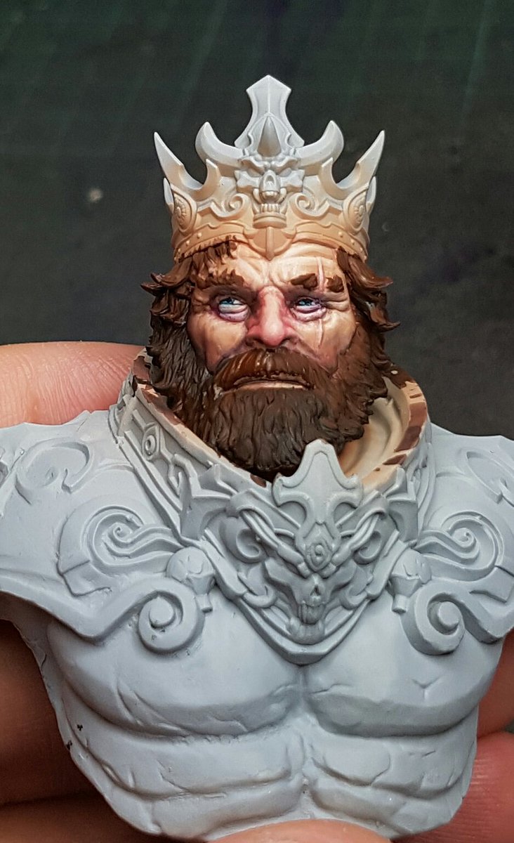
One area that I struggled with on Mannaz during the class was fur, and this model has hair similar to fur, so I wanted to retry the technique and see how it would go once I understood all aspects of it. Here I used Scale 75 Cokum Copper, Pale Sand, Brown Leather and Dark Sea Blue in various mixes to highlight up across the beard, again taking into consideration light source and so on.
I think I feel better about the technique now.

Once I had the face to this stage, I wanted to progress with the rest of the model, and figure out the colour scheme for everything. I still want to put a bit more texture and depth into the face, adding a few more colours and perhaps some age lines, or liver spots and so on, and also add some grey to the beard and temples, but I want to have a colour concept for the rest of the model first, because I can try to integrate those colours into the face a bit as well, tying it all together.
Another suggestion from Raffa was Panzer Putty, I've been using blutac but it always is a bit risky and I have pulled paint off before by accident. This felt like cheating. It is such a good product. Well worth the money I paid for it, and it will last literally forever. Certainly didn't need to mask it off with good airbrush control, but I wanted to make sure I was fully opaque on the basecoat, and didnt want to risk overspray. Painted the crown in Dark Sea Blue.


I didn't really go in with a strong plan on this guy, treating him more as a pure learning piece so I want to feel freed in my choices. I did have one thing in mind though, which was the absolute opposite of the box art, super warm colours with fiery hair. I figured more of an aquatic themed king might be cool, king of Atlantis or something like that. It might give me the possibility of adding some attempted water reflections on his face (like a cool blue glaze to make it look like he is peering out over the water, surveying his aquatic kingdom). But thats a down the track idea.
I used Blue Green for the basecoat, and then using my colour theory, I shaded with Dark Sea Blue, and Armour Brown. This desaturated the colour a lot, I highlighted with Pale Sand mixed in. The airbrush glaze was done again, and left me with the below model so far:

I will be going further into the colours and texture of the breastplate more tomorrow, and I'll have to make a call about the metallics soon too. Overall though, very happy with tonights progress. A really positive experience and making me feel really good about my painting again, after yesterday being a downer.
Cheers
Trent!
No comments:
Post a Comment