After sleeping on the look of the tree, I came to the conclusion that it was ruining the impact of the model, and changing the dynamic of the piece.
However, it was really important that the piece have some height. One of the really interesting things that I learnt from Meg at Crystal Dragon earlier this year was the discussion on plinths. I've never really considered them too much, I just try a few out until one feels right. Meg basically said that if you measure the top of the model all the way down to the bottom of the plinth, roughly the centre point is where the focus should be. A larger plinth will often draw the focus down towards the feet of a model instead of the actual point it needs to be at. By removing the tree, I dropped that focus point to the water at the base.
I threw it out to Twitter and asked for suggestions, and there was a great suggestion of a signpost from @Megagribix, and I immediately had inspiration. I carved it out of plasticard, attached it to an interesting twig, and stuck it down. I plopped a pumpkin up there as well. Really happy with the aesthetic of the piece.

I started by airbrushing some brown to the tree, and started highlighting up through the brown and orange tones. The next step which really brought it to life was adding some shading with green, particularly focused on rivulet type areas where the water would run down. I painted little bottles and bits and bobs, then spent a bit more time adding some moss and green tones to the base. Added more flocking and got it all to a stage I was happy with.


I went back to working on the dude. There is a lot of detail on the model, and getting the right balance of colours, contrast and focus points was not easy. Naturally your eye is drawn to a models face but this one has no real easy facial details to focus on. So it made it more difficult. I had to try and really up the contrast around the head area to draw the attention there.


You can see I am really trying to balance the colours, trying to keep in mind the rule of three, where a colour has an appearance on a model three times, in a roughly triangular shape on the model. Focus on dragging that attention up. Things really started working when I added the orange bit to the hat, and then added the bone coloured areas. The face wasn't really popping enough, but it was ok.

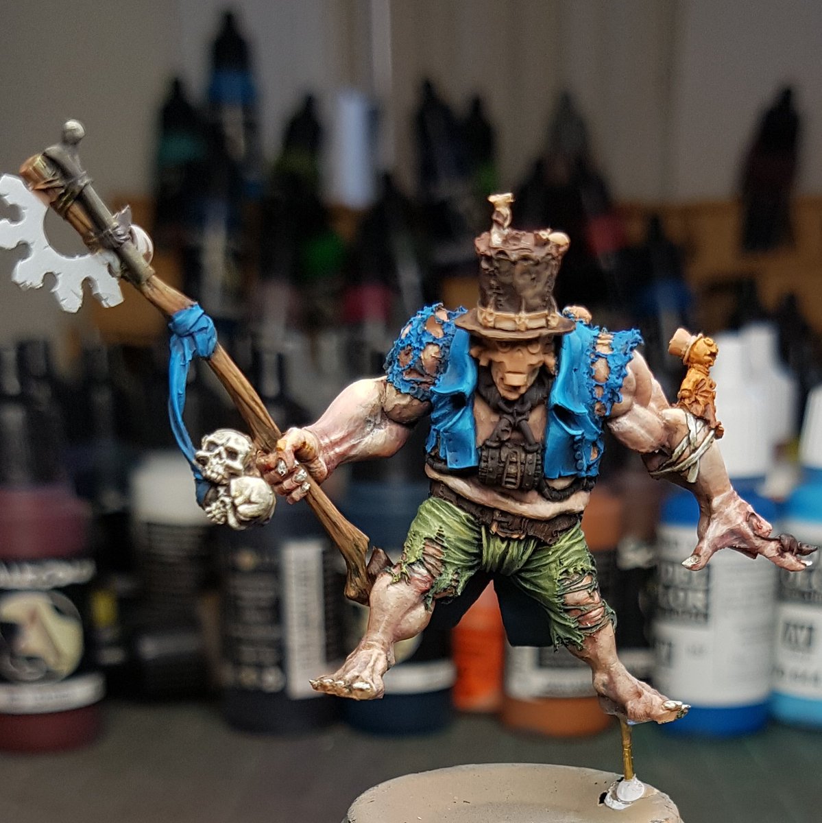
I tried this patterned idea on the front of the hat, again in an effort to draw attention, but after looking at it I really didn't like it. Made him look more circus like than voodoo sort of theme.

I switched back to black and white, and tried a chequered pattern and this really worked well. I painted the mice, and started all the various little bits and pieces.
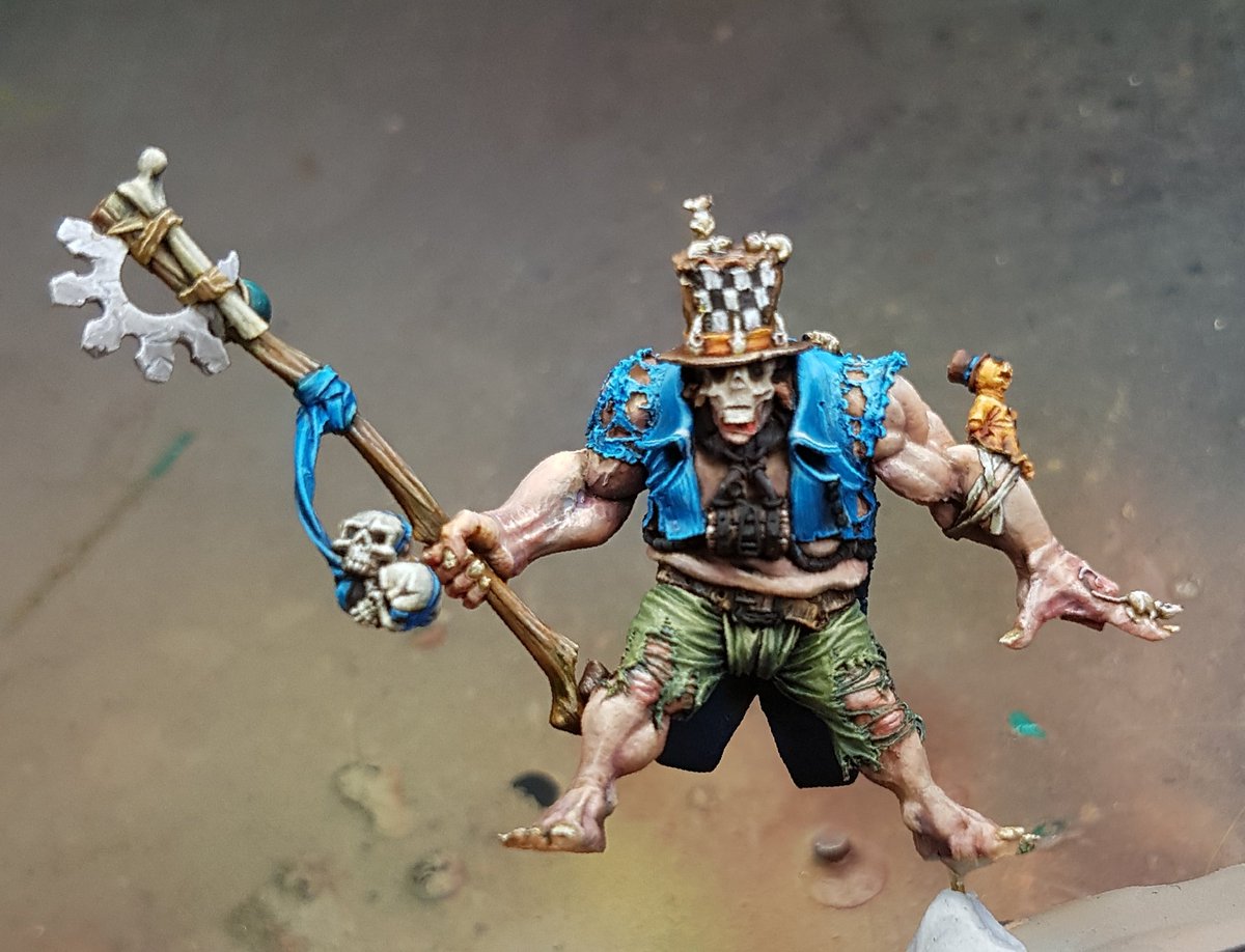
I was happy with how everything was looking, so I varnished it, painted the metallic sections, and then glued it to the base.
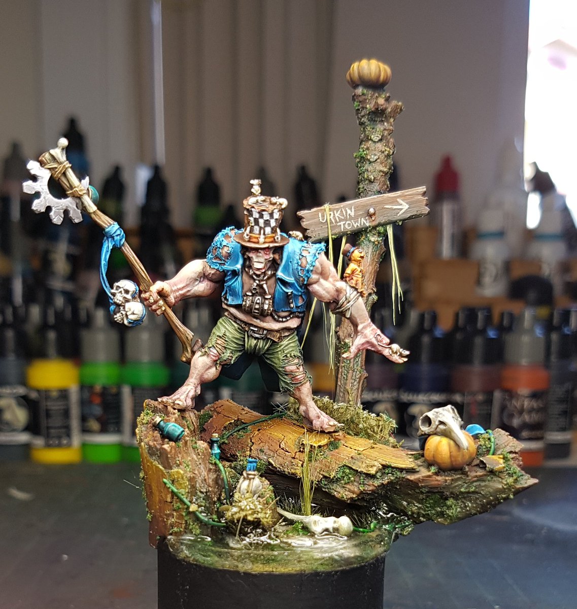
Looking at it now I want to add some gloss varnish to the eyes, and add some blood around the mice. A bit of gore I think will work nicely there. Overall I think the model looks pretty good, but there is not enough contrast between the focus points and the lower areas. There isn't enough real texturing on it to bring it to life. I think I've also got a habit of using too much dark in my shading, and it creates an unrealistic cartoon sort of look.
I will do those last touchups and additions and I will take some studio shots!
No comments:
Post a Comment