Monday, 8 May 2017

The Barbarian King - Part 1


I basically just buy models all the time, that I find inspiring.  Sometimes, unfortunately, they sit on my shelf, I lose interest in them for whatever reason, or aesthetically I've found something similar that I enjoy more.  Occasionally I buy a model and when it arrives I dislike the sculpt.  But usually when I buy a model and it turns up, I get super excited, put it on my shelf of models to paint.  That shelf has dwindled dramatically the last few weeks!  I am running out of cool shit to paint.

Sometimes I forget models that sit on my shelf of models to paint.  This was the case with my Conan model, or its proper name: the Barbarian King from Joaquin Palacios Studios.  Alongside Lucas Pina, Freeman is probably my favourite sculptor at the moment.  He is incredible.

I was showing off my models to Yianni and he was checking out my pile and he pulled that out and had a closer look.  I remembered I had it and decided to put it together while I was watching Toya paint some Arcadia Quest models.  Once I got it together, it reminded me of old school pieces of artwork from like Frank Frazetta and Boris Vallejo, guys whose artwork made my eyes boggle when I was a young lad.  I have been aiming to push myself more and try more difficult techniques on each piece, and this model felt like a good chance to try painting something that was in a similar vein to their artwork: vivid, full of colour and depth and atmosphere.


Cue, crazy balls deep starting point:


I airbrushed some really basic colours and shades onto the model, all very desaturated.  The plan was to use wet in wet technique to create some colour and interesting volumes.  I added some drying retarder and mixing medium to the colours so that I could spend a bit more time blending and fusing the colours all together.  After I mucked around with that, I then used a hairdryer to dry it off, and use some more fleshtone to paint on some highlights.


You can see I have already got a lot of volumes in there with the blending and highlights, as well as a few different colours and tones.  One of my techniques that I wrote my article on is called airbrush glazing, so after this crazy wild beginning, I tone everything back down.  But because it drops contrast, what you see here is not enough contrast.  I pulled out a pure white and cream colour and added even more crazy light points.


One of my mantras these days is "There is no mistakes, only happy accidents".  Thanks Bob.  But really, when you actually start to live and breathe this mantra, you find yourself with more freedom and creativity.  You can always, always fix a bit of paint in the wrong area, or a colour choice not quite right, or a textural mistake or whatever, so why not go crazy and push things and see how it all comes together.


Using my airbrush, I glazed multiple thin coats of mid tone paint over the entirety of the model, softening the transitions and colours and harmonising it all.  This is a technique I am using more and more, just in the early stages of my pieces, because I can go crazy large on highlights, knowing that it will be softened.


And this is what it looks like after I use my glazes. You can see the huge difference between the two models, and what is probably most interesting is that to get to that second stage took me all of about five minutes?   In fact, this entire process was less than an hour, because I am not worrying about precision and refinement, just actually getting value and tones where I want them.


After this I need to bring more contrast back in, and add a few more colours and tonal interests.  Red on the knees, elbows, nose and armpits is usually where I start, and then some cooler blues and purples in the deep recesses.  The next step then is to paint in the rest of the model.  It is so crucial to have the rest of the colours at least blocked in, because the contrast and relative value of everything relies on everything else surrounding it.  The best example of this is when you paint a models base black.  Going from either white, or grey and then suddenly having the base black makes the model pop more, because the other areas are not reflecting more light, or are not a higher or similar value.  So I pulled out my trusty Panzer Putty, covered the skin and then painted the cloak.


Why orange?  I dunno.  I've been using so many primaries recently, I wanted to dive into a model with mostly secondary colours. In fact, that was my focus on Alice as well, and she came together so well that I figured I could keep trying to push it and see how far I could take it.  The orange I planned to be like a dry leather, with a bit of texture on there.

I pulled off the Panzer, painted the loin cloth in blue, the complementary colour for orange, but kept it very dark.  Painted the hair, and suddenly the model looked a lot more accurate to what I was going to be ending up with.


Another thing that the pros do which I've been trying to use more and more is shade and highlight with complementary colours.  It adds more richness and diversity to the piece, so I started with blue and purple/red to shade the cloak with.  I was pretty heavy handed early on, even though the airbrush creates that really nice effect, adding some actual texture is a part of the plan down the track.  I painted in some of the browns and leather areas.  Starting to come alive now, as each area starts breaking apart the model.


I went back in and worked a bit more on the skin, smoothing the face details and so on.  I kept trying to get the balance right between skin texture, smoothness, colour and contrast.  It is still not where I want it, but you can see it is getting close.  I also mixed in the orange from the cloak, and some ivory, into the blue of the loincloth.  This create a really interesting desaturated green, which I used. It still has some of the hints of blue so I think still works with the orange.
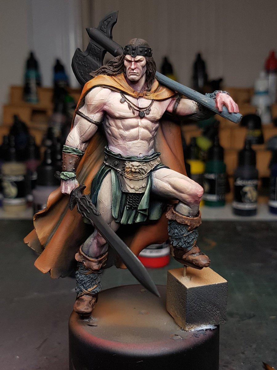

More highlights on the cloak, painting the fur with some more wet in wet work, the leather strappings, painting the leather belt, and getting the skin smoother again, as well as adding more contrast to the lower areas.  Looking at the black and white photos I could see that I need more contrast within the skin itself.


I have a large up version of the back of the cloak.  I've got a lot of different shades in there, but the highlights are consistent orange, to an ochrey yellow.  The next stage of their highlights will be a cream colour which should make the cloak pop off the model.


I also painted the eyes, a very difficult job on this model as they are inset, and very small.  I managed to nail it first time, which I am stoked about.  I also added some blue tones to the lower jaw, and a bit more white to his forehead and nose.
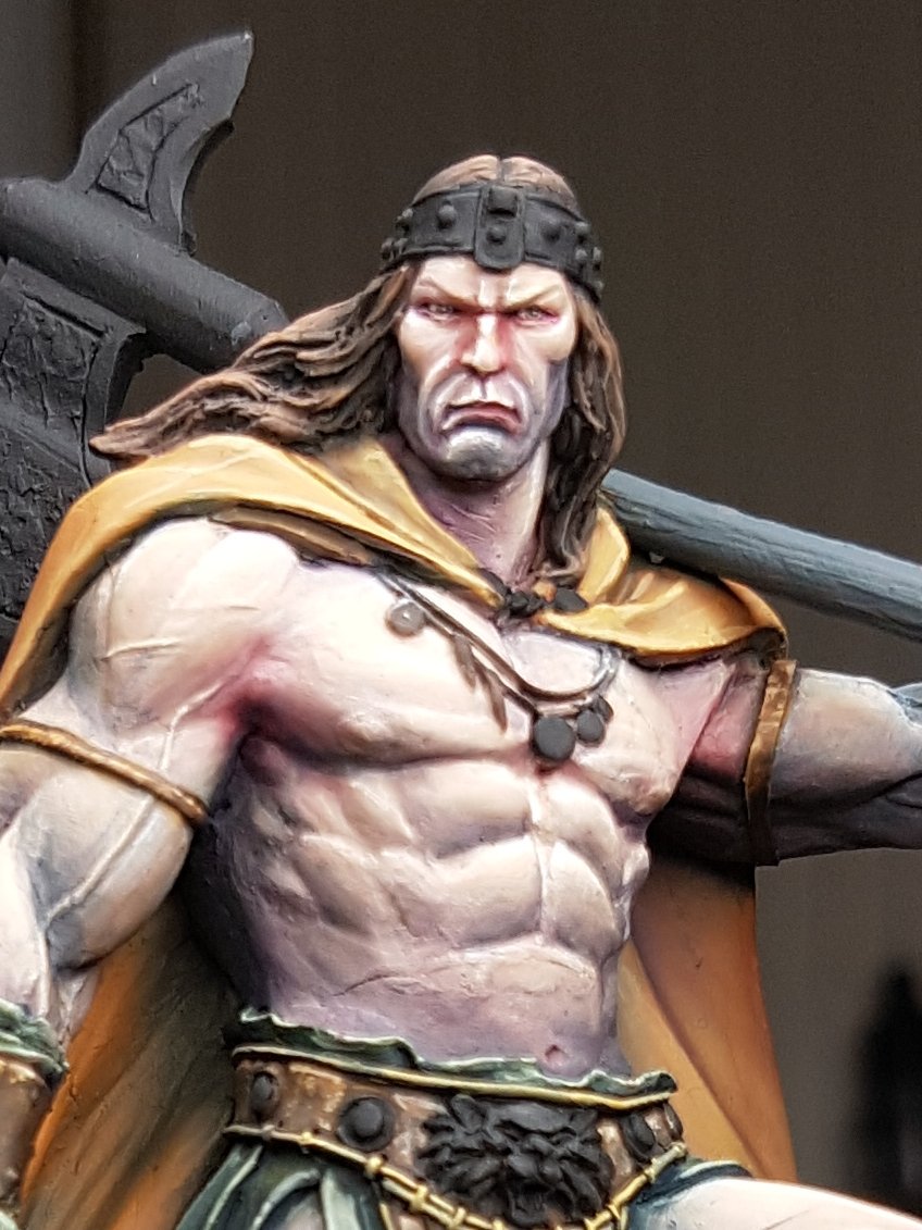


Moving forward from here, I want to use some really small micro stippling to add to the stubble effect on his jaw, to put even more redness into the nose underneath, work on the hair more so it is more refined, add those pop highlights and texture scratches on the cloak, smooth the torso skin tones out just a tiny bit more, darken up the leathers on the lower half of the model and make the fur even darker, make the straps and cables around the belt ivory, paint the wooden haft and then move into the metallics!

I've still got the base to consider, which I've been waiting on some more plinths before I put together, but I am really excited to play around with one, because I feel its an area that I need work on, but also one that I have started to develop.  


Exciting times. 

Sunday, 7 May 2017

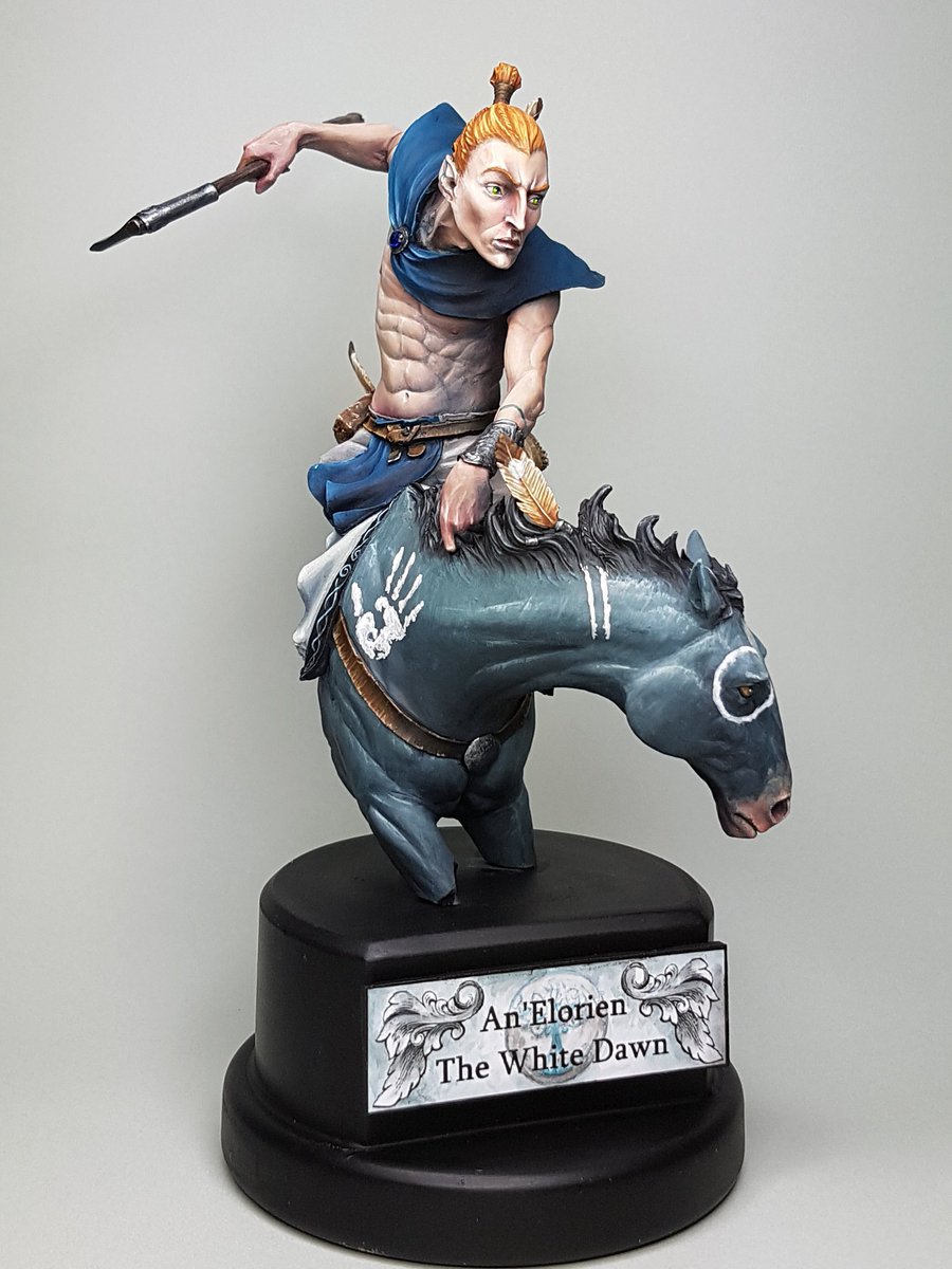
The Elf Rider Step by Step

Welcome back to regular blogging.

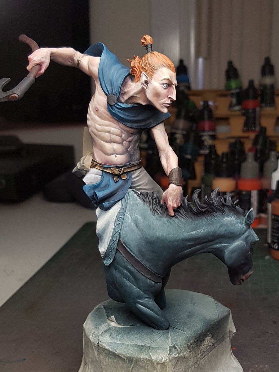
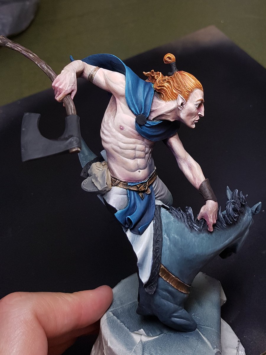
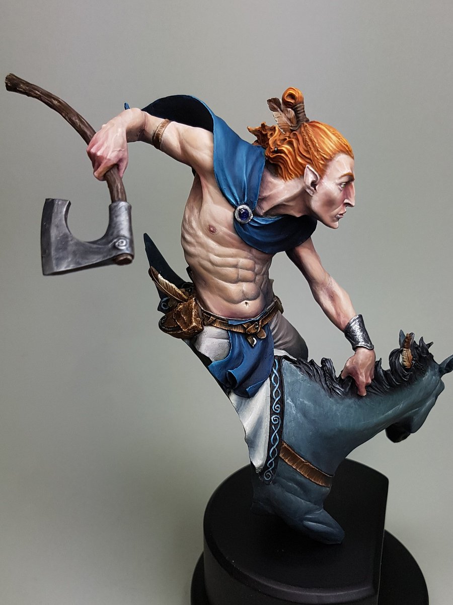
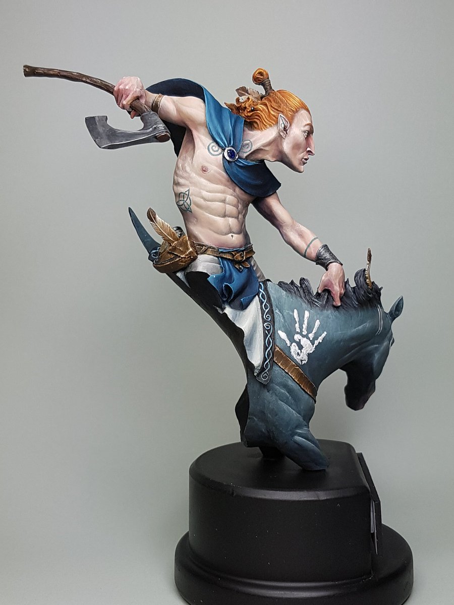
I've gushed about this sculpt a lot, and it is pretty divisive.  Some people have said they don't like it.  I think its one that really needs to be viewed in person, because the sheer dynamic nature of the model makes it hard to photograph.  I really wanted to do a great job on this model, so I didn't try and push any boundaries of techniques or ideas.  I stuck with what I felt good about and it came out quite well.  I think that when I don't push myself, I don't really create my best work.  I do not feel challenged and it is only when we are challenged that we grow.


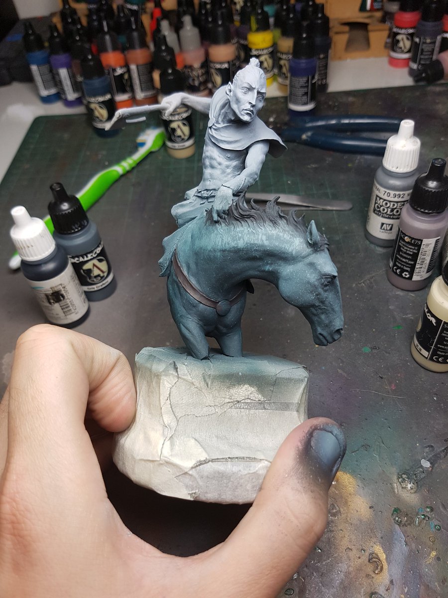
The first thing I did was obviously assemble and gap fill the model.  I also spent a lot of time choosing the right plinth.  I found that having the right shape and plinth size is really important.  The one I ended up with has worked out so perfectly, but in hindsight I may have got the facing of the model every so slightly wrong.  I think if it was turned slightly more to the right, it would have a bit nicer front on angle.  You'll see from my step by step photos the angle I preferred.


I started off with a grey undercoat over the top of the black.  I did some research on horses, and I wanted the model to have quite a cold colour scheme, from the mountains or in the snows.  I found a horse called a blue roan, which is apparently quite a rare patterning.  I tried to emulate this colour scheme, although I started off a little bluer than may have been optimal.


I used a toothbrush to scrape down some texture of fur on the upper areas.  The idea I was going to try and use was lots of thin glazes of colours over the top to try and retain a little of that texture coming through.  I added some cream and white and brought up the contrast, and also added some darker areas underneath the neck.  Looking back at what I did, I think I would add some splotches of colour at that early stage with the toothbrush, and use that glazing technique to show off those patches.


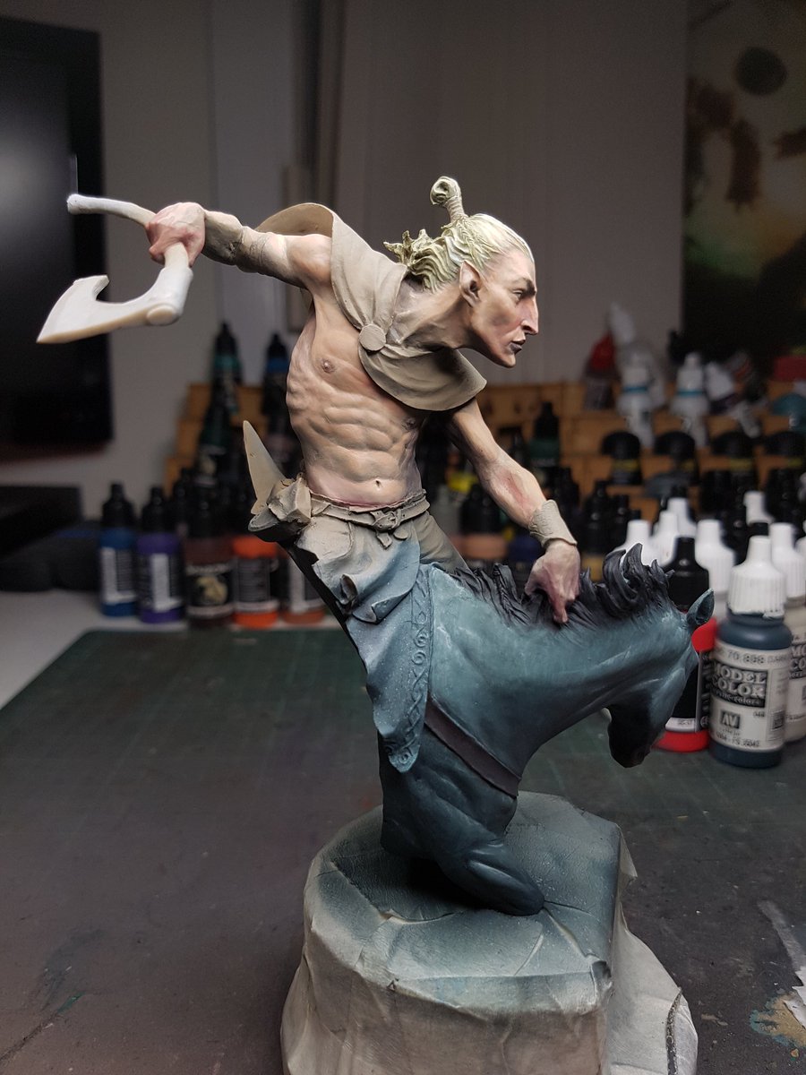
My next step was airbrushing in some desaturated skintones to start off the basic flesh.  I started with a colder colour again, trying to keep the atmosphere in mind.  A bit of black to fix up the hair of the mane.


I started adding some warmth to the skin, using purples, and reds.  I initially decided on a blond hair colour, and I added this on.  I immediately was not sure, because the whole model had a very pale appearance and it felt a little washed out.  I decided to keep going for the time being, and see how things progressed.


More warmth to the skintones.  I was trying to add a bit of colour in there as well, and also try and have the skin feel like it was cold.  I then painted in the other areas, to get a better idea of how much contrast the other areas would need.


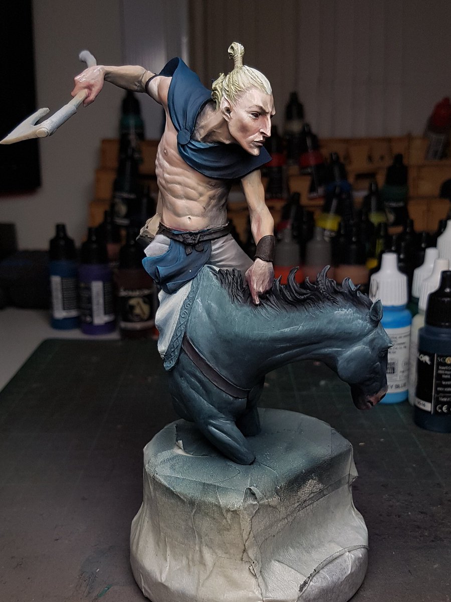
The skin felt like it needed a bit higher value, and higher contrast points.  I was enjoying the way the colours were all working, and the hair actually looked quite good with the other colours in there.  I added to the skin tone, and painted in the leathers on the belt.


I felt like the hair was working alright, but when I looked at the piece as a whole the focus was not driven up, because everything was all cold.  By changing the hair to red, it would make the head pop and everything else recede.  I decided to go for it, and in the end I think it was a positive move.


I kept working on the blue, adding more contrast and smoothing it out.  I painted the red hair with the highlights and made it quite bright.  Added the leather to the horse, and some grain on the wooden haft of the axe.


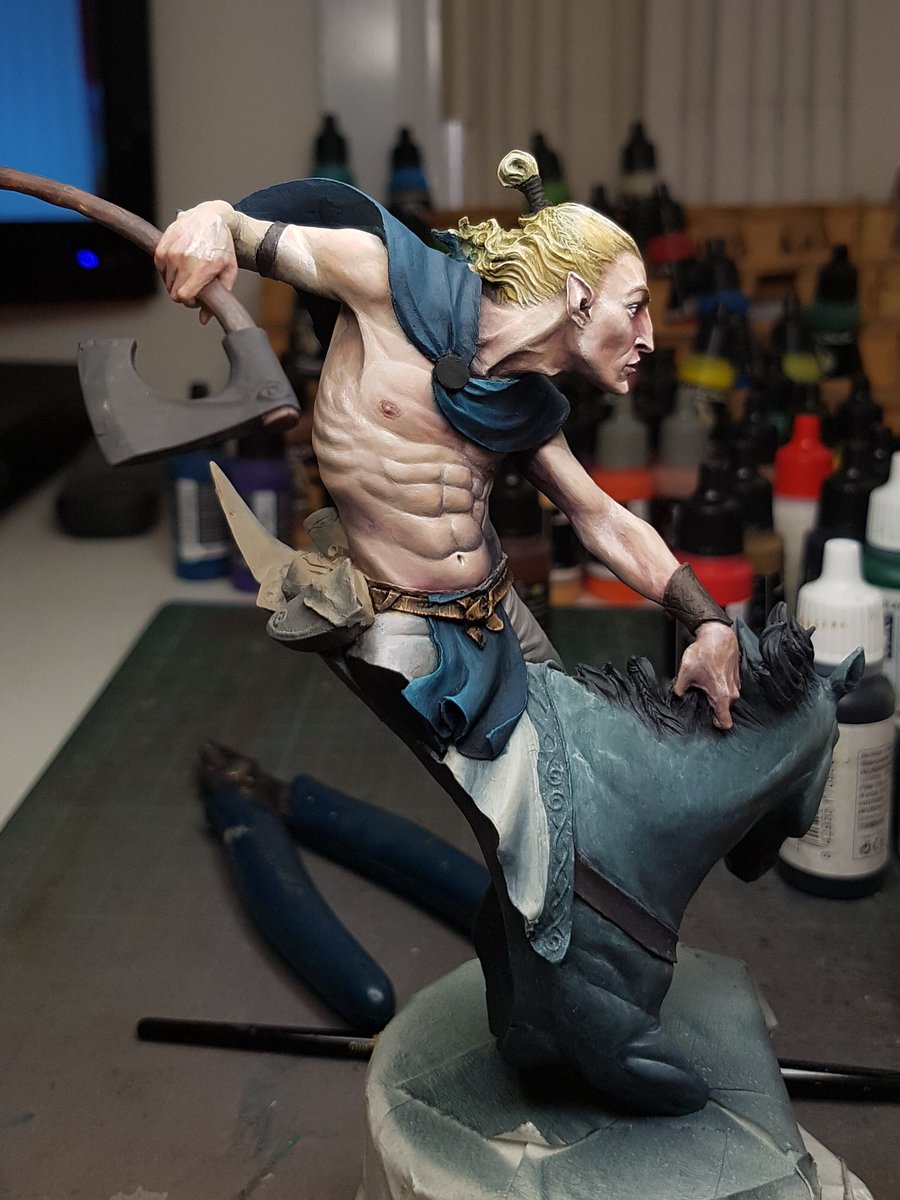
As things were starting to progress along now, I realised this would be a perfect time to start making changes to the model!  Not really, I had just been struck by inspiration, and had some perfectly sized feathers that I wanted to add to the model, and a jawbone.  I think they benefited the overall story and made him a bit more unique.


I was nearing the home stretch now.  Adding more colour, smoothing transitions, painting the little bits and pieces, sealing the model and painting the metallics, constantly evaluating the contrast and trying to make sure this model lived up to my expectations.


The last step was to paint on some warpaint, and tattoos.  I think the  biggest regret I have is not leaving the model off the plinth.  I really struggled with keeping the lines smooth and getting the detail stuff done because the model was so heavy and difficult to hold steady.  I used a bit of pigment and bicarb for the warpaint on the horse, and I liked this addition of some texture.


Now that he is all finished up, you can find more photos here: http://www.puttyandpaint.com/projects/13360


On the whole, this is a model that I think feels a little bit safe.  I didn't really push the boundaries of what I can do and although it is definitely one of the better things I've painted, I feel a little on the low side about it.  It doesn't have the same punch as some of the other pieces.  Maybe thats the desaturated colours, or the base plaque I did up being a little naff.  I just think I am capable of better, and I want to be making that happen.

I am going to be using less black and white and more colour in the next few pieces I work on.   


General Painting Update!

It has been a month since I last updated the bloggo.  So, this post is an update on what I have been up to in the last few weeks in terms of painting and general awesomeness.


A model I plan to do a little step by step on soon is the Elf Rider by Lucas Pina.  I have a lot of models that I love, but this one is very high on that list.  From the moment I got it, all my other projects got put on the back burner.  I am pretty stoked with how this came out, any honestly I could have done more to it, because the size of the model is simply so immense.  Instead I settled for some very basic freehand work and called it a day.  My arm was getting fatigued from holding such a huge model!


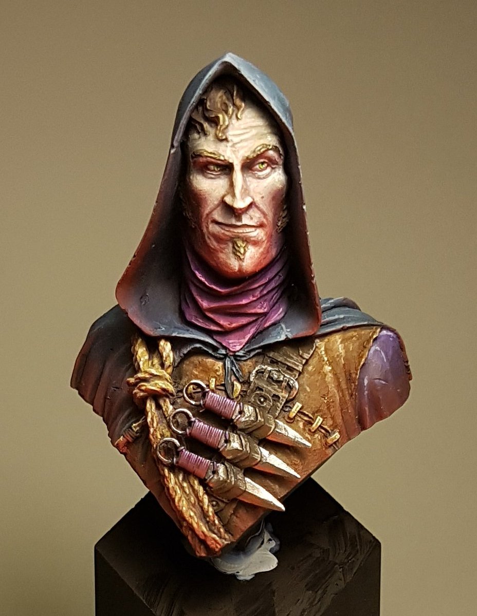
I was approached by Jay Martin of figurementors.com to see if I would be interested in writing an article on how I paint models.  I was very humbled that I was asked, I certainly dont consider myself a mentor as such, because I am still learning on every model that I paint.  Despite that I decided to go for it, as it is great exposure for my painting and anything that you can do that broadens your viewership is great.   I did have a few things that I wanted to touch on in the article, but the main focus was a few airbrush techniques.  I've finished the model, and the article, and it should be up on the site soon.  In the meantime, here is the model I painted for it:


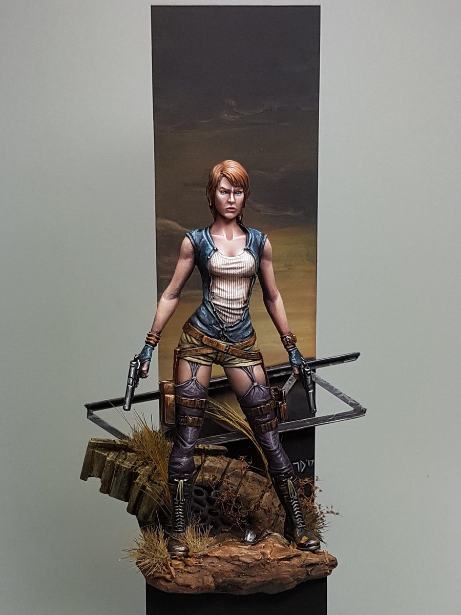
I had a bit off an odd request the other week from another Brisbane painter,Yianni.  He had been following my work for a while and wanted to watch how I paint in the flesh.  Again, another somewhat humbling experience.  He came over on the last week of my holidays for a few hours to watch me paint.  I had Alice from Black Veil models all assembled and ready to go, and since I did not have anything else ready to start yet I chucked some undercoat on her and hit it.  It was a fun experience, trying to explain why I was doing things, when often I do not really consciously make decisions about colours or techniques or whatever, I just paint.  Yianni asked a lot of great questions and made me evaluate the whole process I use and I think as a result it solidified some of the things I've learnt from Raffa, Meg and other sources and how I've integrated them into my own style.

I ended up spending 9 hours in total on Alice, and I think she is one of my best models.  She just feels like she works, and I got so many things right, contrast, texture and colour scheme.


And then I started working on a Conan model from Joaquin Palacios, where I decided to throw out everything I've been doing recently and paint in a totally different way.  I'll have some step by steps as well on him, because I think its been really interesting to try something new.  I don't know how the model will end up looking, but I am pretty happy with the fact that I've again tried to push my boundaries and limits.


That brings us up to date.  Next I will be doing my Elf Rider step by step, and starting off on the Conan one.

I am also planning a video soon showing how I paint, we will see how that goes.


Cheers
Trent

Saturday, 1 April 2017

Excelsy Step by Step


I have noticed a trend with a lot of the models I have painted recently, although its been unconscious. I have tended to stick heavily to blue and red as my core colours.  Whether it be confidence in painting them, or just the power of the colours, I seem to stick very closely to them.

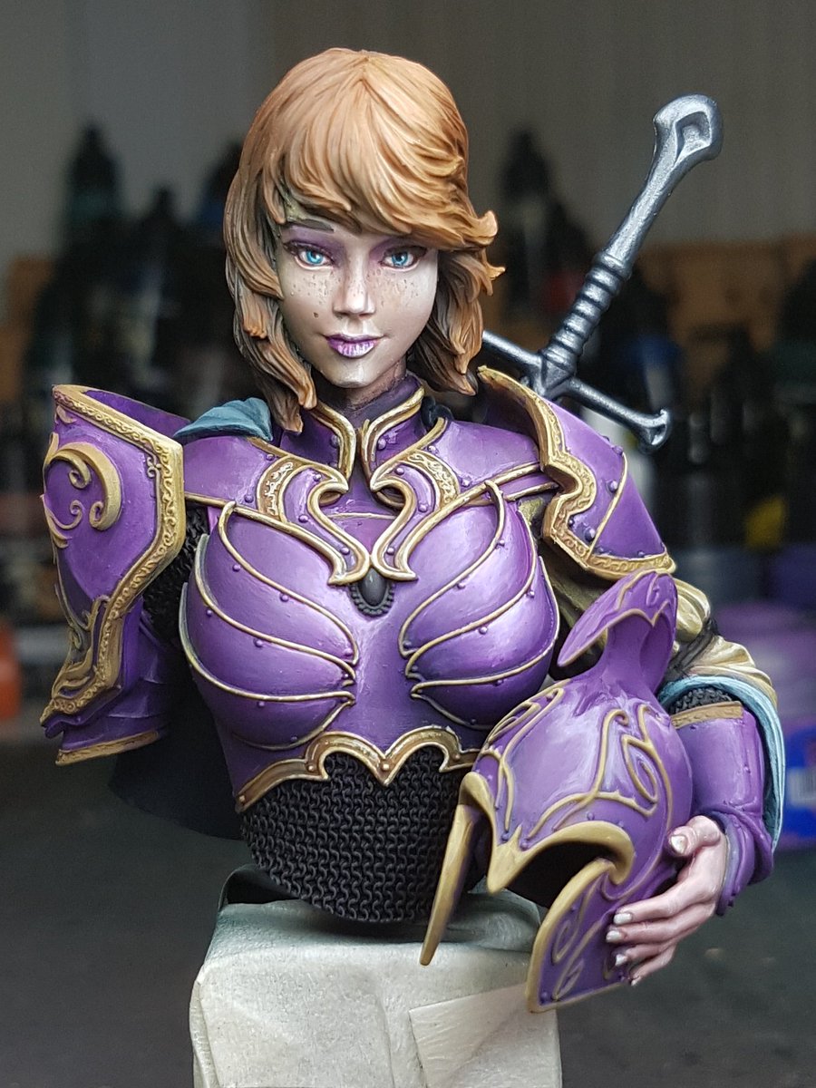
When I picked up this bust, I had no real vision for it outside of wanting her to feel like she was in an outside glade, with a greenish tint to her armour and hair.  As I progressed this idea faded away, as I chose a purple colour for the armour.  It certainly has been a challenging paint job and I think the end result is probably one of my best pieces so far.

Here is the step by step process I followed.


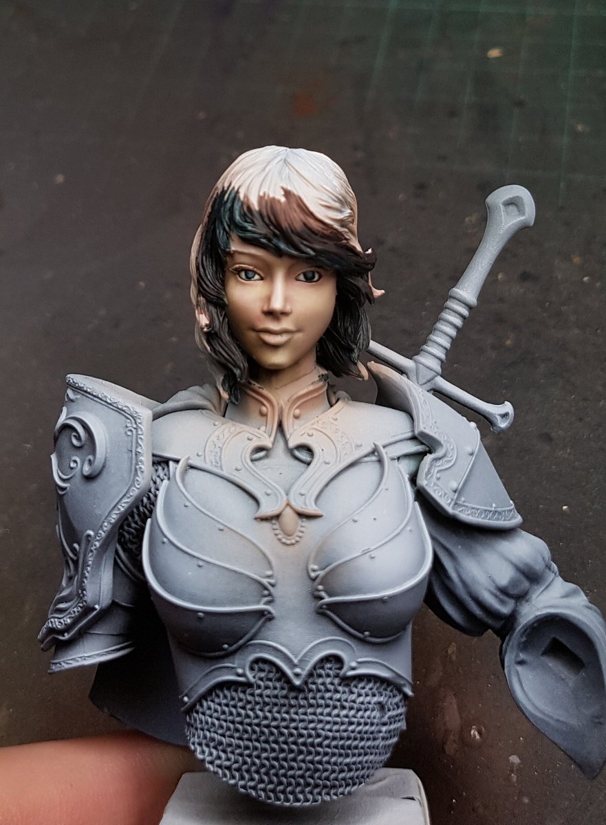
Firstly I airbrushed the base coat skin colour, then added some very simple shading.  I used green and a warm yellow for the basic highlighting.  


It can often be tricky to see exactly how well the contrast is going when the rest of the model is still a quite bright value.  I painted the hair to get a better idea of the face.  I added more contrast, painted in the eyes, and lips started.  I was pretty happy at this stage with the face, so I began working on the hair.


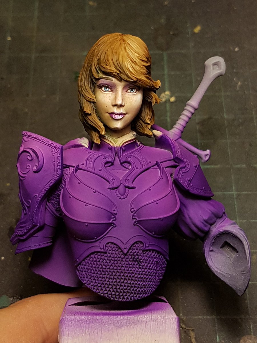
After bringing the hair up a few stages, I put a few touches more into the face, and then decided to go balls deep on some freckles, and a bit of eyeshadow.  I then airbrushed the armour purple.  I put a little bit of shading into the airbrushing but not a lot.  I wanted to use the brush for most of the contrast and highlighting work.


After I finished up with the airbrush, I filled in the other colours. I used white mixed in with purple to figure out were I wanted the high points of light.  I then painted in the yellow areas, which I never intended to be NMM.  I've never painted it before and I am not really sure of how to do it.


I smoothed out some of the purple,and began adding the highlights to the yellow areas, and painted in the black.  Now that the whole figure was painted, I could see that there was some issues with the purple being too powerful and distracting from the focal point of the face.


I tried to darken the purple with a little bit of dark blue.  I decided to attach the other arm and paint it alongside the rest of it. You can see the purple how it starts vs the shaded and highlighted areas.


I put more work into the yellow gold areas, and fixed up the helmet, painted the cloak.  I did the metallic areas and her hand.  She is starting to look pretty good!


Painted the gemstone, the rest of the metallics, and added some more highlighting to the yellow.


I deepened the shadows on the purples, put some more white highlights in the yellow areas.  The final few touches were adding some scratches to the armour, as it was looking a little too clean.  I darkened the metallics.


I painted the grip of the sword, a few little touchups here and there, and then I called her done!


I have to say that I think this is my best model to date.  I unfortunately realised about halfway through that I painted her to look identical to the 3rd version that Marc Masclans painted, and his shits all over mine.  But I do not feel embarrassed putting mine up beside it, which I think is an achievement!


Next model I will paint will be a full figure, as I've done quite a few busts recently.  


Sunday, 26 March 2017

Meg Maples Intermediate Class

I recently attended another painting class run by Meg Maples.  The focus of the class was on more advanced theory and techniques, and there was a projector where a number of slides were presented and we discussed a lot of colour theory and concepts.

We were each given a bust, Romero the Cat, sculpted by Raffaele Picca.  You can purchase it here from FER Miniatures: Romero!


The idea with the bust was we had to consider the environment and atmosphere that our chap would be found in.  Having already done a class with Raffa, talked with Meg and read a lot of articles about this type of considered painting, I already had planned out in my head how I would paint Romero.  I wanted him standing over a pit of lava, basically wondering to himself how he got into this situation.


I started with a very simple basecoat from the top right with a grey colour, and then I simply airbrushed bright red from underneath.  That gave me my basic sort of colour ideas.

From this I glazed a lot of colours over this, blue for the cloak, skin on the face, brown on the leather armour and so on.  These were thin layers, allowing the translucency to come through from the layers of airbrushing.  Next step was creating more contrast, so I considered the dark moonlight above, and used cool colours for the highlights on top, and then warmer colours for the highlights below.  I took the face up very high, almost to pure white.  Again, these were glazes, but I did use a bit more opaque colour towards the highest points.

Once I had established the basic colours and framework, I went back with the airbrush and sprayed another layer of that red, although a lot thinner.  Just to reestablish the colour and atmosphere.  I considered adding a bit of orange, but I didn't want it to feel like torchlight, or a warm sort of colour.  I wanted like a cold red, like the darkness of lava with the black edges.


All up, I spent just over 4 hours on him.  He was a pretty simple paint, the model has real quality and easy textures and surfaces to paint.  His face is absolutely filled to the brim with character.


More photos here:

http://www.puttyandpaint.com/projects/12938


Highly recommend attending one of these classes with Meg.  Very informative and really challenges how you consider colour choices and theory.  A lot of people as I looked around the room were really having a lot of ahah moments.

I tried to help out the other students with my spare time, and in a lot of ways I got as much out of this as I did about the class.


You can find out more about her classes on her website:

http://www.arcanepaintworks.com