Sunday, 7 May 2017

General Painting Update!

It has been a month since I last updated the bloggo.  So, this post is an update on what I have been up to in the last few weeks in terms of painting and general awesomeness.


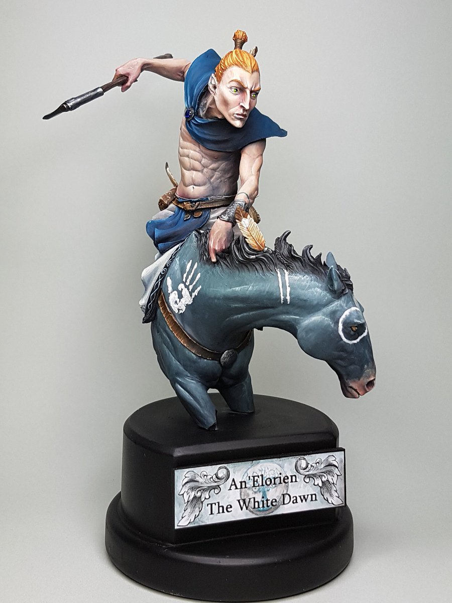
A model I plan to do a little step by step on soon is the Elf Rider by Lucas Pina.  I have a lot of models that I love, but this one is very high on that list.  From the moment I got it, all my other projects got put on the back burner.  I am pretty stoked with how this came out, any honestly I could have done more to it, because the size of the model is simply so immense.  Instead I settled for some very basic freehand work and called it a day.  My arm was getting fatigued from holding such a huge model!

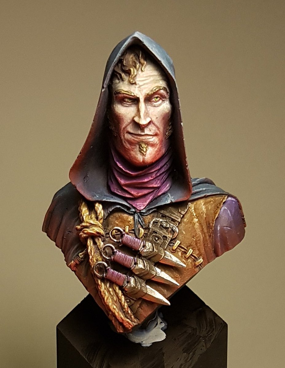
I was approached by Jay Martin of figurementors.com to see if I would be interested in writing an article on how I paint models.  I was very humbled that I was asked, I certainly dont consider myself a mentor as such, because I am still learning on every model that I paint.  Despite that I decided to go for it, as it is great exposure for my painting and anything that you can do that broadens your viewership is great.   I did have a few things that I wanted to touch on in the article, but the main focus was a few airbrush techniques.  I've finished the model, and the article, and it should be up on the site soon.  In the meantime, here is the model I painted for it:


I had a bit off an odd request the other week from another Brisbane painter,Yianni.  He had been following my work for a while and wanted to watch how I paint in the flesh.  Again, another somewhat humbling experience.  He came over on the last week of my holidays for a few hours to watch me paint.  I had Alice from Black Veil models all assembled and ready to go, and since I did not have anything else ready to start yet I chucked some undercoat on her and hit it.  It was a fun experience, trying to explain why I was doing things, when often I do not really consciously make decisions about colours or techniques or whatever, I just paint.  Yianni asked a lot of great questions and made me evaluate the whole process I use and I think as a result it solidified some of the things I've learnt from Raffa, Meg and other sources and how I've integrated them into my own style.

I ended up spending 9 hours in total on Alice, and I think she is one of my best models.  She just feels like she works, and I got so many things right, contrast, texture and colour scheme.
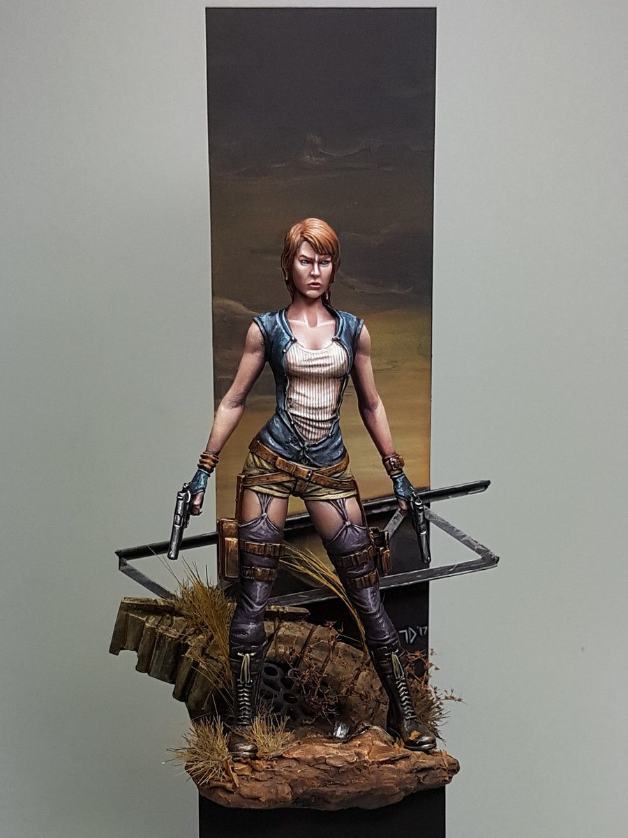


And then I started working on a Conan model from Joaquin Palacios, where I decided to throw out everything I've been doing recently and paint in a totally different way.  I'll have some step by steps as well on him, because I think its been really interesting to try something new.  I don't know how the model will end up looking, but I am pretty happy with the fact that I've again tried to push my boundaries and limits.


That brings us up to date.  Next I will be doing my Elf Rider step by step, and starting off on the Conan one.

I am also planning a video soon showing how I paint, we will see how that goes.


Cheers
Trent

Saturday, 1 April 2017

Excelsy Step by Step


I have noticed a trend with a lot of the models I have painted recently, although its been unconscious. I have tended to stick heavily to blue and red as my core colours.  Whether it be confidence in painting them, or just the power of the colours, I seem to stick very closely to them.

When I picked up this bust, I had no real vision for it outside of wanting her to feel like she was in an outside glade, with a greenish tint to her armour and hair.  As I progressed this idea faded away, as I chose a purple colour for the armour.  It certainly has been a challenging paint job and I think the end result is probably one of my best pieces so far.

Here is the step by step process I followed.


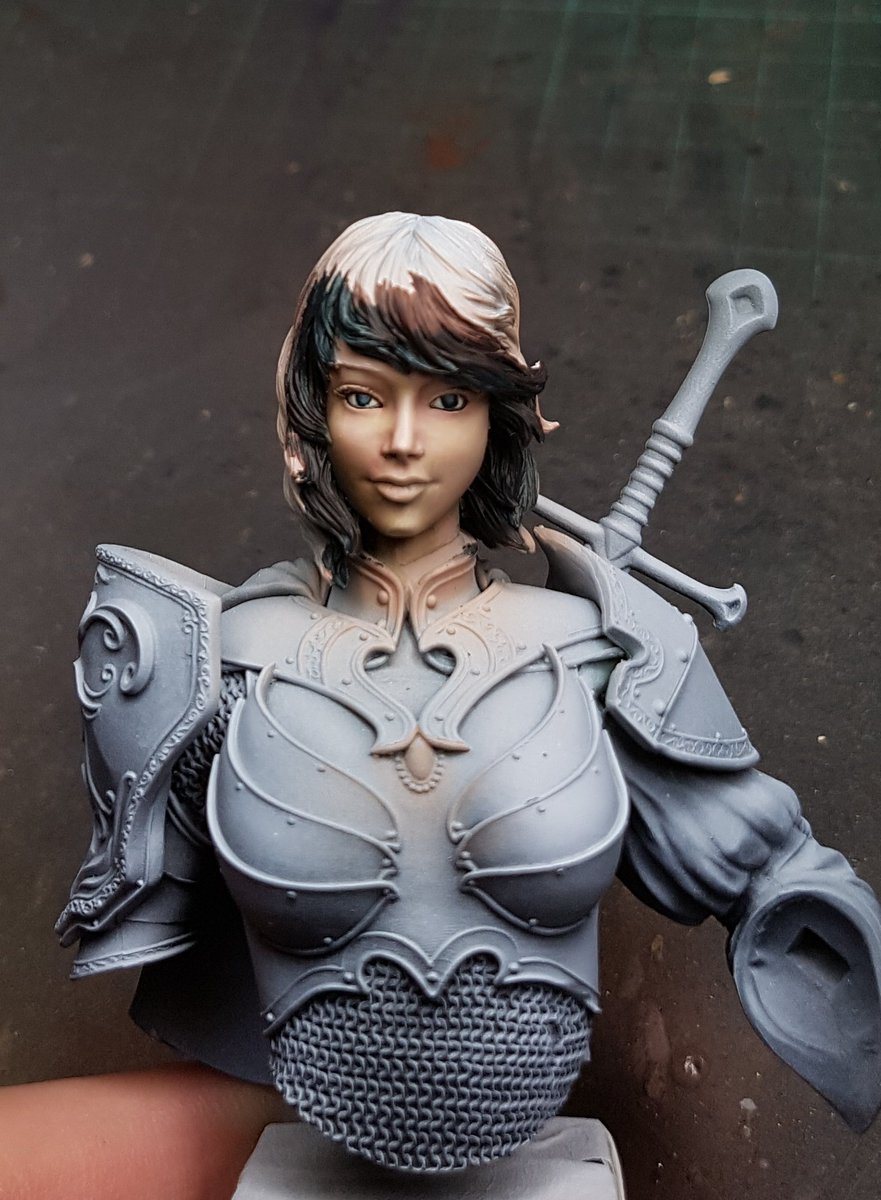
Firstly I airbrushed the base coat skin colour, then added some very simple shading.  I used green and a warm yellow for the basic highlighting.  


It can often be tricky to see exactly how well the contrast is going when the rest of the model is still a quite bright value.  I painted the hair to get a better idea of the face.  I added more contrast, painted in the eyes, and lips started.  I was pretty happy at this stage with the face, so I began working on the hair.


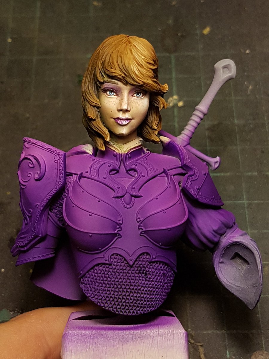
After bringing the hair up a few stages, I put a few touches more into the face, and then decided to go balls deep on some freckles, and a bit of eyeshadow.  I then airbrushed the armour purple.  I put a little bit of shading into the airbrushing but not a lot.  I wanted to use the brush for most of the contrast and highlighting work.


After I finished up with the airbrush, I filled in the other colours. I used white mixed in with purple to figure out were I wanted the high points of light.  I then painted in the yellow areas, which I never intended to be NMM.  I've never painted it before and I am not really sure of how to do it.


I smoothed out some of the purple,and began adding the highlights to the yellow areas, and painted in the black.  Now that the whole figure was painted, I could see that there was some issues with the purple being too powerful and distracting from the focal point of the face.


I tried to darken the purple with a little bit of dark blue.  I decided to attach the other arm and paint it alongside the rest of it. You can see the purple how it starts vs the shaded and highlighted areas.


I put more work into the yellow gold areas, and fixed up the helmet, painted the cloak.  I did the metallic areas and her hand.  She is starting to look pretty good!


Painted the gemstone, the rest of the metallics, and added some more highlighting to the yellow.


I deepened the shadows on the purples, put some more white highlights in the yellow areas.  The final few touches were adding some scratches to the armour, as it was looking a little too clean.  I darkened the metallics.


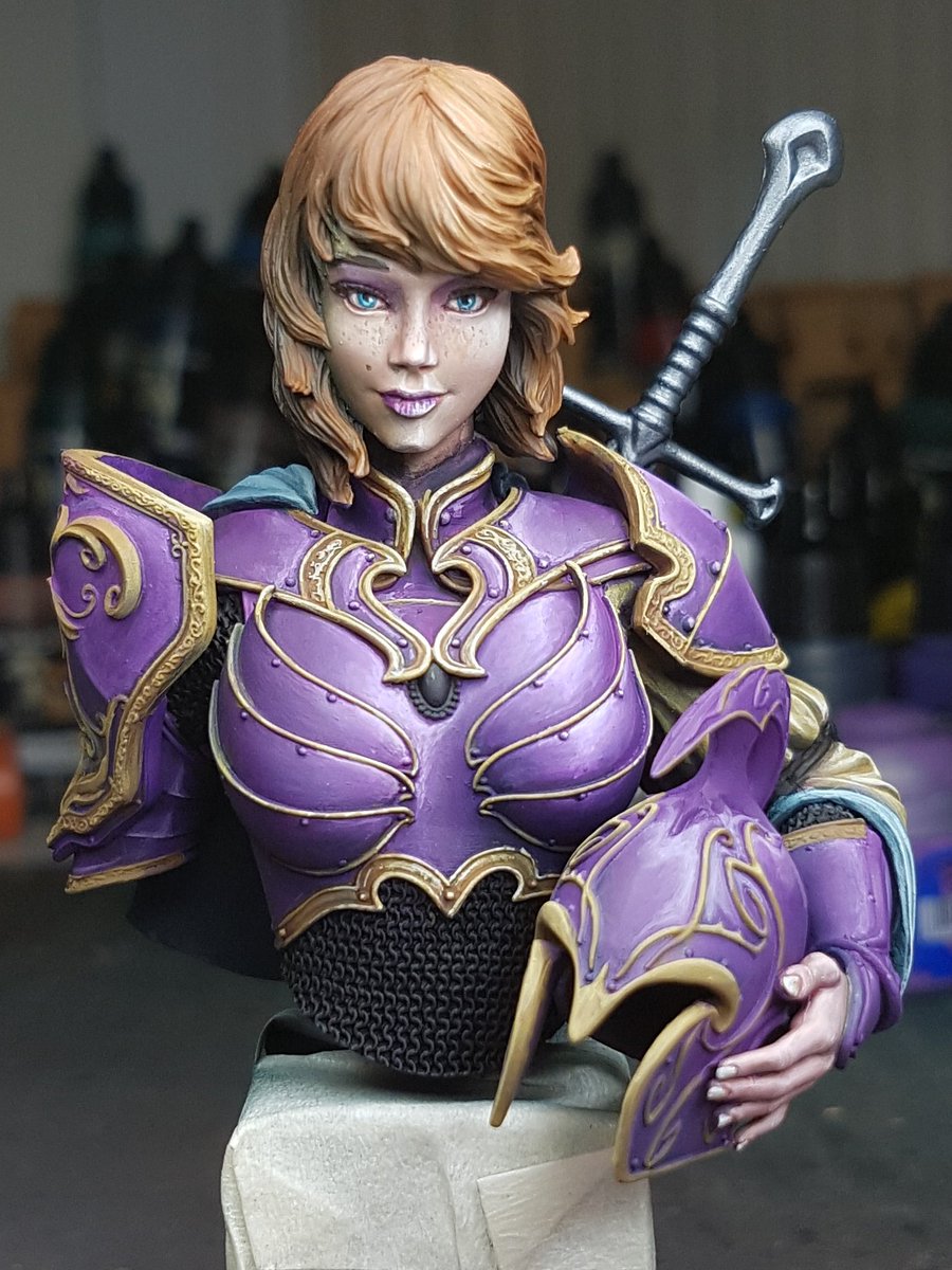
I painted the grip of the sword, a few little touchups here and there, and then I called her done!


I have to say that I think this is my best model to date.  I unfortunately realised about halfway through that I painted her to look identical to the 3rd version that Marc Masclans painted, and his shits all over mine.  But I do not feel embarrassed putting mine up beside it, which I think is an achievement!


Next model I will paint will be a full figure, as I've done quite a few busts recently.  


Sunday, 26 March 2017

Meg Maples Intermediate Class

I recently attended another painting class run by Meg Maples.  The focus of the class was on more advanced theory and techniques, and there was a projector where a number of slides were presented and we discussed a lot of colour theory and concepts.

We were each given a bust, Romero the Cat, sculpted by Raffaele Picca.  You can purchase it here from FER Miniatures: Romero!


The idea with the bust was we had to consider the environment and atmosphere that our chap would be found in.  Having already done a class with Raffa, talked with Meg and read a lot of articles about this type of considered painting, I already had planned out in my head how I would paint Romero.  I wanted him standing over a pit of lava, basically wondering to himself how he got into this situation.


I started with a very simple basecoat from the top right with a grey colour, and then I simply airbrushed bright red from underneath.  That gave me my basic sort of colour ideas.

From this I glazed a lot of colours over this, blue for the cloak, skin on the face, brown on the leather armour and so on.  These were thin layers, allowing the translucency to come through from the layers of airbrushing.  Next step was creating more contrast, so I considered the dark moonlight above, and used cool colours for the highlights on top, and then warmer colours for the highlights below.  I took the face up very high, almost to pure white.  Again, these were glazes, but I did use a bit more opaque colour towards the highest points.

Once I had established the basic colours and framework, I went back with the airbrush and sprayed another layer of that red, although a lot thinner.  Just to reestablish the colour and atmosphere.  I considered adding a bit of orange, but I didn't want it to feel like torchlight, or a warm sort of colour.  I wanted like a cold red, like the darkness of lava with the black edges.


All up, I spent just over 4 hours on him.  He was a pretty simple paint, the model has real quality and easy textures and surfaces to paint.  His face is absolutely filled to the brim with character.


More photos here:

http://www.puttyandpaint.com/projects/12938


Highly recommend attending one of these classes with Meg.  Very informative and really challenges how you consider colour choices and theory.  A lot of people as I looked around the room were really having a lot of ahah moments.

I tried to help out the other students with my spare time, and in a lot of ways I got as much out of this as I did about the class.


You can find out more about her classes on her website:

http://www.arcanepaintworks.com

Sunday, 12 March 2017

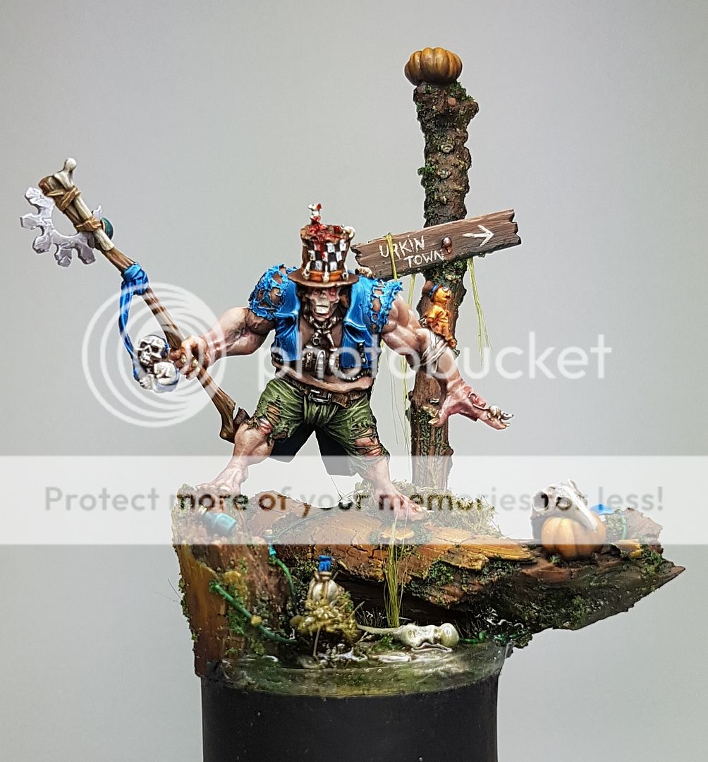
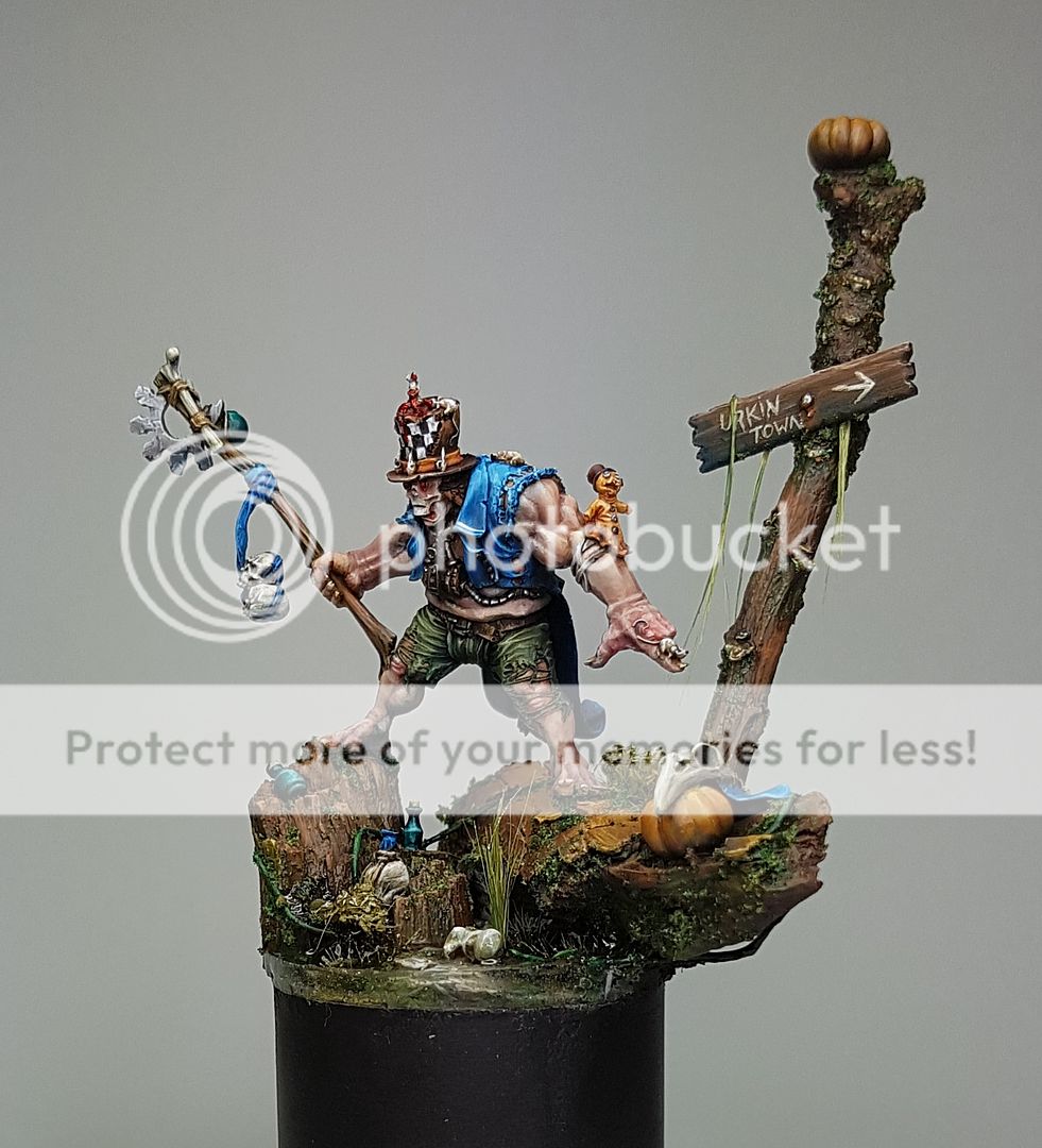
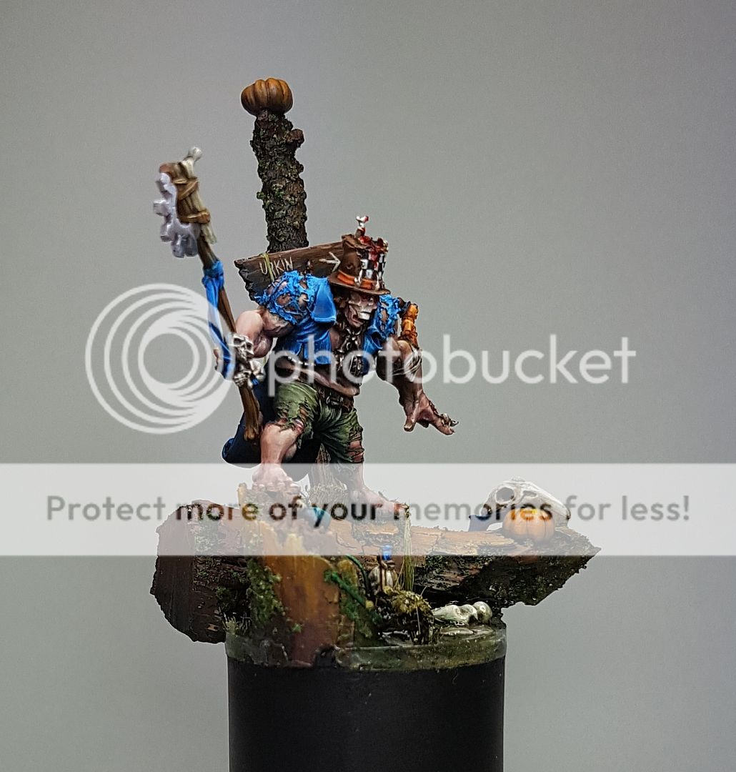
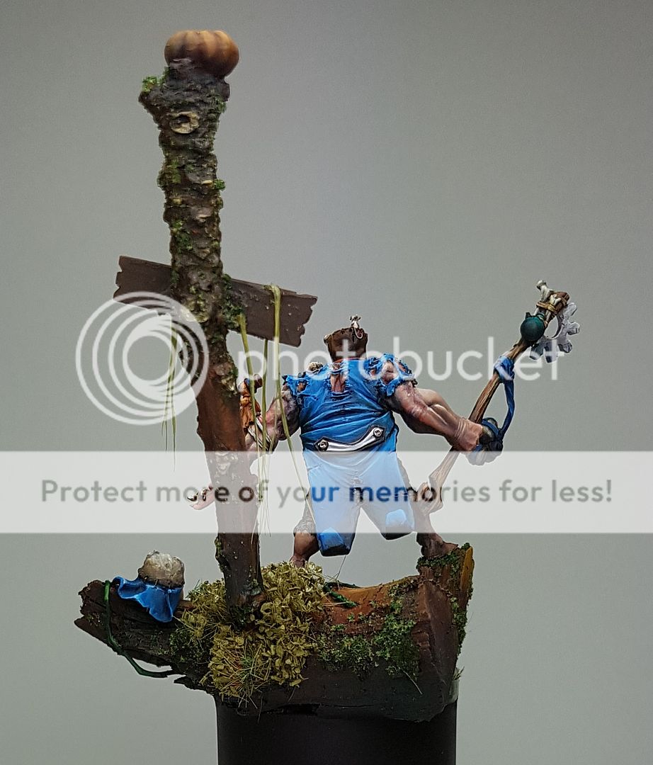
Urkin Bloodrage Shaman, Finished!


Took some feedback from a few other great painters on board, and here is the finished model.


You can see more photos and vote for this guy on Putty and Paint:

http://www.puttyandpaint.com/projects/12737


And he is also for sale, along with all of my other pieces:

http://bigdenopaints.blogspot.com.au/p/models-for-sale.html

Saturday, 11 March 2017

Twisted Urkin Bloodrage Shaman, Part 2


After sleeping on the look of the tree, I came to the conclusion that it was ruining the impact of the model, and changing the dynamic of the piece.

However, it was really important that the piece have some height.  One of the really interesting things that I learnt from Meg at Crystal Dragon earlier this year was the discussion on plinths.  I've never really considered them too much, I just try a few out until one feels right.  Meg basically said that if you measure the top of the model all the way down to the bottom of the plinth, roughly the centre point is where the focus should be.  A larger plinth will often draw the focus down towards the feet of a model instead of the actual point it needs to be at.  By removing the tree, I dropped that focus point to the water at the base.


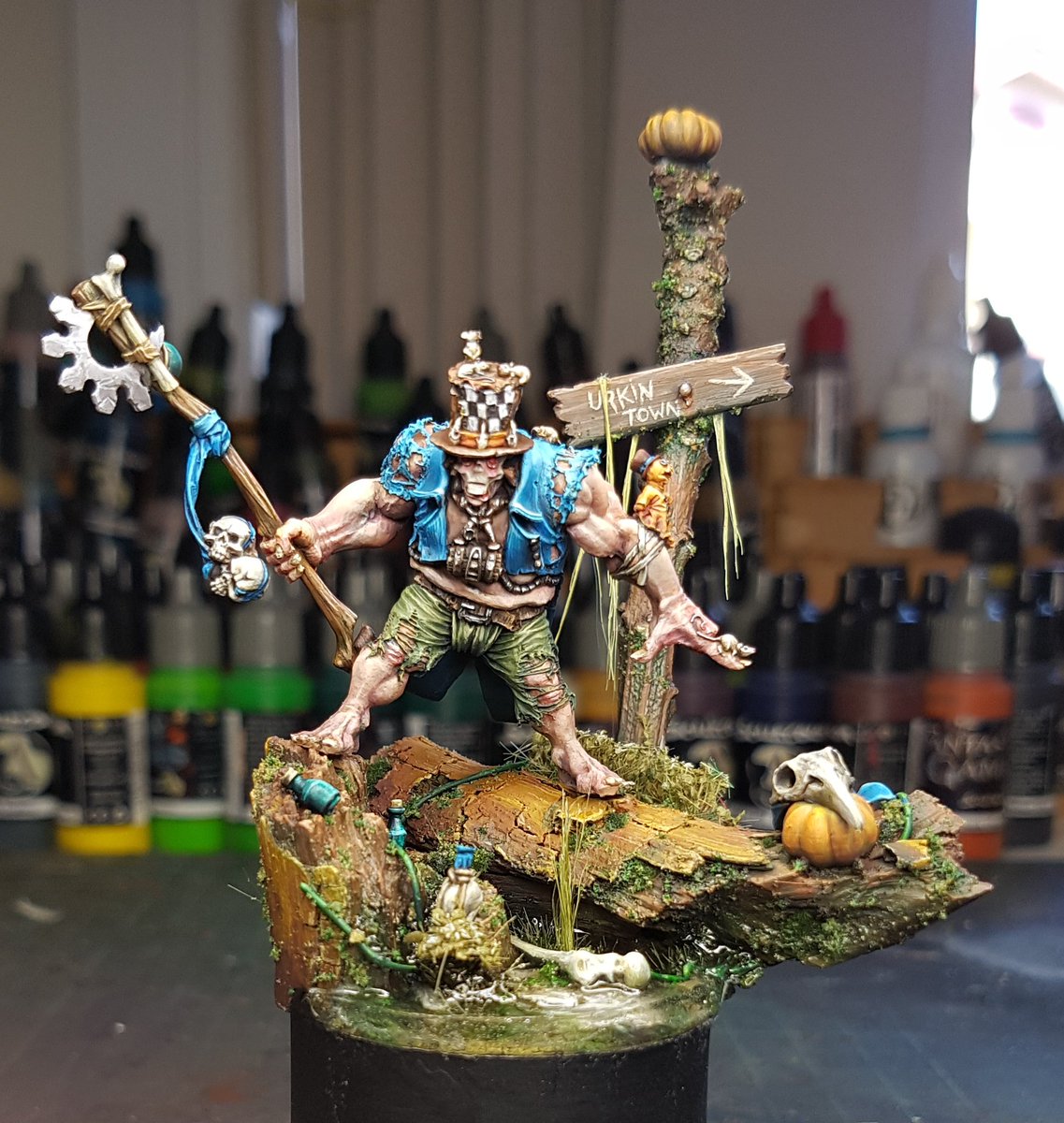
I threw it out to Twitter and asked for suggestions, and there was a great suggestion of a signpost from @Megagribix, and I immediately had inspiration.  I carved it out of plasticard, attached it to an interesting twig, and stuck it down.  I plopped a pumpkin up there as well.  Really happy with the aesthetic of the piece.


I started by airbrushing some brown to the tree, and started highlighting up through the brown and orange tones.  The next step which really brought it to life was adding some shading with green, particularly focused on rivulet type areas where the water would run down.  I painted little bottles and bits and bobs, then spent a bit more time adding some moss and green tones to the base.  Added more flocking and got it all to a stage I was happy with.


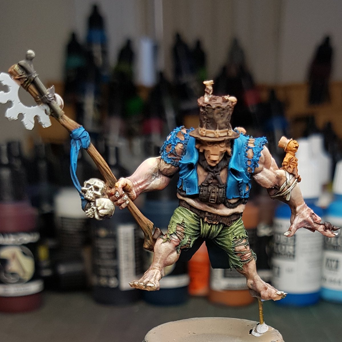
I went back to working on the dude.  There is a lot of detail on the model, and getting the right balance of colours, contrast and focus points was not easy.  Naturally your eye is drawn to a models face but this one has no real easy facial details to focus on.  So it made it more difficult.  I had to try and really up the contrast around the head area to draw the attention there.


You can see I am really trying to balance the colours, trying to keep in mind the rule of three, where a colour has an appearance on a model three times, in a roughly triangular shape on the model.  Focus on dragging that attention up.  Things really started working when I added the orange bit to the hat, and then added the bone coloured areas.  The face wasn't really popping enough, but it was ok.


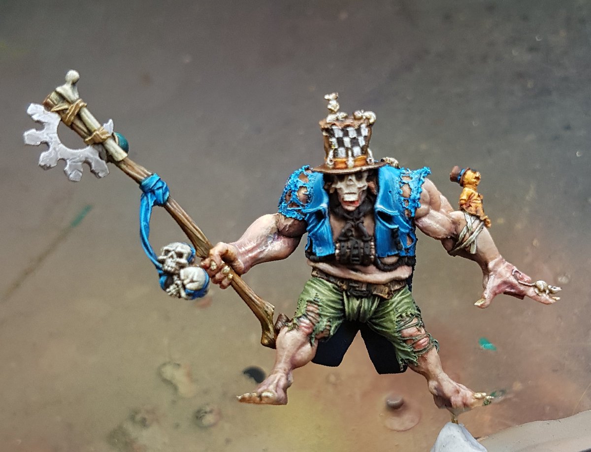
I tried this patterned idea on the front of the hat, again in an effort to draw attention, but after looking at it I really didn't like it.  Made him look more circus like than voodoo sort of theme.


I switched back to black and white, and tried a chequered pattern and this really worked well.  I painted the mice, and started all the various little bits and pieces.


I was happy with how everything was looking, so I varnished it, painted the metallic sections, and then glued it to the base. 


Looking at it now I want to add some gloss varnish to the eyes, and add some blood around the mice.  A bit of gore I think will work nicely there.  Overall I think the model looks pretty good, but there is not enough contrast between the focus points and the lower areas.  There isn't enough real texturing on it to bring it to life.  I think I've also got a habit of using too much dark in my shading, and it creates an unrealistic cartoon sort of look.  


I will do those last touchups and additions and I will take some studio shots!