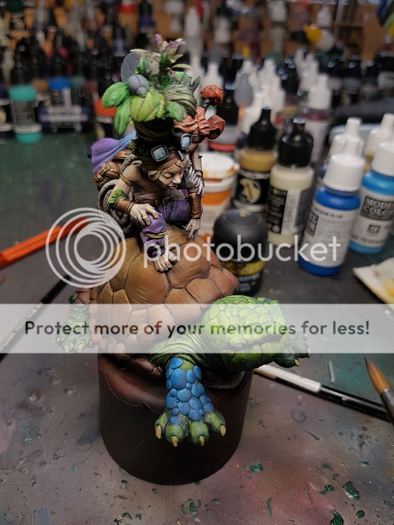
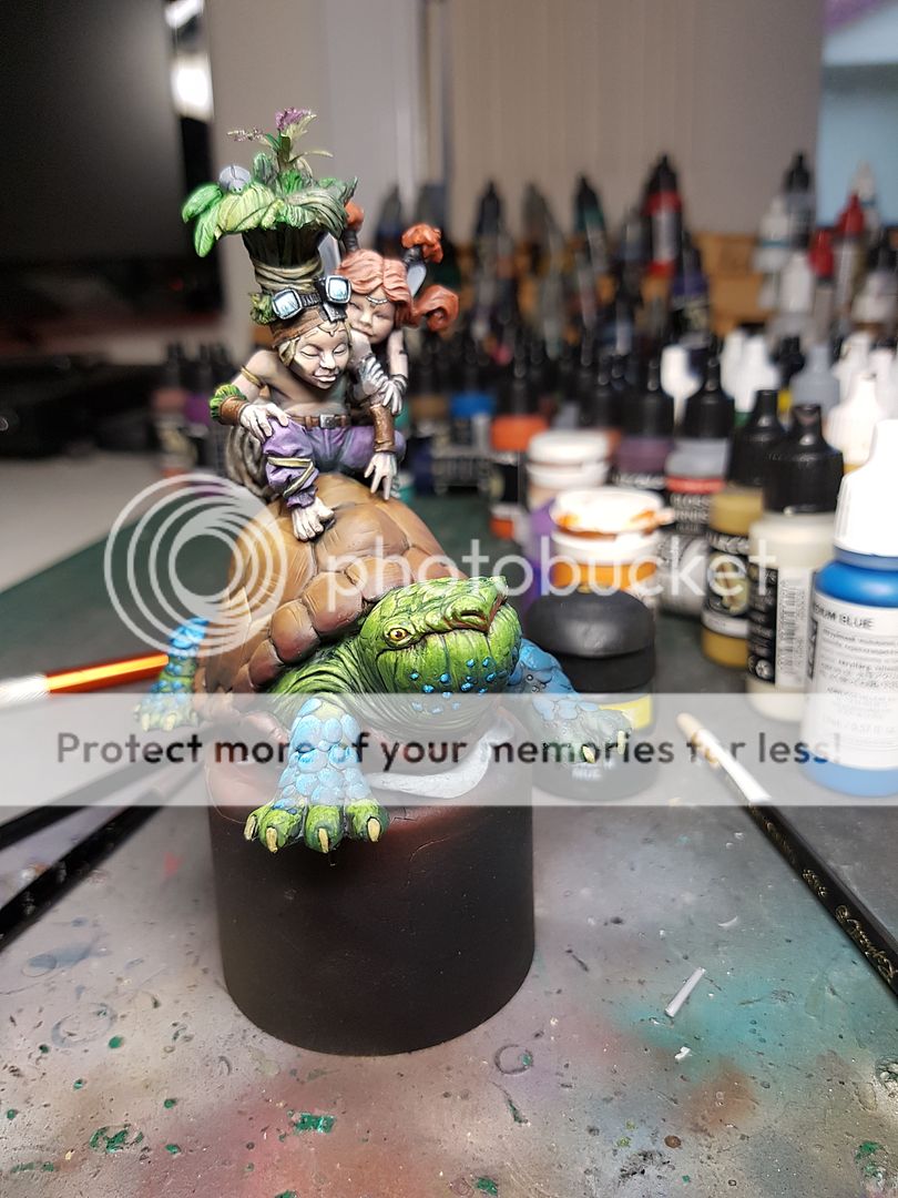
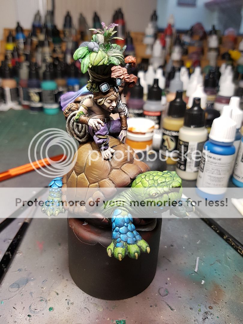
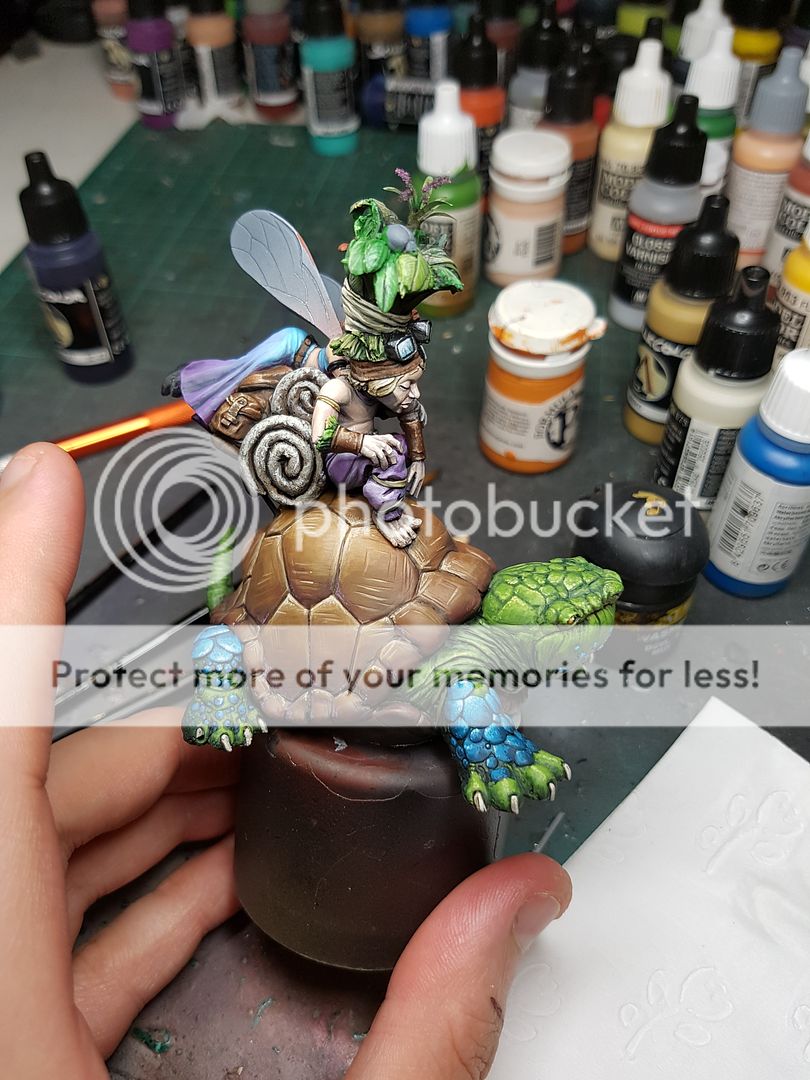
The challenge of painting Surt continues, with the difficulty of painting with no black ramping up now that I am painting metallics.
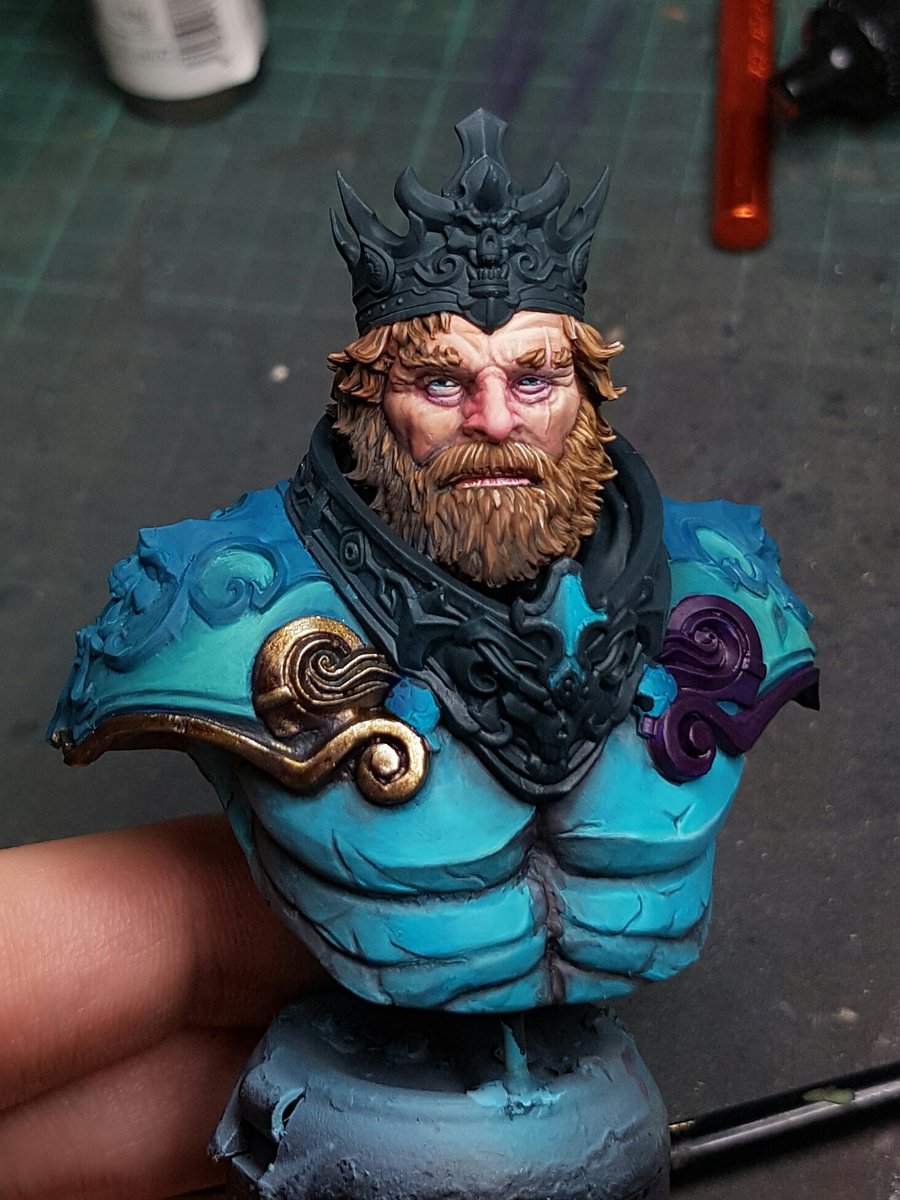
The next stage I did was airbrush some bluer tones on his top shoulder pads. I started painting but I quickly realised it was looking terrible, so I shifted it back towards the Blue Green, but this time I shaded with only Dark Sea Blue, and I added in some Inktense Green from Scale 75. I highlighted with Ice Yellow, and gave it a few airbrush glazes to soften things out. I think that whole area, and in fact colour needs tweaking, but I want to get a sense of what the "completed" model will look like, so I am trying to get the rest of the model colours painted so I can have a visual reference to go off.
Anyway, I decided to paint some gold trim on his shoulder pads... I had to basecoat in Royal Purple, as painting over black was obviously not an option!
I mixed Dark Sea Blue with a colour called Regency Gold from some company I cannot remember. Darkstar maybe? Anyway, its a desaturated base tone that doesn't glitter as much as the full metallic. I went Regency straight next, then mixed in some Renaissance Gold from the same company, and then up to VMA Steel. I washed and shaded with Inktense Chestnut, Dark Sea Blue, Royal Purple and Inktense Violet.
Metallics has never been a strong point of mine, but I've always found gold much much easier. I think I am going to mostly stick to silvers for the rest of the model, but I thought the gold trim might look good there. Will be interesting to see the balance of that once I've painted some silver areas.
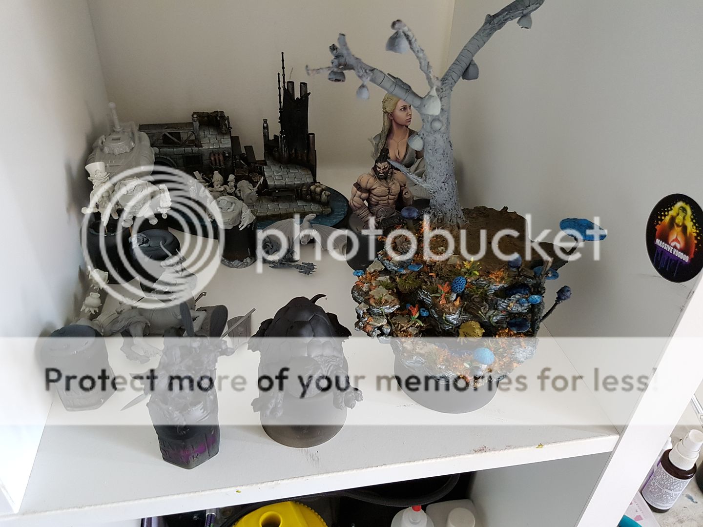
I also had been thinking about last nights blog post whree I started imagining this guy, and creating a little story in my head. I have been finding myself excited about adding little base elements onto the busts I've been painting, something I've not seen done a lot elsewhere. I feel like it adds a little story to what is happening with the bust, and just makes for a bit of interest on what can be a little boring.
Admittedly, it can detract from the model, when its too overpowering, much like the Enchanted Pool base became. So this idea I ran with for a concept, but now that I look at it I wonder if it might not be better as a base for an actual miniature?
I don't want to do much else, sculpt a little bedrock, add some sea weed, underwater foliage and maybe a little fish, keep the colours very sandy, hints of orange to offset the blue in the model, but keep it quite dull, and then the nice clear water from the resin, a little name plate in front. I think it could look great! Could also look shithouse. Thoughts?
Friday, 30 December 2016
Thursday, 29 December 2016
Surt, Scale 75, Part 1
Now that I am back to regular painting and updating, I feel almost liberated.
Yesterday was a down day, disappointed in the completion of a project. Today, today was a new day, filled with new painting opportunities. I had not really spent much time painting a piece in the style and with the techniques I had learnt from Raffa.
I pulled out my collection of busts, and decided to get cracking.on Surt. I sort of forgot I had the guy to be honest, but when I looked at what I wanted to try, he had great facial texture, a nice beard and hair, and some areas I could practice my weakness of metallics, either TMM or to give the NMM a go.
I set myself several goals for this piece:
1. No pure black, or pure white, anywhere on the model. I've been really struggling with contrast and making things look natural. I think the biggest issue is black, and how I use it.
2. No black undercoat.
3. Avoid using washes unless absolutely necessary.
4. Airbrush and OPAQUE basecoat, and then use it for glazing colours and varnish.
5. Try to take what I learnt from Raffa and put it into my own techniques.
So with those goals in mind, I sprayed Surt with Vallejo Grey Primer, and let it dry.
The first colour I airbrushed was Beige Red, on his skin. The basecoat I did was fully opaque, no black areas or areas of washed out colour. I immediately noticed a difference to my normal airbrushing over the black how much more vibrant the colour looked. I then switched over to the brush, and used Basic Skintone to block in highlights, very harsh, and then mixed in some Pale Sand.
I glazed in Red Leather, then Armour Brown, Royal Purple, Flat Green and Dark Sea Blue, all in various mixes and across the model, keeping in mind the light source which I have pegged as slightly top right.
Once I had a pretty harsh highlight/ shading piece, I glazed colours back in to soften the transitions, and then added a bit of Flat Red onto the nose, and highlighted with Pale Flesh.
The next step is a big one, I mixed in a bit of Basic Skintone and Pale Sand along with some Matt Varnish into the airbrush, heavily diluted, maybe 10 parts thinner (my magic mix) and 1 part paint, 2 parts varnish. The purpose is to soften transitions, but this will also bring the contrast down. You need to do maybe six or eight passes over the area, with really thin layers, waiting for each layer to properly dry before the next.
To explain further, imagine you have painted contrast from 1 being darkest, to 10 being lightest. Using this glazing technique, you will create smoother blends, but it also will reduce the 10 to an 8, and bring the 1 back up to a 3. The trick is to go back in and add more depth again, and put those spots of brightness in there.
You can use this technique over and over on an area, softening transitions, slowly adding more contrast and keeping everything harmonious. The Matt Varnish is my addition, purely to help the layers also transition, keep the really thin layers of airbrush on the model, and seal work you've already done. Here is this technique used for the first time on this model.
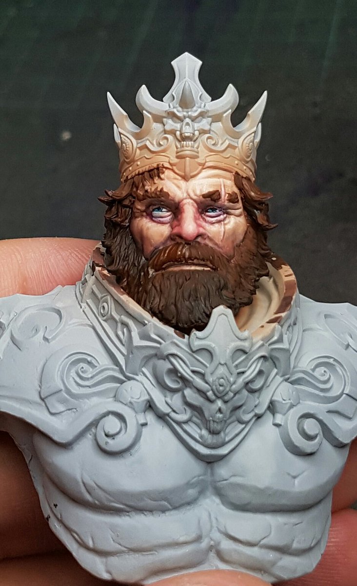
And then here it is the second time, at which point I've painted eyes, and wet blended the hair together. (Dark Sea Blue, Scale75 Brown Leather, Pale Sand)
One area that I struggled with on Mannaz during the class was fur, and this model has hair similar to fur, so I wanted to retry the technique and see how it would go once I understood all aspects of it. Here I used Scale 75 Cokum Copper, Pale Sand, Brown Leather and Dark Sea Blue in various mixes to highlight up across the beard, again taking into consideration light source and so on.
I think I feel better about the technique now.
Once I had the face to this stage, I wanted to progress with the rest of the model, and figure out the colour scheme for everything. I still want to put a bit more texture and depth into the face, adding a few more colours and perhaps some age lines, or liver spots and so on, and also add some grey to the beard and temples, but I want to have a colour concept for the rest of the model first, because I can try to integrate those colours into the face a bit as well, tying it all together.
Another suggestion from Raffa was Panzer Putty, I've been using blutac but it always is a bit risky and I have pulled paint off before by accident. This felt like cheating. It is such a good product. Well worth the money I paid for it, and it will last literally forever. Certainly didn't need to mask it off with good airbrush control, but I wanted to make sure I was fully opaque on the basecoat, and didnt want to risk overspray. Painted the crown in Dark Sea Blue.
I will be going further into the colours and texture of the breastplate more tomorrow, and I'll have to make a call about the metallics soon too. Overall though, very happy with tonights progress. A really positive experience and making me feel really good about my painting again, after yesterday being a downer.
Cheers
Trent!
Yesterday was a down day, disappointed in the completion of a project. Today, today was a new day, filled with new painting opportunities. I had not really spent much time painting a piece in the style and with the techniques I had learnt from Raffa.
I pulled out my collection of busts, and decided to get cracking.on Surt. I sort of forgot I had the guy to be honest, but when I looked at what I wanted to try, he had great facial texture, a nice beard and hair, and some areas I could practice my weakness of metallics, either TMM or to give the NMM a go.
I set myself several goals for this piece:
1. No pure black, or pure white, anywhere on the model. I've been really struggling with contrast and making things look natural. I think the biggest issue is black, and how I use it.
2. No black undercoat.
3. Avoid using washes unless absolutely necessary.
4. Airbrush and OPAQUE basecoat, and then use it for glazing colours and varnish.
5. Try to take what I learnt from Raffa and put it into my own techniques.
So with those goals in mind, I sprayed Surt with Vallejo Grey Primer, and let it dry.
The first colour I airbrushed was Beige Red, on his skin. The basecoat I did was fully opaque, no black areas or areas of washed out colour. I immediately noticed a difference to my normal airbrushing over the black how much more vibrant the colour looked. I then switched over to the brush, and used Basic Skintone to block in highlights, very harsh, and then mixed in some Pale Sand.
I glazed in Red Leather, then Armour Brown, Royal Purple, Flat Green and Dark Sea Blue, all in various mixes and across the model, keeping in mind the light source which I have pegged as slightly top right.
Once I had a pretty harsh highlight/ shading piece, I glazed colours back in to soften the transitions, and then added a bit of Flat Red onto the nose, and highlighted with Pale Flesh.
The next step is a big one, I mixed in a bit of Basic Skintone and Pale Sand along with some Matt Varnish into the airbrush, heavily diluted, maybe 10 parts thinner (my magic mix) and 1 part paint, 2 parts varnish. The purpose is to soften transitions, but this will also bring the contrast down. You need to do maybe six or eight passes over the area, with really thin layers, waiting for each layer to properly dry before the next.
To explain further, imagine you have painted contrast from 1 being darkest, to 10 being lightest. Using this glazing technique, you will create smoother blends, but it also will reduce the 10 to an 8, and bring the 1 back up to a 3. The trick is to go back in and add more depth again, and put those spots of brightness in there.
You can use this technique over and over on an area, softening transitions, slowly adding more contrast and keeping everything harmonious. The Matt Varnish is my addition, purely to help the layers also transition, keep the really thin layers of airbrush on the model, and seal work you've already done. Here is this technique used for the first time on this model.
And then here it is the second time, at which point I've painted eyes, and wet blended the hair together. (Dark Sea Blue, Scale75 Brown Leather, Pale Sand)
One area that I struggled with on Mannaz during the class was fur, and this model has hair similar to fur, so I wanted to retry the technique and see how it would go once I understood all aspects of it. Here I used Scale 75 Cokum Copper, Pale Sand, Brown Leather and Dark Sea Blue in various mixes to highlight up across the beard, again taking into consideration light source and so on.
I think I feel better about the technique now.
Once I had the face to this stage, I wanted to progress with the rest of the model, and figure out the colour scheme for everything. I still want to put a bit more texture and depth into the face, adding a few more colours and perhaps some age lines, or liver spots and so on, and also add some grey to the beard and temples, but I want to have a colour concept for the rest of the model first, because I can try to integrate those colours into the face a bit as well, tying it all together.
Another suggestion from Raffa was Panzer Putty, I've been using blutac but it always is a bit risky and I have pulled paint off before by accident. This felt like cheating. It is such a good product. Well worth the money I paid for it, and it will last literally forever. Certainly didn't need to mask it off with good airbrush control, but I wanted to make sure I was fully opaque on the basecoat, and didnt want to risk overspray. Painted the crown in Dark Sea Blue.
I didn't really go in with a strong plan on this guy, treating him more as a pure learning piece so I want to feel freed in my choices. I did have one thing in mind though, which was the absolute opposite of the box art, super warm colours with fiery hair. I figured more of an aquatic themed king might be cool, king of Atlantis or something like that. It might give me the possibility of adding some attempted water reflections on his face (like a cool blue glaze to make it look like he is peering out over the water, surveying his aquatic kingdom). But thats a down the track idea.
I used Blue Green for the basecoat, and then using my colour theory, I shaded with Dark Sea Blue, and Armour Brown. This desaturated the colour a lot, I highlighted with Pale Sand mixed in. The airbrush glaze was done again, and left me with the below model so far:
I will be going further into the colours and texture of the breastplate more tomorrow, and I'll have to make a call about the metallics soon too. Overall though, very happy with tonights progress. A really positive experience and making me feel really good about my painting again, after yesterday being a downer.
Cheers
Trent!
Wednesday, 28 December 2016
Hmm.. Why Secret?
So I spent a lot of time today reflecting on the project I spent three weeks doing.
Unfortunately, I feel a little flat. I realise now, after looking at the "completed" model, that I made a number of decisions that probably weren't ideal. I started with a grand vision, and despite putting together a model that I think is really quite good, I feel like I am capable of better. Unfortunately the piece has collapsed a bit under all of the things going on, whereas I wanted it to be enhanced by all the little easter eggs you could find looking at it. I think firstly the fact that I spent a lot of the project going back and correcting things, and not having a truly clear and planned piece from the start was a lot to ask for a project of this size. A Raffa or Roman could easily just knock this up with magic, and it would be amazing, but for me, I need to have more experience at creating something of this scale.
And thats how I am treating this project. As a really great experience, that I am taking a lot from. My next few models that I paint I will be doing busts, or something a lot more simple, and focusing on my painting, rather than creating this mammoth sprawling project that does not have enough focus on any one area.
Things I discussed with a few other peeps about the model, the paint work on the fairies is pretty good, although I am capable of better. The basing I didn't spend enough time painting to get truly right, and again, I have the issue of having these really saturated bases full of colour that tend to detract from the piece. I have been really getting deep into the technical aspects of painting and spending a lot of time considering it since I got back from Germany, and one of the things I am really struggling with is the contrast. When I look at other pieces I see incredible contrast and I think, how the fuck do they do that? When I try, I go from black all the way up to white, yet it actually looks less contrasting. I think the reason is the fact that I use black, and white, and have chalky, desaturated colours. I plan on removing black and white from my palette for the next model I try to paint, just as a learning exercise to really think about how I can use light and shadow in different ways.
The final thing I was considering was why I wanted to keep it secret. It is exciting unveiling a project that nobody has seen for an event like this, and I think the appeal of having something that made the judges go wow when they first saw it was more appealing to me than it should have been. I need to remember my focus is on learning and growing as a painter, and the way I do that is through constructive feedback from people, from myself and serious consideration after a piece is finished as to how I can improve.
Whilst I am looking forward to the feedback from the judges, and the fun of competing, the real lessons I am taking from this model are the ones I have learnt over the last few weeks, the technical aspects of a model of this size, the consideration that needs to be had to planning, minimising the excess detail to focus on what really matters, and making sure that I paint a model completely, and to the best of my ability, before gluing them together.
Here is the actual conversation with Benny (I am Ramjet, he is Stebon... its a long story... Our chat has evolved a lot):
Really?
Like what
Fair enough
I think it's a pretty good piece, but your right it's not quite on the level of the top pieces from last years show
Do you think you should slow the process down in future?
As in, plan more and know how things will work before doing them?
Yeah I think the fact that so much of this was stuff you had never done before, and then you were doing the test runs on the model itself
I was going to say that actually
I feel like this piece is a big departure from the style you practiced with German mate
Raffa?
And I think you should try for more of that style
My main knock against this piece is that I think it's a bit too busy. The eye doesn't naturally get drawn to any one spot
I think the blue mushrooms/blue legs plays into that a lot
Your busts were a lot more focused and colour cohesive
Yeah the base got a little out of control for the model on it haha
Well sure, but colours in the bust were still very cohesive
Actually something I noticed in a photo you posted last week
Let me find it
More photos here, on Marks Putty and Paint profile.
Stebon
Hugely elaborate base
But by using a very limited palette on the base, the eye doesn't get drawn away from the model
Exactly
Contrast with your base, on its own it's just as impressive, but it's rich colours makes it the focus
Even without the blue mushrooms
The flagstones for instance
Probably should blend in more
Then you would have a very detailed, but almost entirely autumnal base
And the model on top would stand out
Awesome
That's a good observation
Do you have a spare bust you can do for cancon?
Hah course you do
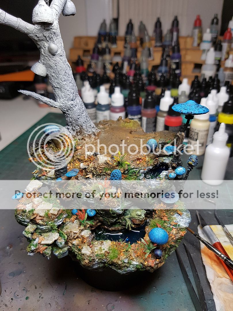
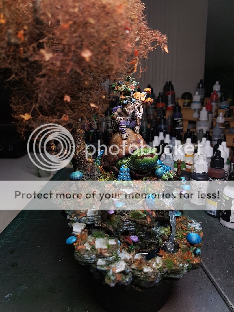
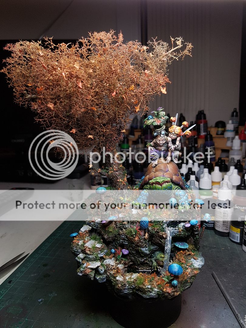
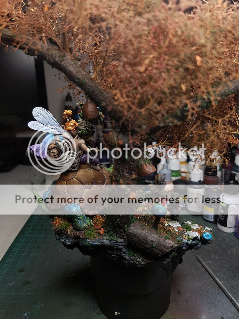
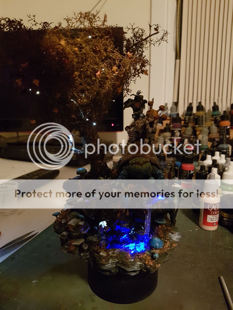
Anyway, here is the completed, studio shots of the Enchanted Pool.
And here is a video that shows off the lighting, by Powered Play.
Unfortunately, I feel a little flat. I realise now, after looking at the "completed" model, that I made a number of decisions that probably weren't ideal. I started with a grand vision, and despite putting together a model that I think is really quite good, I feel like I am capable of better. Unfortunately the piece has collapsed a bit under all of the things going on, whereas I wanted it to be enhanced by all the little easter eggs you could find looking at it. I think firstly the fact that I spent a lot of the project going back and correcting things, and not having a truly clear and planned piece from the start was a lot to ask for a project of this size. A Raffa or Roman could easily just knock this up with magic, and it would be amazing, but for me, I need to have more experience at creating something of this scale.
And thats how I am treating this project. As a really great experience, that I am taking a lot from. My next few models that I paint I will be doing busts, or something a lot more simple, and focusing on my painting, rather than creating this mammoth sprawling project that does not have enough focus on any one area.
Things I discussed with a few other peeps about the model, the paint work on the fairies is pretty good, although I am capable of better. The basing I didn't spend enough time painting to get truly right, and again, I have the issue of having these really saturated bases full of colour that tend to detract from the piece. I have been really getting deep into the technical aspects of painting and spending a lot of time considering it since I got back from Germany, and one of the things I am really struggling with is the contrast. When I look at other pieces I see incredible contrast and I think, how the fuck do they do that? When I try, I go from black all the way up to white, yet it actually looks less contrasting. I think the reason is the fact that I use black, and white, and have chalky, desaturated colours. I plan on removing black and white from my palette for the next model I try to paint, just as a learning exercise to really think about how I can use light and shadow in different ways.
The final thing I was considering was why I wanted to keep it secret. It is exciting unveiling a project that nobody has seen for an event like this, and I think the appeal of having something that made the judges go wow when they first saw it was more appealing to me than it should have been. I need to remember my focus is on learning and growing as a painter, and the way I do that is through constructive feedback from people, from myself and serious consideration after a piece is finished as to how I can improve.
Whilst I am looking forward to the feedback from the judges, and the fun of competing, the real lessons I am taking from this model are the ones I have learnt over the last few weeks, the technical aspects of a model of this size, the consideration that needs to be had to planning, minimising the excess detail to focus on what really matters, and making sure that I paint a model completely, and to the best of my ability, before gluing them together.
Here is the actual conversation with Benny (I am Ramjet, he is Stebon... its a long story... Our chat has evolved a lot):
Ramjet
i look at it now and i see a lot of fucking issues
its probably the best i can do right now
StebonReally?
Ramjet
but its still shit really
lol
yeah man
StebonLike what
Ramjet
just the painting, the use of grass, the sculpting
everything
im just not as good as i want to be
i was looking at crystal dragon entries from last year
and im no fucking chance
mind you, there has been big improvement
just have to keep working at it i guess
until i get where i want to be
StebonFair enough
I think it's a pretty good piece, but your right it's not quite on the level of the top pieces from last years show
Do you think you should slow the process down in future?
Ramjet
I felt a time pressure on this one
StebonAs in, plan more and know how things will work before doing them?
Ramjet
And I think I bit off more than I can chew
I look at my recent bust painting
And I am much happier with those
Papa Jambo
Because I can just focus on painting
StebonYeah I think the fact that so much of this was stuff you had never done before, and then you were doing the test runs on the model itself
Ramjet
It's all about the journey though
StebonI was going to say that actually
Ramjet
And this has been a fun journey
Lots of interesting learnings
StebonI feel like this piece is a big departure from the style you practiced with German mate
Raffa?
Ramjet
yeah
hugely different
i actually said to someone this morning
i want to paint another model before cancon
just a bust
StebonAnd I think you should try for more of that style
Ramjet
to try and paint like raffa and i did
Stebon
I agreeMy main knock against this piece is that I think it's a bit too busy. The eye doesn't naturally get drawn to any one spot
I think the blue mushrooms/blue legs plays into that a lot
Ramjet
And that's actually a flaw with the design
And with how I've executed it
StebonYour busts were a lot more focused and colour cohesive
Ramjet
i mean
its a bust
StebonYeah the base got a little out of control for the model on it haha
Ramjet
the eye has to be drawn towards it
because there is nothing else
this was an attempt at a huge, elaborate diorama
with lots of different things to look at
StebonWell sure, but colours in the bust were still very cohesive
Actually something I noticed in a photo you posted last week
Let me find it
More photos here, on Marks Putty and Paint profile.
Stebon
Hugely elaborate base
Ramjet
marks lara croft
but still focused
colours are more tonally similar
StebonBut by using a very limited palette on the base, the eye doesn't get drawn away from the model
Ramjet
draws the eye centrally
yep
StebonExactly
Ramjet
i actually tried to do that with this base but then the mushrooms got out of control blue
i want to try taking what i learnt here, and doing it on another model now
StebonContrast with your base, on its own it's just as impressive, but it's rich colours makes it the focus
Even without the blue mushrooms
Ramjet
smaller, but still elaborate
haha
yeah
fucking shrooms
StebonThe flagstones for instance
Probably should blend in more
Then you would have a very detailed, but almost entirely autumnal base
And the model on top would stand out
Ramjet
i think one of my biggest issues with my own painting is black
when i looked at my models and bases
i have black in the recesses
from airbrushing and trying to use zenithal stuff
but what i've found is it is making the models look very harsh
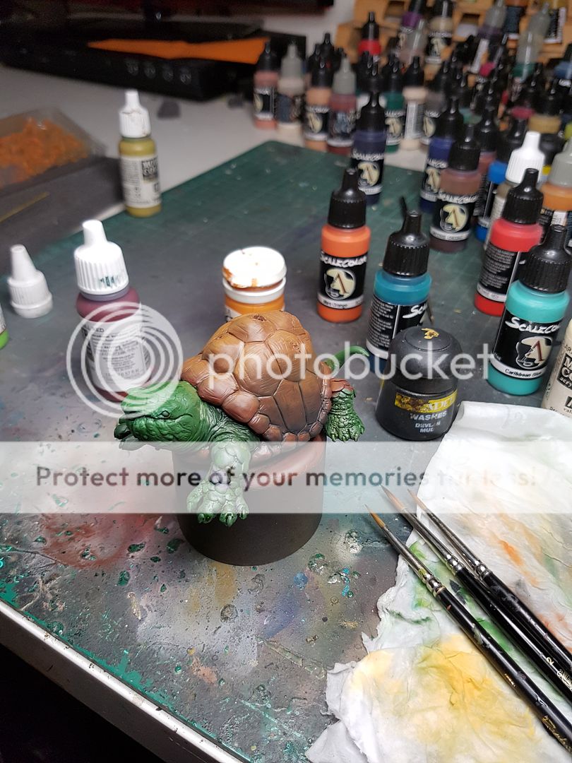
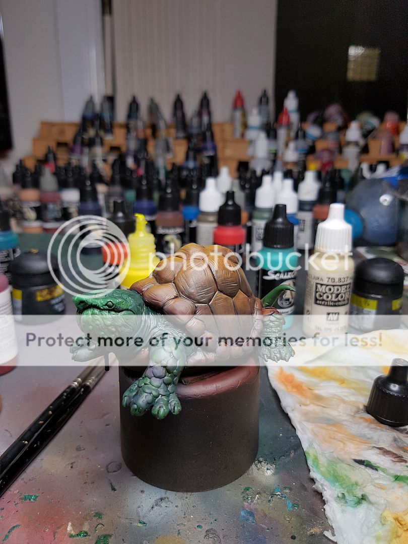
i actually painted in the neck of the turtle
added in red and dark sea blue instead of black
and it looked so much fucking better
so my next model i plan on basically removing black from my palette, and undercoating white
StebonAwesome
That's a good observation
Do you have a spare bust you can do for cancon?
Ramjet
yeah i've got like six
StebonHah course you do
Anyway, here is the completed, studio shots of the Enchanted Pool.
And here is a video that shows off the lighting, by Powered Play.
Tuesday, 27 December 2016
The Enchanted Pool, Start to Finish
I talk my way through the process of building, problem solving, painting, adding new details and more painting and basically muddle my way through. This was typed up on a nightly basis, so it may change tenses during the article, so apologies. You can see a 99% finished model at the end!
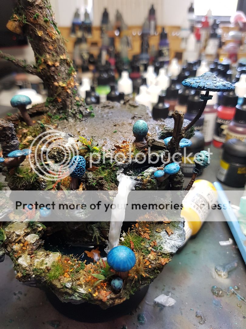
I had a pretty clear vision from the start of this project: I wanted to use LEDs to create a glowing pool, and have fibre optic cable running from some more LEDs to look like fairy lights twinkling in a willow tree.
There was obviously a lot of preparation work needed before I would be able to realise these aspects of the project, let alone create a piece that would actually look good, and not just like a gimmick. The first step was figuring out how to use LEDs!
I did a bit of research on how exactly to wire LEDs and so on, and realised that it was probably a little out of my depth. I was running on a schedule and this made things a little more difficult. So I made the call to purchase some pre wired LED setups from a company called Powered Play. They are expensive, but they are ready to use straight away. They arrived with a number of different light options.
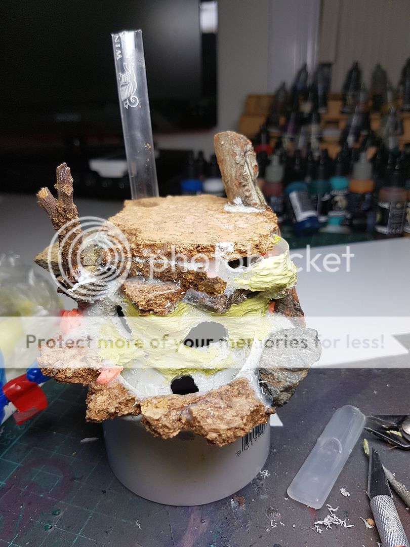
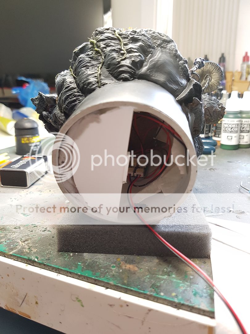
The next step was figuring out the specifics of the base, where each component would sit, and so on. I drew a little sketch and once I had that idea in my mind, I went down to Bunnings to purchase a PVC pipe end to use for the base. I picked this because I knew I would need some space inside for the 9V battery, wiring and whatever else needed to be in there. I used my Dremel to cut some holes, added some cork, and made a plasticard "pool".
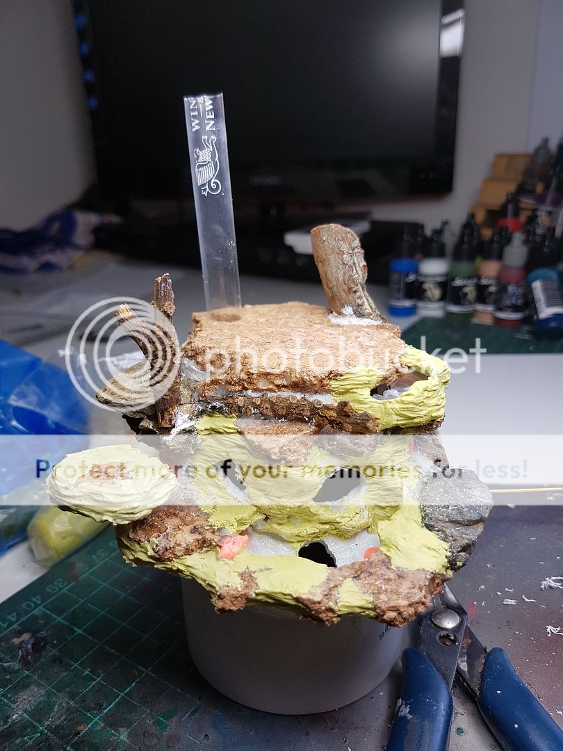
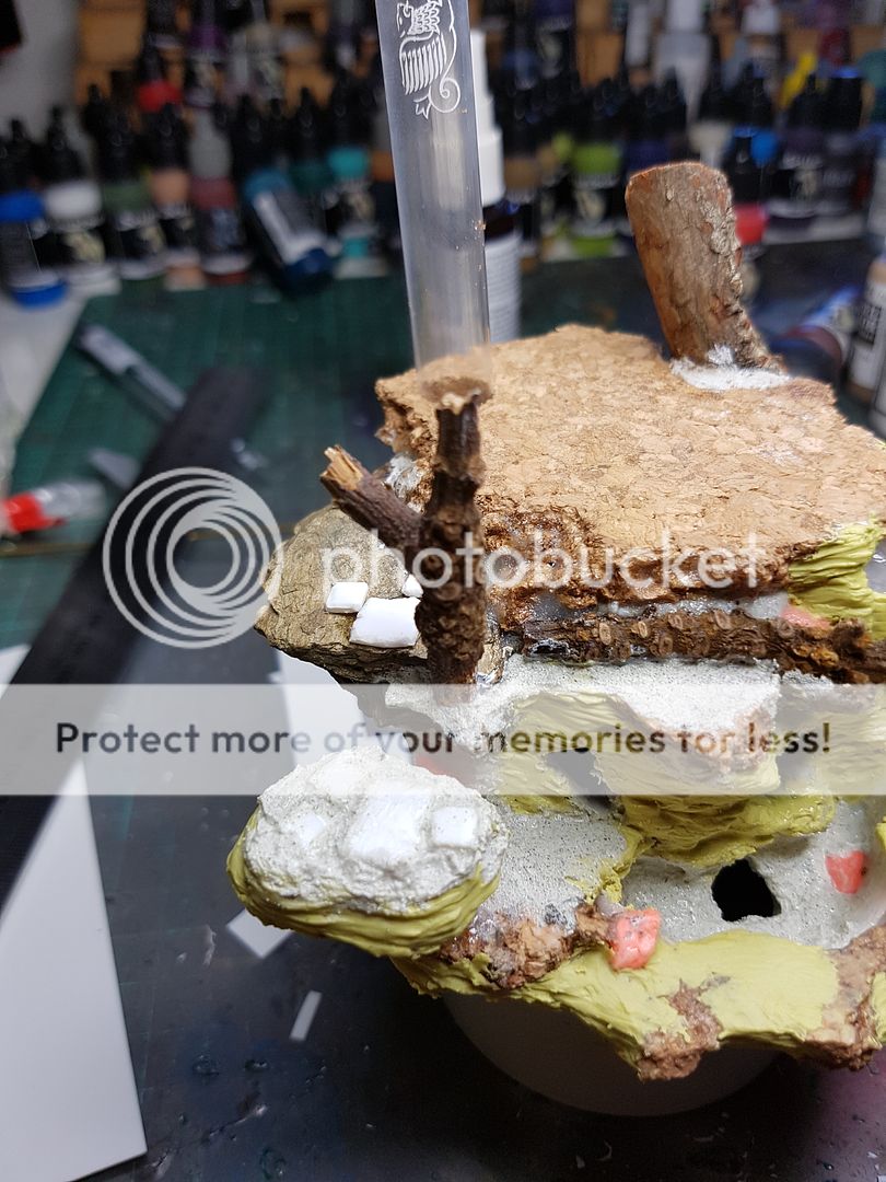
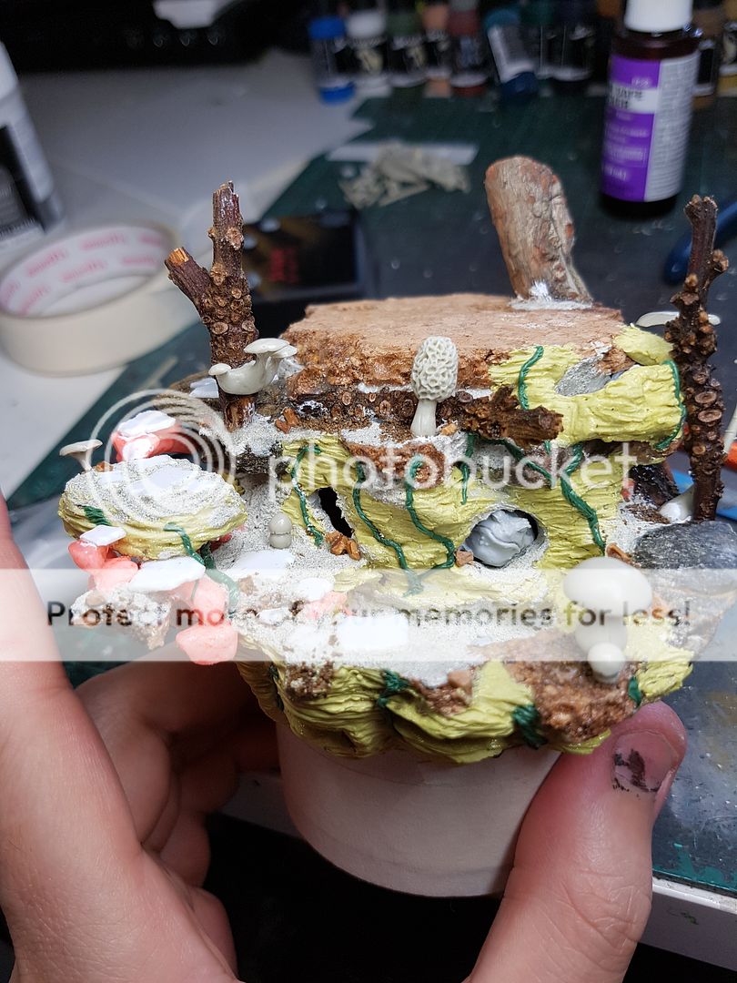
You can see I've already started adding some rocks, twigs and the tube where my LEDs will run up inside the tree I will sculpt. I am not worried too much about the exact textures right now, just creating the shapes that will eventually make up the final base. One other idea I had at this point was to have a second, smaller pool sitting up the top, also lit from the LEDs. Exact specifics yet to come on how this would occur, but the important thing during my process is that I let myself go crazy when I have a cool idea.
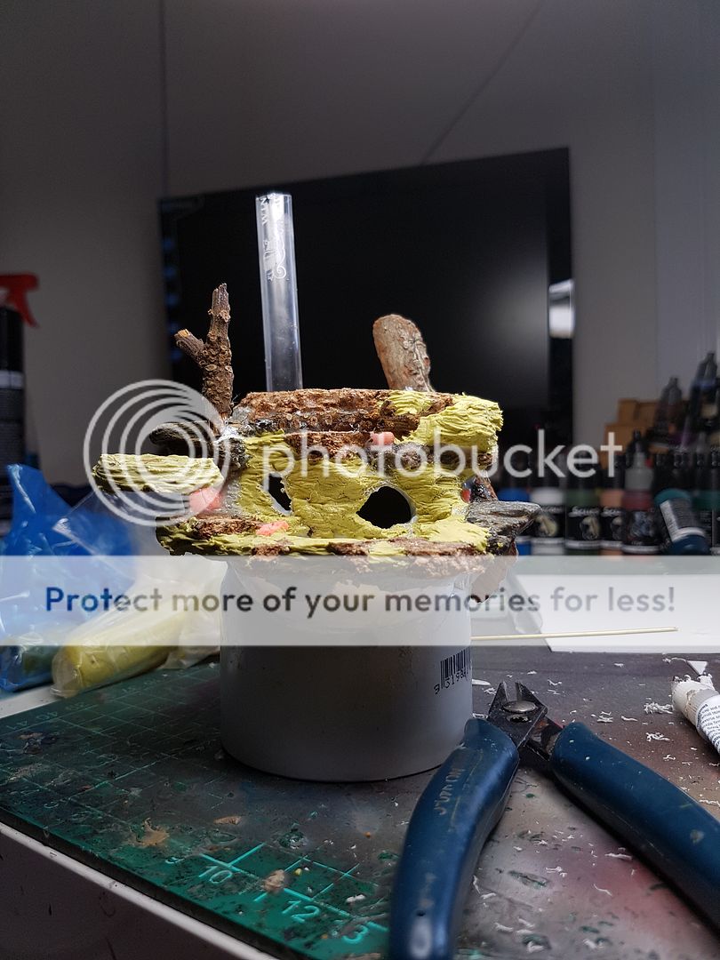
I began sculpting some of the rock face, using Milliput. I realised at this point that I wanted to create more depth, having some things to look inside as well as the surface areas. I cut some holes out of the top area, not really having any idea what I would do with them. I also decided at this point, yes, a waterfall was a great idea!
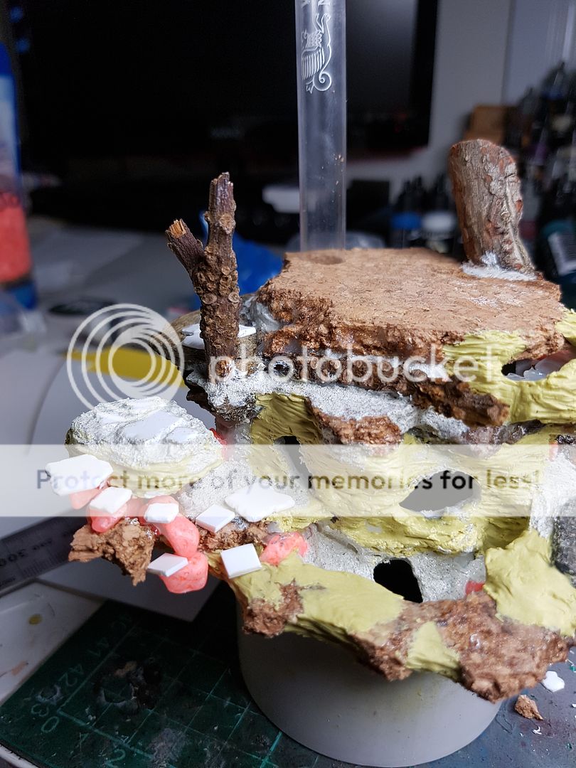
Began adding more volume, decided I wanted to have a little pathway running down from the top section down to the pool itself. I figured since this was a fairy world that some floating rocks would look quite cool, although certainly not the first time anyone has done that concept, it wasn't the main focus and would just be another little addition. I created the first floating rock, a larger one, that the rest could be attached too.
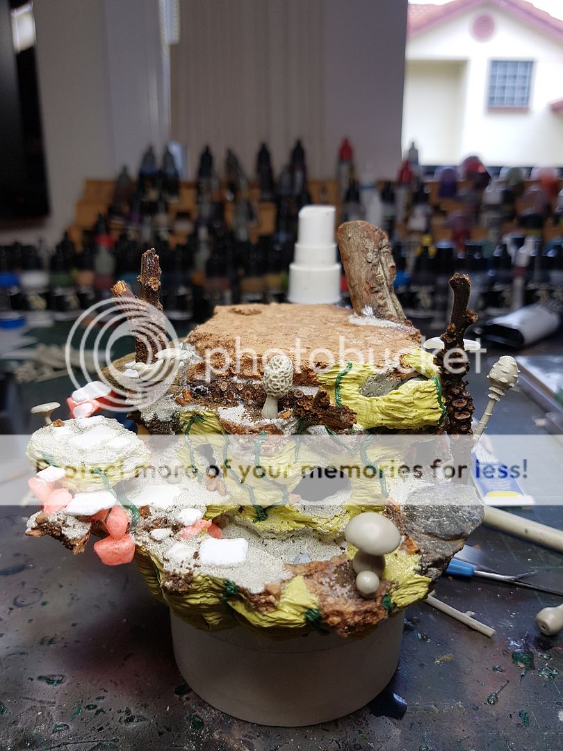
Here you can see some of the tiles for the little walkway being added, and more of the floating rocks being attached. I use a Vallejo Sandy Paste, and a Liquitex Sand Gel to add dirt. I used to use sand, but as I get more invested into the display piece side of painting I have realised that the scale of the sand is all wrong. Although it drybrushes up well, it does not look good for these sorts of pieces, so I use the sandy paste to create a texture that I can work with.
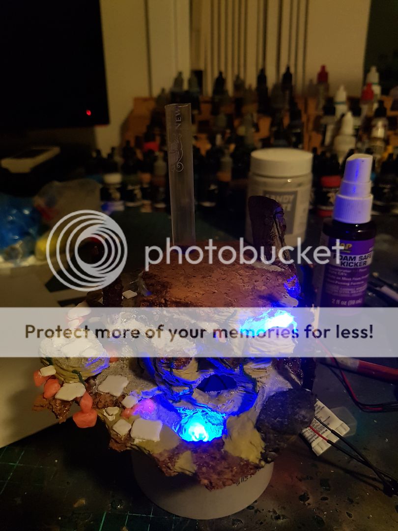
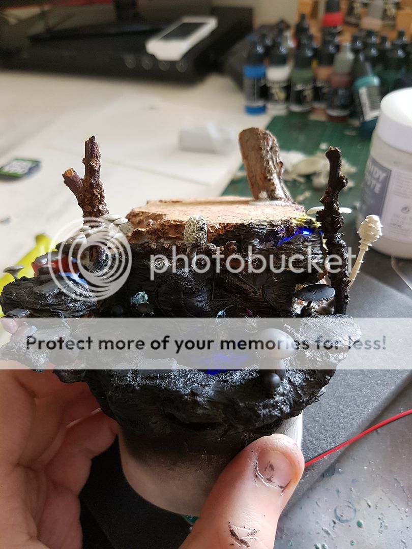
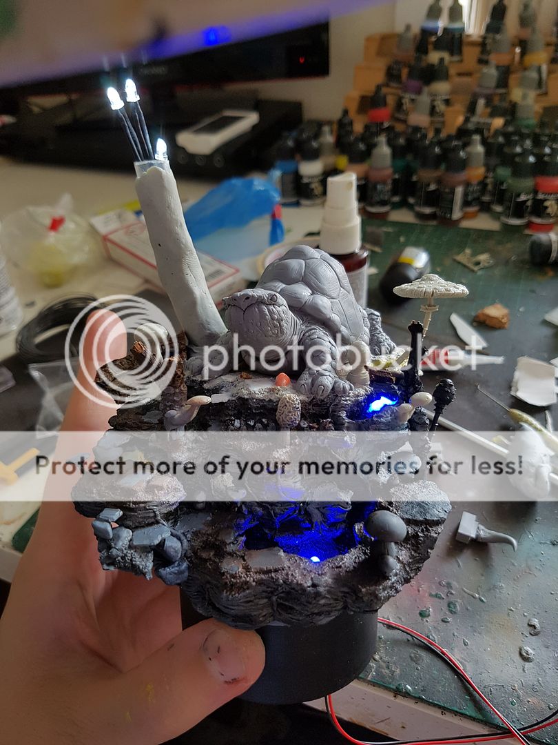
At this point I figured I should probably do a test run of the LEDs, and began feeding them into the holes I had left for them. Moment of truth...
The glow was pretty full on! I realised I would probably need to diffuse the light slightly, otherwise it would be taking all the focus of the model, instead of being a fun little aspect of the piece. It did look super cool though.. LOL
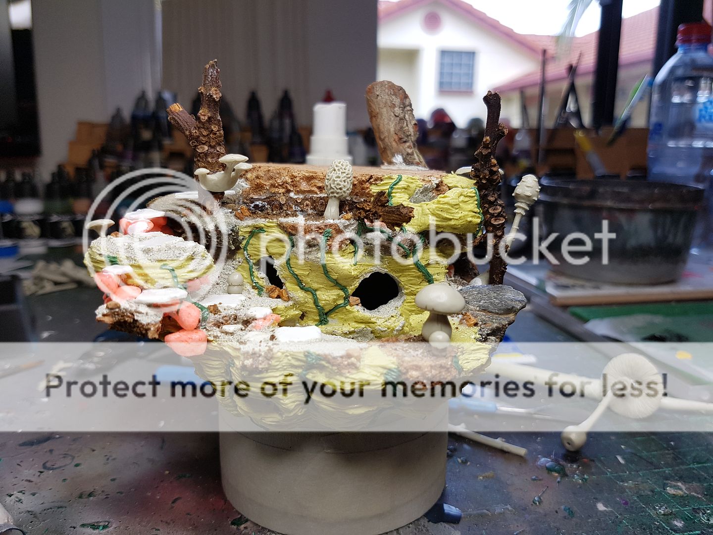
I glued in the LEDs, added some sand in the base of the pool, and began adding vines to some of the rock face. The overall shape of the piece is beginning to take shape now, and I feel like I could be onto to something quite cool. Still a lot of work left to go of course! Here is a Lizardman model to give you an idea of the scale! (Incidentally, I am supposed to paint up that Lizardman model for my best man as a gift for the wedding!)
Now in my travels over the internet, and over the last few months I have accumulated lots of cool little add on bits and pieces I have purchased to use on projects when I feel inspired. This particular piece I had a few things in mind that I was going to use out of my bits box...
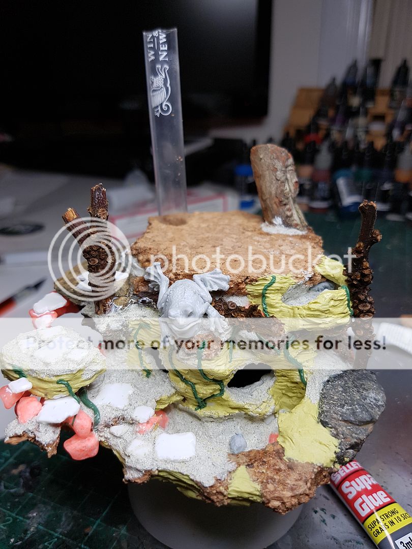
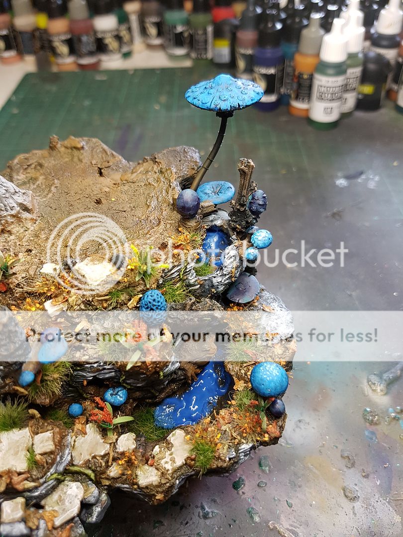
Mushrooms and froggos! The mushrooms are a beautiful little resin kit from Blacksmith Miniatures, and the frog is actually a piece I cast off from a Troll bust from MJ Miniatures. The frog wasn't going to sit there, I wanted him to sit on the rock on the right hand side of the piece, just being a little fat shit.
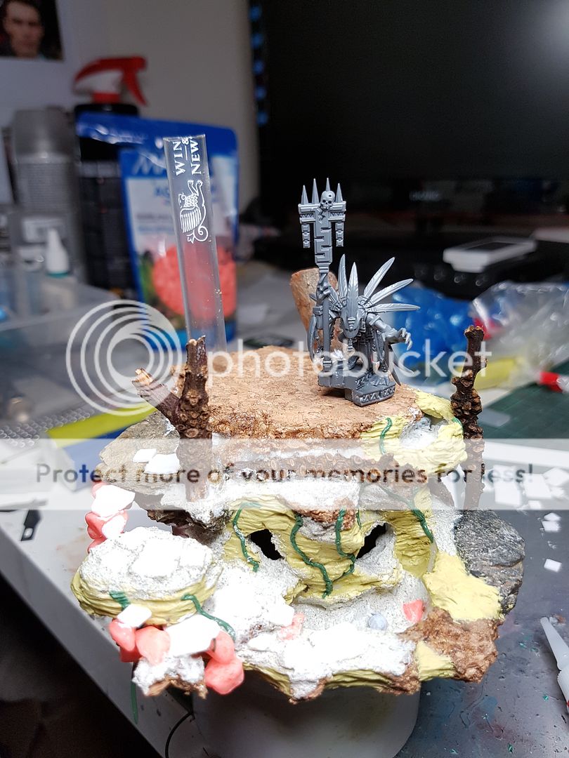
Here at this point I sat back and had a good look at how the model was shaping up. I really, really liked the round shape of it, how it tapered down. I felt like I would try and reinforce that shape as I constructed the tree, trying to keep it quite round. I obviously planned on adding a lot of foliage and texture to the base, so I didn't need to go much further than this with adding details, but I was beginning to stall at this point... because I didn't have the focal point of the piece yet! I was waiting on the model that would sit above the Enchanted Pool to arrive, Sina and the Knight by Aradia Miniatures.
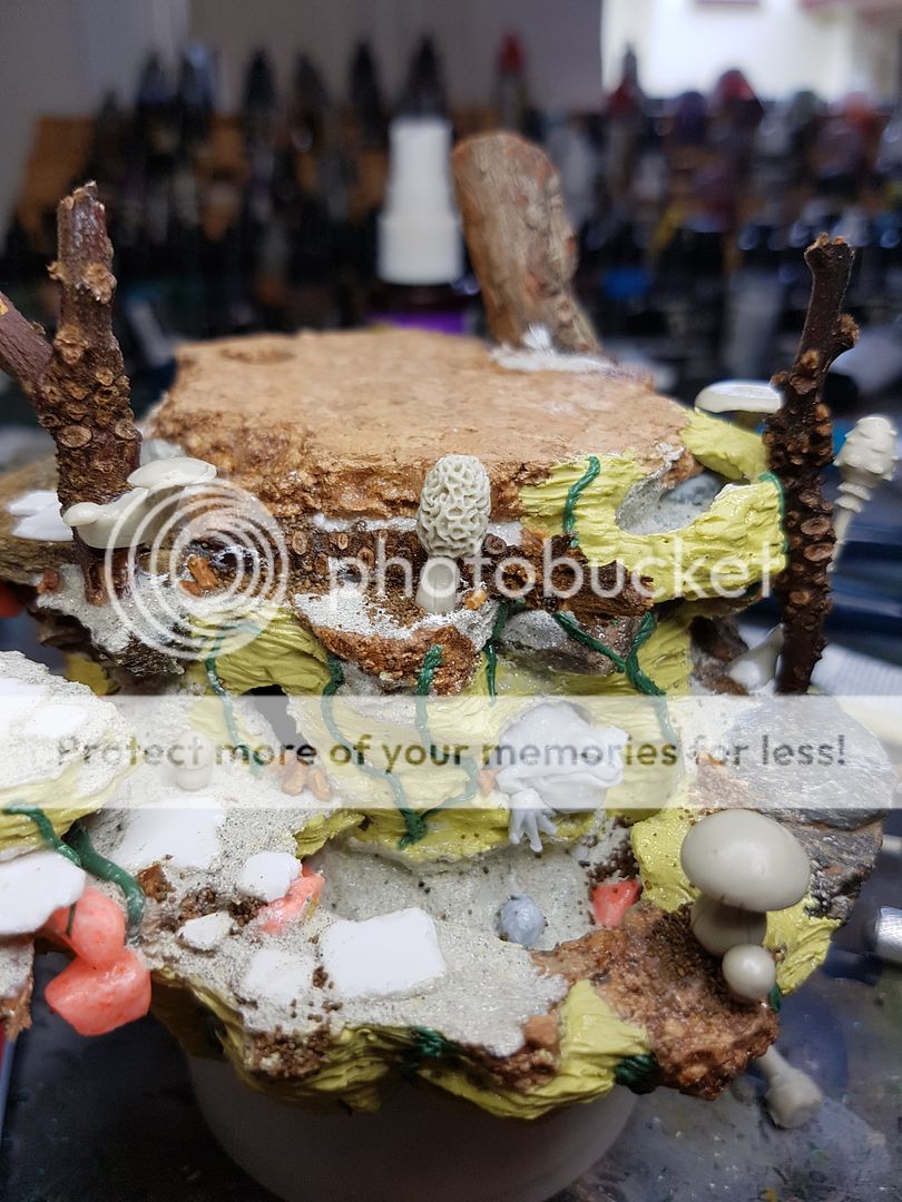
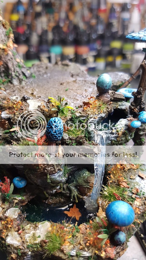
In the meantime, I mucked around with the stupid frog. I usually feed my ideas through my Twitter, but this time I was relying upon my loyal OzMachine bros, and Leeps suggested sticking the frog out of the bigger hole. I wasn't convinced, but I tried it out... and fell in love. LOL! I hung him a little further out, and added a little hand sticking out as well, and viola. It was a fun little addition, adding more cool things to look at. One initially unseen factor of this was where the froggos head was placed... right in the path of the waterfall... looks like my frog is going to get a little wet!
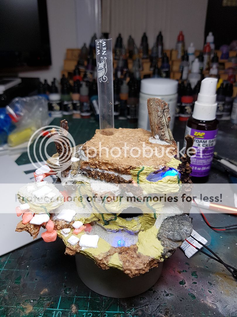
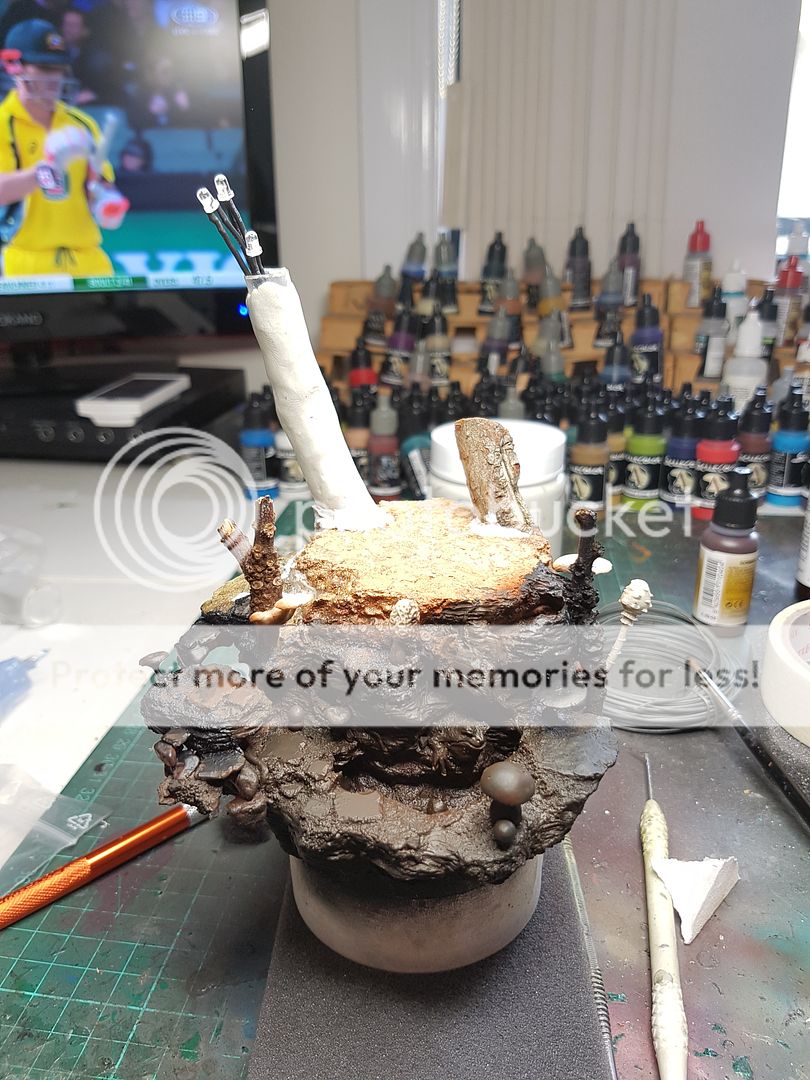
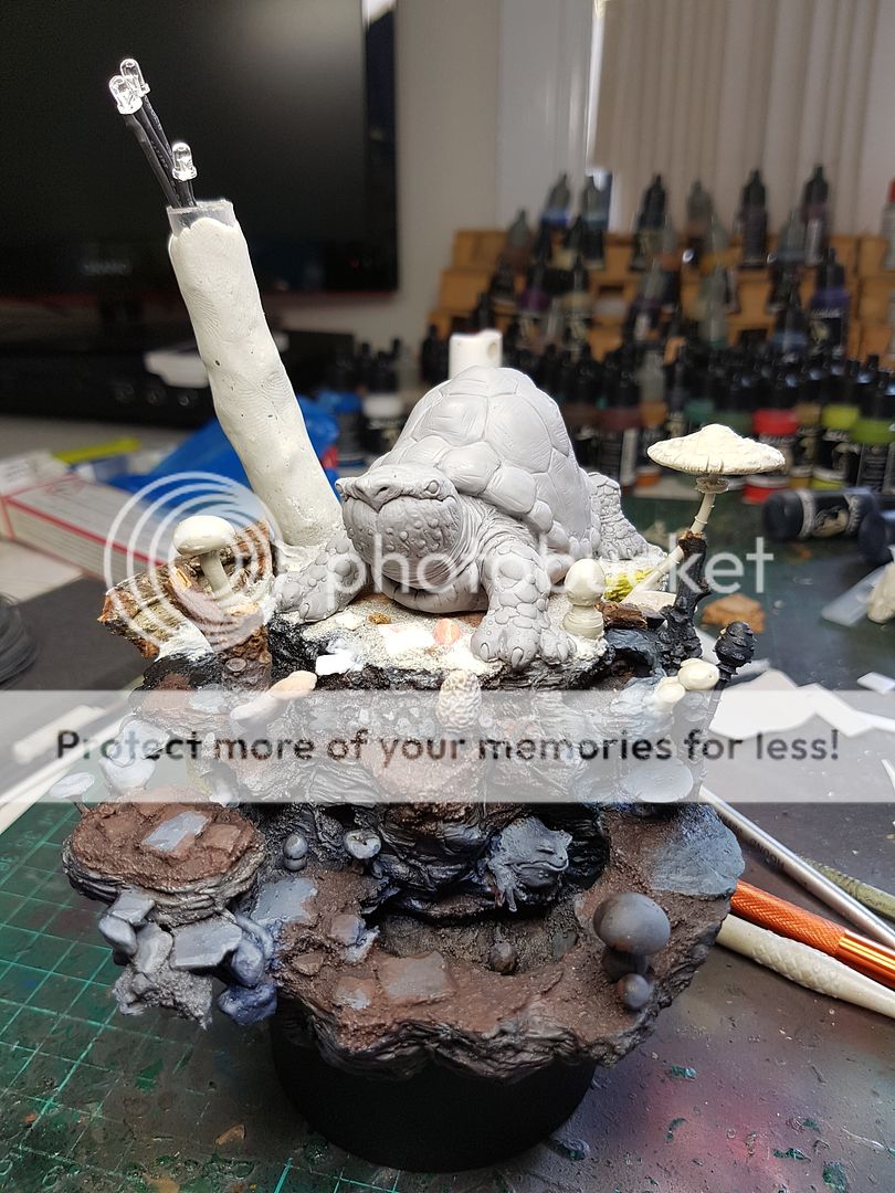
I got to this stage and I really was stalling, because I did not have the model! I decided to part undercoat the areas I felt were finished, and keep the positive energy and creative enthusiasm rolling along. Was another opportunity to see how the model shaped up with the lighting! The darker surrounds as opposed to the white reflective plasticard made the glow a lot more subtle, so less concerning. It will only need a little diffusing! Started laying down some basic browns, and began construction of the larger tree. I didn't want to progress too far with the construction because I didn't know exactly how much shape the turtle would take up, but I ran three LEDs up the trunk and glued the basic construction in place.
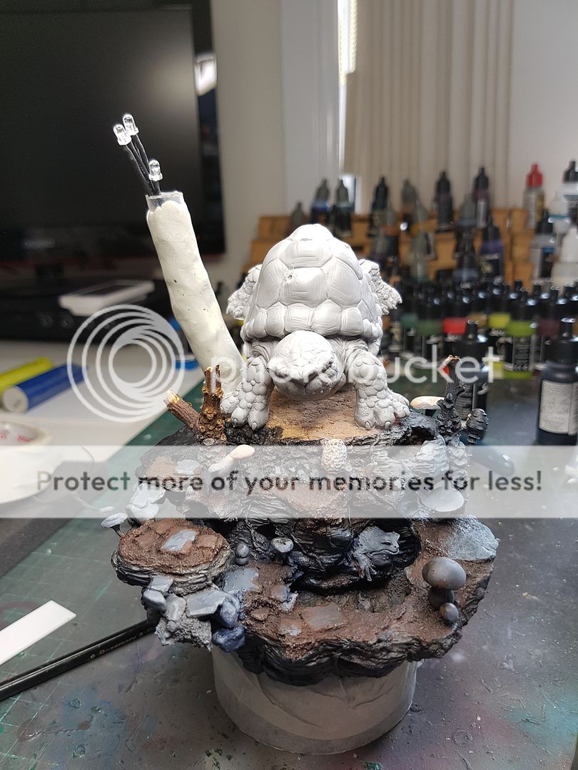
After a number of days, I finally managed to obtain the model that would be the centrepiece of this whole shebang! And.. it was way bigger than I expected! LOL
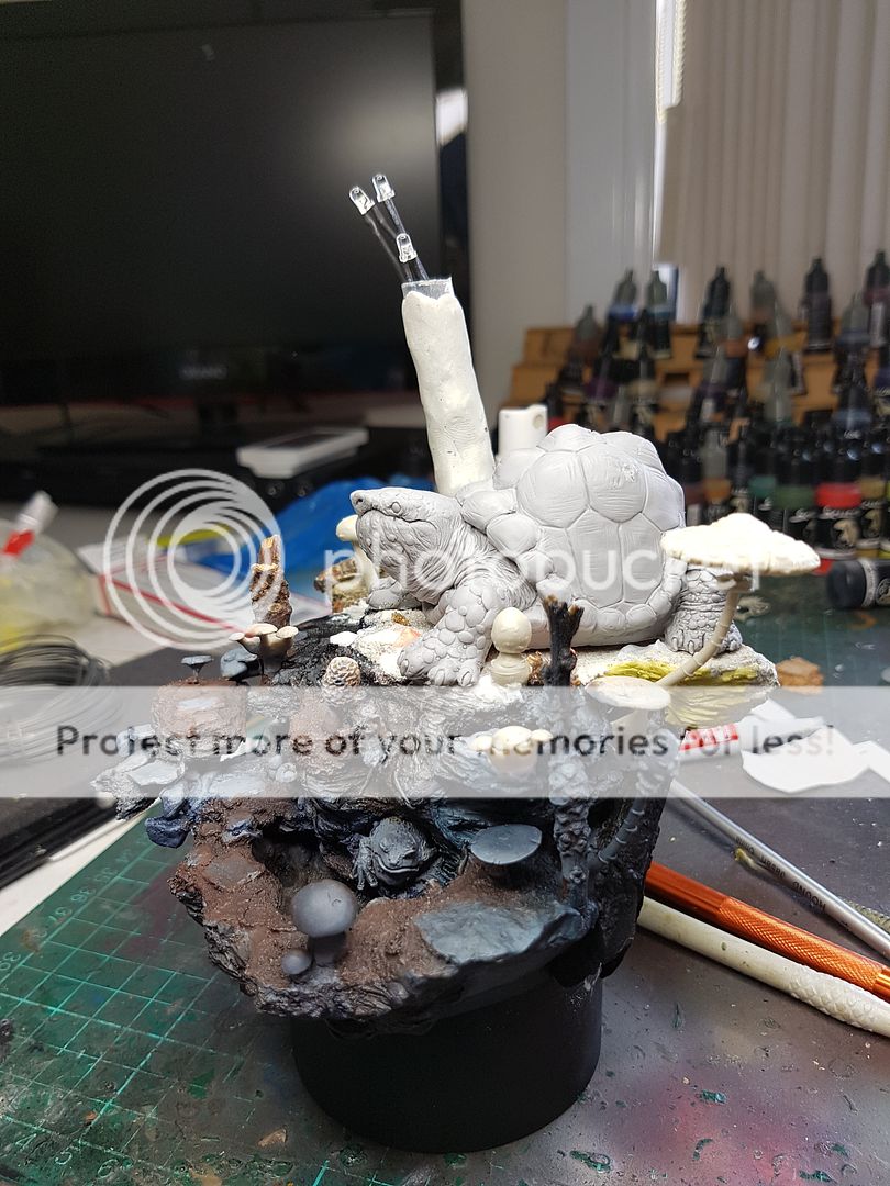
I trimmed the beautiful log that I had put up the back, and put it over the other side, purely to get the texture and shape on the piece somewhere! I added a few more mushrooms and began adding the sand.
I sculpted the back of the model, adding the rocks and covering up all the crap. The whole model base was starting to reach the finishing stages. Another quick lighting test... :)
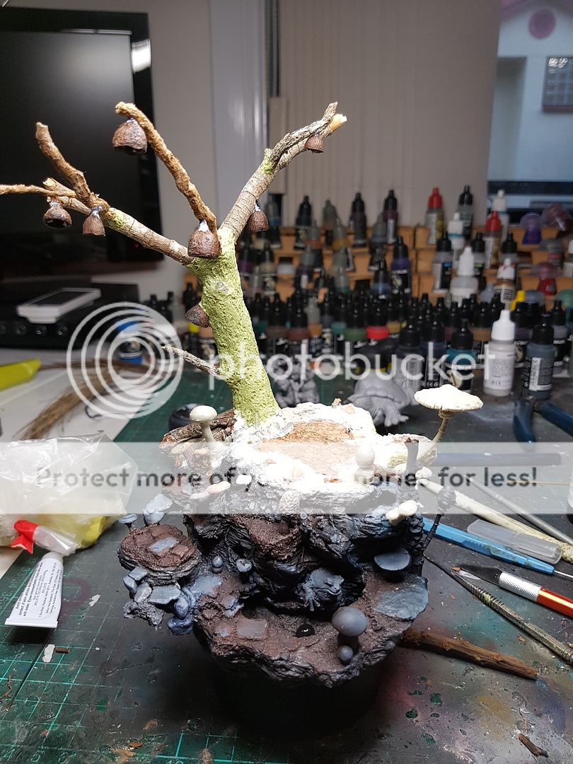
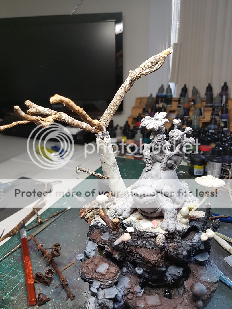
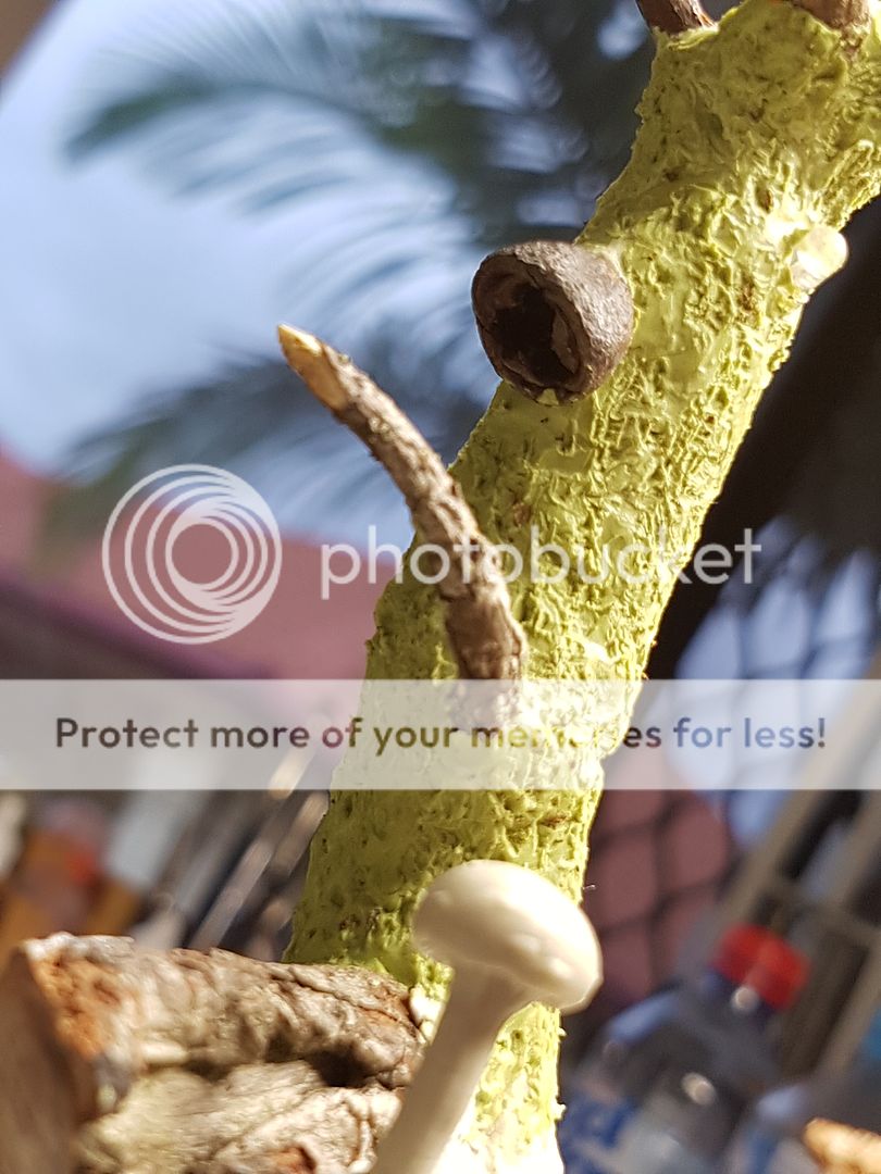
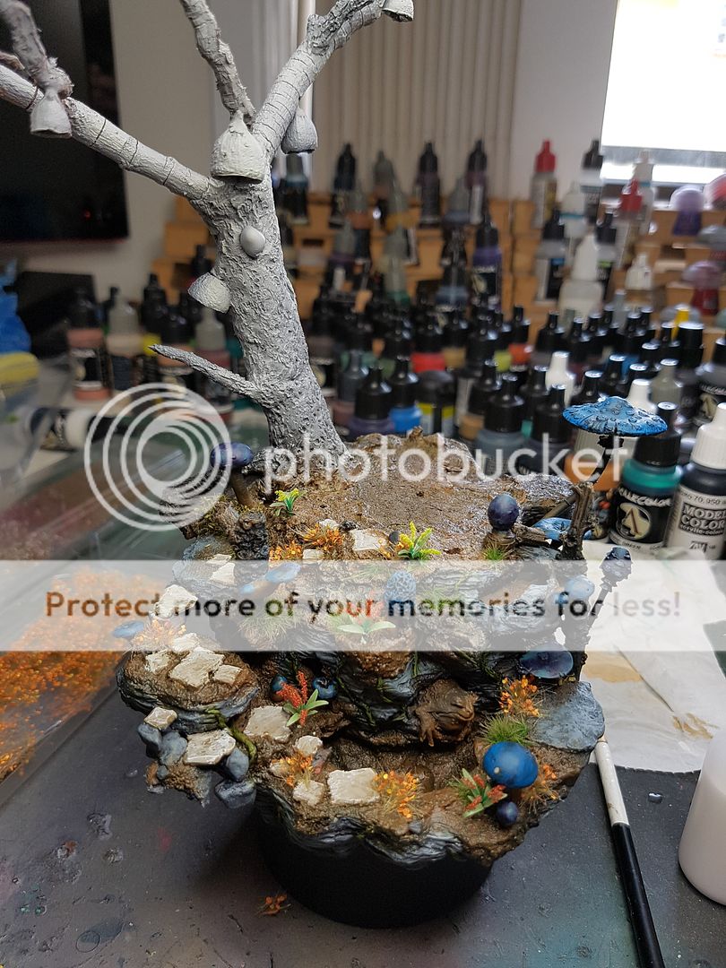
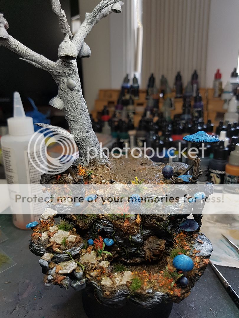
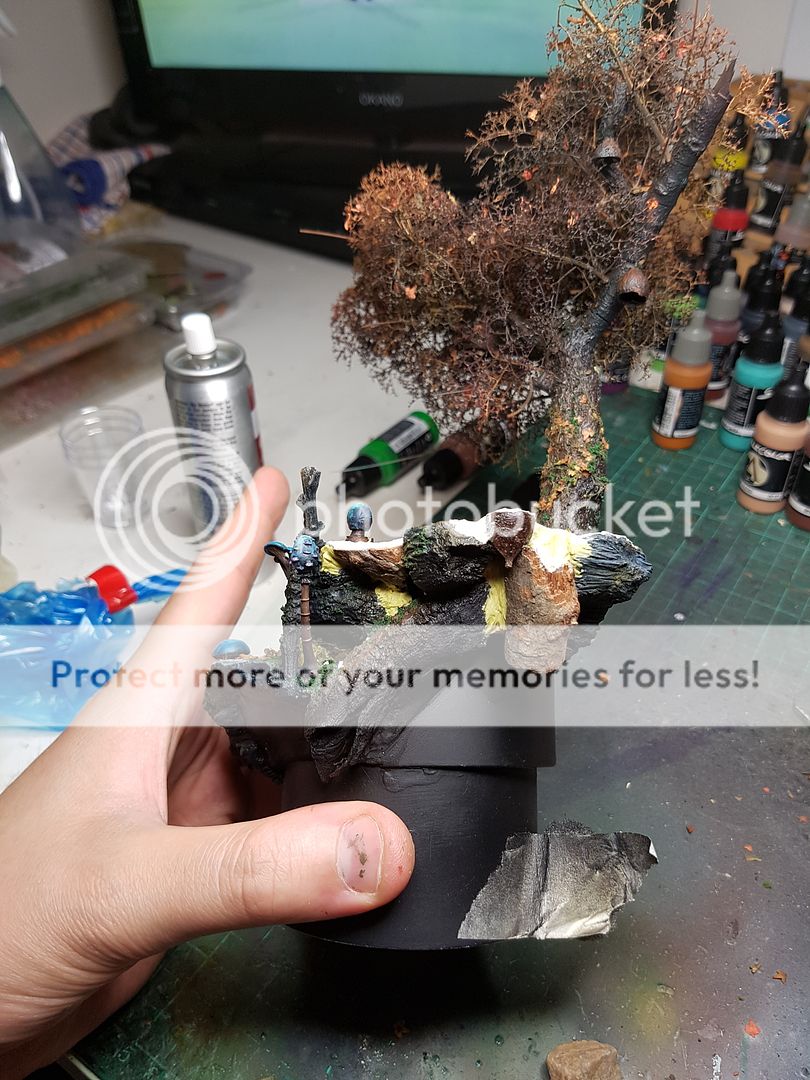
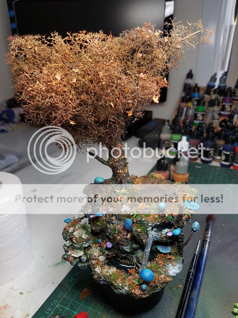
Time to build a tree! I've done quite a few recently, and I've tried a lot of ways. I have added bark, I've tried sculpting the texture, and I've tried using twigs to make up the framework. I decided to try a combination of a few of these ideas, I wanted to use larger twigs to create the upper branches, and sculpt some texture on the main trunk. I found some cool seed pods, and attached them to the twigs. The bark on the tree came from milliput/green stuff mixed, moistened and smoothed with water, and then ran a piece of twig up and down it.
I also tucked one of my three LEDs from the tree into a seed pod...
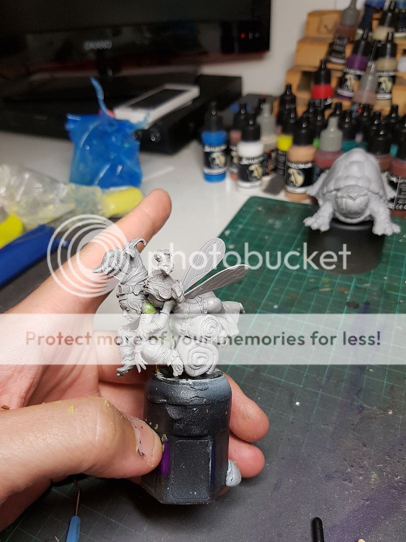
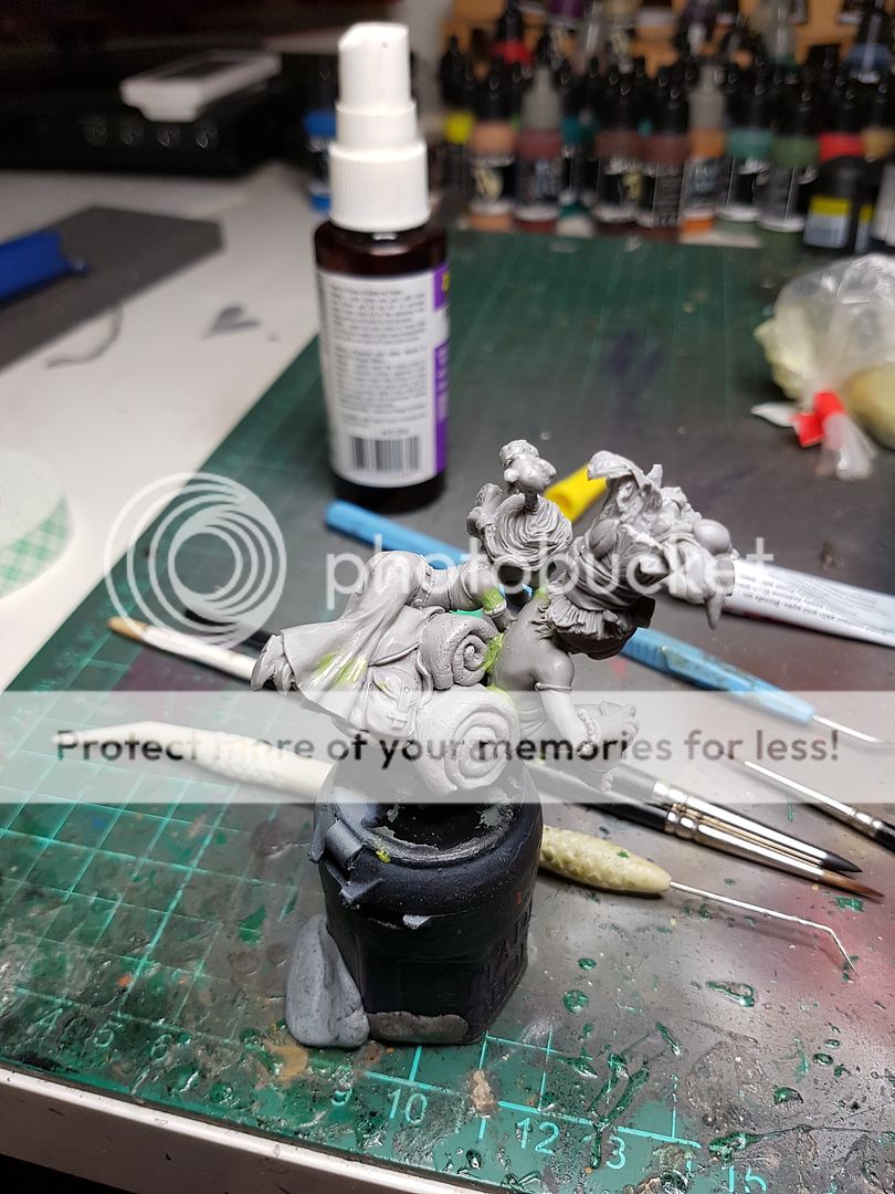
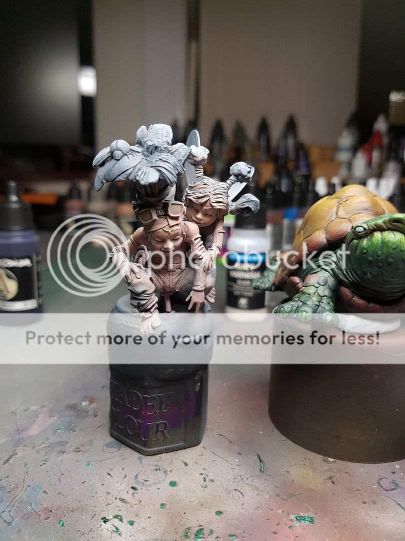
I left that to dry and set to work filling some gaps on the model itself. The actual turle was fine, the connection between turtle and riders is not great but I've left that until after I've painted the two pieces separately. But the riders had a lot of gaps, a lot of pieces with interesting connections, and I was forced to add a fair few sections of GS to make it all match up.
And before you know it (well, not really, but for the purposes of this article, it happened in like twenty seconds), we are ready to start undercoating!
I went back in with the airbrush, adding a lot more colour to the base, and tried not to worry too much about areas I had already worked on a little bit. I then went over the whole lot with some washes and got everything a little more dirty looking and harmonised.
Now, my biggest weakness as a hobbyist (outside of a glaring lack of skill) is my impatience. I love gluing things together that really shouldn't be glued yet, because I love that sense of completion that stage brings. However, this time I really felt like this whole base needed to be worked on as a complete piece, not just stage by stage. It's not really the way I work best, but for this model it felt like the best way for it to be constructed.
I began by adding some colours to the areas that would have colours, and just blocked in a bit more on the rocks.
And once that was done, I started gluing down plants! I have a huge collection of interesting tufts, plants, flowers, grass, leaves and so on that I basically scattered randomly about.
Once that was dried, it was time to sort out the last of the technical LED placement things, I glued down the wiring underneath, fixing up the placement of the motherboard, made a little battery holder, and then also added the first layer of gel to diffuse the lighting to the LEDs in the pools.
I set them all aside, ready to dry, and be worked on more later on. That also marked the last part of the sculpting and assembling part of the model, outside of gluing down the finished piece, so I was noticeably excited at this point. Time to get down to the really important stage, the painting of the core model, the main focal point of the piece! I felt like this was the next step as the colours on it would help inform how much more or less saturation the base needed to have.
So time to try painting old mate turtle. Or at least, get started on some colour concepts for him! The base you can see has a pretty strong colour contrast going on between the blue mushrooms, and the blue LED, and the orange flowers and scatter. This is intentional! I want to work with these two colours predominantly as my scheme, but for the fairies themselves, I want to go pretty crazy with lots of different variations of blue and orange.
However, to start with some base tones on the turtle I wanted to start with green and brown, normal turtle colours. I figure the turtle guy is just a normal turtle dude, hanging around getting ridden by fairies on occasion. I start with Hull Red and P3 Orange on the shell, and a mix of several different greens for the skin. I shade with both Hull Red and DSB, and highlight with a bit of orange. These are just the basecoats for the moment, trying to get an idea on where I am going with it.
In the meantime, I start pouring my first layer of envirotex. I wanted to diffuse the brightness of the LED so I started by mixing in a bit of ink with the first layer to soften the glow. I tested out old mate turtle and I enjoyed the colours. Once those colours were highlighted, I felt like they would pop from the base a good amount, keeping the focus where it needed to be. Painted froggo too.
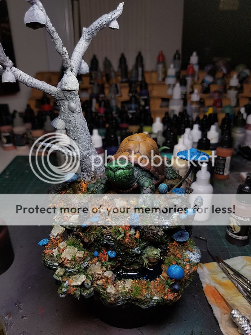
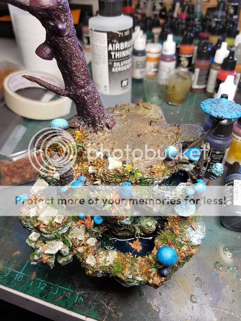
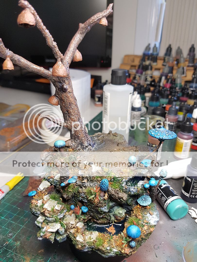
At this point the tree was becoming a problem. I was actually thinking an iron grey initially but the colour just didnt fit in with the autumn palette that was going on, so I opted for a more traditional brown, but threw in some purples in the shadows as well. That was airbrushed relatively quickly, then drybrushed and washed a few times with various colours.
I painted the seed pod things in a brighter orange, again to tie it all together.
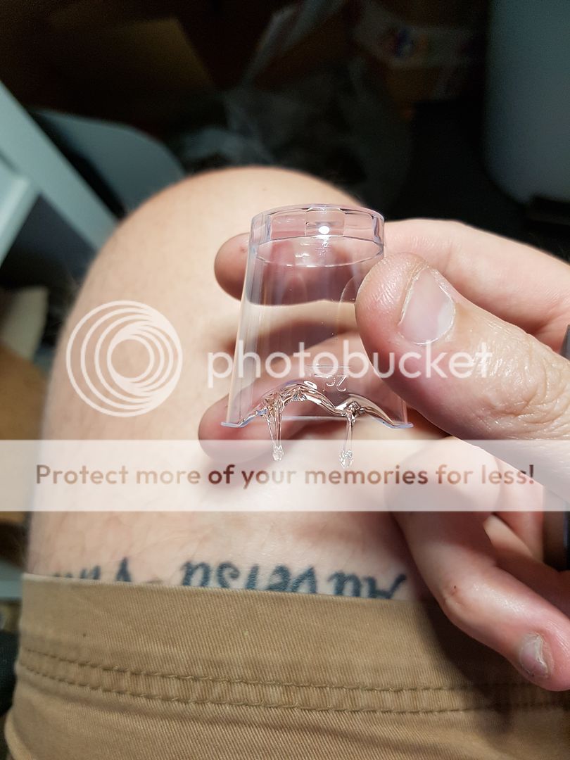
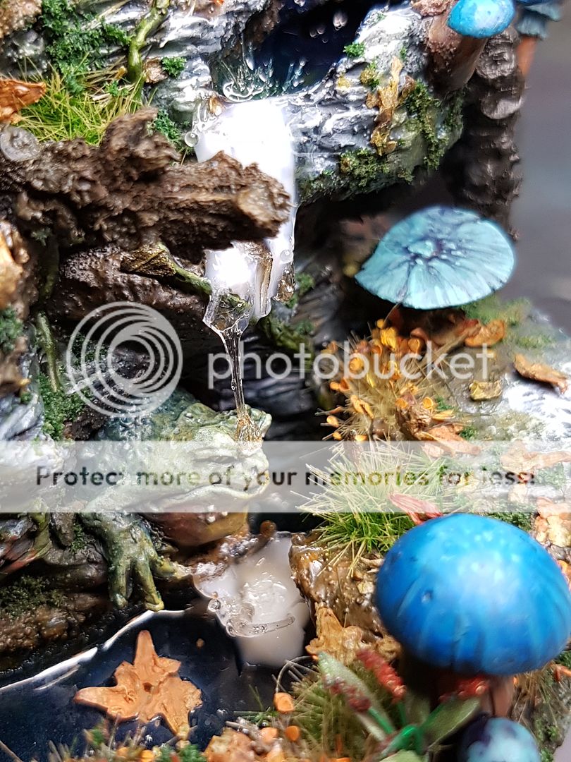
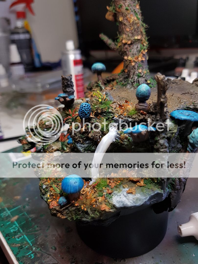
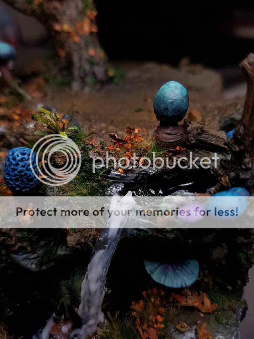
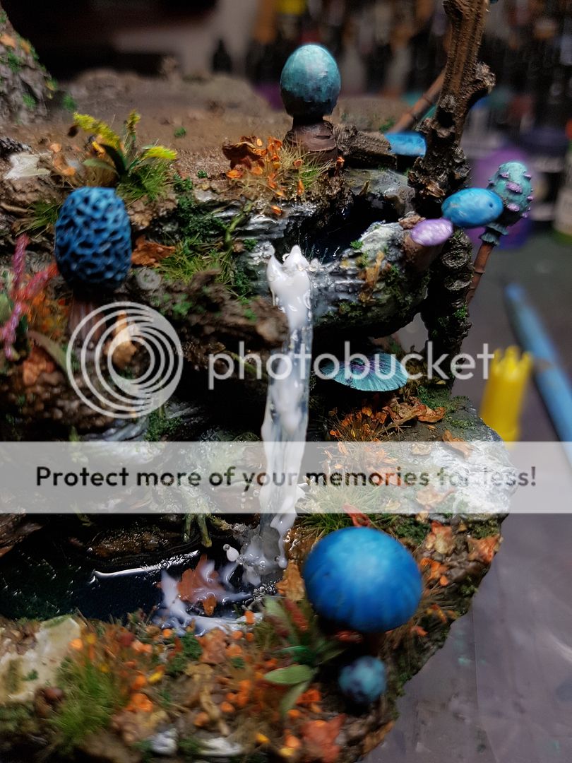
I have been working quite erratically on this project, jumping from task to task and I think it is working out quite well for me so far, I am remaining engaged with the various different things. Doing the water, and landing some water on froggos head from a waterfall seemed like a fun thing to try. I have a few different techniques for creating water and water effects. In this instance the melted plastic idea seemed like the best way to get interesting shapes for the flowing water.
I glued the first few layers down, and added the gel. I also create a splash effect at the water below the froggo, and also tried to cover up the LED a little more, since the glow was still too powerful. I added some leaves and arranged them to look like a lillypad, but submerged. I kept working on the flowing water, but at this stage I am not ultra happy with it.
Painting the tree was not going to be as simple as what I had already done, but I was beginning to feel like I should not be wasting time painting shit that I was going to cover up anyway. So I decided to glue down vines and dosh across the tree so when I did highlight it, I was only doing the areas that mattered.
Back to working on mr Turtle, although this night I didn't have a lot of time so I just started exploring some more blue tones and adding some interesting colours. I also airbrushed the basecoats of the skin on the fairies.
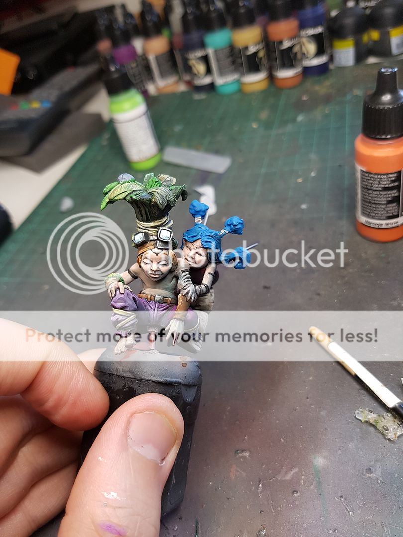
I went back in with the brush and started putting some more colours into the skin of the fairies. It was a tricky balance, trying to keep the skin looking a little pale and unnatural, but also creating some interest. I ended up going for some blueish tones in the skin, and tried to remember that my main areas of light would be the tree, and a little bit from underneath. Here is the first few stages of paintwork on the skin.
As you can see I have tried to reflect the fact that the model will be lit from below by blue LED light, before it even gets turned on! This is just a very early colour concept, and before I went any further, I needed to block in some of the other colours to see how it would work with the base I had already done.
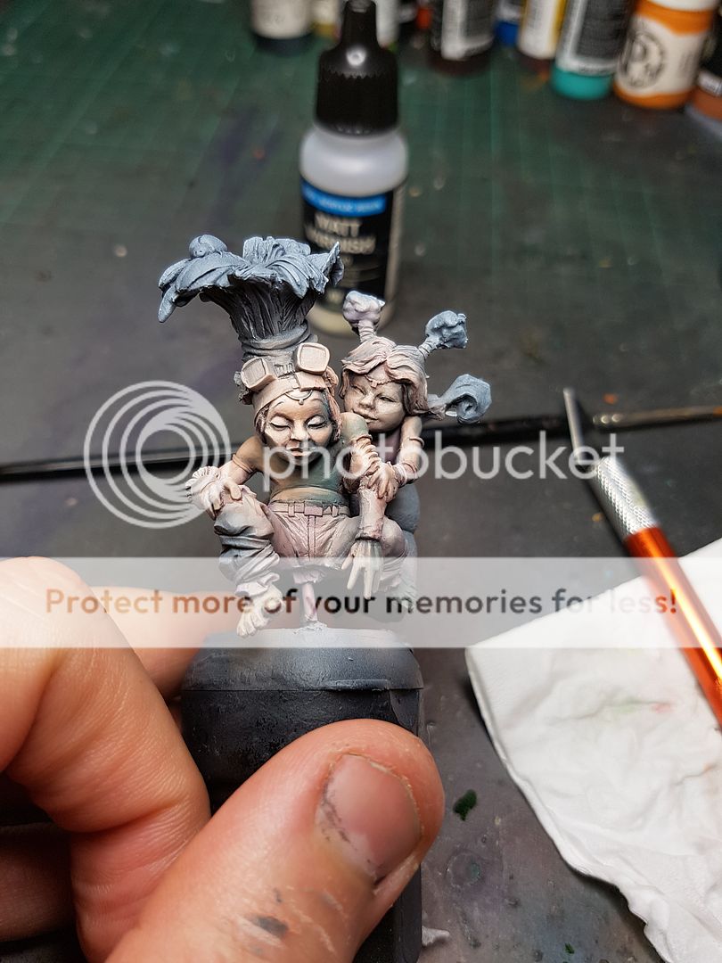
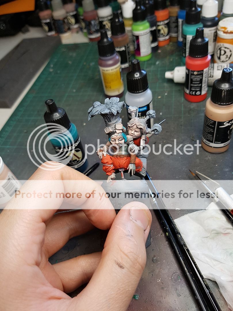
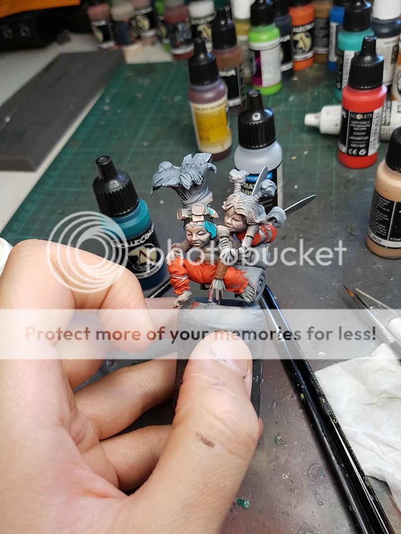
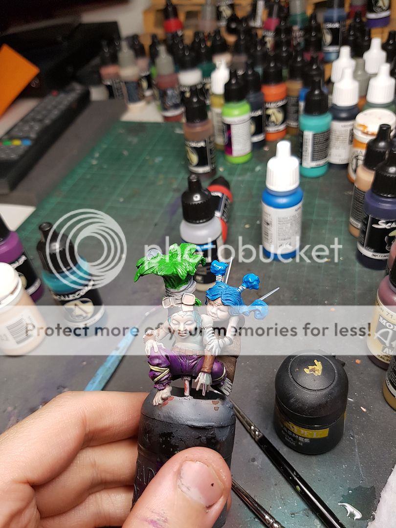
My first idea was to go for a bright orange for the pants, to tie it in with the base I had already used very warm colours on. But immediately I realised the red was just too saturated, and really didn't feel right. I decided to switch it up, and try a purple. I didn't originally plan on using purple on this model, but I felt like the same colours as the base might not work quite right.
I still wasn't sure. I liked the way the purple sat beside the green, but I really didn't enjoy the overall coolness of all the colours. Something again about it was not quite feeling right. I decided to push on with painting the green leaves on the headdress and make sure I maintained some forward momentum on the piece. I then started on the brown leather bits and bobs.
I changed the hair colour to better fit in with the purple, to an orange tone. I did some funny stripes and streaks to represent a reflective surface for the glasses.
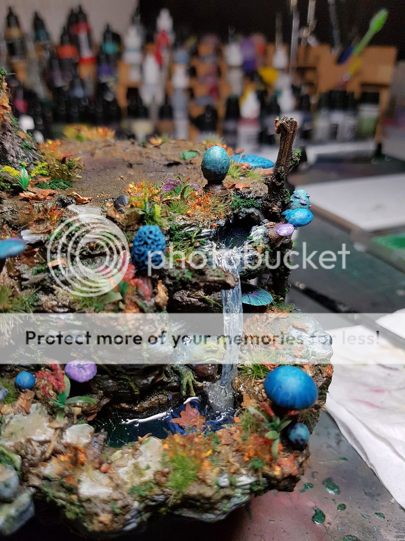
I took a look at the waterfall I had done. Although the plastic I had done for the splash looked really good, the rest of the waterfall had not come out as well as I had hoped. I had added a little white foam into the clear gel, and it didn't really look right. I decided I had to try again, and I went to option number two for waterfalls: fishing line.
Clear fishing line, glued from the rock face, down to the splash, glued together in a few points. I then painted the Vallejo gel over the top of that. I was able to have a much more flowing stream that looked more natural, although it missed little froggo with the splash now.
I had a bit more time to reflect on the colours of the fairies. The problem was, the colour of the base was quite saturated, even though I had tried to keep it a little down. The model needed to stand out more from that. But the colours I was choosing made it look discordant and jarring, so I had to think a little differently.
The other issue was the subject matter itself: Fairies. They are kind of ephemeral, whimsical creatures, and I looked at some artwork for inspiration:
The colours were generally a pastel colour. I figured that the problem with pastel would be that naturally it would be a lot less saturated, meaning it would tend to recede. So I had to strike a balance!
Here was the first attempt.
And surprisingly, I actually really enjoyed it. I felt like it played nicely with the pale skin, and still had a lot of vibrancy. I decided to try and emulate that piece of artwork on the lady.
I went back and checked on the waterfall, and was immediately much much happier with the result.
You can see that old mate froggo lost a little bit of skin when I peel away the old waterfall, which is something I will need to correct before adding the final splash elements to the waterfall.
Something about the blue hair felt forced, like I was trying to tie it in with the base on purpose without having a good reason. So I tried red hair for Sina, and also shifted the hair on the Knight to be a sandy blond. I noticed that there was a strange leaf in the centre of the Knights head, and figured I might drill it out and stick one of my pre made flowers in there, again focusing on tying things together and keeping everything a unified whole. It worked out well!
Time for a test fit. This is the first time in the process of painting that I have put everything together, and for me it is an important process to continually check back and see how the model completes on the base.
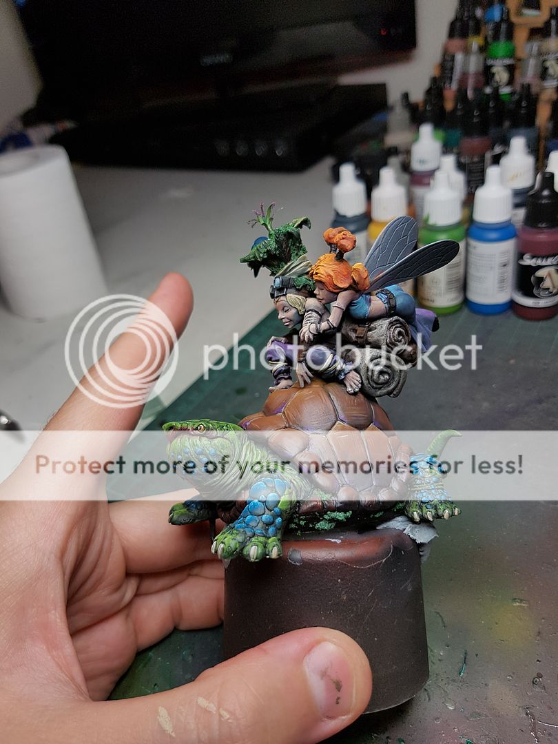
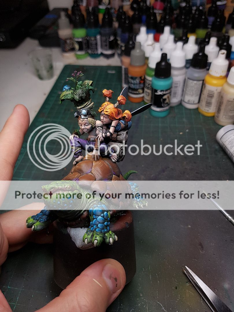
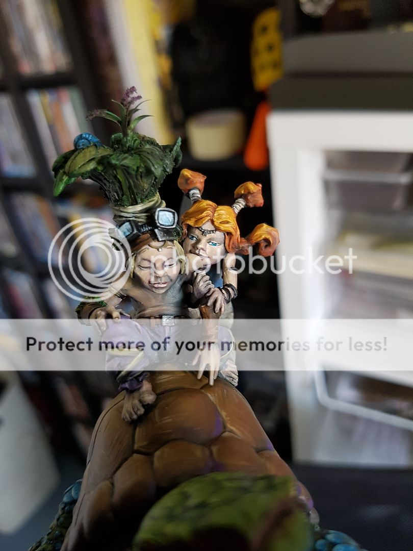
I am really loving the lilac clothing. It works for me. I want to reflect that colour in the base a little more, and the obvious fix is adding some purple mushrooms on there. I also have reached a point on Sina where I feel like I can actually glue them to the turtle. There is a few gaps that need filling and before I reach a completed paint stage on either of them I need to do that. So, here is the next photo showing exactly that, the fairies glued down to the turtle, the gaps filled and a few purple mushrooms added, although I want to add a few more splashes of purple to the base yet.
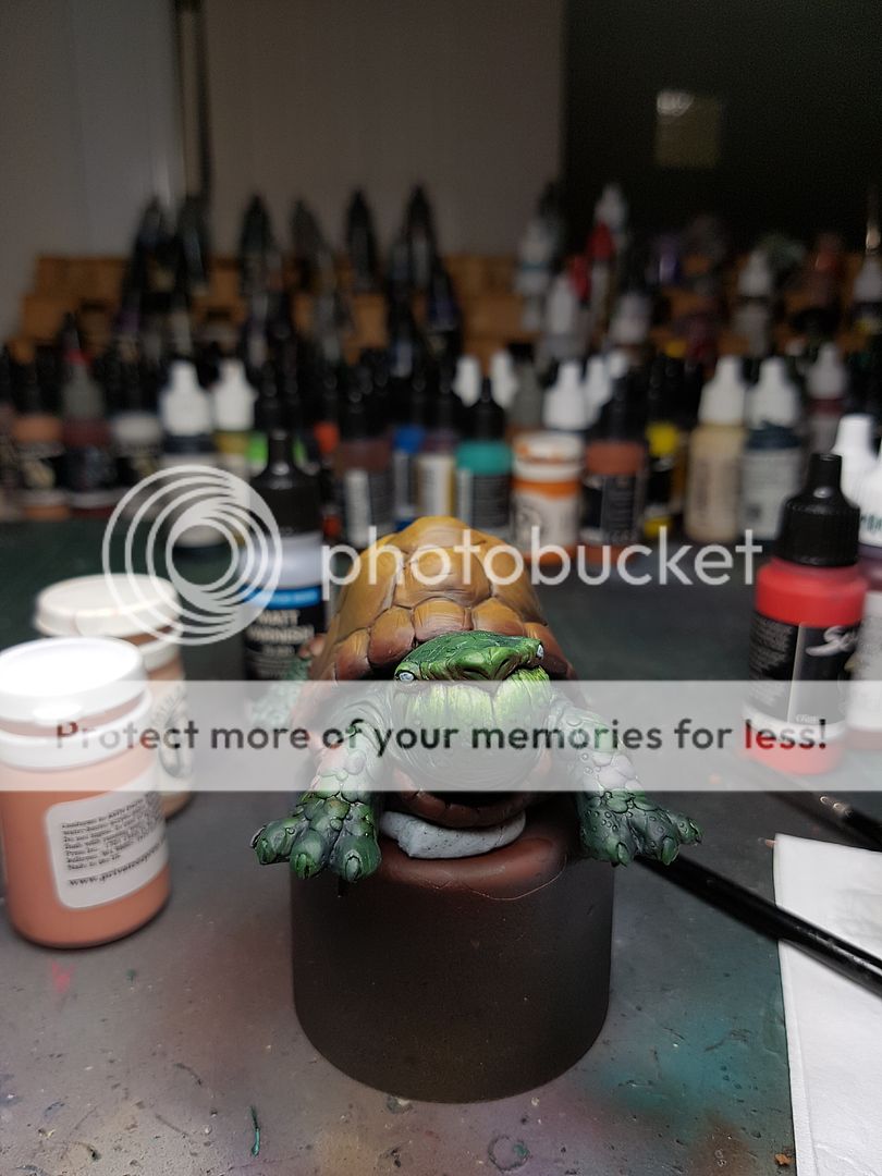
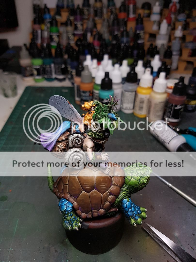
I began working a bit more on the shell of the turtle, covering up the gaps I had just filled, and starting to add some more highlights and shading. The colours I've used for this model I've tried to keep in the orange or blue spectrum, so the green has a lot of blue tones, the purple has more blue than red, and so on. The shell is the same, shading with the ubiquitous DSB, Hull Red and P3 Orange mixed together. I also started the process of highlighting the turtles skin, mixing in a lot of yellows and creating some stippling textures in there.
Once I added the skin tones, I realised that my initial plan of using the same coloured scales on his skin as the shell just would look a little too drab. It is supposed to be a fairy turtle thing, so it needed more colour! I figured to help tie back into the mushrooms, since I had removed the blue from the models themselves that the blue would work. I tried it out:
I wasn't convinced, but I also wasn't really dissuaded either. I felt like I needed to add more saturation and highlight everything up to the same sort of level to really see how it all looked together. So I pushed through and got the blue to a point where I actually really enjoyed how it came out!
I actually started to see the model coming to life now. It is amazing the impact of these last few stages of highlighting, of really adding the lighting and watching the colours start to pop out. I was pretty happy with it, and when I put it beside the base, it was all really looking good together, harmonious and unified, whilst the model was still popping out more. Put a bit more time into the shell, adding that same level of highlighting, and putting a few different colours in there as well.
I gave the turtle a varnish, and moved back to the base. I wanted to start getting a firmer idea of how the whole piece would look a a single entity, as opposed to just the two seperate sections. I needed the tree finished off, with the colours all painted on to know exactly where the turtle and his bros would sit on the base.
I was still waiting for the materials I planned on using for my foliage, so I switched back to the waterfall for a bit, adding some more size to the water with the gel, and adding some more splashes. This is not a new technique, I have blatantly copied from one of the people I am most inspired by, David Soper from Sprokets Small World. I got some tiny clear fishing line, glued it in place, added a tiny bit of vallejo gel and then added a microbead on the end. I did this in a few areas up the top of the waterfall, and I started down the bottom but I had to go. I will add a few more later, but here is the progress so far.
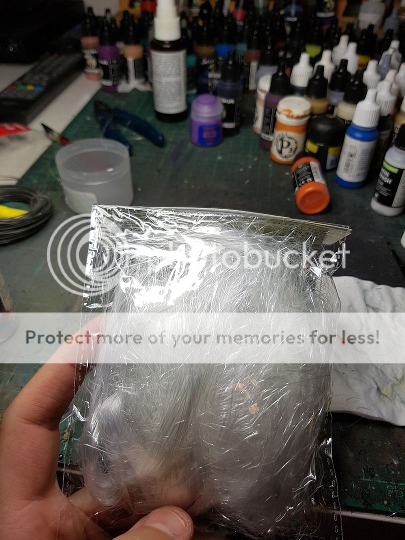
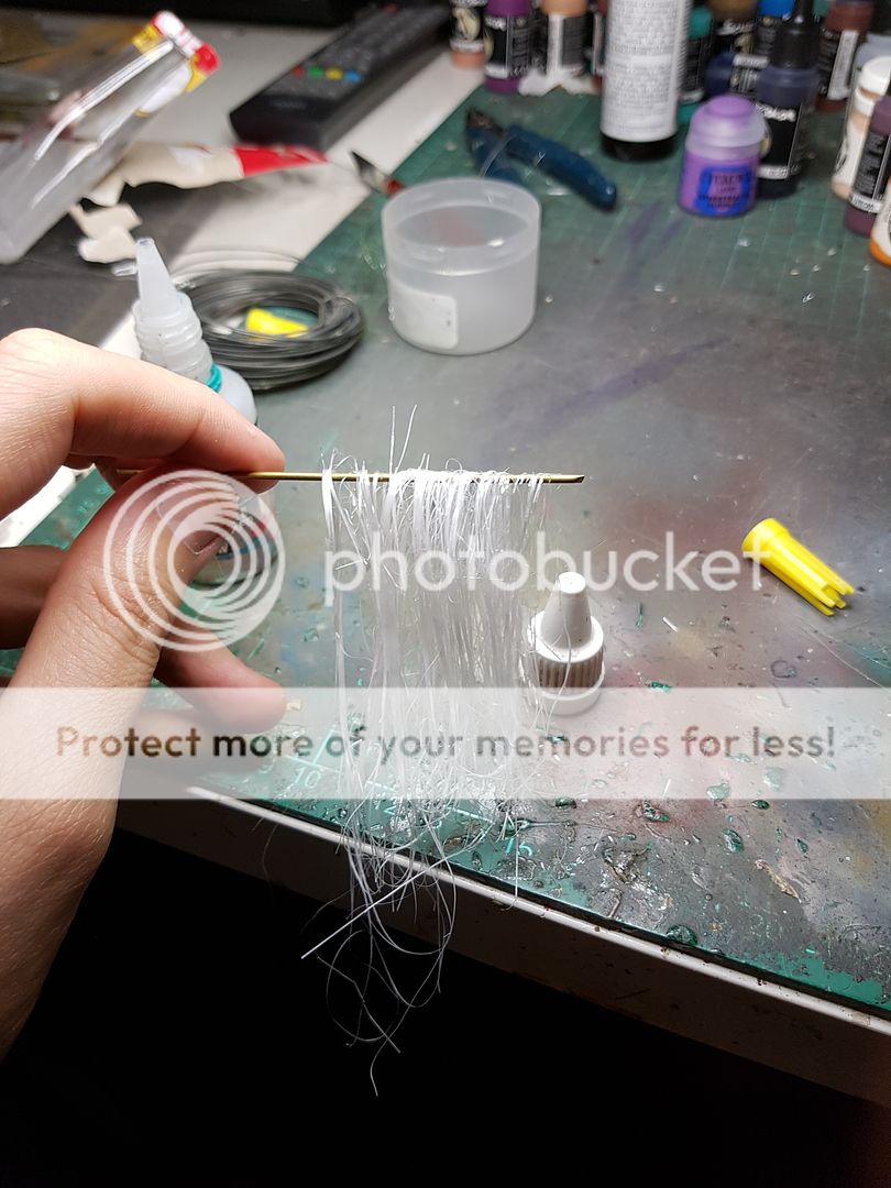
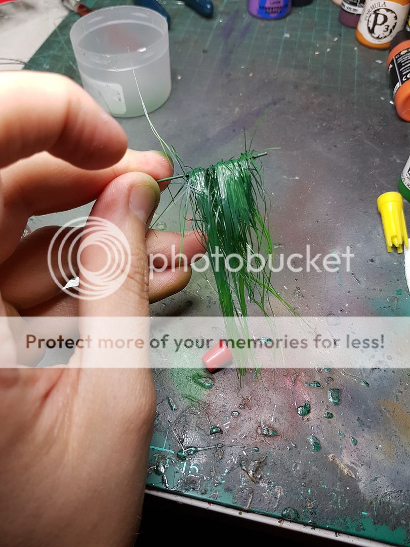
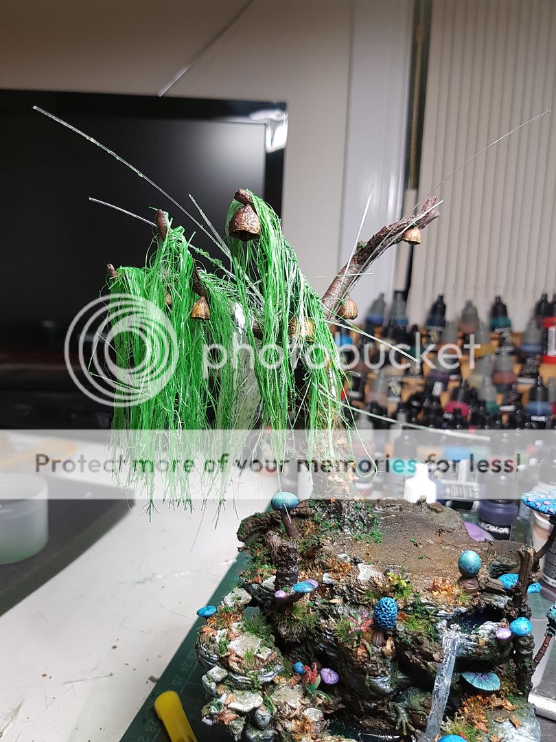
Finally after a long delay I was forced to go to a different supplier for the product I was using for my foliage. Again, another not original technique, this one is by Raffa at Massive Voodoo, using a christmas decoration called angel hair to create hanging foliage.
You first glue some of the angel hair to a section of wire or whatever, then run slightly watered down pva glue over it with your fingers. Once this has dried, you can airbrush it and glue it on. I started experimenting with this idea:
So whilst I liked quite a few aspects of this technique, it did not quite look perfect to me. The colour on that piece is too saturated at the moment, but as this was just a test run, I figured I could easily adapt it.
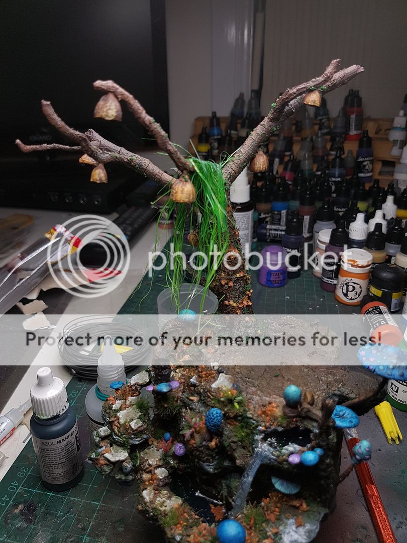
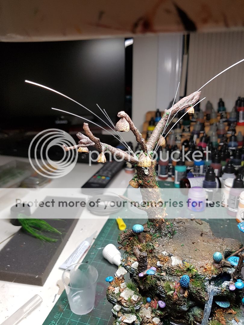
I needed a bit more texture on it, so I used the same dosh that I had put on the base, and added it to some of the strands. I felt like, again, I needed to work on it at one time, rather than individual strands getting painted and then just stuck on. So I decided I would airbrush them on the model after glueing them all down. Which meant that the next step was actually to add in my fibre optics!
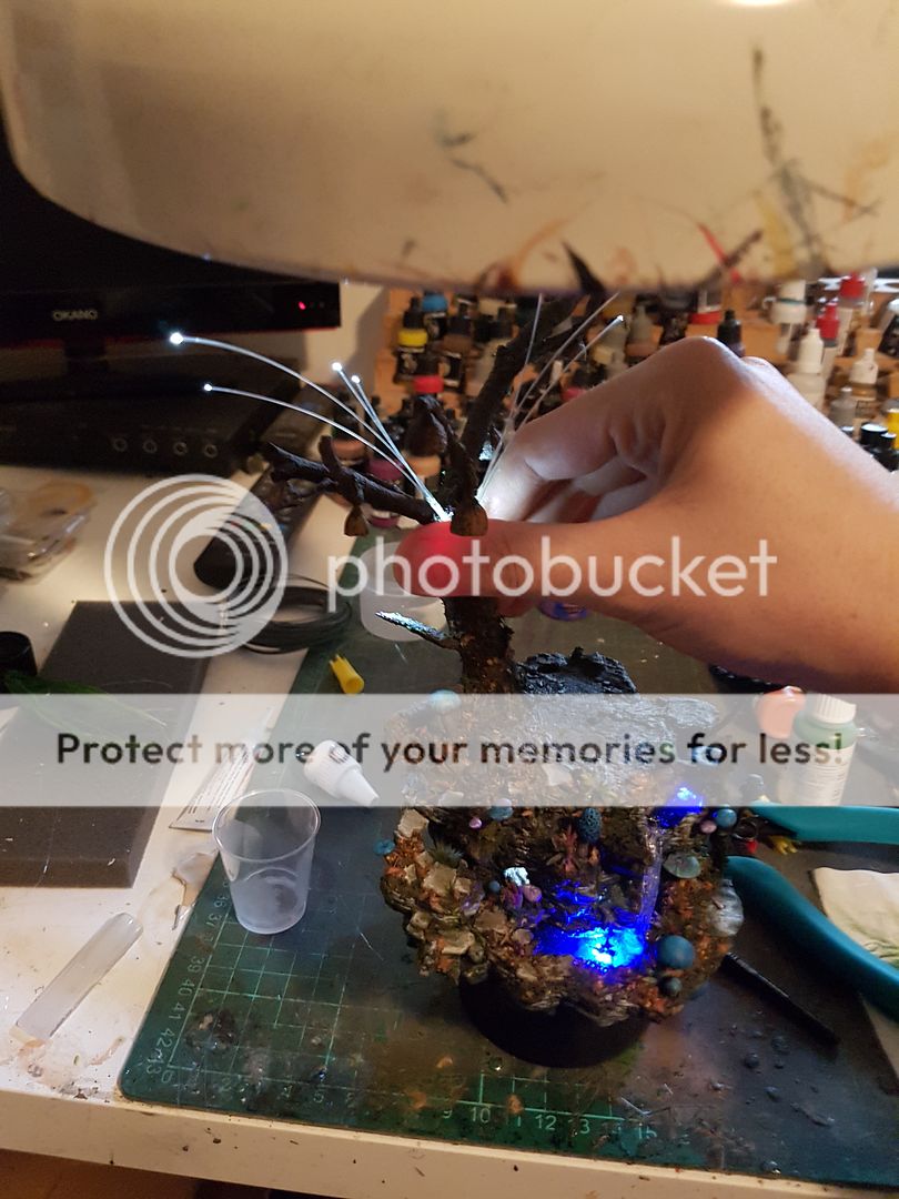
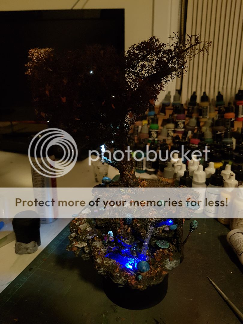
The plan from the start has always been to have weird glowing dots in the tree, representing fairies as the caper around the willow tree. The pool glowing, the tree twinkling, it is all happening. So to do this I need to attach the fibre optics with superglue to the LED, then run the cable out through the foliage and glue it to a few strands, then trim it as the very last stage, so just the edge is visible out of the foliage. I glued down 10 different cables to the front LED.
Another lighting test, very exciting. I feel like if I can pull this off it is going to look, well, magic! So I began adding some of the strands of angel hair to the tree, working back into them, trimming, adding texture, so on, back and for until I had reached this:
Whilst I certainly dont hate it, I think the strands are too large, and the height of the strands needs to vary more. In nature, you dont get the straight ends, you have a lot more natural variation. I need to somehow add that, and add some smaller, more fine strands of detail.
The funny thing was, at this point I had a look at the model and realised a massive, massive flaw in the whole piece. I had highlighted the model based on the light source being the tree itself, which was consistent with the LEDs and so on. But, when I put down that foliage, the best and most saturated areas were mostly hidden by the foliage. The "front" of the model looked, well, average. I went to bed feeling a little despondent about it all.
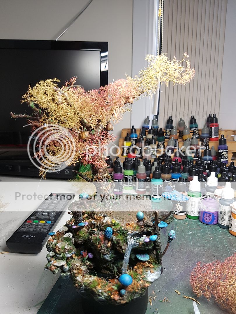
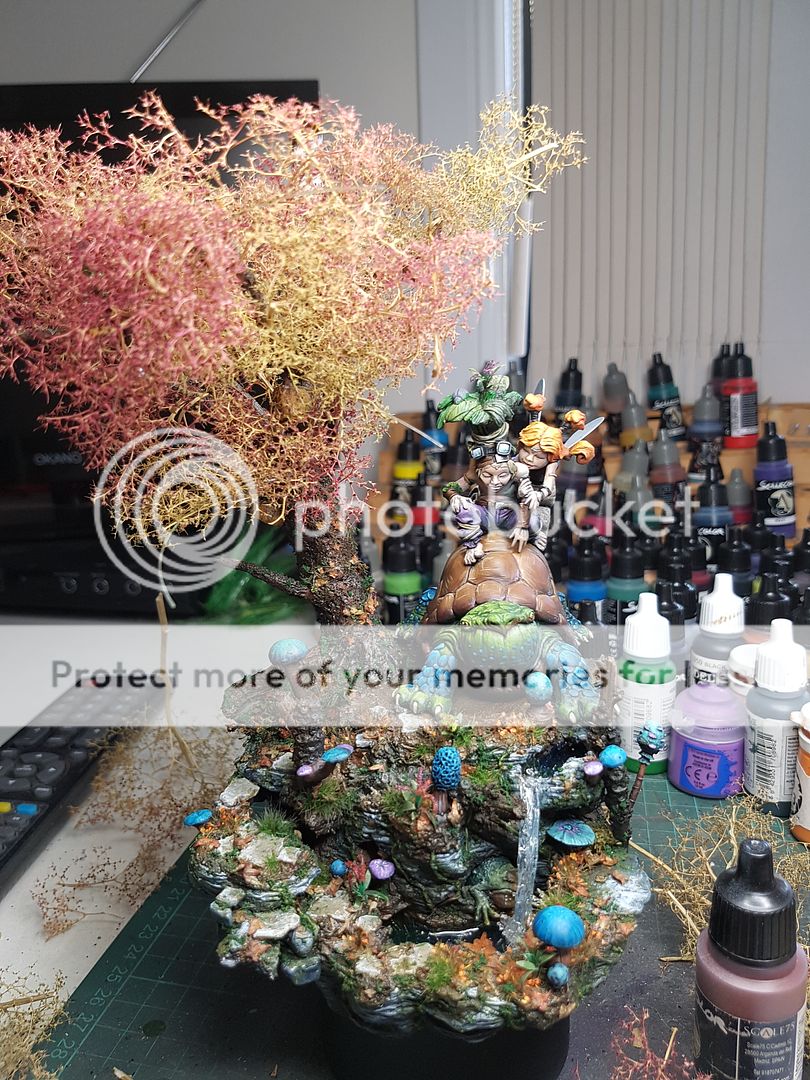
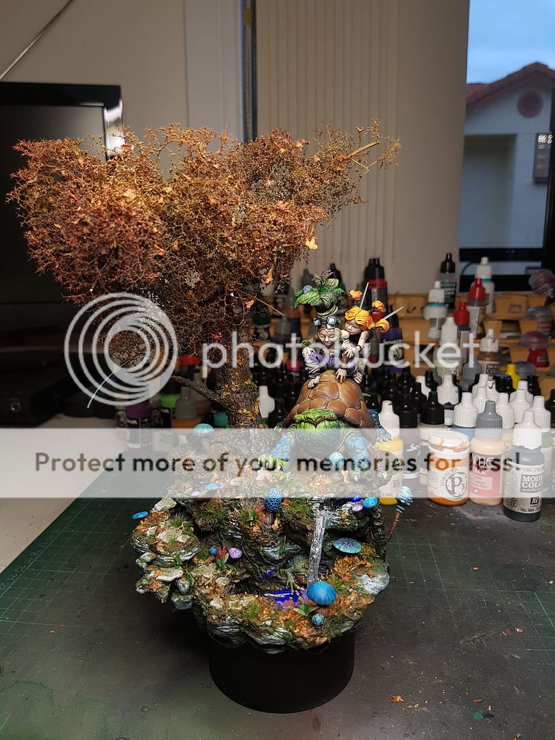
After I slept on the willow fronds, I got up and had another look, and felt pretty disappointed in the overall look. The rest of the model has lots of tiny little details, intricate but also subtle. These hanging fronds were anything but little, or subtle. They ruined the whole piece. It was a real shame, because I imagined the tree from the start as a willow tree. I decided to go for a more traditional tree, and I used a product from a company called JOEFIX to expand the foliage. During this point I figured, since I was changing the tree significantly, might as well change the turtles position so that I opened up the nicely painted areas. I would need to resculpt a few rocks, add more foliage and things to some areas and remove a mushroom, but suddenly the front of the piece actually looked good.
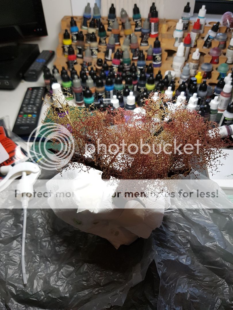
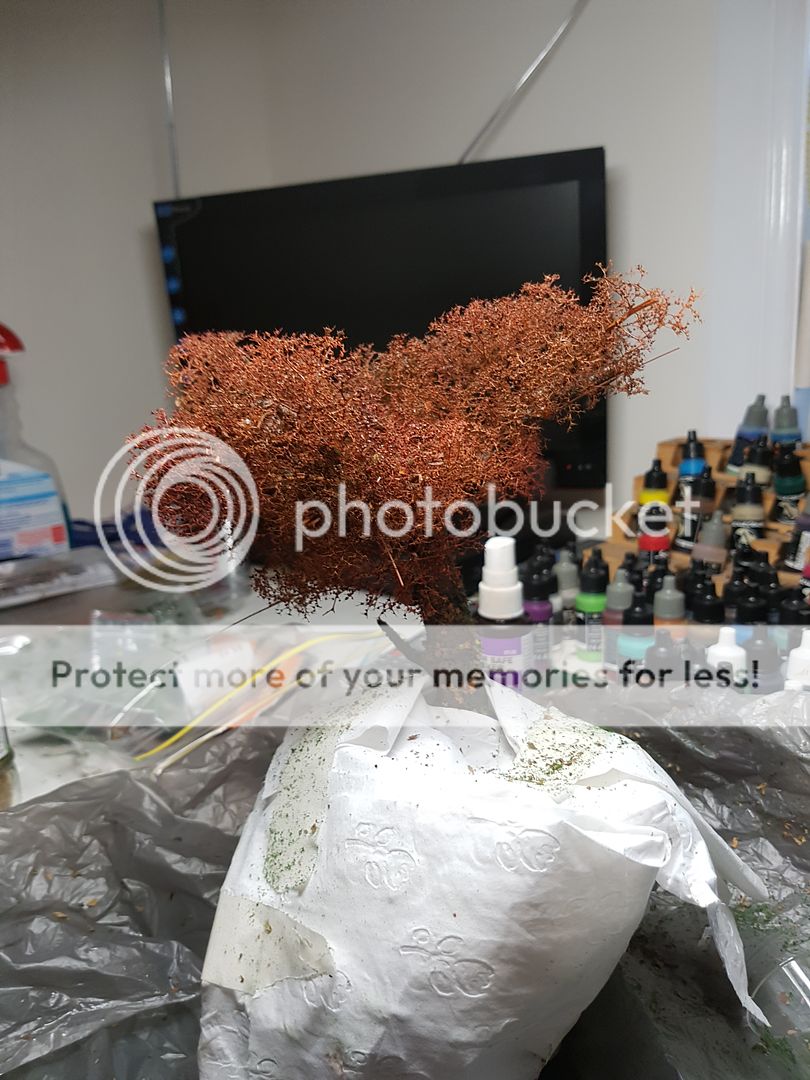
The first stage was to glue these foliage pieces to the current structure of the tree. They have very natural shapes, but they do not have a lot of volume. So the next step was to add more texture and volume to the final structure. I sprayed thinned PVA over the trees, and sprinkled oregano and fine flock over it. I did this a few times to build up the layers. I covered up the other areas obviously so I would not ruin the work I had done. I then ran some varnish and shades of orange through the airbrush to seal everything together. Once it dried I spread a bit more colour around, adding a bit more natural variation, until it started to look pretty good.
Trying to tie the base in with the tree more, I decided to add some of the leaves that I had scattered on the ground onto the tree. I again sprayed PVA and sprinkled the leaves on. Once that dried, I added some more varnish, and a little bit more orange to tie things all together.
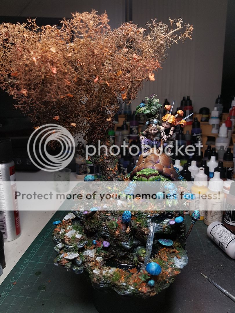
Moment of truth... I pulled everything apart and added the turtle back to the base in his new position.
Suddenly I could see the finish line! We still have a long way to go, but I have a base that needs a bit more painting, and a model that needs a bit more painting, and we can glue it together and bam, its done! Obviously it is a little more complex than that, but that is the sense of accomplishment I got from seeing the model like this.
I began adding in the shapes that would keep turtle mate with his feet on the ground, adding in a few more interesting twigs and rocks, filling in the gaps.
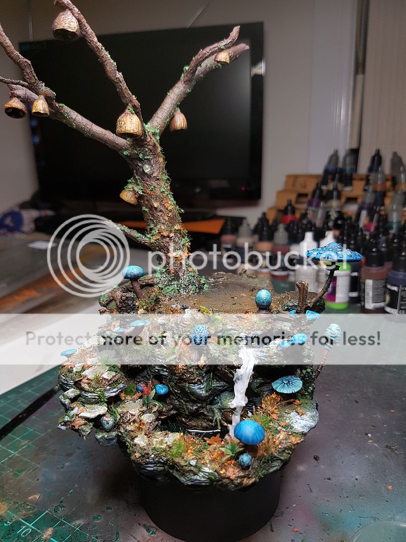
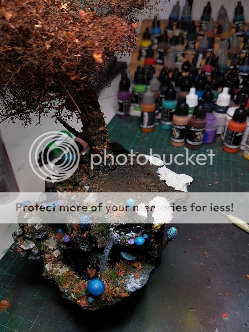
I painted and added the same flocking to these areas that I had on the rest of the model, and took a look at the base as a whole. Really starting to look like a finished base, but I want to try and elevate it to another level, so the last stage will be little details, like another layer of envirotex so the water level is accurate, adding a few more leaves and vines to the tree, and edge highlighting on areas to ensure that it has enough contrast and pop.
Back to the model again, I began bringing the value up on the right hand side of the model now, even though I have opened up the base a lot, I want the model to be a little more "complete", because currently the right hand side looks partly unfinished. Although it is slow going, things are starting to happen now. This guy needs the leaves finished, the girl needs a lot more work, and the turtle has some more shell highlights and adding some different colours and hues into it to create some variation.
I decided to add some foliage to the shell, and add some of that dosh to his headpiece. I figured it would add a lot to the model to have it on there, subtle but still trying to work things together.
I finally decided to paint mr Froggo at last, and hit him with a gloss varnish as well, so he glistened with wetness. That is an expression I did not expect to use in this particular context, I have to say.
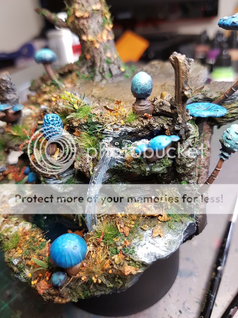
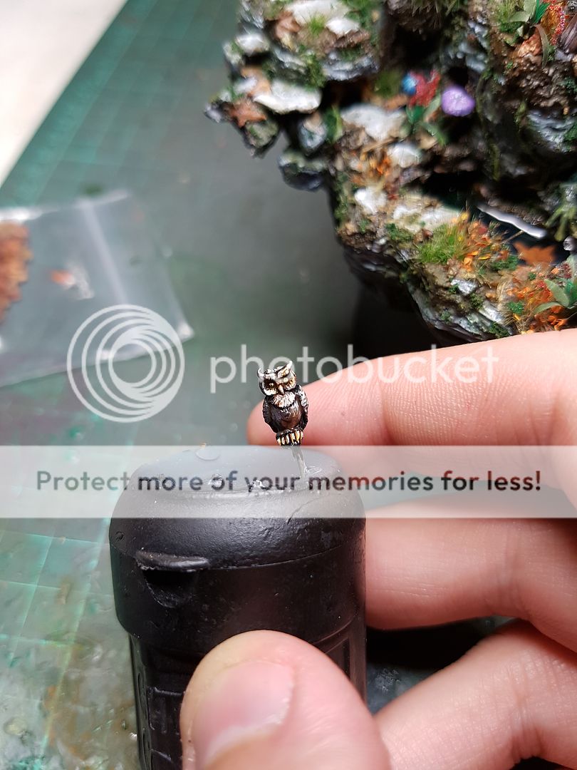
One thing I noticed as I was putting some final touches to the base was one of the LED positions, the one on the far left, pointing out of the walnut thing, was utterly wasted! This little branch was being lit up by an LED, and nothing was on the branch... so I rooted around in my bits and found a little owl, from a Malifaux basing set (I think). I did a quick paint job, and glued him to the tree. Added a little branch nob for him to sit on, and voila, the LED shines on a little owl. The scale is all askew when you consider the frog and the turtle, but since this is fairy land, its all good I reckon. Here is an in the dark photo of the owl being lit up1
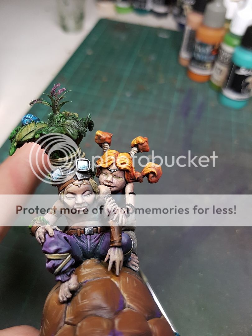
The base needed a few final touchups, highlighting mushrooms and edging some rocks, then making sure everything was properly sealed, before adding one more layer of envirotex to the water. I put that aside to set, and got back to working on the model. The biggest issues at the moment were Sina, the girl, and the leaves on the Knights head. I left the leaves, as honestly they've been giving me trouble from the start, and went back to Sina. I smoothed out the rough highlighting on her dress, I fixed up the issues with her hair, I filled in most of the little details on, leaving just some metallics on her and her bangles, her face, and her wings. I've been lightening the entire right side, adding more saturation to reduce the effect of the atmosphere lighting I was trying to achieve, but I still want a little sense of that so there is still a little blue on that side.
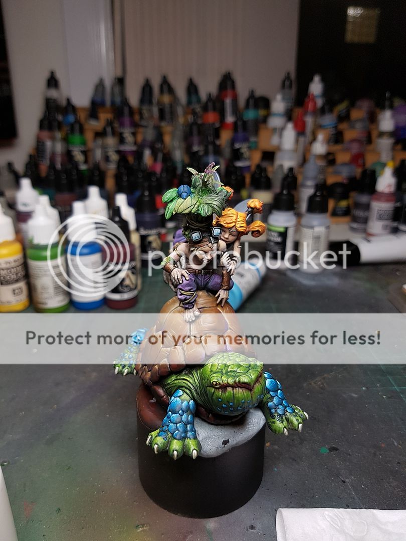
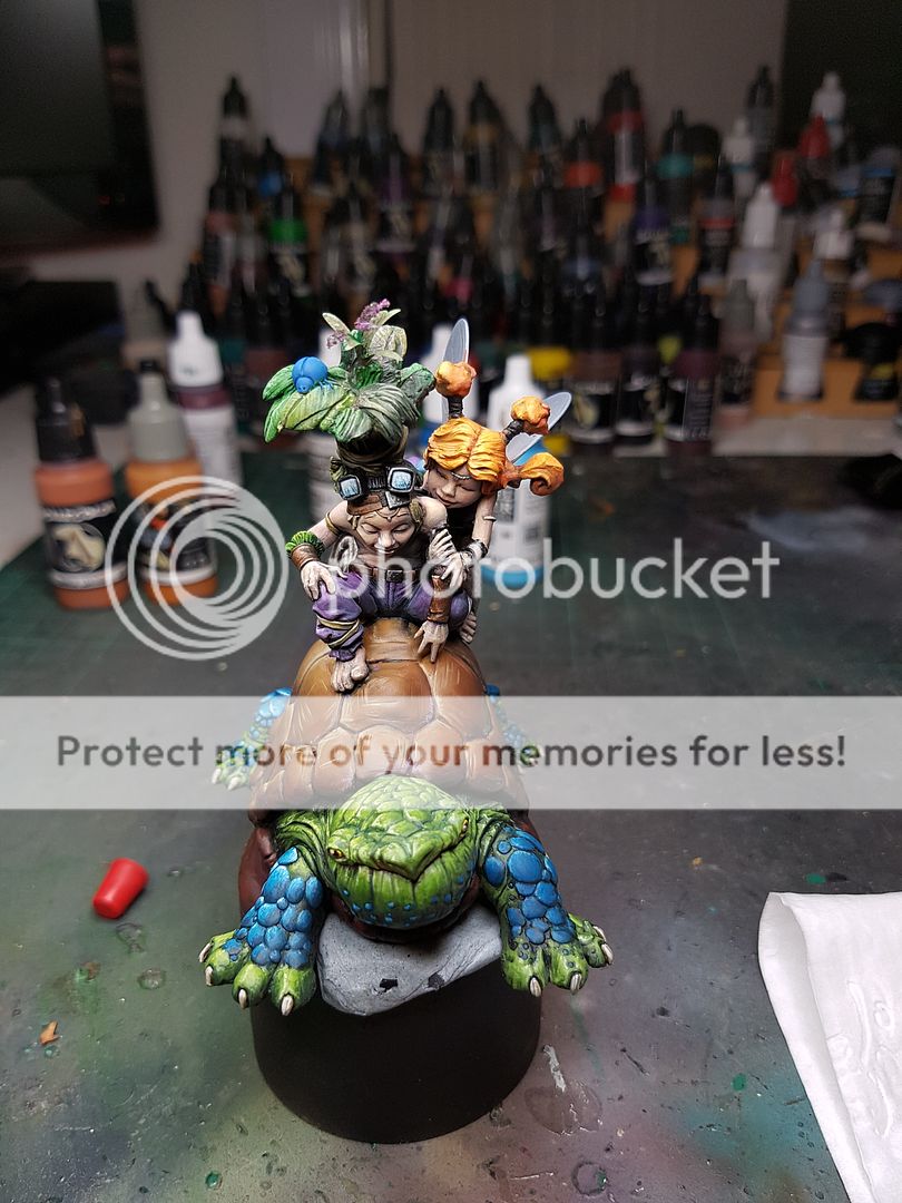
Here is the obligatory, all assembled photo, giving me an idea of how it all looks together, constantly trying to make sure the model is the focus of the piece.
One thing I noticed when adding some purple to Sina's face was her eyes. Honestly, they've bothered me for a while, but I just figured it was because I wasn't painting them right. As I got back to painting on her, I decided I needed to fill in the eyes and give me a chance to paint some more detailed eyes on her. So I pulled out the Milliput and filled them in, and left them to dry overnight.
Once I had a look at the eyes the next day, I was very pleased with the result. Whilst I am far from an experienced sculptor, I get by ok. This was pretty simple, making sure they were smooth and trying to leave a small line for an under eyelid and above eyelid. I painted them with very little problem, and then did some more touch ups on her face.
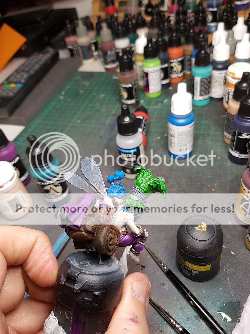
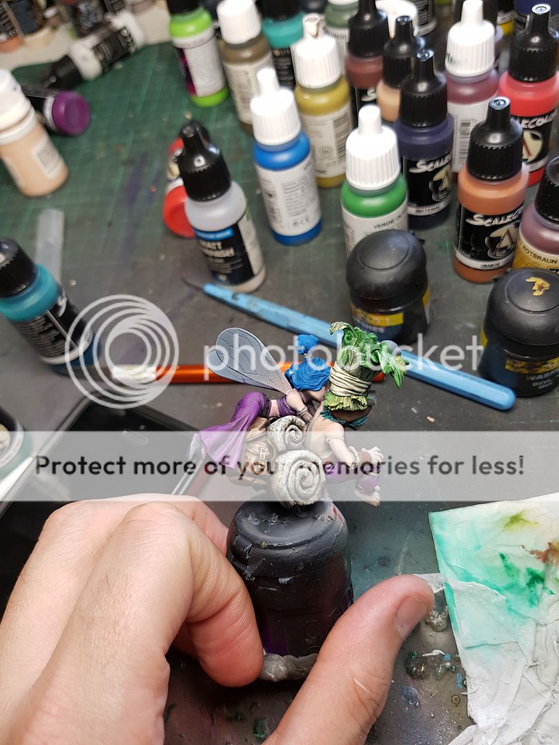
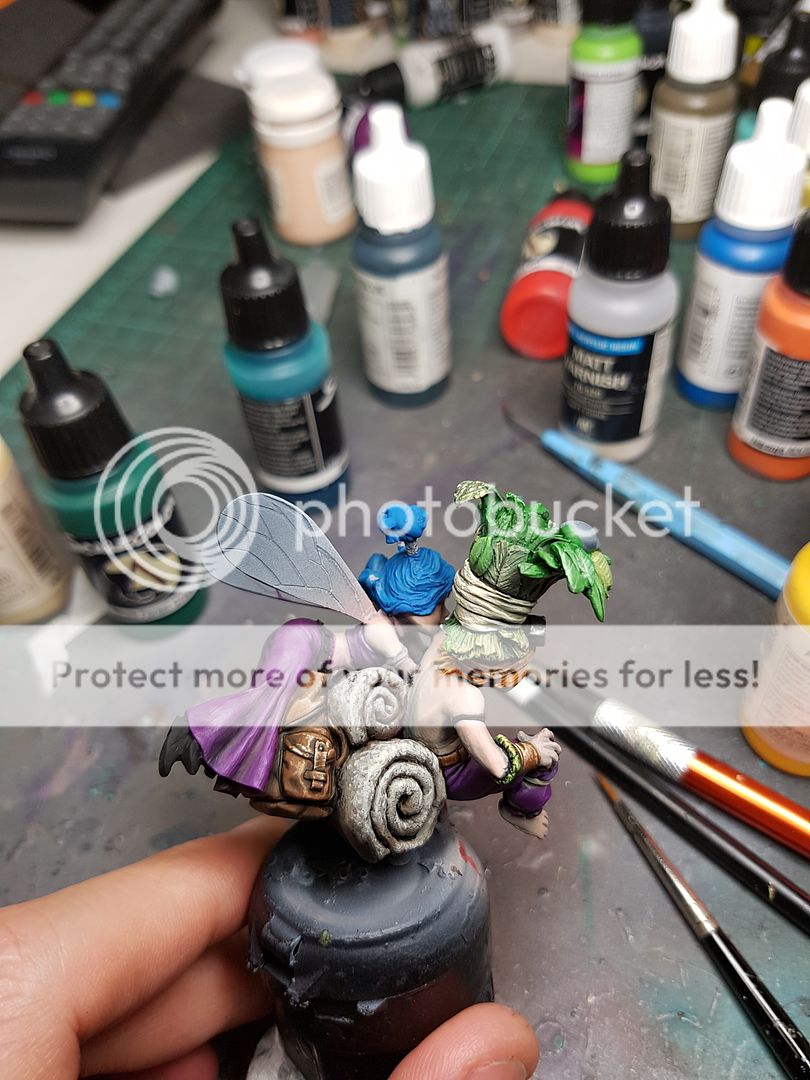
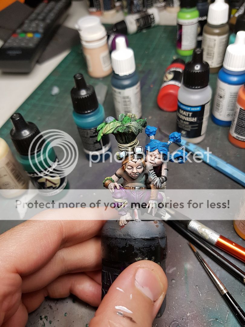
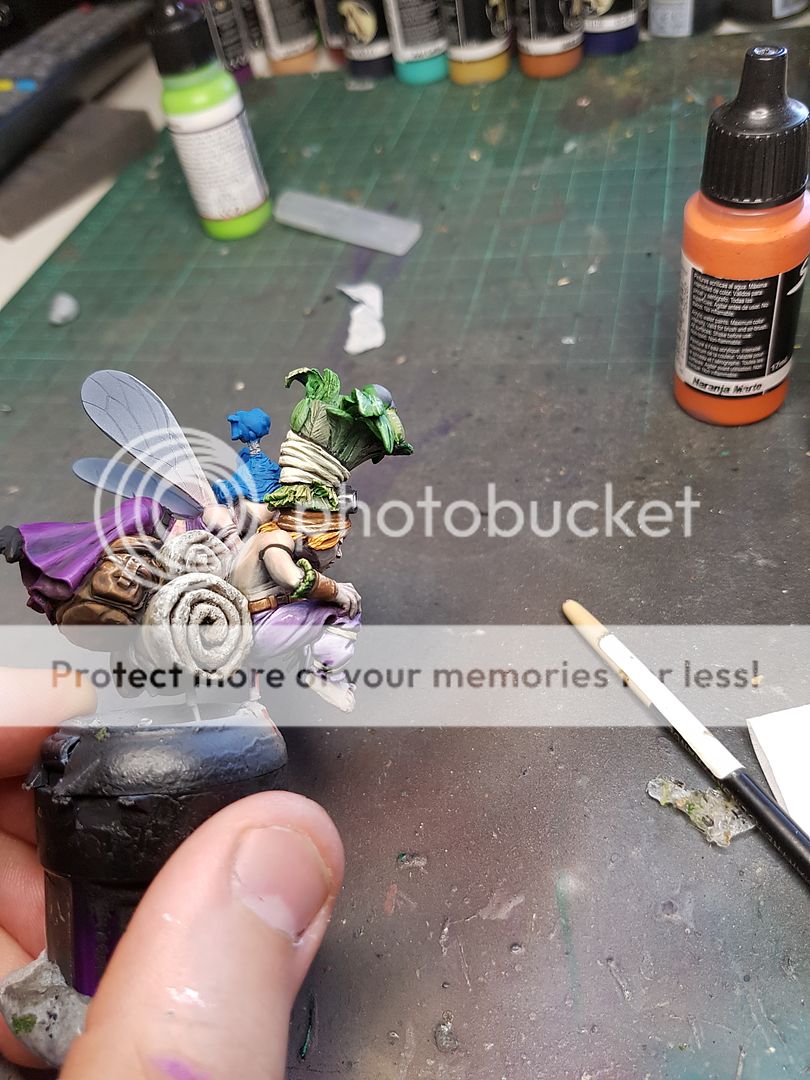
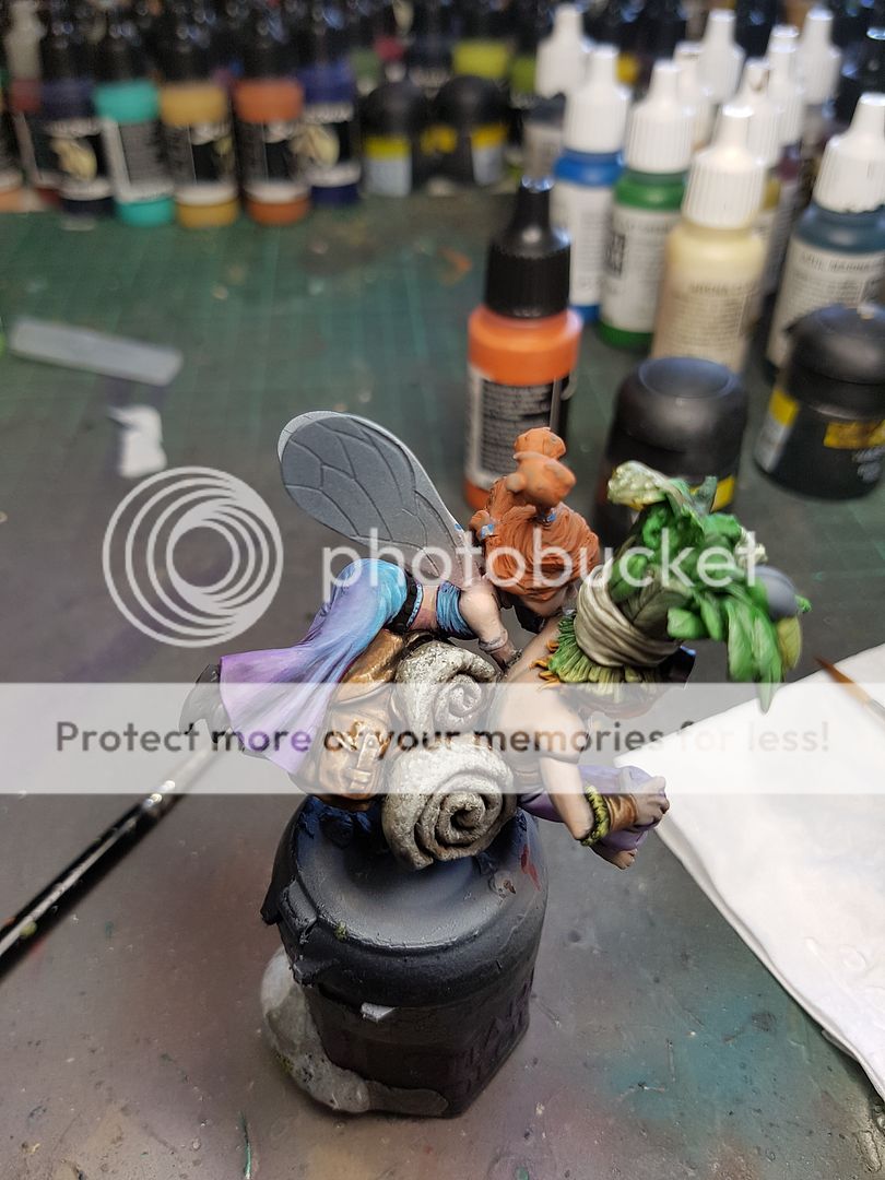
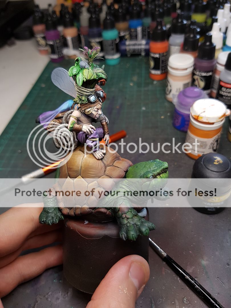
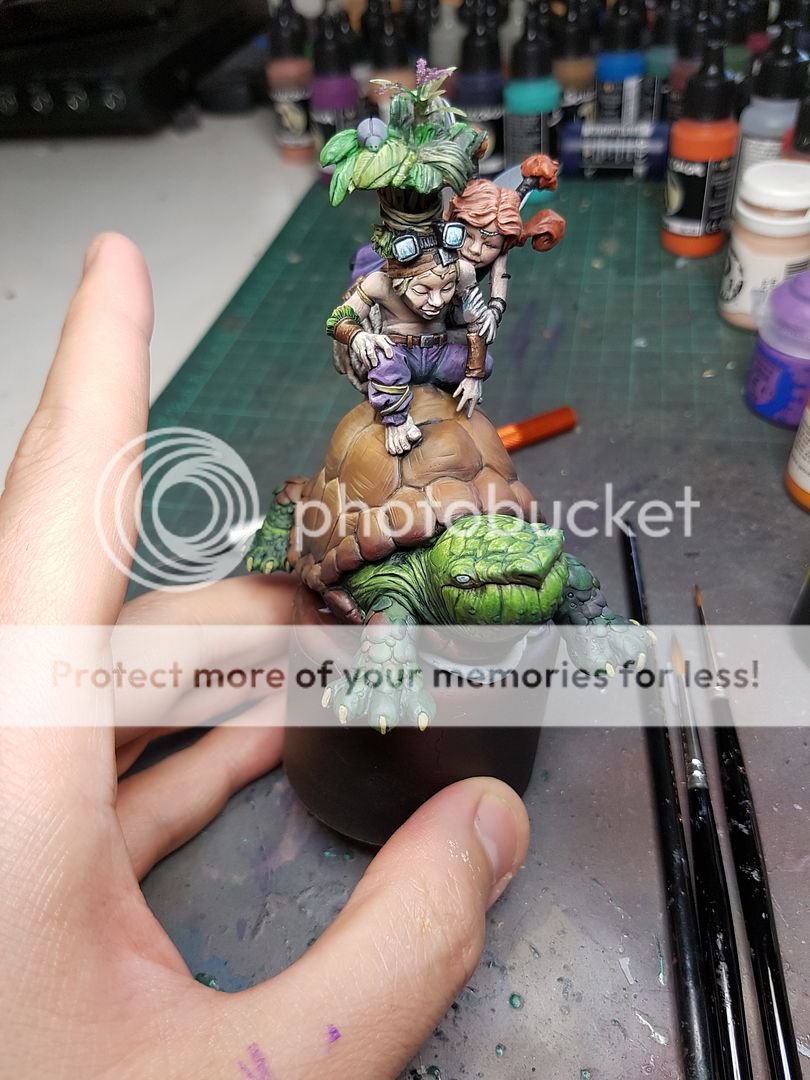
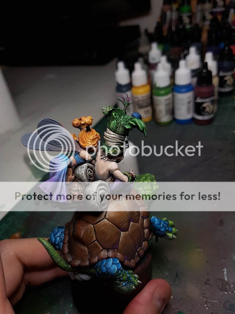
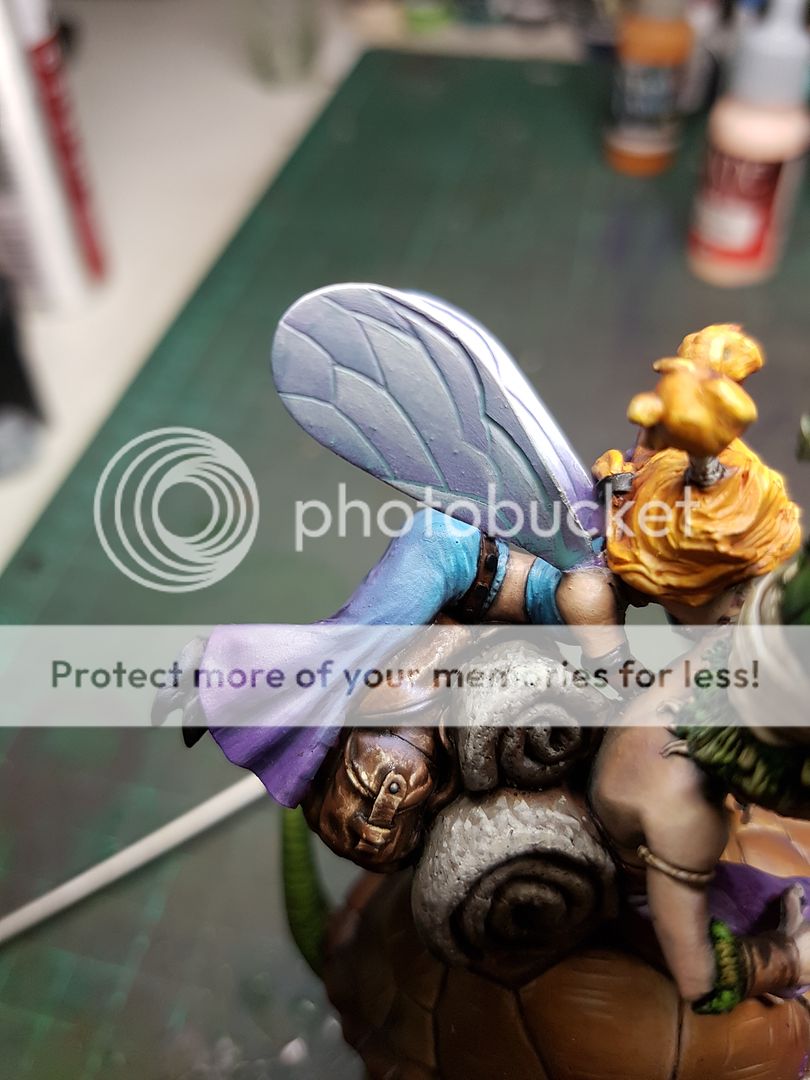
The wings had been something I had not really considered to be honest. I entertained an idea of maybe trying to recreate them out of a clear plastic, or a mold of some kind using the envirotex, but honestly that was never going to be something I wanted to try on this project. So when it came time to actually paint them, I sort of winged it... pun intended. :) I slapped white with the airbrush, then some purple glazing also with the airbrush. I then pulled off the masking and found I had done a shit masking job. Possibly the most frustrating experience ever? Easy enough to fix, but still, annoying as shit. You can see an example of this on the bag.
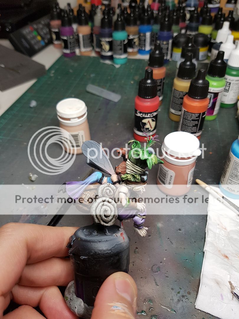
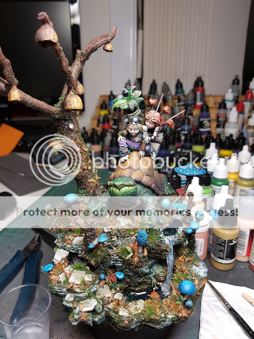
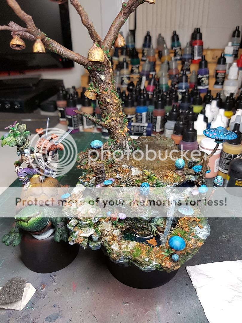
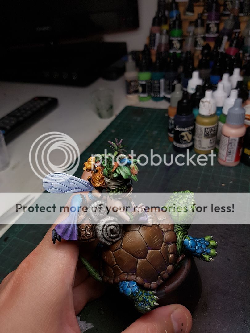
Anyway, I fixed up those areas, and added some cross hatching onto the wings and softened out the white with some more white. I then began finishing off the little bits and pieces that I had left, adding some proper hand textures, adding some metallics after a matt varnish to seal all the blends together, etc. Excuse the giant finger.
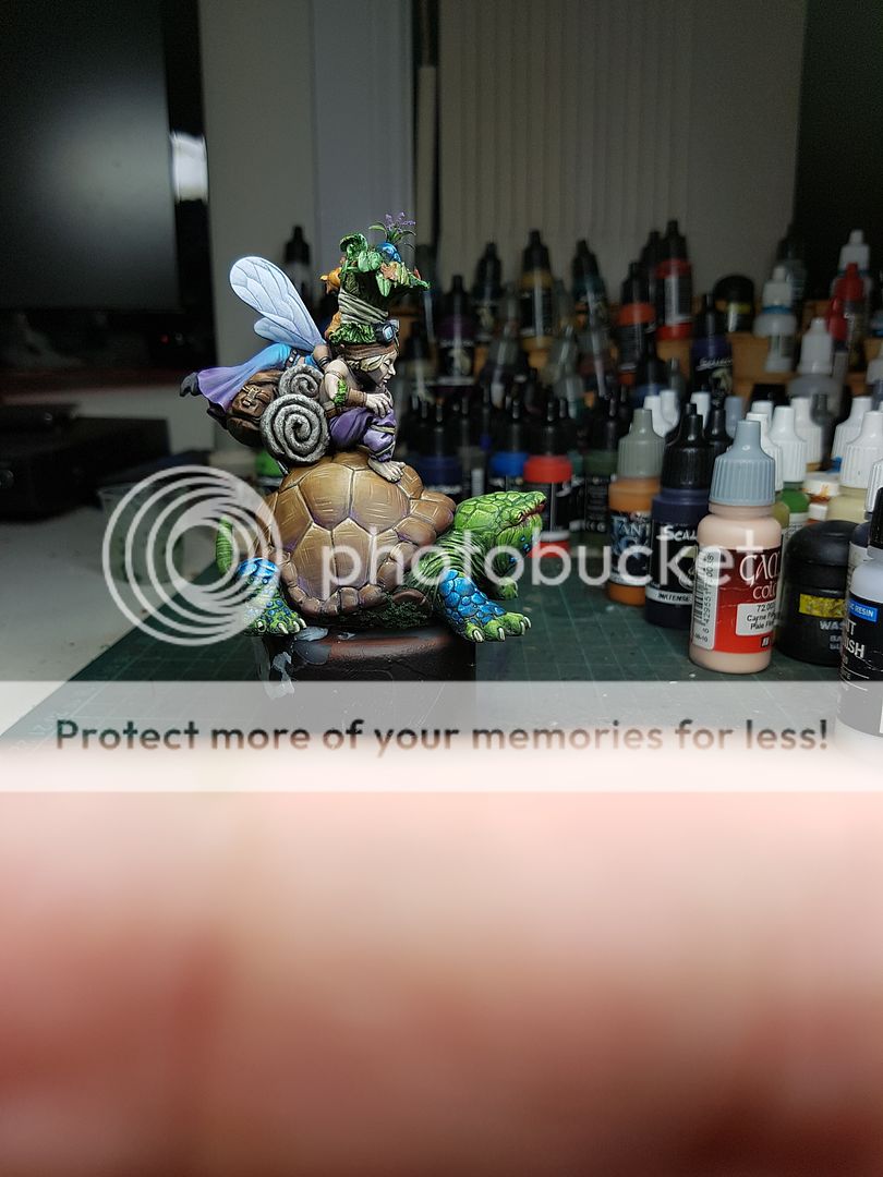
And with that, I called it quits on the painting of the model! Time to give it all a test fit!
Wow, what a mammoth project. I want to do up a small plaque for the front, and maybe just make a few tiny more adjustments here and there, but on the whole I feel like this is a completed project! It has been a lot of work over a few weeks, but I think it is close to the best project I've done (although possibly not the best painting, I think maybe I've painted a few pieces slightly more technically and better).
I know I am far from the worlds best miniature painter, sculptor or hobbyist, but this project has given me a sense that anything is achievable. My miniature painting mentor told me many years ago that if I wanted to paint as well as him, all I needed was passion, perseverance and practice. After almost 6 months of serious miniature painting, I can see how practice has evolved my painting and I am excited to see where I will be in another 6 months. Without perseverance I would not have finished any of the many projects I have started, because as you've seen throughout this process, there are always setbacks, challenges and problems that need to be thought around, solved or bypassed. I know that some people like to plan everything out down to the smallest details, but to me that feels like you would lose a little bit of soul and heart from it. I find my joy in painting, much like Bob Ross, comes from happy little accidents. Sometimes you just stumble upon things during the process that were unintended and yet they become some of the best aspects of a model. And finally, passion. Without passion, why would you bother painting at all? I am so passionate about what I do, that it often causes problems with my significant other, because I spend almost every spare second I have painting, thinking about painting or wishing I was painting. LOL
Thanks for following along with the blog, and for reading through this mammoth step by step. I hope it has provided some insights into how I tackle a project and gives you the motivation to try something like this. Wish me luck for the Crystal Dragon at Cancon!
Subscribe to:
Comments (Atom)
